

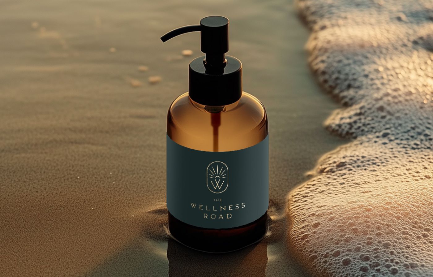

I was contacted by the client via email after they discovered my work on Instagram. They mentioned that they really liked my portfolio and asked about my brand design package, including its pricing and what it covered. After a brief discussion, they reached out again about a month later, ready to move forward with the project.
Questionary before logo development
Before I start a logo design, I send a quick questionnaire to gather important information. There, I ask general questions such as the logo name, its meaning, the brand story, color preferences, and more.
For this project, I received detailed answers with extensive information about the business, which helped me understand the brand in depth. I noticed the strong philosophy behind it and was inspired to bring that personality to life through the visual identity.
The client mentioned that their mission is: “To empower and support people through the transformative stages of life and ageing, fostering a balanced, vibrant, and fulfilling life“. And the vision: We are dedicated to enhancing vitality and well-being by integrating natural therapies, personalised health strategies, and educational guidance.
Logo design process for a wellness company
While reading the brief, I already understood the concept and philosophy behind the brand. During the logo development stage, I focused primarily on the brand’s positioning and its niche. The company promotes health and recovery through bodywork, lifestyle changes, and nutrition, while also providing psychological support. I realized that the brand could not be defined as purely medical. Instead, it felt more human-centered, value-driven, and at times sacred.
On the other hand, the brand is not associated with energy healing or esoteric practices, as is often the case with similar therapies. Therefore, I aimed to create a logo connected to nature or body – something tangible, authentic, and grounded in reality.
Then I analyzed the name itself – The Wellness Road. The word “Road” caught my attention. My first idea was to represent a winding road through the typography.
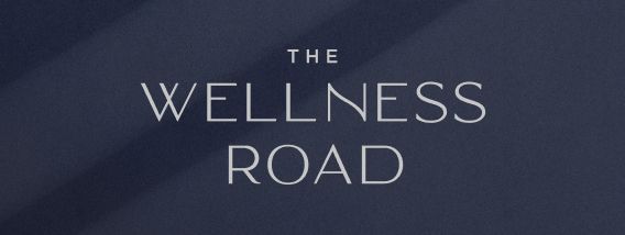
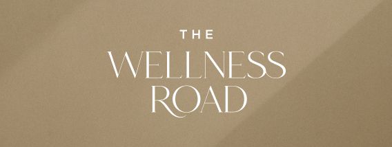
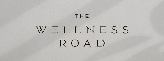
I liked the idea of using a wavy serif or sans-serif typeface. The letter “R” provided a natural opportunity to reflect the curve of a road, while the letter “N” could also incorporate a subtle wave.
I created 5 logo concepts:
- The first option featured a symbol with wavy lines rising upward, conveying blooming flowers and sun rays. The intertwining lines formed an energy circle with a human figure inside.
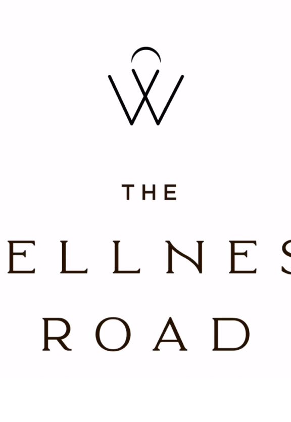
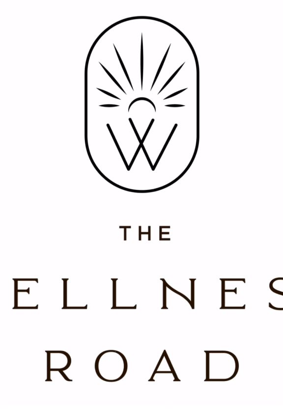
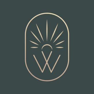
- The second option featured the letter “W” and the sun, symbolizing the “road” through its association with warmth and harmony.
- The third option was an arc-shaped logo that represented an invitation to the wellness journey. The lines inside the circle formed leaves, while the sun subtly resembled a person rising up.
- The fourth idea was an eye-catching symbol that connected the letter “W” with a natural element in the shape of a leaf. It also subtly resembled a crown.
- The final option featured linear letterforms that reinforced the road concept while adding a flowing, personal touch.
Once I finalysed all my thoughts, I sent all of them to a client with my thoughts explanation. She answered:
“
Oh, these are great! This is like choosing my favourite child! I love option 2, both logo and font. I love you have incorporated a sun. Initially, I always wanted a sun as this represents my best friend who passed away from cancer a few years back. You must have been channelling her 🙂
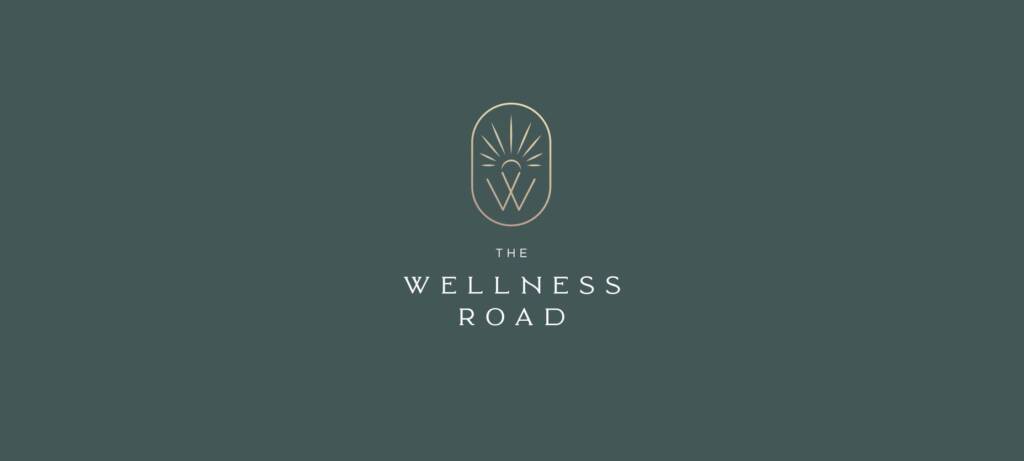
This heartfelt feedback really touched me. As a designer, I can’t help but believe that there are connections between people, whether they are alive or not, whether we know them personally or not. In the end, the client chose concept #2 without requesting any changes.
Do you love the wellness aesthetic? Check this project – Mortar logo design and branding for a compounding pharmacy
Colors and color theme for a wellness company
When the client confirmed the logo, we moved on to defining the color palette. Since the logo featured the sun, I carefully selected sand, gold, and sunny tones to enhance this element. The green shades beautifully represented nature. I also added warm, sun-inspired colors to create a more cohesive and meaningful visual identity.
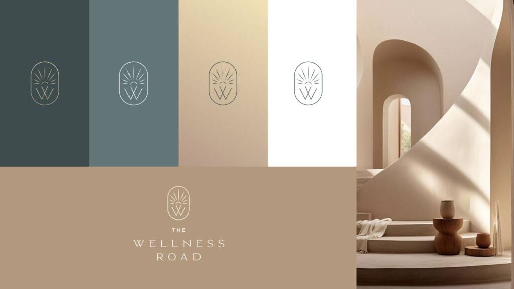
I called this palette “Boho Room” because it combined calm, muted tones. I wanted it to evoke the feeling of a space where sunlight streams through the windows.
You can read more about the bohemian aesthetic – Boho branding style. Features, bohemian palettes and fonts
Logo elements and logo layouts
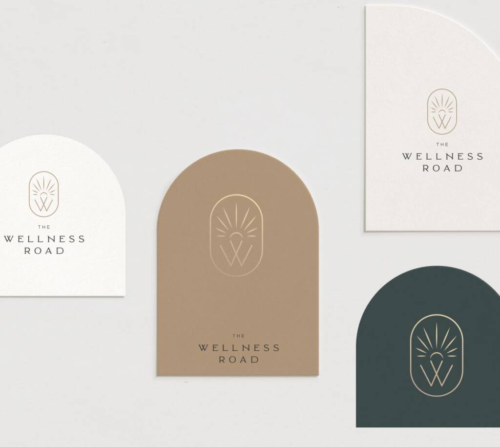
The next stage of the brand development process was defining the logo layouts. They are useful from a practical perspective, ensuring versatility across different applications. They also help separate the branding elements and establish a clear visual hierarchy.
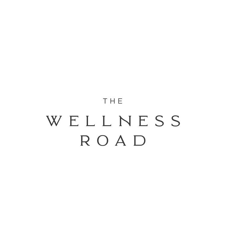
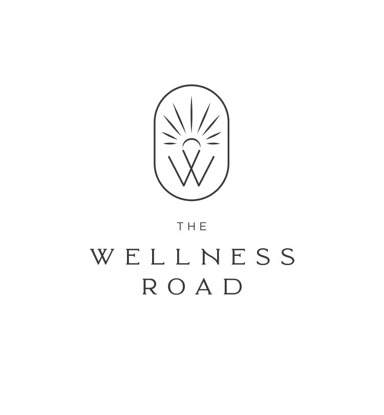
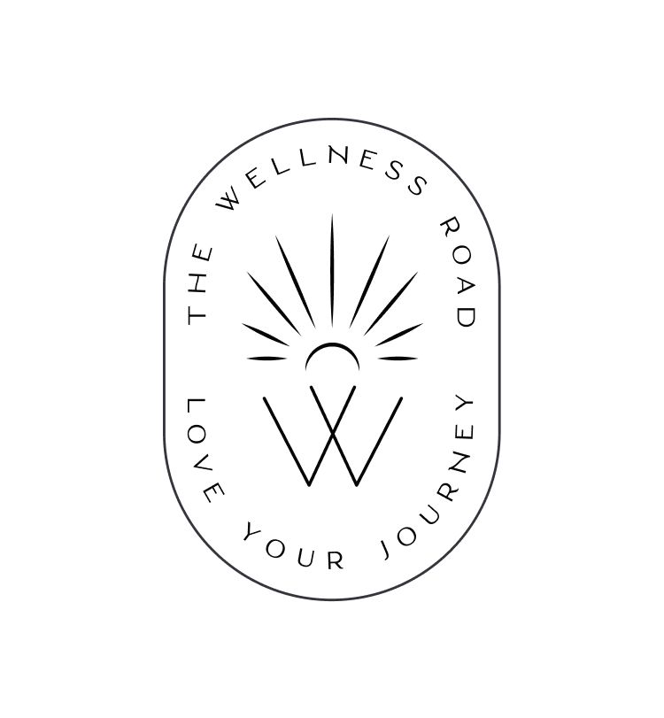
Each variation solves a specific practical need:
- Primary logo – the main brand signature used in most applications, including the website, presentations, and printed materials.
- Vertical logo lockup – designed for narrow formats where there is more vertical than horizontal space, such as packaging, banners, or social media posts.
- Badge logo – a compact version suitable for stamps, seals, profile images, labels, and situations where a contained mark is required.
- Icon inside the frame – intended for small applications such as social media avatars, app icons, or favicons while maintaining brand recognition.
- Standalone symbol – used when the brand is already recognizable. It works well for watermarks, patterns, merchandise, and secondary branding.
- Graphic element – an extracted design element that extends the visual identity beyond the logo. It can be used as a background graphic, decorative pattern, or branding accent across print and digital materials.
Color usage for a wellness company
When the colors are defined, it is important to test how they work together and determine which color combinations are allowed.
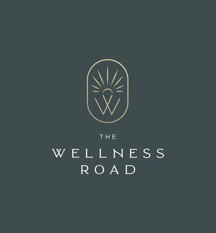
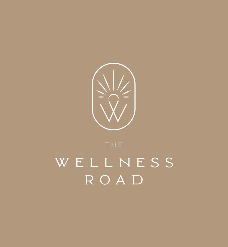
This is a beautiful organic brand identity. Love this aesthetic? Check out the project I created for an fashion company – Eye-catching and creative logo design for a fashion brand
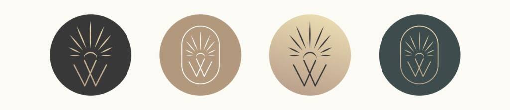
I also suggested versatile avatar variations that can be used across different social media platforms, including Instagram.
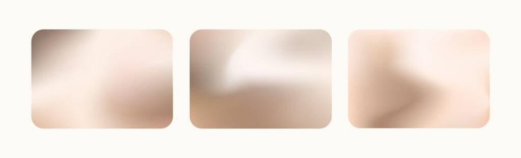
To reinforce the sun-inspired identity of the brand, I also suggested using warm holographic gradients in social media posts.
Brand visualisation
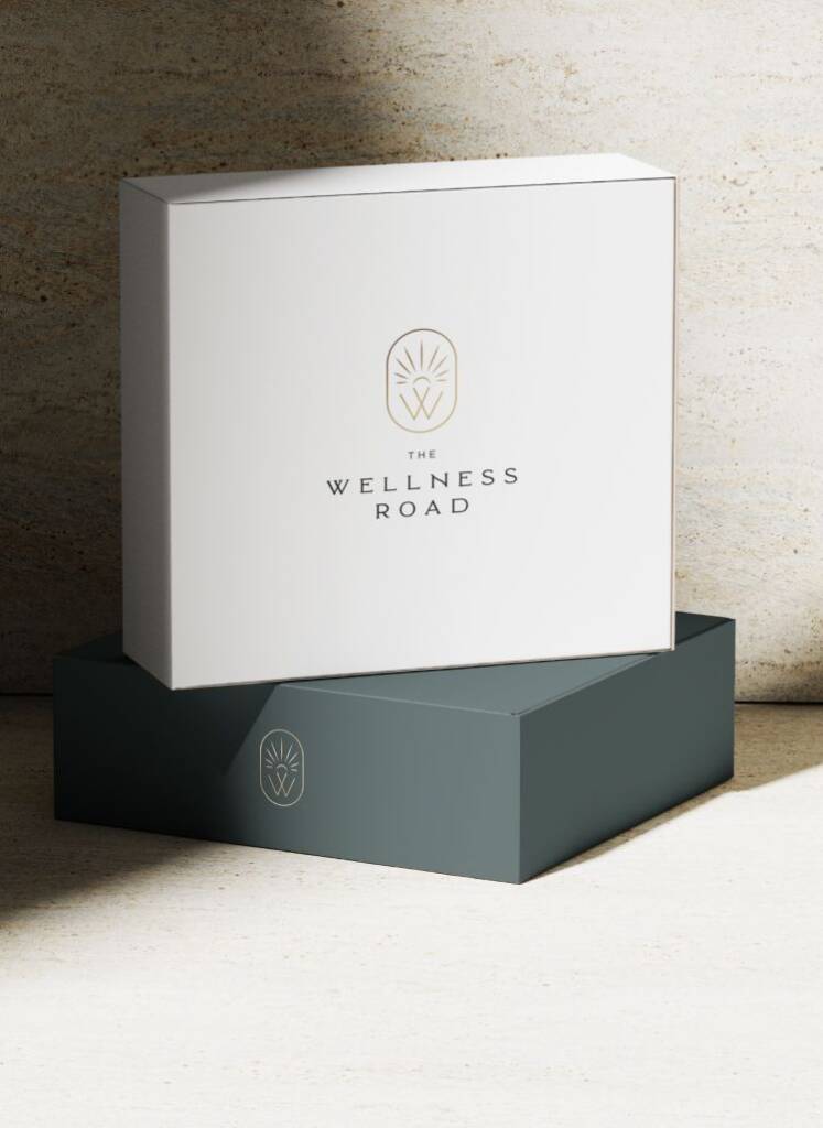
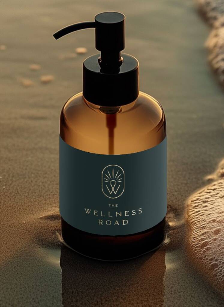
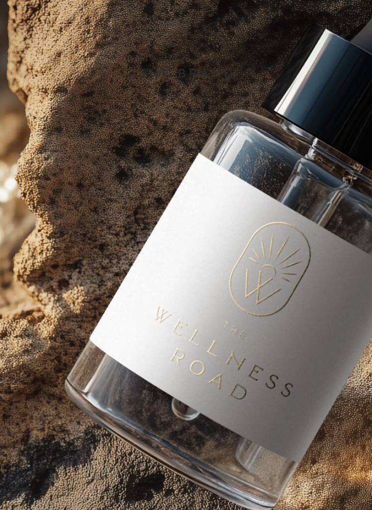
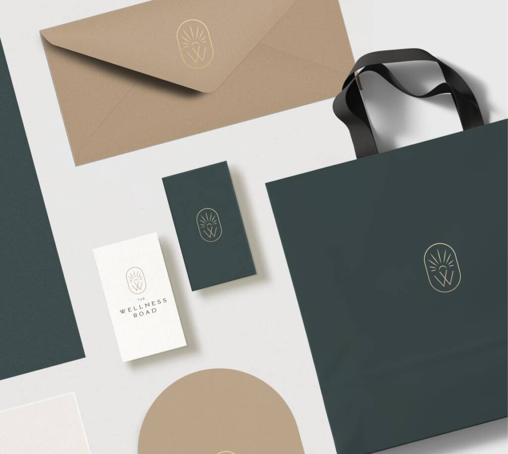
The final part of the branding process is its visual application. I define color proportions and specify how each color should be used, allowing the brand to be used consistently across different teams or by the founder without the need to hire a designer.
Check out another green brand identity I created for an interior designer – Elegant and timeless logo design and brand identity for a kitchen interior studio
The client feedback
I really love it, and I am very happy with it. Thank you so much 🙂
Wellness Road
Owner