

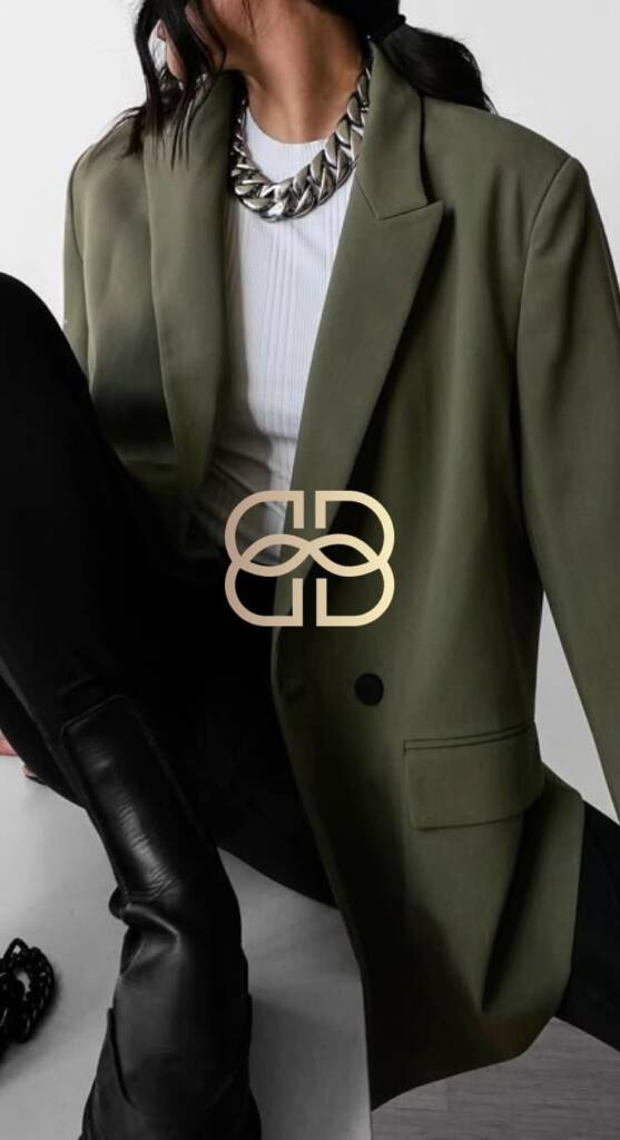
This beautiful logo was created on a freelance platform. You can check my profile here. I competed with many designers and wanted to create something strong to win the contest.
Logo design process
When I started working on this logo, I had minimal information – I only knew it was a sustainable brand for eco-conscious people, and that became the key direction. My goal was to strengthen the business feature, as sustainability was at its core.
Sustainability means using resources responsibly so they don’t run out or cause long-term damage. An example — a company produces packaging using recycled paper and designs it to be reused or easily recycled again. Overall, it relates to care for the planet and life. Based on this, I separated the keywords: organic, grounded, natural.
Logo style for a fashion brand
What “organic” means from a visual brand perspective — calm, smooth, circular or linear shapes. Visual associations — leaves, seeds, trees.
A small research if you enter “organic imagery” in a google search
Logo industry
As a next step, I went through the industry specifics. It is a fashion brand, so it should follow certain visual rules — to be minimal, bold, luxurious, and creative. The logo would be used on clothes, printed on labels and tags, and frequently used in small formats; that’s why most fashion brands lean toward bolder lines and a simple appearance.
Logo lettering
Then I explored the business name. Betta Brand uses the letters “B” and “B,” which are easy to interconnect.
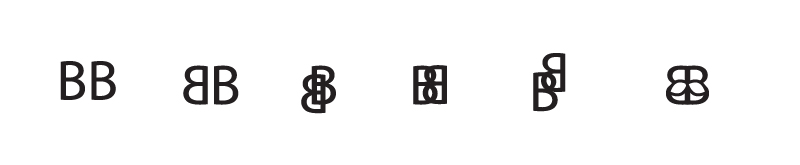
A basic letter brainstorming to identify a possible logo idea
I somehow caught the idea when considering the interconnection of the “B” letters, but it looked disproportionate because the top loops were smaller. Only when I made the “B” fully symmetrical did I achieve the idea that had been spinning in my head.
You may also like to check a strong and dynamic logo for a wellness brand – “OC” letters shaped as a human figure in a logo project for a wellness company