

This journey started with an email from a client. They introduced themselves as a compounding pharmacy specializing in customized medications tailored to each patient’s needs. They mentioned that they had come across my work, were interested in my design approach, and wanted to learn more about my services.
I was excited about the opportunity. Pharmacy branding was still a relatively new niche for me, which made the project even more interesting. After presenting my process, services, and project details, we agreed on the direction and began our collaboration.
Logo design process for a compounding pharmacy
Each project starts with a brief questionnaire. The client shared that their pharmacy specializes in customized medications for hormone therapy, wellness, and functional medicine. They wanted a modern and inviting brand that reflects personalized care and high-quality service.
They also shared inspiration from other brands, which helped me better understand the desired direction and explore initial logo concepts.
Mortar logo design
When I reviewed the brief, I noticed repeated references to a mortar and pestle. Since the pharmacy specializes in customized medications, this traditional symbol felt like the perfect way to communicate craftsmanship, precision, and personalized care. I decided to use the mortar shape as the foundation of the logo and explore it through several different design directions.
As you can see, I explored a single concept through completely different directions, combining elements that evoke nature, wellness, and healing. In parallel, I tested different typography styles, each creating a distinct emotional feel – from elegant and sophisticated to bold and confident. When I start a project, I never know which emotional direction will resonate most with the client.
- The first option combines a mortar, leaves, and a sun symbol to communicate health, vitality, and personalized care.
- Option 2 takes a different approach. It is a bold geometric logo that combines the mortar and leaf into a clean, memorable symbol.
- Option 3 is a curvy, eye-catching concept. The circular lines of the symbol echo the shapes and flow of the typography.
- Option 4 presents a more organic interpretation of the mortar and pestle. The leaf elements soften the symbol and give it a natural, approachable feel.
When the client received these options, she told:
I am so excited 🥳 Thank you for your time designing these. Every design is so beautiful and chic!!! I do love all of them, so that’s why it’s hard to choose just one 🙂 I have a few inputs for the 3 options:
We then continued refining the logo and typography, exploring several iterations along the way. After multiple rounds of refinement, we arrived at a solution that the client was truly happy with.
Love hand-drawn logo designs? Explore this logo and brand development project featuring a custom leaf logo for a professional luxury building company.
Brand guide development for a compounding pharmacy
Establishing the brand color system
Defining the color scheme is a necessary step before developing the brand guide. It helps establish the brand’s visual direction, emotional tone, and overall personality, creating a consistent foundation for all future brand assets.
After a few interactions we chose the following colors:
- A deep blue, that evokes power and trust
- Terracotta, that evokes desire, passion and vitality
- Latte, calm color that evokes comfort
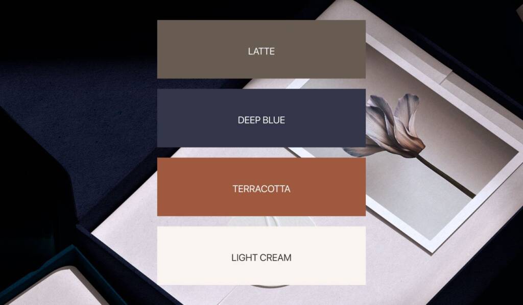
During this stage I explore color usage and color proportion. For this brand I suggested using blue as a dominant color, terracotta as an accent and light cream for big objects.
Do you like these bold colors? Explore more design decisions behind this brand – Real estate logo design and brand identity services
Logo layouts
Logo layouts are created to ensure the brand remains recognizable and effective across different applications. By adapting the arrangement of the symbol and typography for various formats, the logo maintains consistency, balance, and legibility wherever it appears.
The vertical logo layout works well in portrait formats, while the horizontal version is ideal for websites, signage, and banners. The wordmark serves as a flexible branding alternative, the standalone symbol can be used for watermarks and small-scale applications, and the circular layout is particularly effective for social media avatars, profile images, and stamps.


Pharmacy fonts and typography
Typography reflects the brand’s voice, personality, and overall character. Clear guidelines for title and body fonts help maintain consistency, readability, and a cohesive visual identity across all brand materials.


Brand visualisation
The final stage of the project was brand visualization. Since a compounding pharmacy creates custom products, the brand would need to work across packaging, labels, signage, and other customer-facing materials. With this in mind, I created a series of visualizations to demonstrate how the identity could be applied in real-world situations and how the color palette could be used consistently across different touchpoints.


The client feedback
This is great, thank you so much! 🥰🥰🥰🥰🥰🥰🥰🥰
Artisan Compounding Pharmacy
Owner