

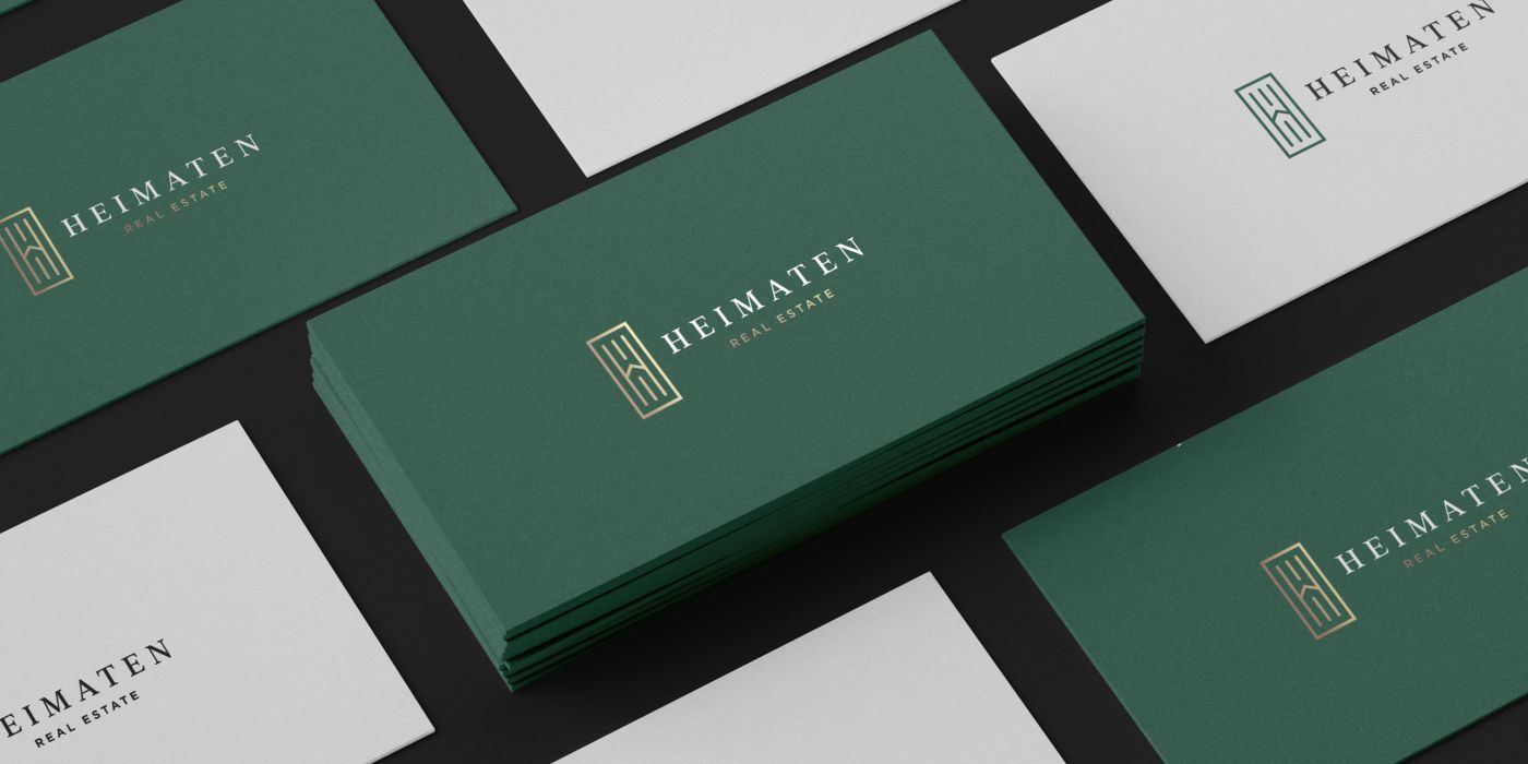

A client reached out to me via email:
“Good day! My name is Widny, and I’m looking for a logo design for my new real estate brokerage firm.”
After a brief conversation, we agreed to schedule a kickoff call. The moment I met Widny, I noticed how effortlessly strong and stylish he looked. He had a vibrant, driven energy that immediately stood out. As we talked, my first impression was confirmed. He was a young, ambitious entrepreneur launching his own brokerage, and he wanted a brand that reflected his passion for what he does. Widny asked thoughtful questions about the design process, as well as the difference between a logo and a brand guide. I walked him through each stage in detail, explained how every deliverable would support his business, and once everything was clear, we were ready to begin.
Logo design process for a real estate company
From the very beginning, the client shared several of my previous projects that he liked. He was drawn to their overall feel and aesthetic, which gave us a clear creative direction. I also sent him a quick questionnaire to better understand his target audience, business goals, and niche.
Then I considered the name “Heimaten.” Although it isn’t a common English word, it is derived from the German word “Heimat,” which means “home” and conveys a deep sense of belonging and connection to a place.
I started developing the logo and presented five initial concepts.
Since the name has a direct meaning, it was obvious to include a home symbol or graphic element into the logo. The most common associations with a home are house outline, key, roof elements
- The first option featured the letter “H” and represented the real estate industry through the use of a small triangle resembling a roof.
- The second option featured a more human and approachable symbol, emphasizing a personal touch. Its playful style conveyed a sense of stress-free and enjoyable service.
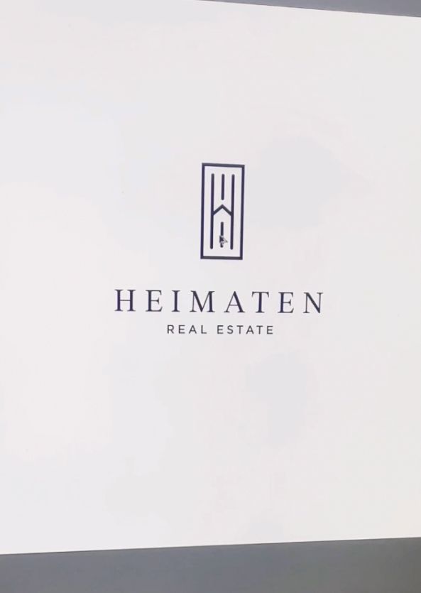
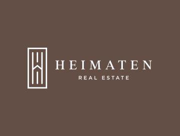
- The third option took a more classic approach, featuring a tall form that reflected premium service and the achievement of the client’s goals.
- The fourth idea explored a more delicate and organic direction, incorporating a leaf to evoke a sense of home.
- The final option combined the letter “H” with a triangle resembling a roof, creating a fun yet stylish logo concept that represented the real estate industry.
The client was excited to see the logo concepts, and I could feel his anticipation. At the same time, as always, I was nervous too, wondering whether he would like the logos I had created.
We scheduled another call, and Widny selected Concept 3, requesting a few refinements and further font exploration. What he liked about this logo was that it is tall, resembles a door, and feels both clever and inviting.
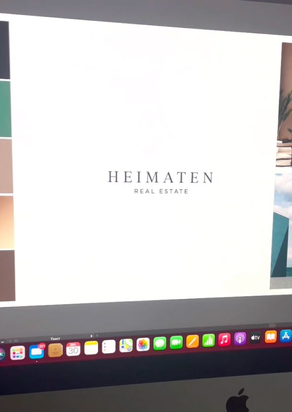
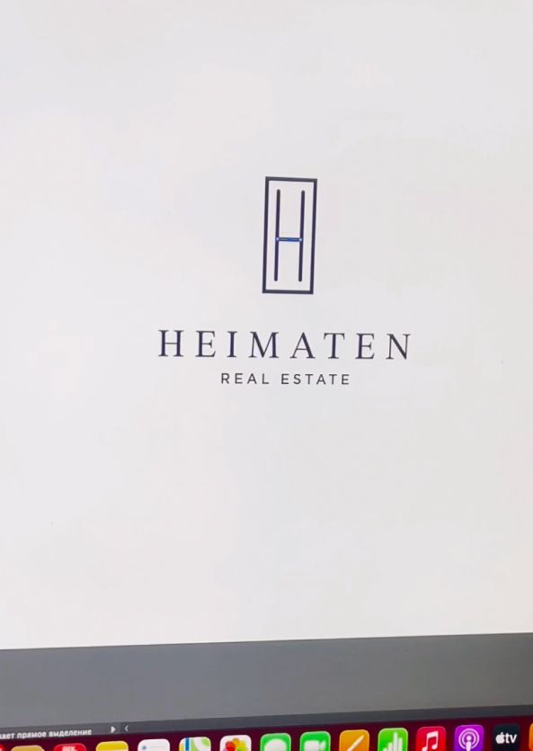
Looking for a real estate logo and brand identity? Check out this branding project I created for a realtor – Real estate logo design and brand identity services
Color palette for a real estate brand
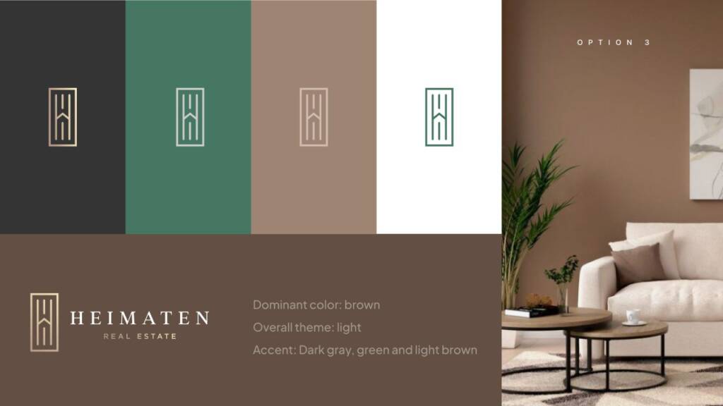
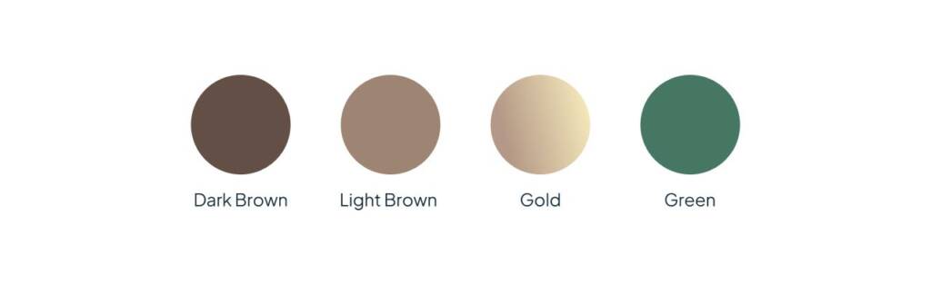
The next step was defining the color palette. I presented a few options, and the client chose one of the themes. From that theme, I extracted the flat colors and used them as the foundation of the brand identity.
Love green colors? Explore this brand – Eye-catching and creative logo design for a fashion brand
Brand design for real estate
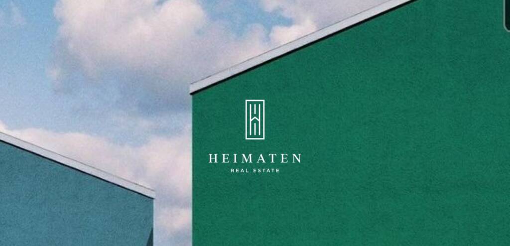
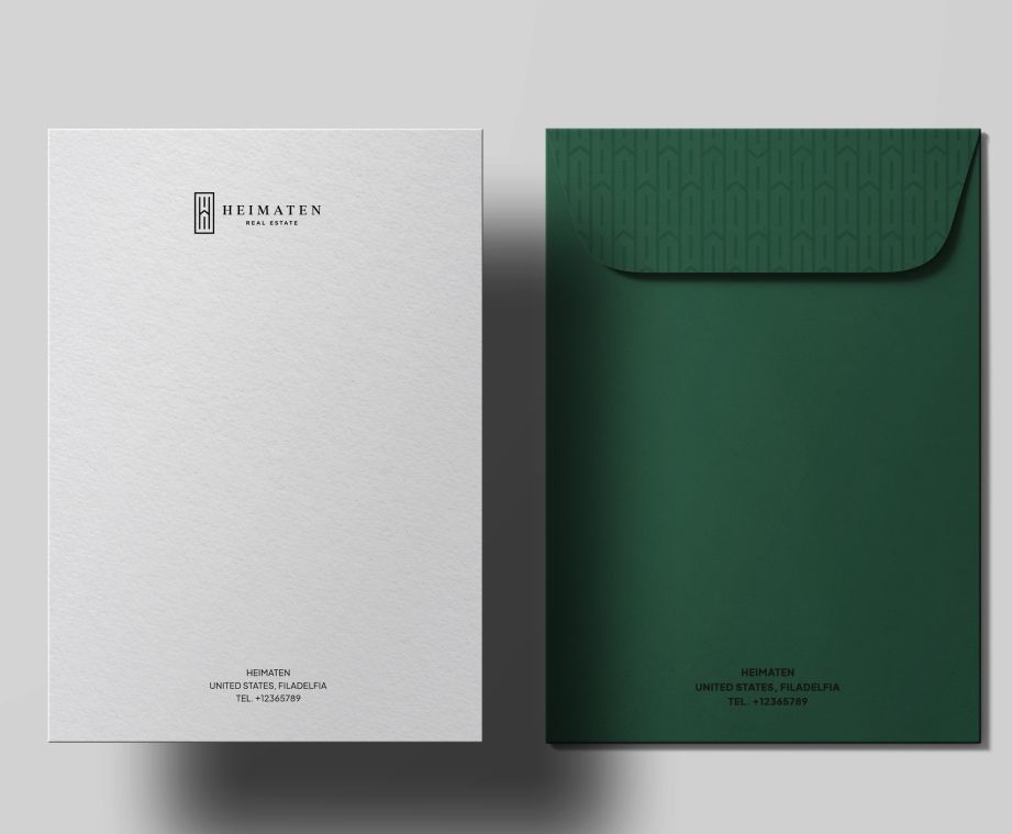
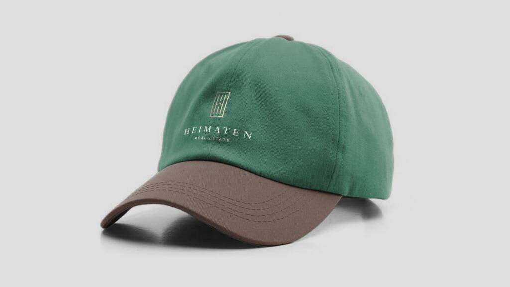
Once the color palette was finalized, I started creating brand visualizations. This allowed the client to evaluate how the colors perform in real-world applications and how the brand identity translates across different touchpoints.
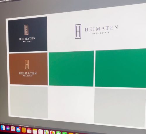
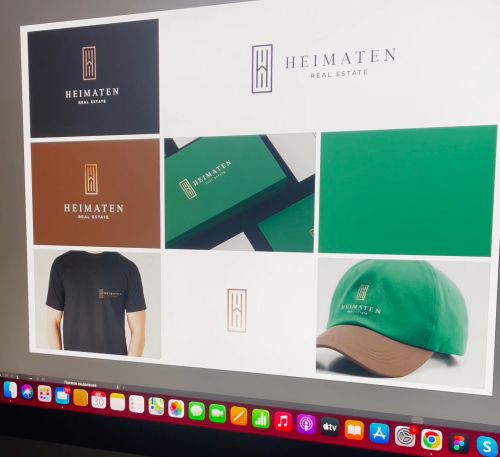
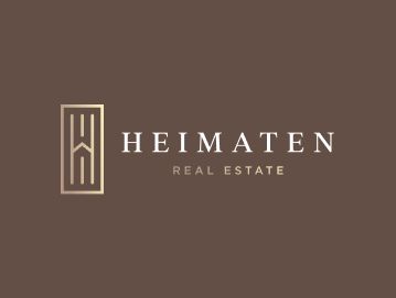
I reviewed the color combinations to ensure they were visually appealing and easy to read. As the final step, I prepared the complete logo suite, presenting every approved logo variation on its appropriate background to ensure consistent and correct usage across all applications.
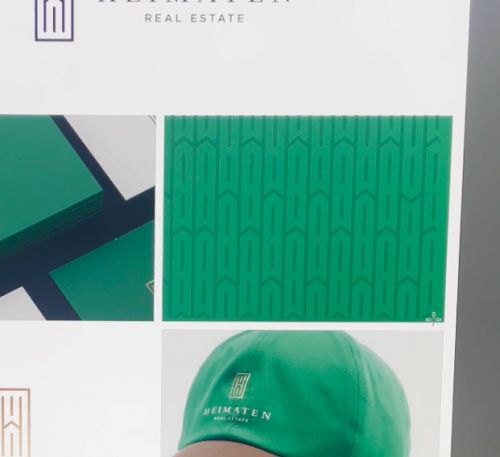
Brand pattern for real estate
The pattern is one of the most important elements of a brand identity. It helps make the brand recognizable from a distance or in situations where the logo or brand name isn’t clearly visible. I created the pattern using the checkmark shape formed by the letter “H” together with its middle crossbar. Combined, these elements create a sense of forward movement, reinforcing the brand’s ambition and progress.

You may also like another brand I created with a similar sense of elegance – Professional, luxury logo design and brand services for a building company
Multicolors and Brand visualisation
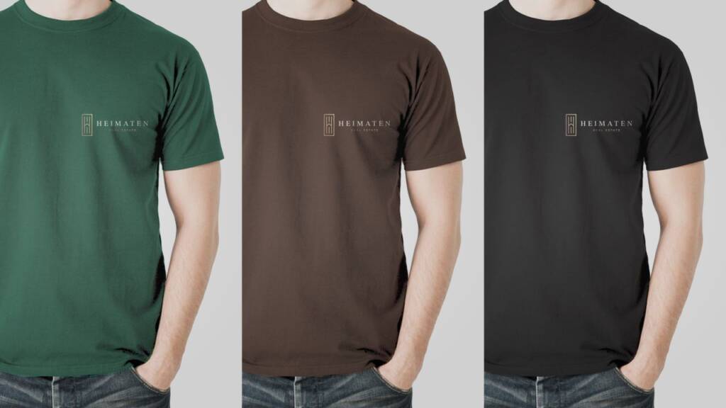
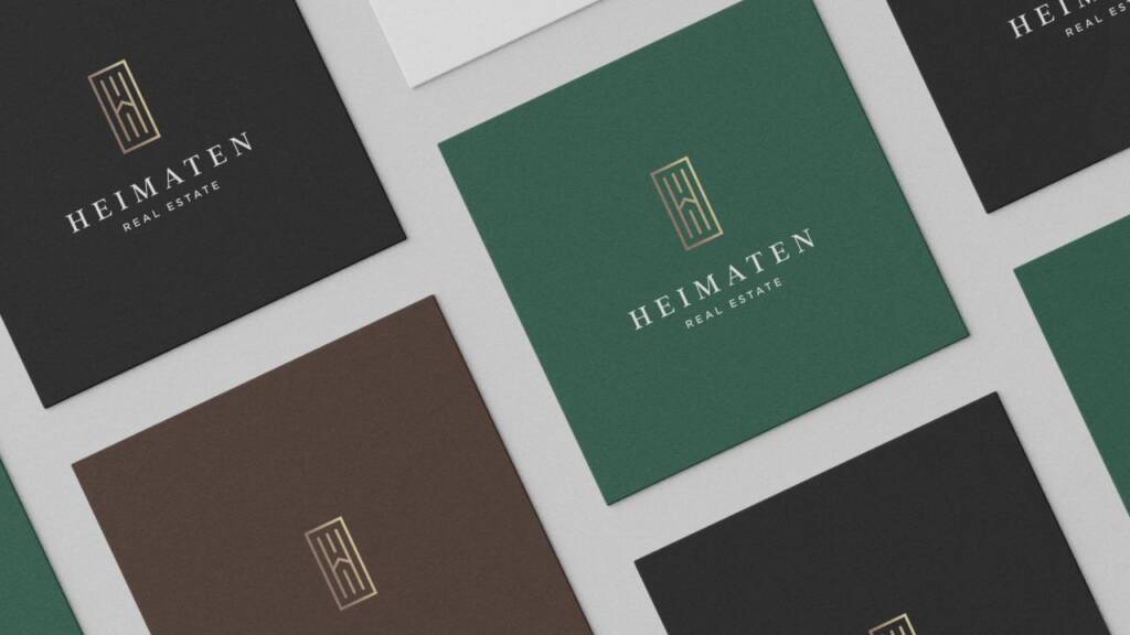
The final stage of the branding process was creating brand visualizations. Once the colors and logo elements were finalized, I explored how the identity would work across different applications. This helped the client understand how the brand could be used consistently and how it would appear in real-world scenarios.
The brand uses three core colors, making the identity more versatile and flexible. Through a series of visualizations, I demonstrated different ways to use all three colors together or individually, helping the client understand how the palette could be applied consistently across a variety of brand touchpoints.
The client feedback
Thank you, @havrydesign! You really brought my vision to life.
Heimaten
Owner