

This logo was created through a design contest on a freelance platform, where I participated as a top-level designer and competed against 320 designers with varying levels of experience. You can view the contest here.
The brief explained the logo niche, and the client also attached several references they liked, along with Pantone color codes.
From the client brief:
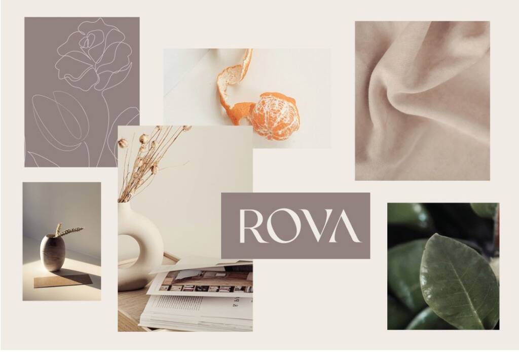
The color palette seemed grounded and bohemian. The logo references had a distinct vintage and elegant feel, with a feminine touch. It communicated a sense of calmness, coziness, and quietness.
The brand name – layout and arhitecture
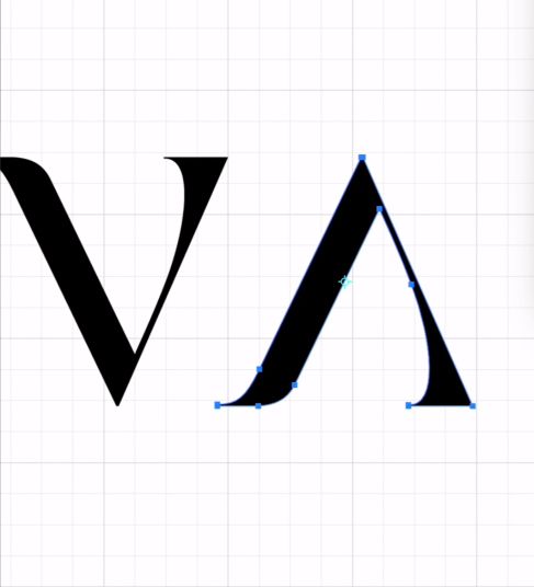
What caught my eye was the simplicity of the name — just four letters. Looking at the letterforms, I noticed that each angle follows the same direction, which suggested a typographic opportunity to emphasize this feature.
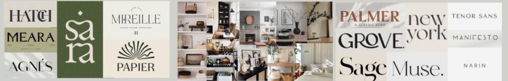
I kept exploring different fonts to define a direction for further elaboration. I tried to assess different outlines, sans-serif and serif fonts, as well as lowercase and uppercase variations. It helped me understand the overall feeling.
As a result, I liked this font. It wasn’t perfect, but it showed me the design direction I wanted to take — crisp, calm wording that evokes a sense of quiet luxury.
Logo design for a home furnishings company
When I defined the direction I started creating a wordmark myself, making the wording perfect.
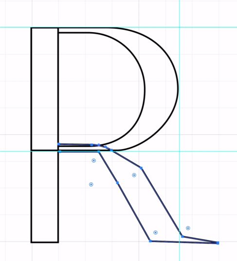
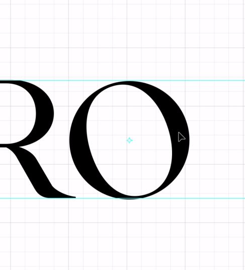
As a result, I created a unique custom wordmark that worked well as a logo on its own. However, that is not always enough — ideally, a brand should also have a shorter logo variation. Since the letters were custom and handcrafted, I chose the letter “R” as the short version of the logo.
As a result, the client pick my design with the comment:
” Yay, we absolutely loved the design and are so excited to see the brand guide. Please let me know if you need any additional information from me. Have a wonderful rest of your night! “
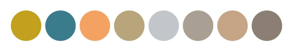
Moodboard for a home decor brand
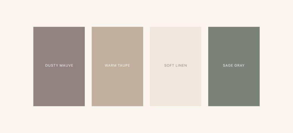
To define the color scheme, I suggested simplifying the initial color palette, as it included multiple colors that could create visual confusion. Instead, I proposed a refined color palette consisting of the following colors:
- Dusty Mauve
- Warm Taupe
- Soft Linen
- Sage Gray
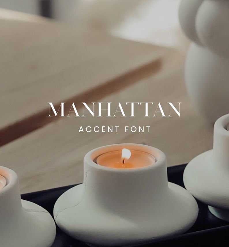
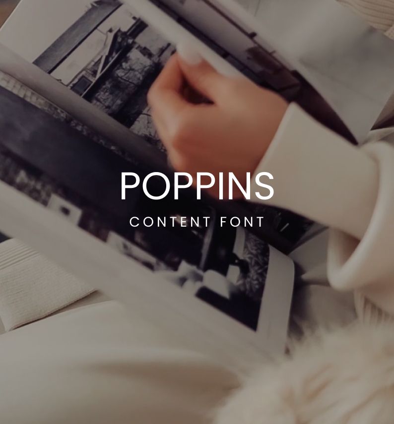
Typography for a home decor brand
As the wordmark design was inspired by one of the fonts I considered, I included it as an accent font for titles and headings. For the body text, I selected clean and readable typography.
Check out the next project for this brand – Packaging design for home decor items
The client feedback
Hi! I hope you are having a wonderful day. Just talked to the team and we are good to go, everyone loved the work! Am I able to get your contact information for future projects? It was amazing working with you!
Rova
Owner