


A client reached out to me via Instagram after viewing one of my Instagram Highlights. She asked about my pricing, and I was happy to answer all of her questions. She continued asking for more details, such as what mockups are, what she needed to get started, and how the process works. Then she took some time to think it over.
I was happy to see that this person had been following my Instagram profile and occasionally resharing my Stories. She also told me that she couldn’t wait to work together. About a month later, she was ready to get started.
Logo design process for a real estate broker
I sent the client a short questionnaire to gather some basic information. I also usually ask clients to share references to brands or logos they like, if they have any. The client provided a few examples along with their preferred color palette. Together with the other information, it was enough to get started.
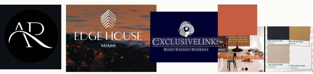
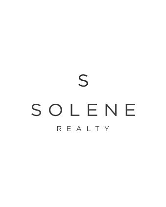
As the client mentioned. Solene means elegance, sophistication, grace, and refinement. I wanted to create a beautiful feminine logo and was focusing on the “SR” logo combinations. The client also added “I wanted to get your open opinion on having just a S as a submark or the SR that I know I said earlier. I just want to make sure my brand feels timeless” – This provided a strong foundation for creating several versatile concepts.
Logo options for a brokerage company
- The first option featured a wavy “R” stroke that evoked a sense of elegance, softness, and grace. It conveyed an impression of relaxation and high-quality service
- The second option reflected two lettering styles, combining elegance with boldness and a sense of stability.
- The third option used an elegant “S” signature, paired with a strong typeface and soft, curved lines.
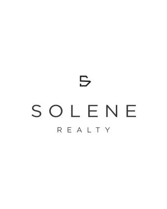
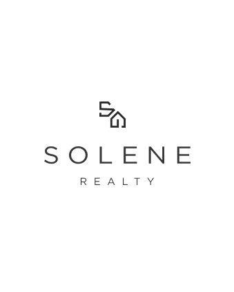
- The fourth option was presented in a more corporate style. Although the client was looking for something elegant, I wanted to present an alternative with a more business-oriented look. It combined a house outline with the letter “S.” I suggested 2 options of this concept.
- The final option featured a wavy lower stroke of the “S,” reflecting the brand’s elegance and grace. Its bold outline conveyed a sense of strength and authority.
After some time of review the client answered:


Looking for a circle logo design? Check this one – Lemon logo design for a textile brand
Color palette for a real estate company
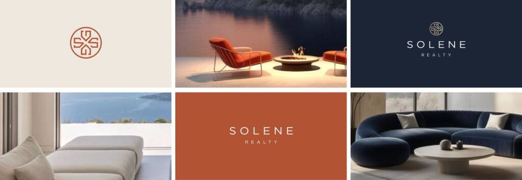
I sent the client a mood board so she could choose the color options she liked. During the refinement process, we found the combination that suited her brand best:
Dark Blue – because this color represents trust and authority, which are essential values in the industry.
Terracotta – this accent color is warm, energetic, and attention-grabbing, evoking a sense of soul and passion.
Gold – This is an accent color that is bright and radiant, intended for foil gold effects and other subtle highlights.
Light Cream – a supportive warm color for backgrounds and inserts.
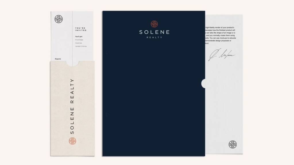
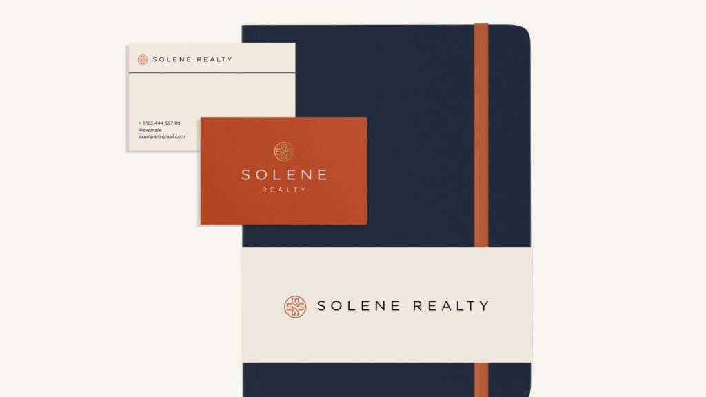
Love these colors? Here’s another brand I created with a similar vibe, but for a different industry – Professional, luxury logo design and brand services for a building company
Logo layouts and elements for real estate branding
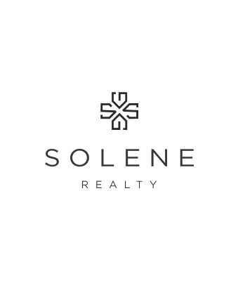
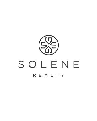
I explained how to use the logo and its different layout variations. Additionally, the symbol itself includes recognizable elements, such as the standalone “S” and the house icon. These elements work well as supporting brand assets and can be applied consistently across a wide range of branding materials.

Pattern design for a brokerage company
The logo itself served as a great foundation for the pattern. Its elements fit together naturally like puzzle pieces, making it easy to create a seamless and recognizable design. A pattern is one of the most effective brand assets because it reinforces brand recognition and can be applied consistently across a wide range of touchpoints, from stationery and packaging to digital and marketing materials.


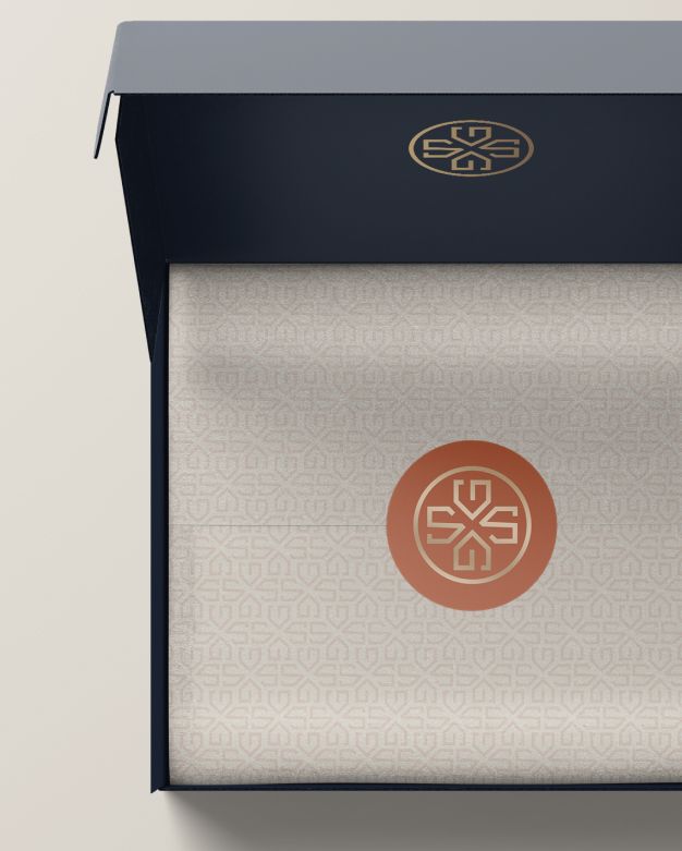
This brand I created has versatile patterns. Check it out – Gift logo design and branding for a gifting company
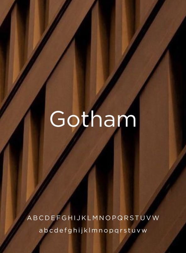
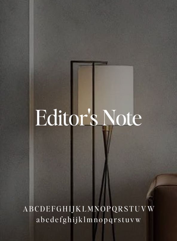
Typography for the brand
The selected typography balances modern simplicity with timeless elegance. Gotham provides a clean, highly legible sans-serif for everyday communication, while Editor’s Note adds a refined serif touch that elevates headlines and reinforces the brand’s premium character.
Looking for a real estate logo and brand guide? Check this project – Real estate logo design and brand identity services
The client feedback
Thank you for executing it perfectly!!! You did amazing work!

Solene Realty
Owner