


I found this project on a design platform. The client was looking for a new logo for their textile brand, which sells bed sheets in the US through Amazon. Their target audience consists primarily of women aged 20–50, and they wanted both a wordmark and a standalone symbol. They also mentioned that the brand name means “lemon,” so I could incorporate that into the symbol if it made sense.
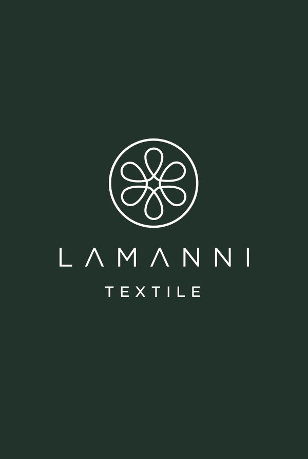
Lemon symbol design for the textile company
I analyzed why the company chose this name. I assumed they wanted to evoke a sense of freshness and tap into the strong sensory associations people have with lemons. Since the brand targets women aged 20–50, I also considered that the name may have been chosen to be memorable and immediately catch the attention of that audience.
Then I went a step further and explored the visual characteristics of both the lemon and the textile itself.
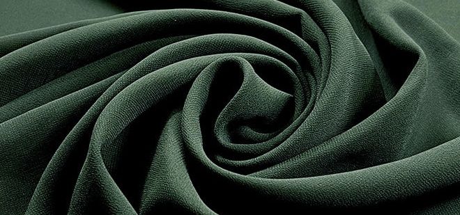
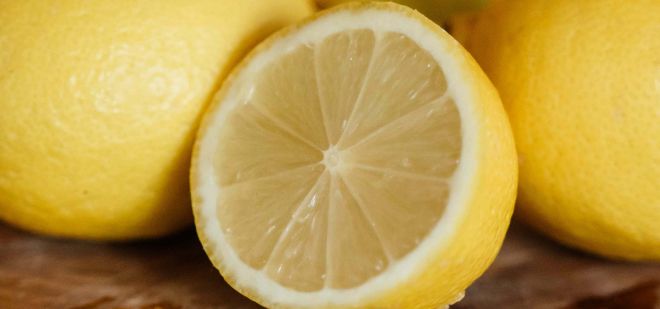
I noticed that the folds created when fabric is draped or folded share visual characteristics with lemon segments. Both feature soft triangular shapes that radiate from a central point. When the fabric is gathered or twisted, the resemblance becomes even stronger, echoing the way lemon segments are arranged around the fruit’s core.
From a graphic perspective, textiles are often represented through the material they’re made of – threads and fibers. That led me to an idea: what if the lemon segments were constructed from thread loops? This approach would merge both concepts into a single symbol instead of simply placing a lemon next to a textile reference.
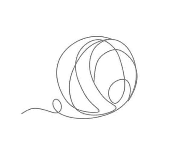
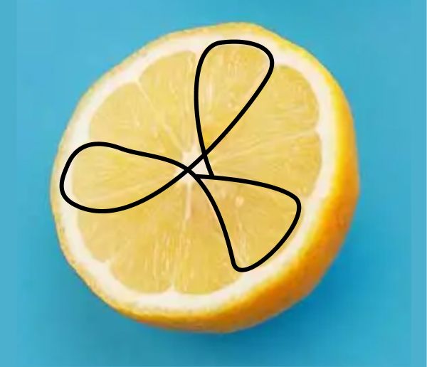
When a thread is looped, it naturally forms a circular shape, whereas lemon segments are much more triangular. My first idea was to closely imitate the structure of a sliced lemon by arranging the thread loops into segments.

However, the result looked more like a wheel than a lemon, so I refined the concept by adjusting the proportions and simplifying the shapes until the symbol achieved the right balance between the two references.
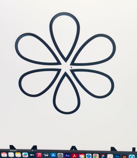
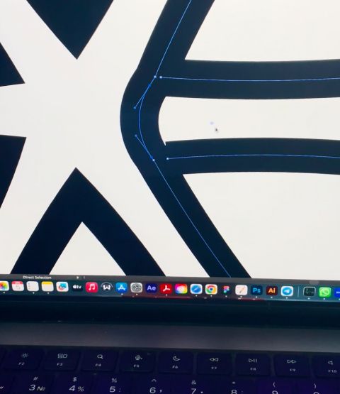
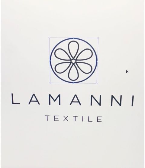
Looking a unique and creative logo design? Check this project I created for e-commerce brand- Shoes logo design for a women online shop
Love green colors? Explore this brand I created for a real estate company – Luxury and strong H monogram logo design
The client feedback
Great work! Loved her designs!

Lamanni
Owner