

First meet
The client contacted me through my website requesting a fun brand for a gifting company. They had just started a new business and were in the logo and branding phase. They already had some ideas and reached out because they needed a professional designer to bring them to life.
Logo design process for a gifting company
At the beginning of each design, I take a closer look at the name—what it means and how it sounds.
“All Things” suggests everything you can’t even imagine. It reflects the idea that the brand’s client doesn’t come with a specific request; instead, the brand curates a gift from local products, creating a sense of surprise. “All Things” implies that the brand has everything needed to delight and impress.
Keeping that in mind, I understood that this is about gifts and people—looking at the logo, one should immediately understand what it represents. This led me to explore several directions:
I suggested versatile options:
– an option with a gift box as the central idea and symbol
– a logo with a smile, conveying happiness and joyful
– an option with a gift frame, that looked catching and noticable.
One of the options included handmade lettering, as if drawn by a person, to create a sense of personal connection. This direction was based on the short and well-balanced combination of the letters—the way they come together makes the word feel complete and visually pleasing. To tie the logo to the gift theme, I added a ribbon, as if the “s” is about to reveal what’s inside.
The client preferred the handwritten option, as it felt more personal. It was also completely unique, created by hand on a Wacom tablet. Since it’s a wordmark, the logo required a compact symbol for social media and smaller formats. The ribbon became a strong detail to use as a brand mark.
Love the vibe? Check this project – Playful heart logo and branding for a dessert brand
Brand guide for a gifting company
Color palette
Once we finalized the logo, I moved on to the brand guide. To begin, I needed to define the color palette with the client. Since the brand is intended to be bright, it was important to clearly establish color gradation and proper usage across all brand applications. The key point was ensuring the logo remains visible and readable on the selected backgrounds.
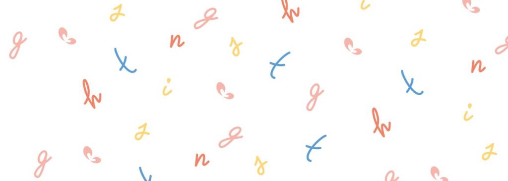
Brand patterns for a gifting company
When we agreed on the colors, I realised a clear direction for how the overall brand should feel. I defined a key brand element for the company: since the theme is playful and vibrant, the best way to express this energy and happiness is through the use of patterns.
There were different ways to derive the patterns:
- Logo ribbon — when you look at the logo, you can see a small ribbon – the element above the “gs” letters, similar to the top of a gift. If taken on its own, it resembles a butterfly. Using this element as a pattern creates the impression of many butterflies around you.
- Circles, squares – are a perfect base for vibrant patterns.
- The word “things” — taking these letters and scattering them creates a great, vibrant pattern that feels very personal and unique.
These pattern elements can be applied across various aspects of brand development—social media, business cards, inner packaging, thank-you cards, tissue paper, and more—helping the brand stand out and feel visually engaging.
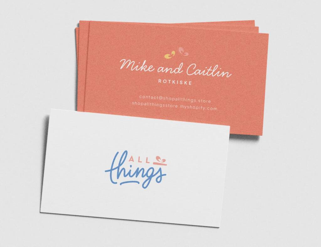
Business cards design for a gifting company
Check these business cards — they are designed for two people, as the brand was launched by a couple. The cards include minimal information and feel clean, thoughtful and creative. Notice the two butterflies above the names “Mike and Caitlin” — they symbolize the couple’s union: the yellow butterfly represents Mike, and the pink one represents Caitlin.
This is an example of how brand elements can connect not only with items, but with people as well.
Other brand elements
During the brand guide development, we decided that multiple colors would be used randomly, regardless of the scent or type of gift. This approach encourages curiosity and allows clients to choose freely, without being influenced by classification. So color proportion was equal.
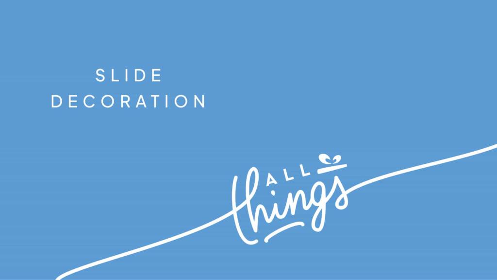
Besides the key attributes, I added additional elements for print and UI to make the brand more engaging and versatile.
Check the further journey with this brand – Fun, joyful social media design for a gifting company