

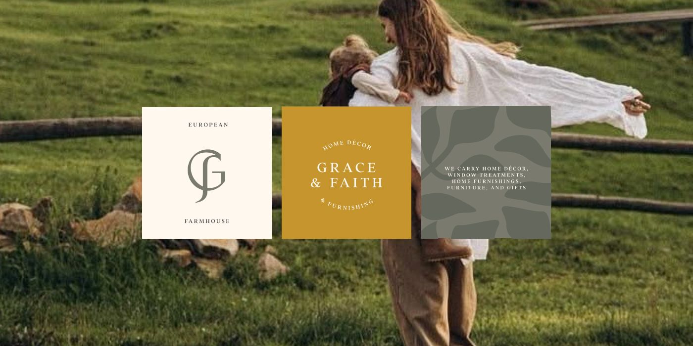

I found this project on a freelance platform and was immediately drawn to the theme of a farmhouse logo. When I was little, I spent my summers in the countryside at my grandmother’s house. I still remember the atmosphere and the smell of the countryside — my grandmother’s headscarf, the fresh grass, and all the animals around. I really wanted to immerse myself in that feeling and create a logo that felt infused with the dampness of freshly cut grass and the earthy scent of freshly turned soil — the kind of soil you dig up to plant a flower.
Client brief and requirements
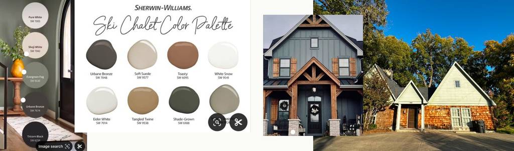
The client’s brief reflected their main business, target audience, and desired aesthetic. They described the brand as a home décor and furnishing store offering home décor, window treatments, home furnishings, furniture, gifts, and interior design services. Their niche is European farmhouse, with women aged 30+ as the primary target audience. Additionally, the client provided references of the shop’s exterior and color inspiration.
Project start and brainstorming
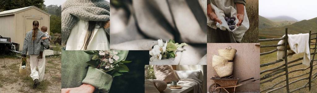
I started the logo development by focusing on the brand’s core style. Since the products are rooted in European farmhouse home décor, it was important for the brand identity itself to reflect this atmosphere. Farmhouse style is traditional, warm, and timeless. It also has a strong, distinctive character. Anyone who has spent time in the countryside knows the feeling: the rich scent of nature, wooden fences, grass beneath your feet, and comfortable, practical clothing. For me, farmhouse is about naturalness and imperfection. It is a style inspired by nature itself — authentic, tactile, warm, and lived-in rather than polished or overly refined.
Farmhouse logo design development
I started analyzing the logo through its typography. This was the easiest starting point because farmhouse style is strongly associated with traditional typefaces, often serif fonts. They remind me of the kind of classic typography you might find in a magazine you read by the fireplace, sitting at a wooden table.
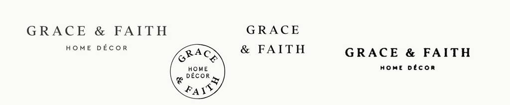
I selected the Addington CF typeface because it has a refined, highly readable structure. Each letterform feels carefully crafted and balanced. It also offers multiple outline styles, which gave me the flexibility to experiment with grunge effects. I particularly liked how the typeface worked as a stamp, adding a more authentic, tactile feel to the identity.
The main question was the symbol. As I mentioned, farmhouse style is deeply connected to nature — but should I actually incorporate botanical elements into the logo? I was concerned that doing so could make the brand feel more related to gardening or floristry rather than home décor.
Instead, I focused on the specific niche: home décor. Contemporary aesthetics are particularly common in home décor branding because these brands sell aesthetic and visual taste, not just a specific product. The logo itself becomes part of that aesthetic experience. I wanted to create a farmhouse brand with a stylish and distinctive logo — something that would combine the warmth and tradition of the farmhouse style with a sense of refinement and high standards.

I dedicated time to exploring different combinations of the letters G and F. The challenge was to preserve the readability of both letters, as some combinations made the G look too much like a C. I tested different typefaces with more modern outlines and eventually found the perfect combination that balanced both letters while keeping the monogram distinctive and legible.


The client feedback: “So I love this!”
Looking a unique and creative logo design? Check this fashionable logo I created –Eye-catching and creative logo design for a fashion brand
Farmhouse color palette for an interior shop
The client approved the logo without any changes and wanted to review the color palette. I suggested a natural color scheme inspired by their references, complemented by a couple of accent colors.
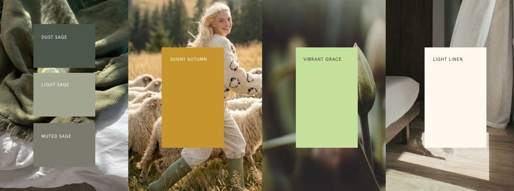
Sage green creates a calm, cozy atmosphere while bringing a natural, grounded feel to the identity. It comes in three shades, providing versatility for different applications and allowing the color to adapt to various brand needs.
Sunny Autumn is an accent color that adds warmth and a subtle rustic character to the palette.
Vibrant Grace is an accent color that brings a fresh, lively touch while maintaining the connection with nature.
Light linen is one of the main colors that
Light Linen is one of the main colors, providing a soft, warm neutral that balances the palette and gives the identity a timeless feel.
Love green colors? Explore this clean and pure brand I created – Drop logo design for an everyday fine jewelry company
Logo layouts for an Farmhouse decor company
With the approved colors, I started building the brand visualisation. One of the most important sections of the branding is the logo layouts and supporting elements, as they help shape the overall look and feel of the brand.
With these layouts, I also developed brand compositions to show the client how the logo elements, content, and colors could work together as a cohesive visual system. This allowed the client to see how the accent colors could be used, how they interact with the main palette, and how the overall color proportions work across different applications. I also introduced subtle asymmetry and imperfections to enhance the authentic farmhouse feel.
Brand element and mockups
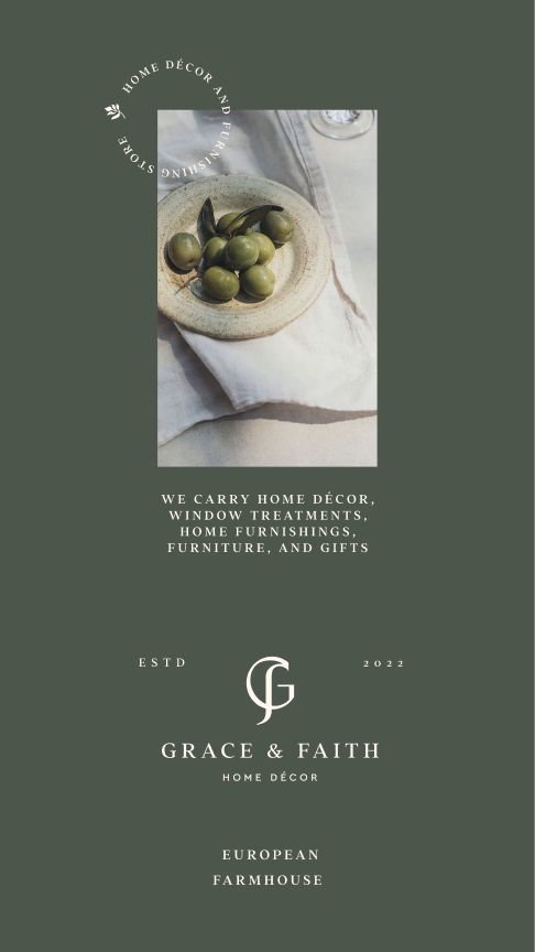
I suggested a leaf branch as a supporting brand element. As I mentioned earlier, flora is a natural and recognizable element of the farmhouse aesthetic. Instead of incorporating it directly into the logo, I chose to make it part of the broader brand identity.
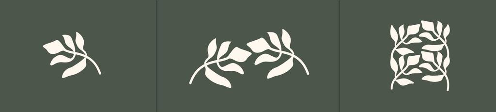
The branch can be used as a standalone graphic element or as part of a pattern. I also developed a seamless pattern by connecting the botanical element, creating a more flexible and cohesive visual asset for the brand.

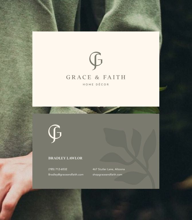
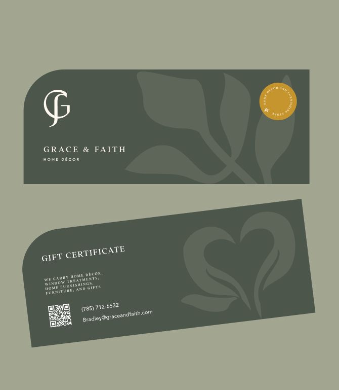
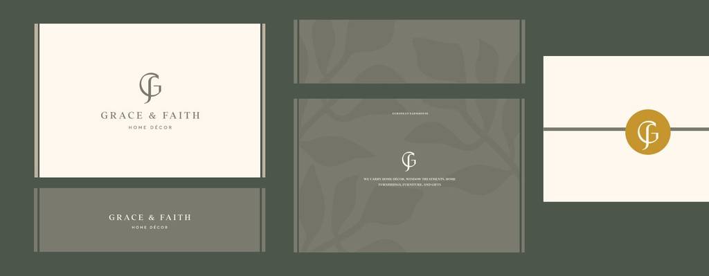
Love patterns and creative approach? Explore the brand I created – Gift logo design and branding for a gifting company
In the examples above, I demonstrated how the floral element can be applied across different brand touchpoints.
Stamp as a brand element and accent color visualization
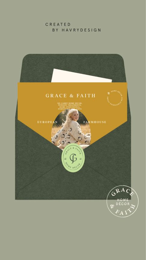
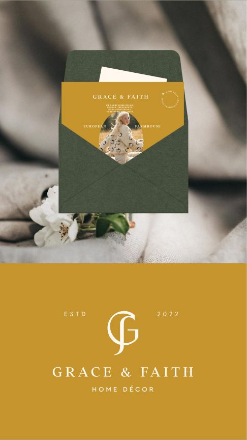
The stamp works as a distinctive brand element, adding an authentic, handcrafted feel while reinforcing the farmhouse character. I provided several options for the stamp that made the brand visually versatile.The accent color works especially well with the stamps, making the visuals more eye-catching and engaging while adding a subtle touch of warmth and character.
This brand has a warm and inviting vibe. You might also be interested in checking out another brand I created – Logo design and branding for a decor company
The client feedback
“Inna was absolutely wonderful to work with! Very responsive to our design needs and we were very happy with her work. I would not hesitate to call on her for assistance again“

Faith & Grace
Owner