

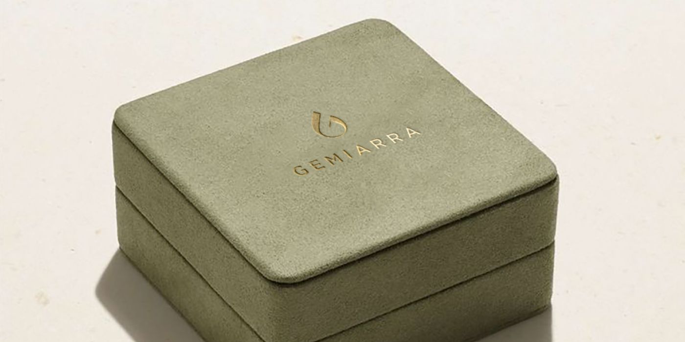

This client found me through a freelance platform. They wanted a full logo design for an everyday fine jewelry brand, including a distinctive symbol that could be used as a signature on jewelry pieces and as a social media profile image. They also needed a refined color palette and typography that would appeal to a gender-neutral audience aged 20–40, while keeping the overall identity understated and allowing the jewelry photography to remain the focus.
I really liked the project and its niche. Jewelry brands are generally sophisticated and clean, so I was happy to work with this client. After a quick discussion, we agreed to move forward with the project.
Logo design process for a jewelry company
First, what I noticed was that the direction of the company was not fully luxury or expensive. The term everyday fine jewelry means that the brand needed to feel sophisticated and elevated, while still being accessible and suitable for everyday wear. My goal was to create something inviting and simple.
The client also attached a list of brands such as Cherituelle, Gorjana, Mejuri, Monica Vinader, and Diamondere, which told me that the client was looking for a delicate, minimal logo design and visual identity.

Name and logo analysis
Logo Name: Gemiarra — a play on the word “gem,” so the first obvious idea was to play around with the gem outline and its associations. The client mentioned that they will be featuring lots of colorful gemstone jewelry to set themselves apart (hence “gem” in Gemiarra), which inspired me to connect the logo with nature in some way, maybe through simple elements of nature such as grass, earth, and water.
I started exploring typography for the logo by analysing the angles and proportions of the name. I experimented with both traditional typefaces and more modern, unconventional options. The name is quite short, so I saw an opportunity to pair a fashionable, bold typeface with an elegant symbol.

Logo options for an everyday fine jewelry
- The first option included a custom “G” letter with an element that resembles a gem sparkle.
- The second option was a traditional logo with a symbol that resembles a gemstone.
- The third option was an elegant logo option that features a distinctive, eye-catching “G” and a diamond element to reinforce the “Gem” concept.
- The fourth idea looked more casual and featured the letter “g” and a gem.
- The final option featured an abstract symbol inspired by the radiance of a gem.
The client feedback
The client had a couple of requirements for the first option and also asked me to provide additional logo concepts: “Overall I love the vibe of Option 1 and Option 4. Option 4 is fun and chic, but the short logo feels more feminine. Can we explore something along those lines but a little less feminine? “
Iteration 1
I made the requested changes and presented several additional logo concepts. The client liked these two options.
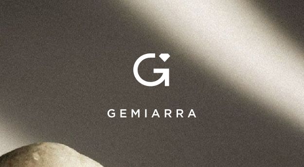
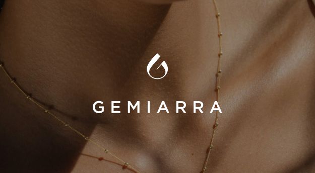
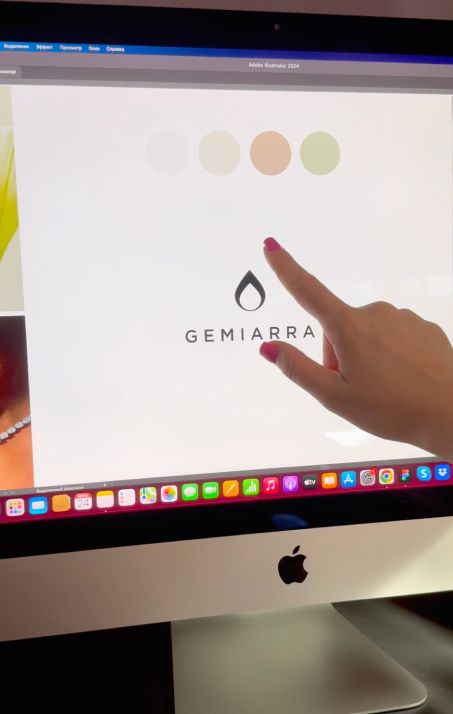
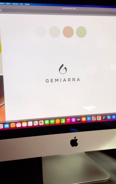
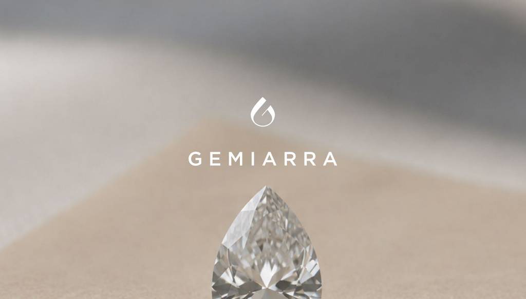
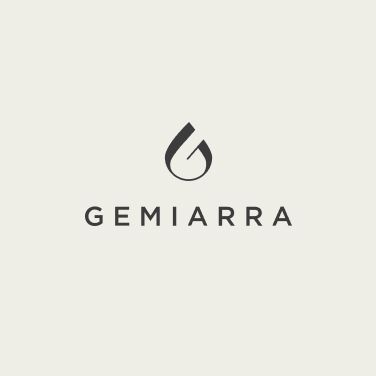
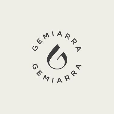
After some time to think it over, they selected option 2 because it felt more natural, pure, and organic. I created this symbol to reflect the essence of water, evoking its crystal clarity, transparency, and shimmer — as if you were wearing a piece of nature on your body. The client loved the concept.
Looking for a clean and minimal logo design? Check out brand I created- Lemon logo design for a textile brand
Color palette for a jewelry company
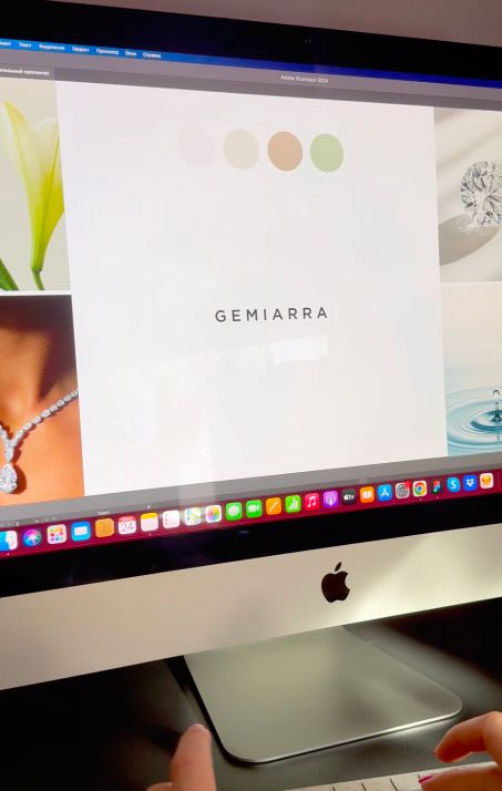
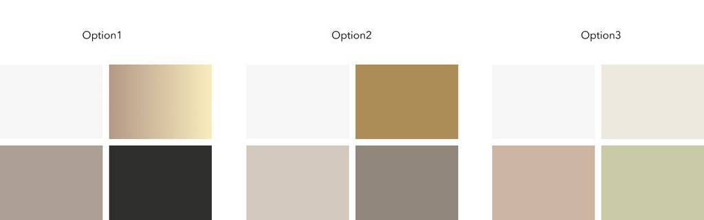
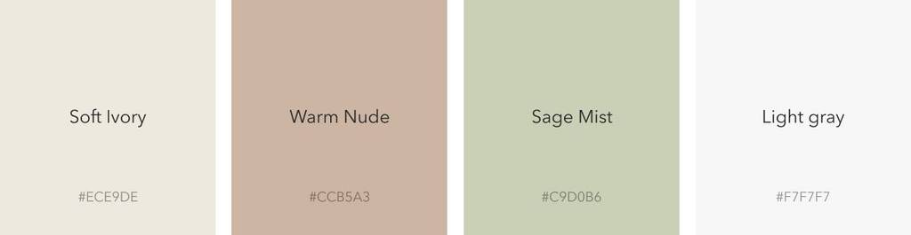
In the brief, the client mentioned that they wanted a neutral palette, primarily featuring white, beige, and muted tones. I presented several options, and they preferred option 3, particularly its light aesthetic and spring-inspired feel.
This brand has a warm and inviting feel. Want to see more projects like this? Check out this one – Shell logo design and luminous branding for a jewelry creator
Soft Ivory is a soft and pure base that evokes natural light, calmness, and the gentle beauty of spring. Warm Nude is a warm, delicate shade that adds softness and reflects the natural tones of skin and stone. Sage Mist is a subtle green inspired by fresh spring foliage, bringing a natural and organic feel to the brand. Light Gray is a clean, sophisticated neutral that balances the softer shades and adds a refined touch.
Logo layouts and elements
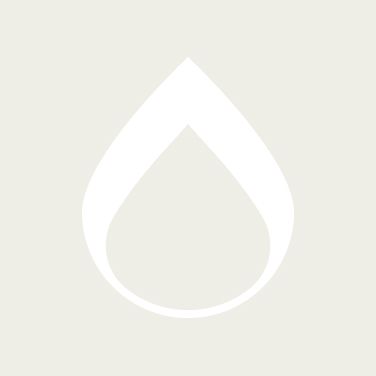
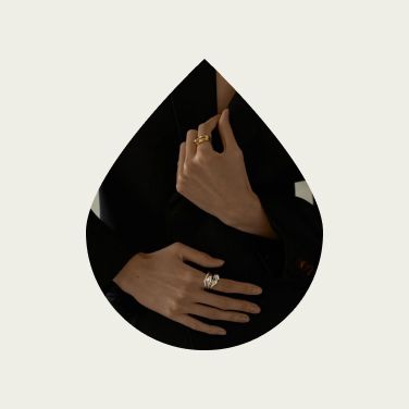
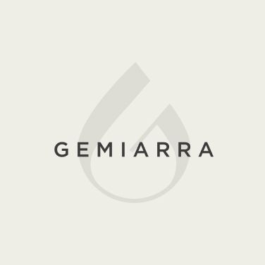
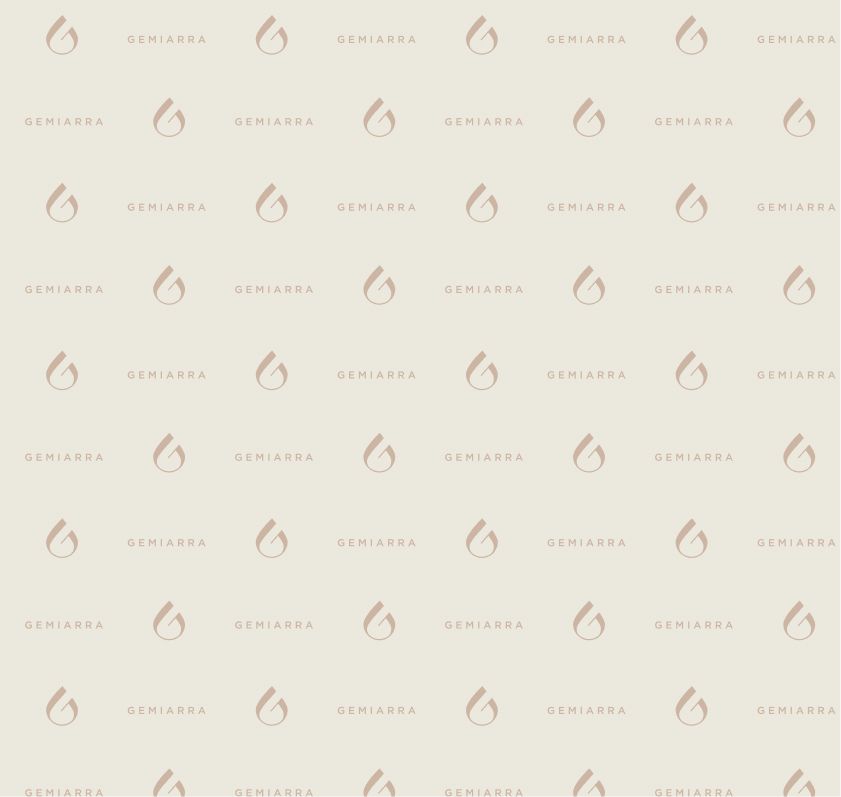
A logo often contains unique visual elements that can be carried into the broader brand identity. Whenever the logo’s architecture allows, I try to identify these recognizable elements and incorporate them into the branding. In this case, the symbol itself is shaped like a drop, so using the drop outline as a recurring graphic element strengthens the brand identity and makes it more versatile.
Looking for a jewerly logo and branding? Check this logo design I created – Ring logo design and bold branding for a jewellery company
Brand typography
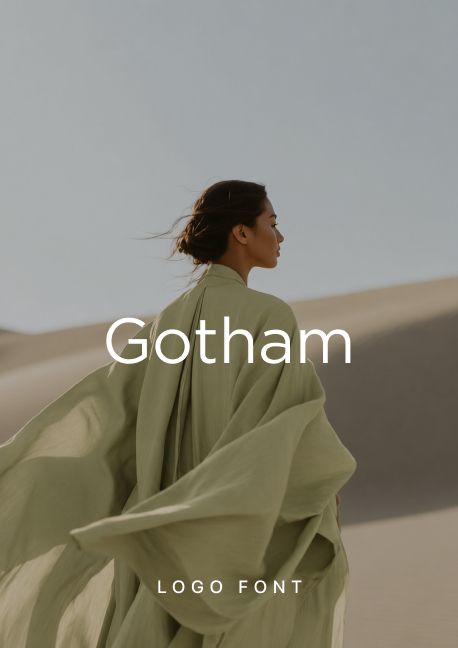
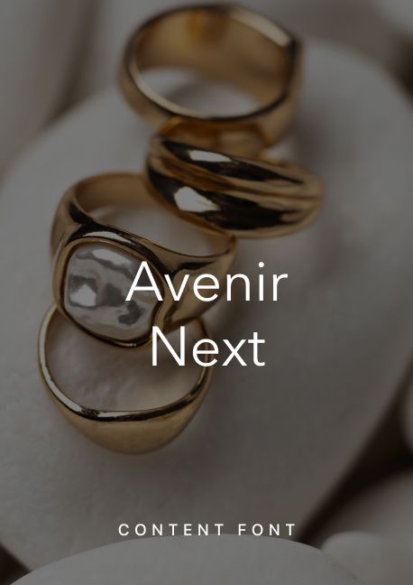
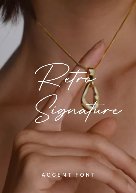
For the brand, I defined a clear hierarchy of typefaces for different uses. Gotham is a wider, rounded typeface that works well for logo names. However, as a content font, it is not suitable for every brand, as it has a more masculine and corporate feel. For content, I suggested Avenir Next — a fashionable, lightweight typeface that keeps the overall look elegant and contemporary. For accents, I often recommend Retro Signature because its lettering style is particularly legible while still adding a more expressive, personal touch.
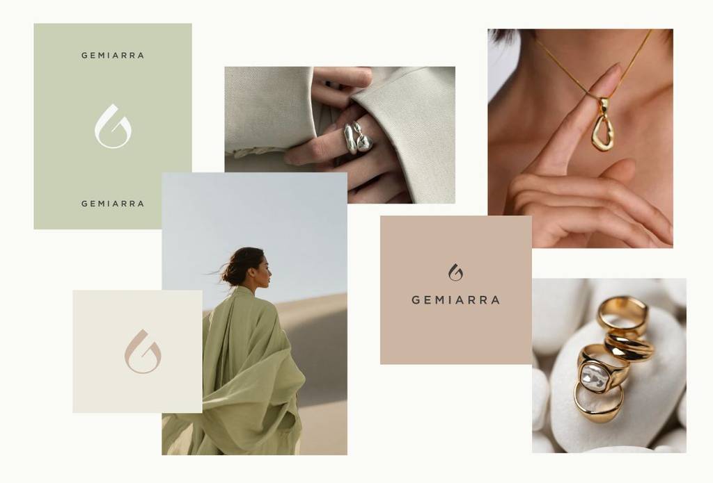
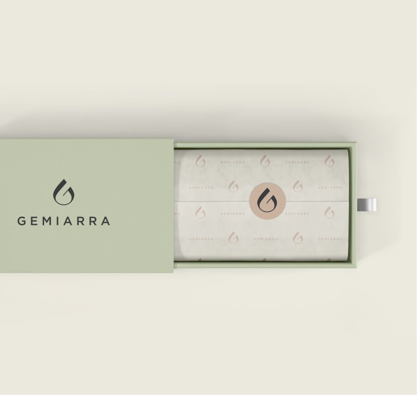
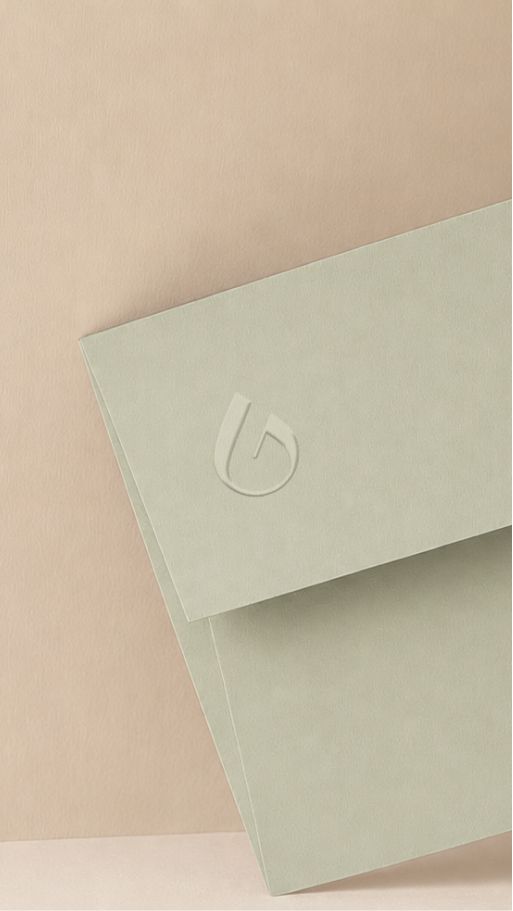
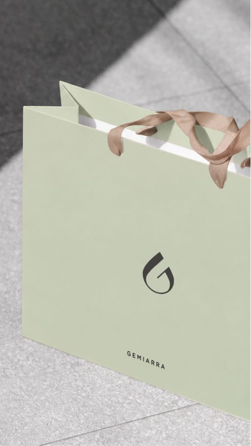
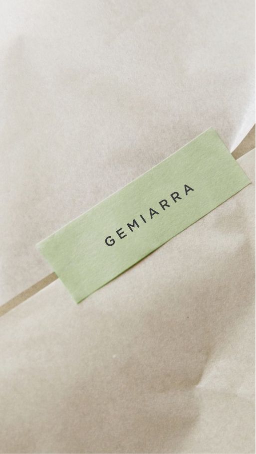
Brand visualisation and mockups
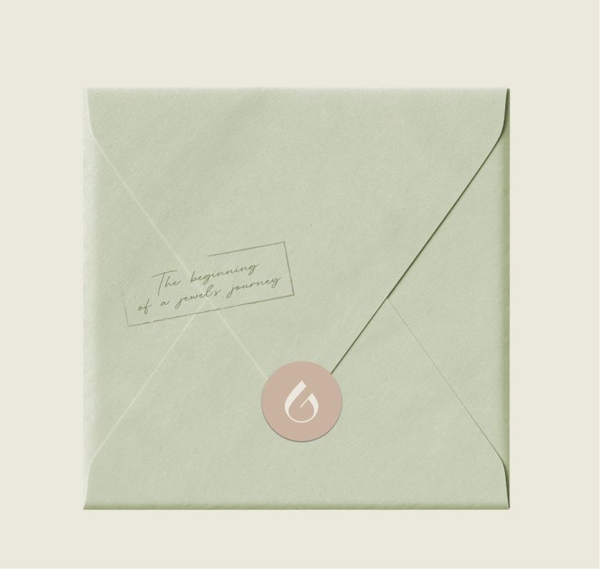
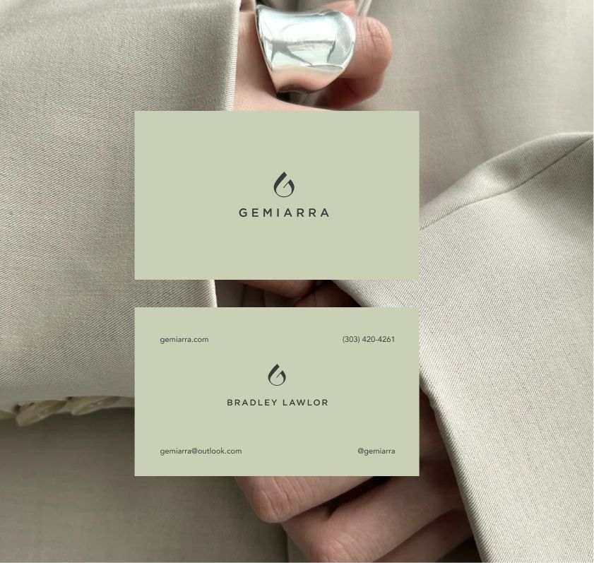
Brand visualisation helps the client understand how to use the brand, its colors, and key accents. Mockups demonstrate how the brand elements will look when applied to real items, making the visual direction easier to understand. This visual reference can also be used by other teams over time to ensure the brand is applied consistently
The client feedback
This looks lovely! Thank you so much for these beautiful designs. Very excited to see it all come to life. Appreciate your quick turnaround times and would be delighted to work with you again 🙂
Hendeer
Owner