

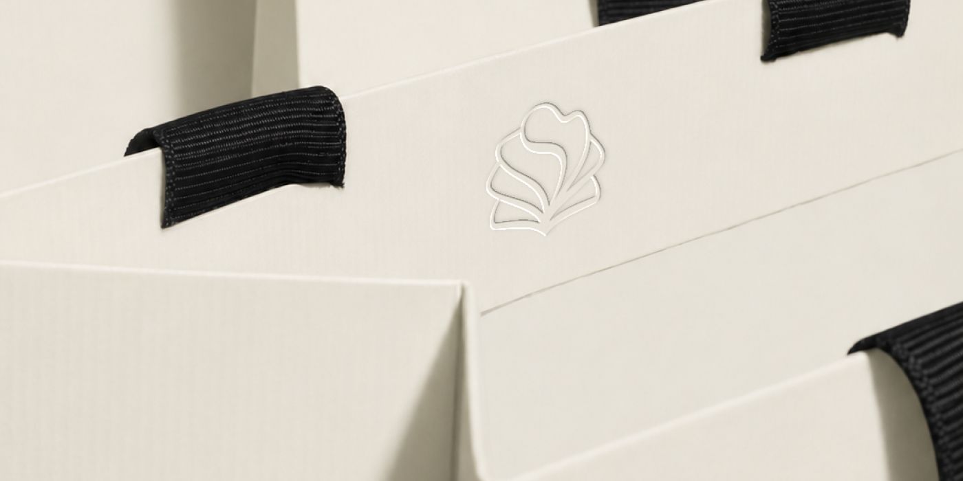

I was approached by a client through Instagram.. She said:
I’m in the early stages of building a jewelry brand and have been exploring designers whose work feels refined and intentional – yours really stood out to me.
The client explained that they already had a logo and wanted to improve its optical centering and overall balance. However, after discussing the project, they decided to create a completely new logo instead. I shared my pricing and terms of use, and we agreed to get started.
Logo information & analysis
Each project starts with a brief questionnaire. It helps me understand the key information about the logo, including its name, target audience, and the client’s preferences. In this case, the client provided a very detailed brief, which was unusual for me. It was clear that the brief had been written by a designer, and I saw this as more of a challenge than a difficulty. Many of the descriptions were quite abstract, so I was concerned that my interpretation might differ from what the client had in mind. For example, I found it challenging to understand what the client meant by saying that the logo should feel familiar — as if you had seen it somewhere before.
The client also mentioned that she had tried creating a logo using AI. However, the results felt more generic and lacked the distinctive concept and originality she was looking for.
Logo design process for a jewelry creator
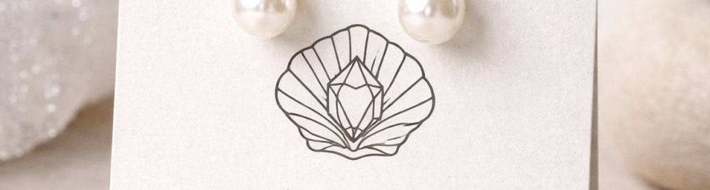
I used the client’s research as a starting point. She had explored a shell and crystal concept, which made sense because the name “Sereiafie” comes from “Sereia,” meaning mermaid, while “fie” represents fire and transformation.
Logo design options
- The first option was a curvy, organic concept that connected the brand to nature through its flowing lines. The lines subtly mimicked an “S” shape, becoming a distinctive symbol that merged the jewelry/mineral theme with the initial of the brand name.
- The second option was a shell-inspired option that connected two “S” shapes at the lower left and right. The gem outline remained centered, while the overall form subtly suggested a crown.
- The third option evoked a sense of shine, connecting the brand to radiance and the sun.
- The fourth idea represented a shell in an organic, flowing manner. The central line subtly resembled the letter “S,” while the overall form conveyed a sense of movement, like water flowing through hands.
- The final option featured a geometric concept that incorporated a gem outline and the letter “S.” The overall design featured vertical parallel lines, giving the logo a balanced, engraved feel.
The client responded within a couple of days:
Thank you so much for this first round — I genuinely loved it. You came very close to capturing exactly what I had in mind, and it really stood out to me. It really blew my mind. I wanted to sit on it for a few days before responding on which one to move forward with.
The client said that she loves option 2 and option 4, as it feels the most aligned with the brand — softer, more fluid, and more expressive.
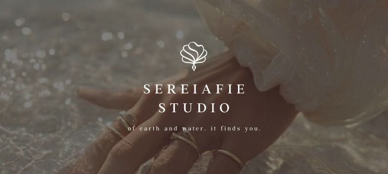
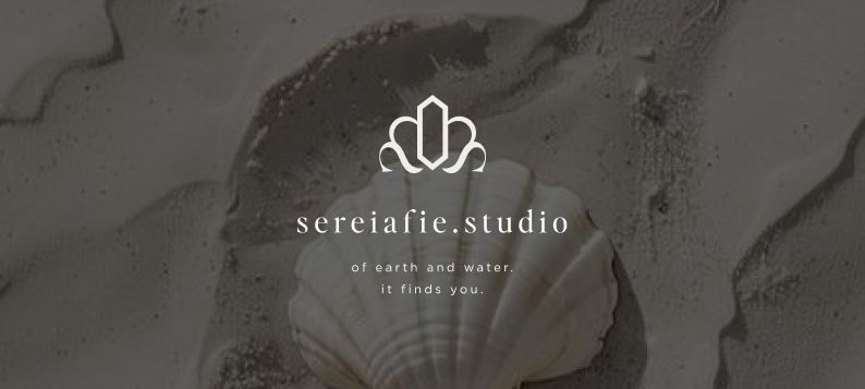
Then, we continued exploring the forms of option 4. She wanted the emblem to feel like a luminous relic — something timeless, sculptural, slightly mysterious, and emotionally memorable. I created several variations for her to review.
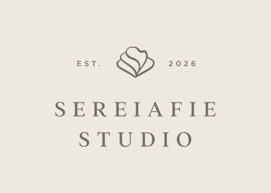
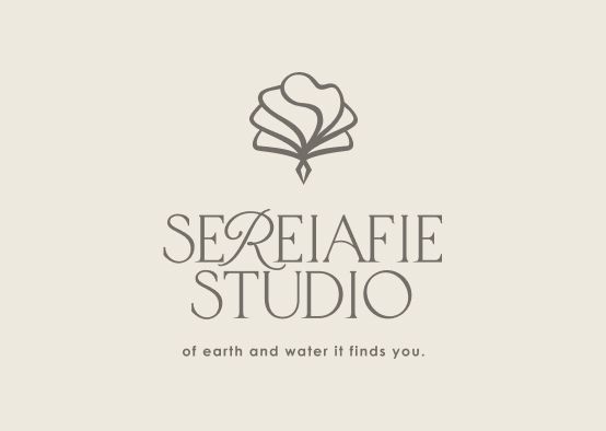
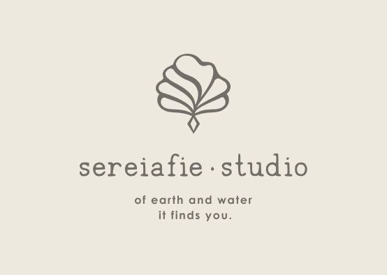
After a few of iterations, she made her decision:
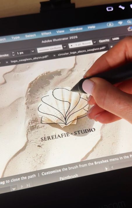
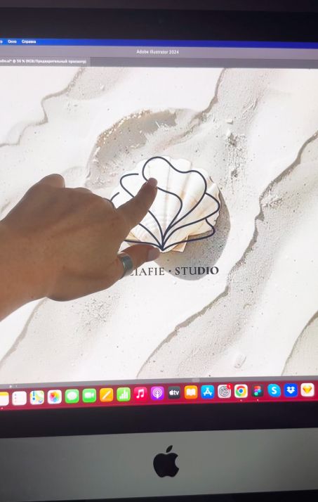
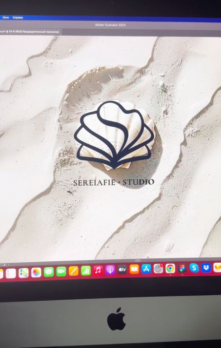
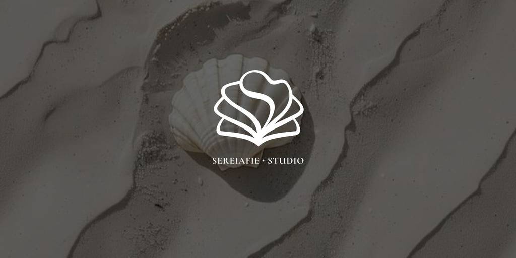
This logo features the letter “S.” Take a look at another brand I created featuring the same letter – House logo design for a premier real estate brokerage
Color palette for a jewelry brand
The client wanted the brand to feel luminous rather than colorful, refined and natural, with a focus on light, reflection, and depth. I understood what she meant — I felt that she was drawn to the soft illumination of the sea and pearls. The challenge was translating these qualities into a flat color palette. While textures can help create this effect, they cannot be applied to every brand touchpoint, so the identity still needed a set of solid, versatile colors.
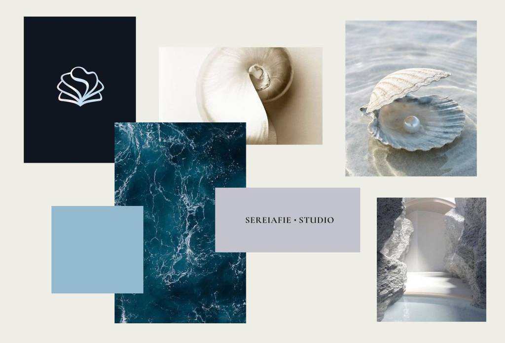
To address this, I created a moodboard to visualise not only the flat colours, but also the overall feeling of the brand. Natural objects change their shades throughout the day depending on the light, but they still carry a distinct colour and mood. The moodboard helped me capture and communicate this atmosphere.
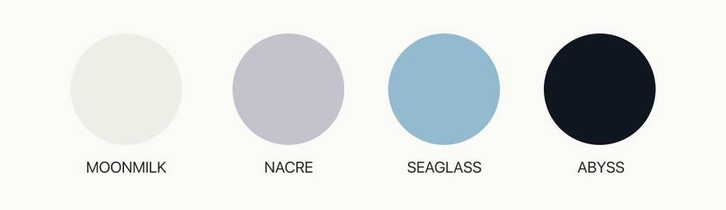
At the result we approved the color palette:
Love the colors? Check a similar vibe for a travel company – Wave logo design for a luxury resort
Moonmilk color is a soft pearl ivory inspired by the luminous surface of fine pearls. Clean, refined, and understated, it serves as the foundation of the palette, bringing a sense of purity, light, and quiet luxury.
Nacre – a sophisticated pearl gray inspired by the layered depth of mother-of-pearl. Elegant and balanced, it adds subtle contrast while maintaining the palette’s soft and luminous character.
Seaglass – a translucent mineral blue inspired by moonstone and light passing through natural surfaces. Calm, fluid, and luminous, it introduces freshness and depth without overwhelming the composition.
Abyss – A deep ocean black inspired by the darkest depths of the sea. Rich and grounding, it creates contrast and depth while bringing a sense of mystery, calm, and timelessness to the palette.
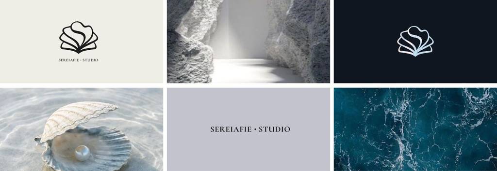
Logo layouts for a shell logo design
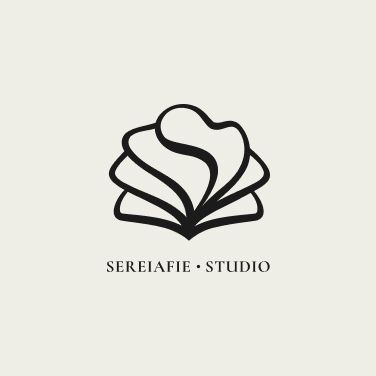
Logo layout refers to how the different elements of a logo are positioned and work together as a whole. It defines the relationship between the symbol, wordmark, and other elements to create a balanced and recognizable composition. A well-considered layout ensures that the logo remains clear, cohesive, and adaptable across different applications.
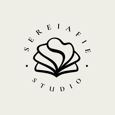
Check another creative logo design for a textile brand – Abstract lemon symbol for a U.S. bedsheet brand
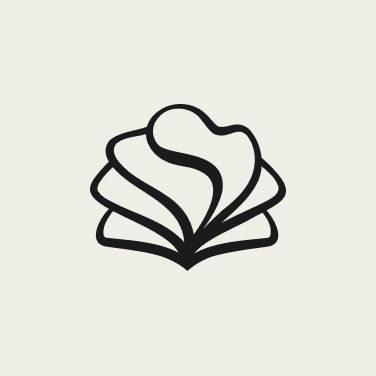
Logo layouts also help identify the key visual elements that can be developed into distinctive brand features. These elements can then be used independently across the identity, creating a stronger visual connection between the logo and the wider brand system.
Brand visualisation for a jewelry creator
Visualising the brand helps turn abstract ideas into a clear and cohesive visual direction. It shows how the logo, colours, typography, imagery, and graphic elements work together as a complete identity. This also makes it easier to understand how the brand will feel across different applications and touchpoints.
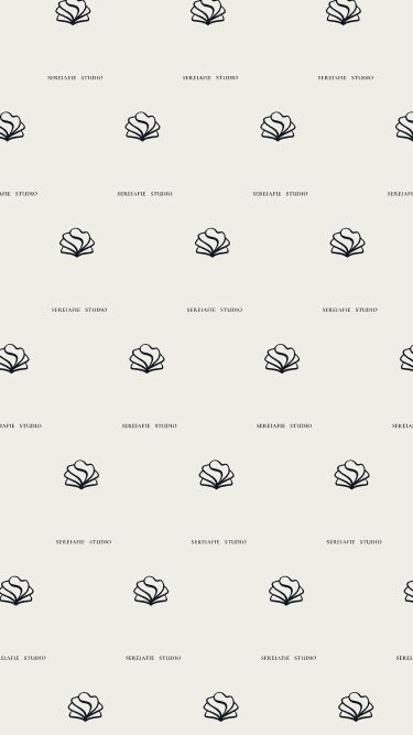
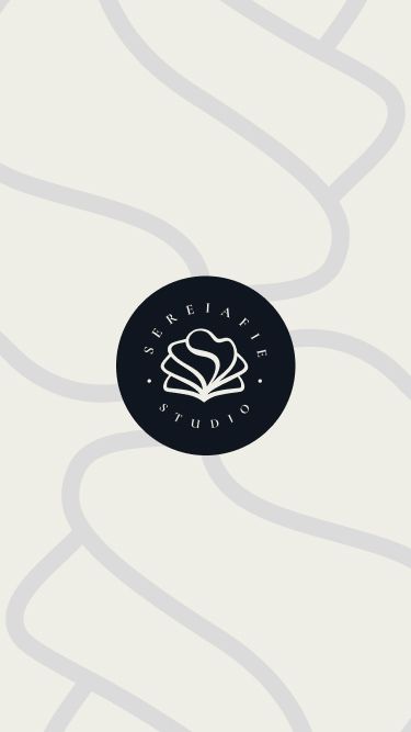
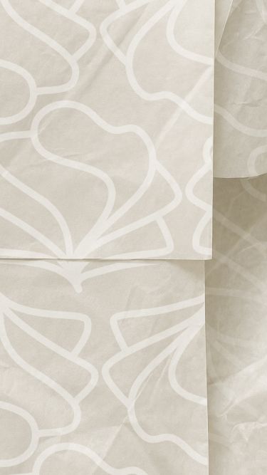
The flowing lines can be developed into a distinctive pattern, creating a consistent visual element across the brand. They can be used on wrapping paper, interior designs, web sections, and other brand applications to make the identity feel more cohesive and recognizable.
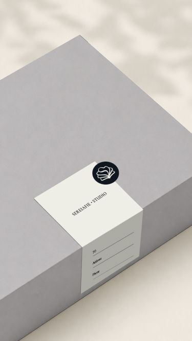
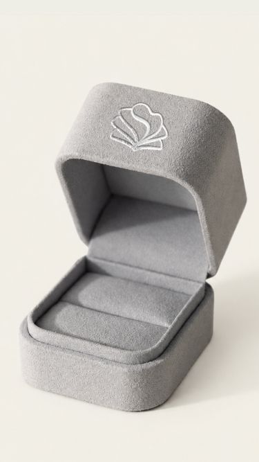
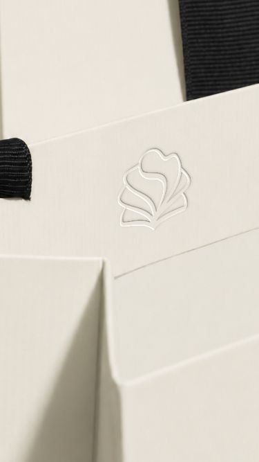
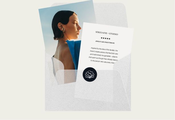
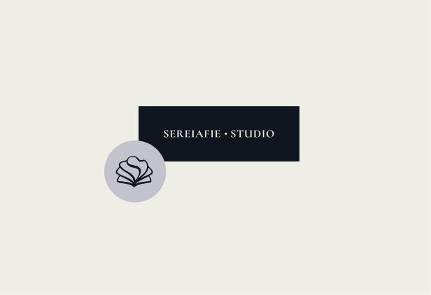
Mockups help demonstrate how the colours can be applied across the brand, where to introduce accents, and how to balance dominant and supporting colours. They also make it easier to see how the colour palette works in real-world applications and maintains a cohesive visual identity.
Love this calm vibe? Explore this brand – Logo design and branding for a decor company
The client feedback
Thanks! This looks great! Inna, thank you so much again for your patience and attention to detail throughout this project!

sereiafie.studio
Owner