


The client found me on a freelance platform:
“
I came across your portfolio while searching for designers, and I was really impressed by your work. I spent the last couple of days reviewing portfolios to create a shortlist of designers to consider, and yours was one of the portfolios that stood out to me.
I’m always happy to hear kind words from potential clients. The client initially reached out to ask about my services, availability, and timeline. After that, they took some time to consider their options. A couple of weeks later, they came back and asked me to start the project.
Logo design development for a luxury coastal resort
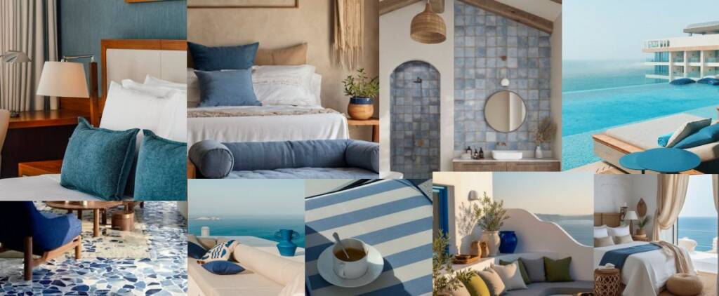
When we started, the client provided a detailed brief outlining their services and competitors. They described their target audience and shared interior renders to help me understand the atmosphere they wanted to create. They emphasized that the resort’s unique feature was its location surrounded by the sea, with beautiful, gentle waves. The entire hotel concept was built around this distinctive connection to the water.
Logo architecture
I started exploring possible logo directions based on the name. “Sea Verve” can be interpreted as “the energy of the sea,” “the character of the sea,” or “the living energy of the sea”. The two capital letters, S and V, naturally became a starting point for the identity. I explored how I could transform these letters into a distinctive shape that would visually express the meaning of the name and evoke the movement of the sea.
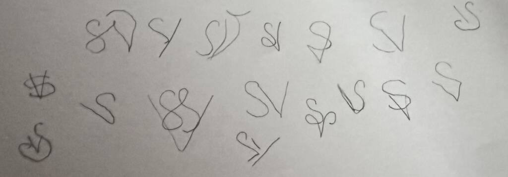
I was looking for a way to express the wave through the letterform. The “S” offered a natural starting point, as its curved shape already resembles the flowing movement of a wave.
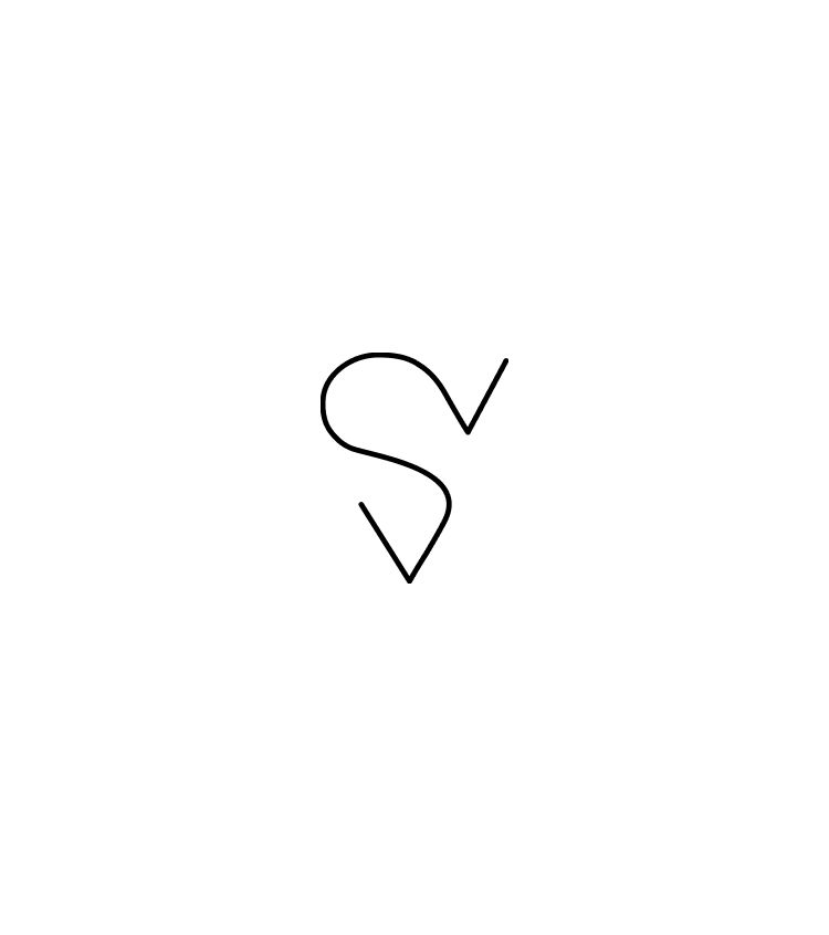
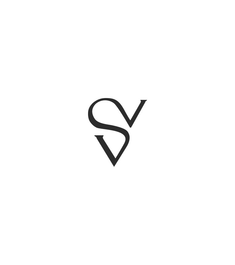
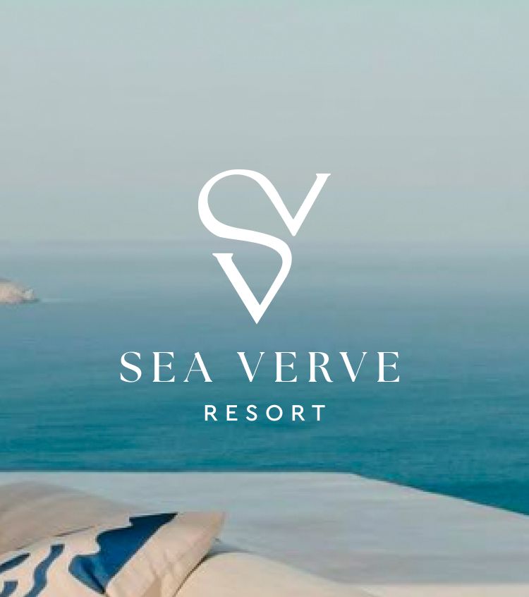
After exploring different directions, I settled on this outline.
Looking for relaxing vibe for your brand? Explore this project – Logo design and branding for a decor company
I liked how it combined the “S” and “V” letters. Since “Sea Verve” starts with an “S”, I wanted it to have a dominant role, while still making the “V” recognizable, as it is also part of the name. This construction allowed me to combine both letters into a single, distinctive mark.
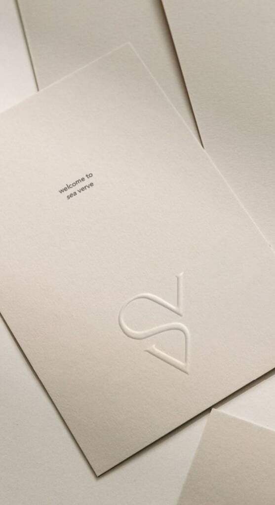
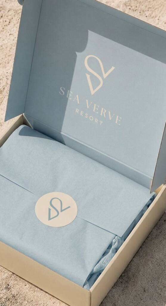
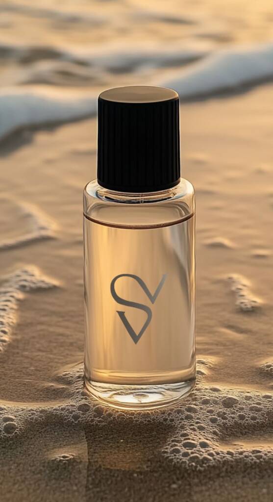
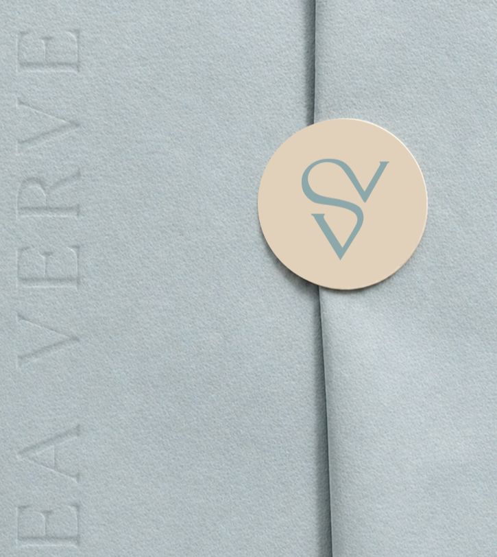
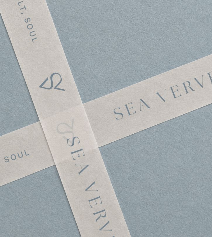
We spent a few iterations exploring different fonts and colors. I created mockups to visualize the overall vibe and tactile feel of the logo and brand. The goal was to capture the resort’s sense of freedom, relaxation, and effortless coastal living.
Love blue colors? Explore this project – Creative and clever logo design and brand identity for a hydration med spa
The client feedback
This is exactly what we’re looking for! I don’t even know how you nailed it in the first round! We ended up with an absolutely stunning logo for our new resort. Thank you for bringing our vision to life and inspiring us to create something beautiful for our guests.
Sea Verve
Owner