


I was approached by a client via Instagram:
“
Hello, loved your page. I have started a new real estate development business and would love to know more about your services for brand building and designing
I was happy to meet a potential client with a real estate project. I answered his questions about my availability, deliverables, and timeframe. Later, we scheduled a meeting to discuss the details. The client decided to move forward quickly, so we got started.
Logo design process for a real estate developer
I sent the client a brief questionnaire with specific questions. It helps me understand the brand story, target audience, and overall preferences for the logo. The client told me that they work in construction and that he is an electronics engineer by education who changed his career path to construction after moving to the USA. They have always loved building beautiful spaces. It inspired me because I could see that this person was starting his own journey, and I was happy to help bring his vision to life.
“Haus” means “house” in German, so I focused on creating a logo that communicates this idea. My goal was to find graphic elements that would evoke the right associations.
- The first option shaped the “HA” letters into a roof form to convey the idea of a house. The letter “A” in “Haus” was a great opportunity to incorporate a roof shape.
- The second option represented the letter “H” in a geometric, architectural form. The “A” in the wordmark echoed the angled lines of the symbol.
- The third option used negative space to reveal both a house shape and the letter “H”.
- The fourth idea included tilted horizontal lines that resemble a row of houses.
- The final option was a classic symbol that resembles a group of houses.
I also liked the simplicity of the wordmark and wanted to create some options with custom, unique typography.

Iteration 1
The client initially liked the logo direction below. They liked the incorporation of the “H” and “G” letters and asked me to create some bolder variations of it.
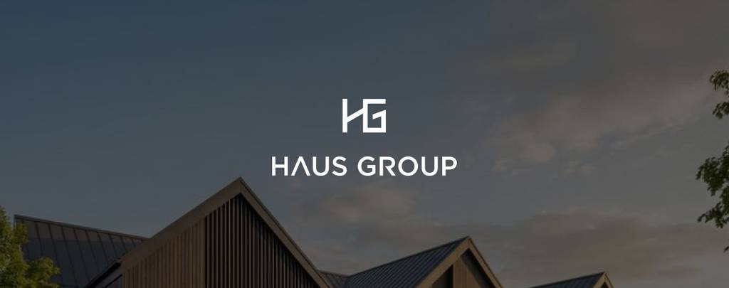
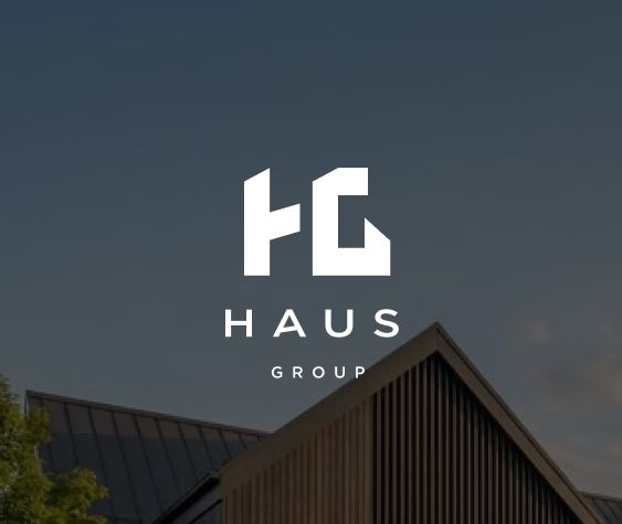
Iteration 2,3
Then the client asked me to develop the letter “H” in a bold, prominent way.
Iteration 4
After a few more iterations, they made their decision. They selected the logo from the first design round and simply wanted to test a few font options, which I sent them. After that, the client made his final choice.
Looking for real estate logo and branding? Check another project I designed – H monogram logo design for a real estate company
Color palette for a real estate company
Answering the questions in the initial questionnaire, the client mentioned that they wanted to evoke a sense of trust while also being aesthetically pleasing. This indicated to me that the brand shouldn’t feel cold or overly corporate, but rather more inviting. Additionally, while working on the logo, I noticed that the client tended to gravitate toward dark colors. During our discussions, they also mentioned wanting the brand to have a minimalist luxury feel.
Love the vibe? Explore this brand – Eye-catching and creative logo design for a fashion brand
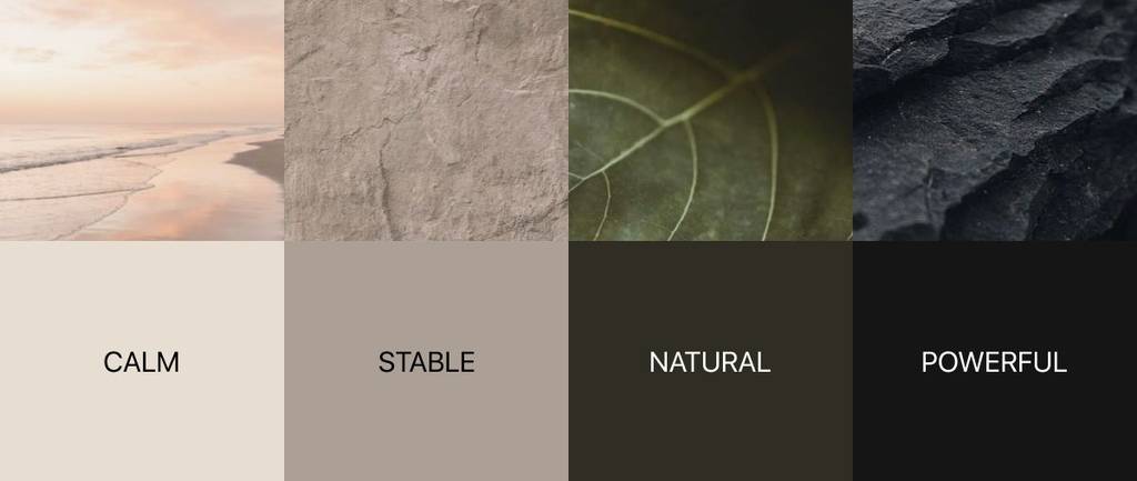
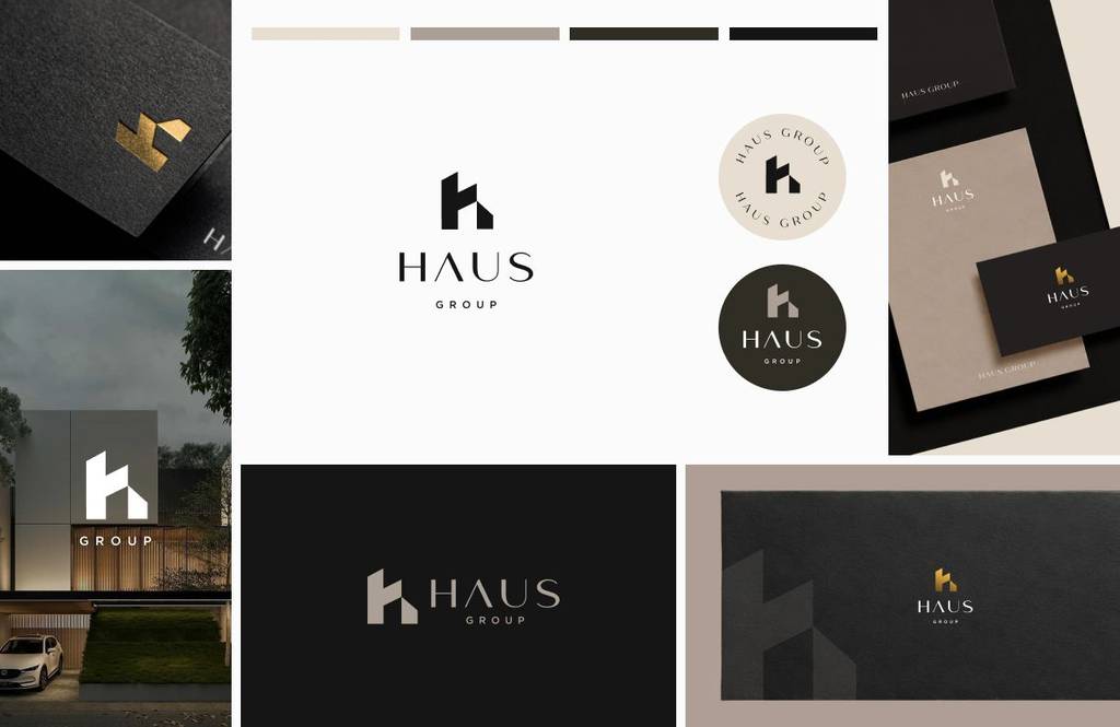
I suggested a color palette designed to evoke the feelings the clients wanted to communicate – calmness, stability, and power – while incorporating a natural tone to convey a sense of care and support. These associations are particularly important for a real estate development company, as they help communicate reliability, confidence, and a sense of security – qualities that clients naturally look for when choosing a company to build with.
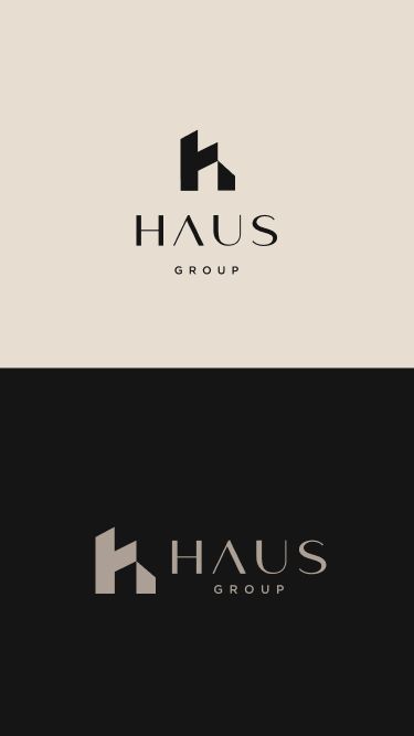
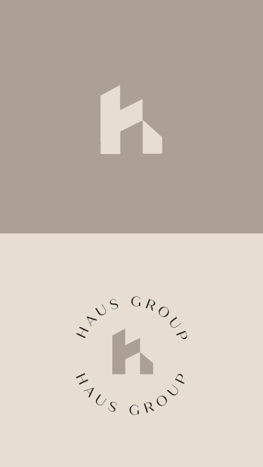
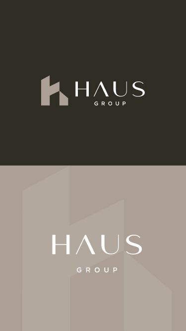
After considering different color combinations and how they worked with the logo, the client approved the palette. Additionally, we added a gold accent and established a color proportion:
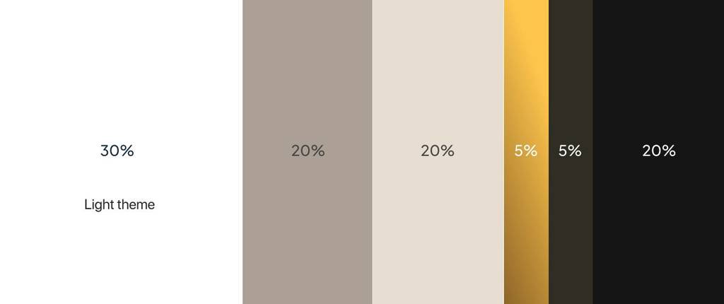
This color palette is warm and onviting. Check another brand I created – Logo design and branding for a decor company
Logo layouts and a brand visualisation
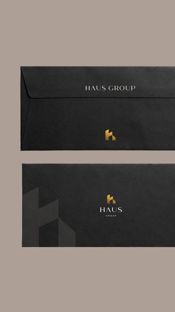
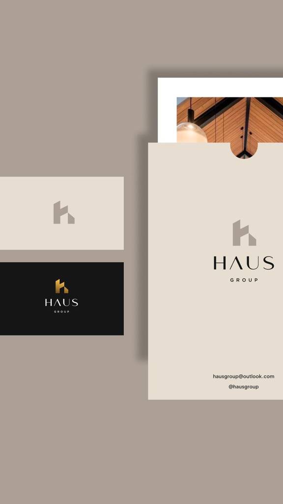
The logo includes an elegant wordmark and a bold, geometric symbol, so it’s important to understand how to use them and how to organize them. This approach allows the brand to use versatile layouts across different applications while remaining consistent and flexible.
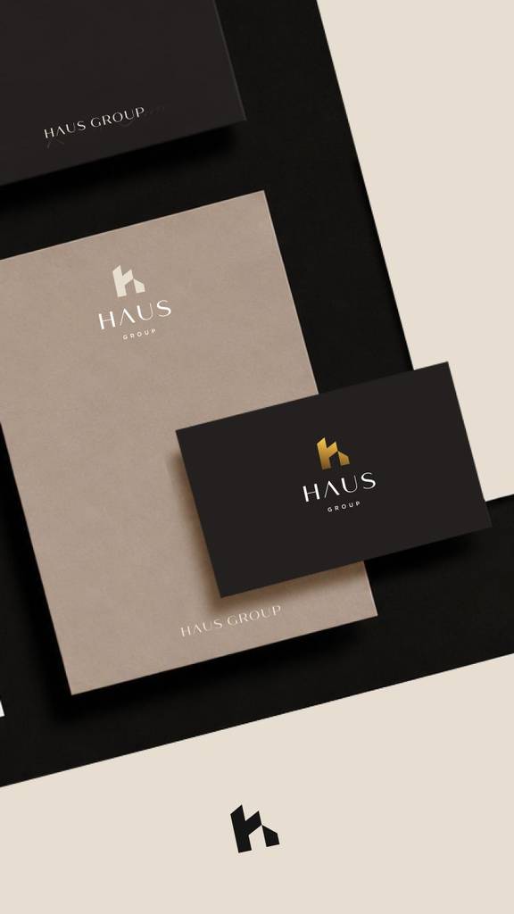
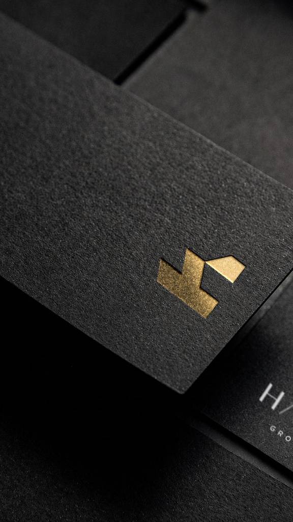
Having a logo with defined colors, I moved to the brand visualisation
This is another brand I created for a real estate brokerage company – Clever logo combining a house shape and the letter S
The client feedback
Thank you so much!

Haus Group
Owner