When working with a brand, one of the key signals for defining the design direction is understanding the industry. The visual language of pharmacy industry is minimal, structured, and intentionally low in visual noise to reduce stress and support decision-making. Here, I want to show the most common and widely accepted colors in the pharmacy industry to help you build your brand.
The most typical and familiar colors for pharmacy users:
Pharmacy colors typically include blue, green, white, and soft neutrals. These colors are associated with trust, health, calmness, and safety.
Blue — trust, clarity, and clinical confidence
Blue is the most dominant color in pharmacy and healthcare branding because it directly reduces perceived risk. It creates a sense of reliability, professionalism, and control — which is critical when people are dealing with health concerns.
Lighter blue tones feel calm and approachable, helping to ease anxiety, while deeper blues communicate authority and medical precision. This balance makes blue suitable for both traditional pharmacies and modern healthcare brands.
In visual systems, blue works well for:
- logos and primary brand color
- website backgrounds and interfaces
- packaging for prescription and OTC products
Blue also pairs naturally with white, reinforcing cleanliness and transparency — two key expectations in pharmacy environments.

Green — healing, balance, and natural recovery
Green is strongly associated with health, recovery, and the body’s natural balance. In pharmacy branding, it signals a less aggressive, more supportive approach to treatment — making it especially effective for wellness-focused and modern healthcare brands.
Unlike blue, which builds clinical trust, green feels more human and restorative. It reduces psychological tension and creates a sense of safety without feeling cold or overly medical.
Different shades of green communicate different meanings:
- soft sage and muted greens — calm, care, holistic approach
- fresh greens — vitality, energy, recovery
- deeper greens — stability, reliability
Green is widely used in:
- pharmacy signage (often as a universal symbol)
- wellness and supplement packaging
- branding for natural or preventive healthcare services
It pairs well with white for clarity, or with blue to balance clinical precision with a more human, approachable feel.

Orange — warmth, attention, and controlled energy
Orange is rarely used as a primary color in pharmacy branding, but it plays an important role as an accent. It introduces warmth and human connection into an otherwise calm and clinical environment.
In small amounts, orange helps guide attention — making it effective for calls-to-action, highlights, or key information on packaging. It can also soften the perception of medical spaces, making them feel more approachable and less sterile.
In healthcare context, orange should be used carefully:
- soft or muted tones — warmth, care, friendliness
- brighter tones — energy, urgency (use sparingly)
Overuse can feel overwhelming or reduce the sense of trust, so it’s typically balanced with blue, green, or white.
Common uses:
- buttons and interactive elements (UI)
- accents in packaging
- secondary brand details

The best choice for pharma colors:
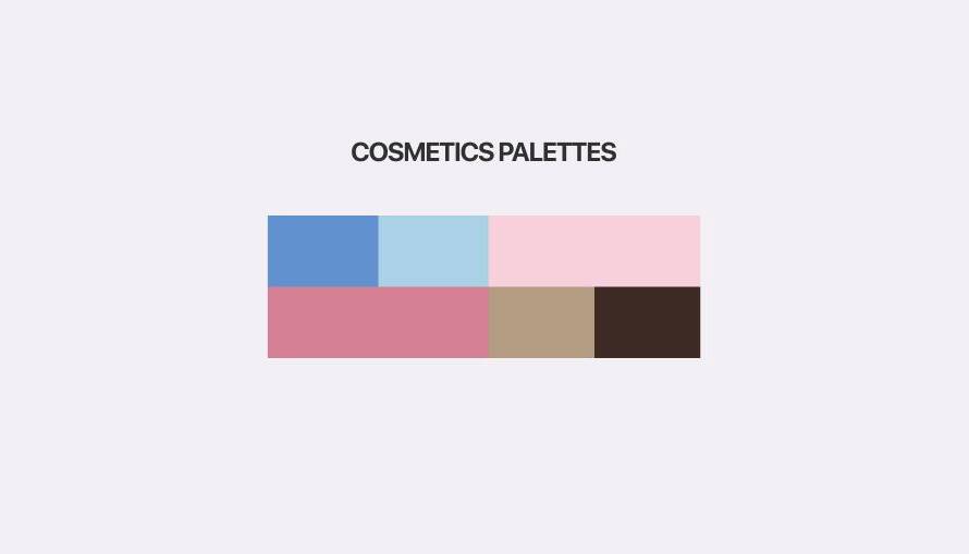
Color palette examples for your brand
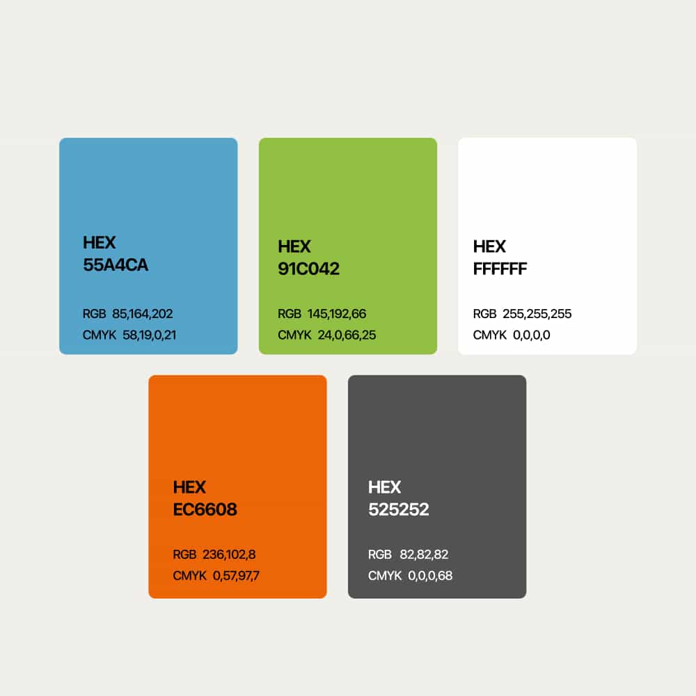
Professional color palette with an accent
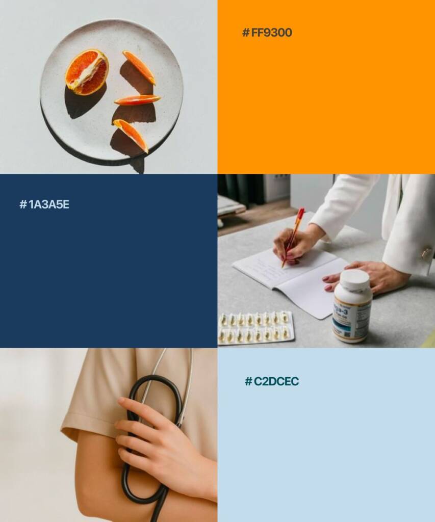
Rich and confident color palette for pharmacy

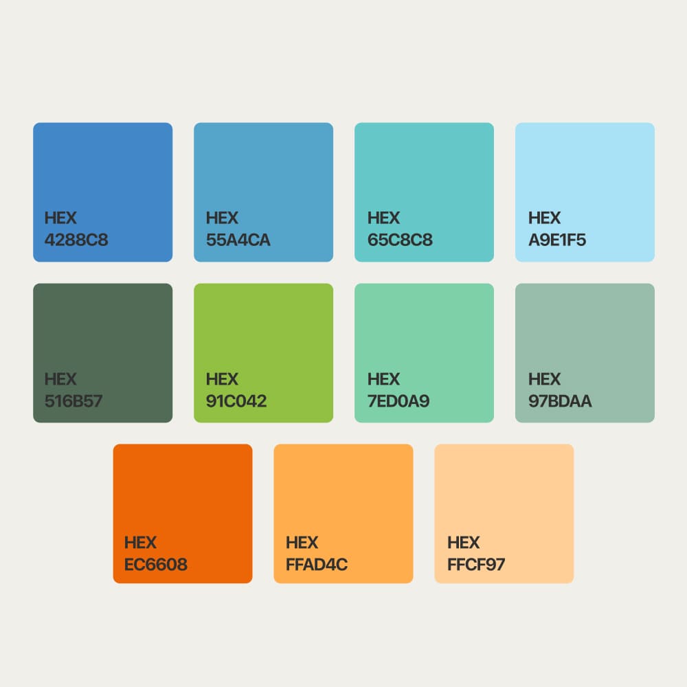
Modern palette with a vibrant touch

Advice
Avoid sharp, loud colors and elements. The style should be clean and calm. Remember, in the pharmacy, people are looking for something to ease their pain, so maintain a comfortable vibe for them.
Looking for a timeless and professional brand? Check this case – Logo and branding for a kitchens design studio
Other information about pharmacy color palette
Pharmacy brands usually avoid overly aggressive or highly saturated colors because healthcare design should feel calm, trustworthy, and emotionally balanced. Extremely bright reds, neons, or harsh contrasts may create stress or discomfort instead of a sense of care and safety.
In addition to classic blue and green tones, pharmacy brands can also use soft beige, muted sage, turquoise, warm gray, light teal, dull gold, or clean neutral palettes. These colors help create a more modern, premium, or wellness-oriented appearance while still maintaining a sense of trust and professionalism.
Some pharmacy and healthcare brands also use orange accents to introduce warmth, energy, and visibility without making the identity feel too aggressive. The choice of color palette usually depends on the target audience, brand positioning, and the emotional atmosphere the company wants to create.
Minimalism works well in pharmacy branding because clean and simple design helps communicate clarity, professionalism, and trust. In healthcare-related industries, people often respond better to visual systems that feel calm, organized, and easy to understand.
Minimal layouts, balanced typography, and restrained color palettes also improve readability across packaging, signage, websites, and printed materials. This approach helps pharmacy brands appear more modern, reliable, and emotionally comfortable for customers.