


A client reached out to me on Instagram:
“
Hi! I am shopping for a brand designer to help with a new dental office. I would love to speak to to discuss needs, timeline and fees if you have a moment. Thank you!
I was interested in working with a dental clinic, as I really like the medical niche – its professionalism, aesthetics, and attention to detail. I was curious about what services they might need. During our initial conversation, the client shared that they were still defining their branding needs but knew they needed a strong visual identity for their clinic. Their main request was a logo and typography system that could be used consistently across multiple touchpoints, including their website, Instagram, Facebook, letterhead, and printed materials such as coffee cups. They also wanted the logo to work well as a monogram for more compact applications. In addition, they were considering support with selecting a color palette to help create a cohesive and professional brand identity for Cornerstone Dental.
I presented several service options, ranging from a logo and brand guide to stationery and social media design. They decided to start with the logo and brand identity package.
Logo design process for a dental clinic
I started the brand identity package with logo design. I usually divide the process into three milestones: logo design, color palette development, and brand guide creation. This step-by-step approach helped me better understand the client’s needs and build the brand strategically.
Logo name and its meaning
The business name is Cornerstone Dental. To better understand the brand, I explored the meaning behind the word “cornerstone,” which refers to the foundational stone upon which a structure is built. It symbolizes trust, support, strength, and stability—something essential and foundational. These insights gave me a clear vision of how the brand should feel and look.
I started with typography to explore possible aesthetic and letter combinations

Logo design for a dental clinic
I created five initial logo concepts to explore different design directions.
The first concept featured a strong, sharp-edged “CD” letterform that evokes the feeling of stone and structure. It also included a spark to symbolize purity and the brilliance of a healthy smile.
The second concept featured an organic combination of the letters C, D, and S, evoking relaxation and trust – important qualities in the dental industry.
The third concept featured an abstract geometric symbol connected to the brand name, conveying the radiance of a precious stone – like a healthy smile – while its drop-like shape evokes comfort and relaxation.
The fourth concept featured a geometric combination of the letters C and D that subtly forms the shape of a diamond.
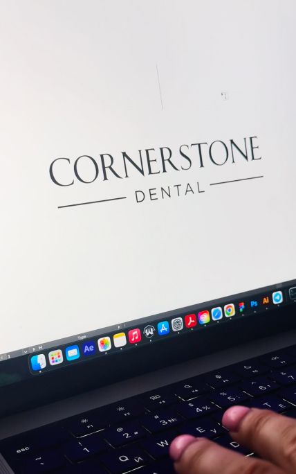
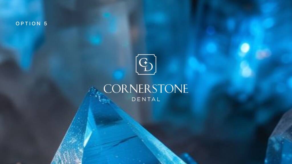
The last, fifth option featured a more traditional design approach. The frame resembled chiseled stone, reflecting strength, stability, and timeless reliability. Its structured form reinforced the meaning behind the name “Cornerstone,” symbolizing a strong foundation built on trust and support. The overall design conveyed professionalism, confidence, and a sense of lasting quality—essential values for a dental clinic.
The client told:
“
Okay, so the group vote is for option number 5 based solely on the logo design. Where do we go from here? I am wondering what the next steps are. Are we talking about colors and logos variations or something else? Thank you.
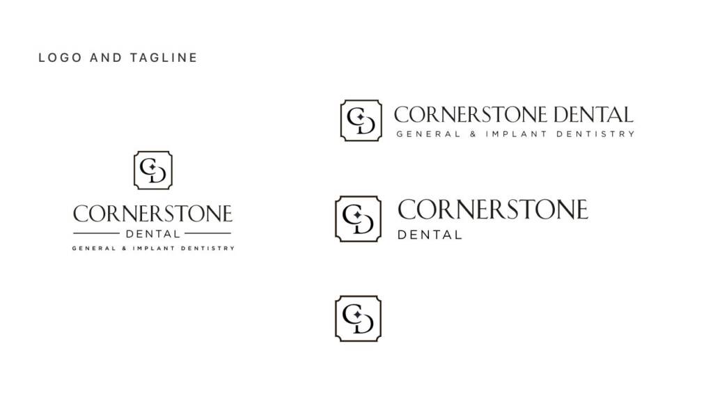
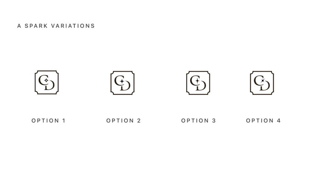
From there, I continued with color palette development. The client also requested several variations exploring the spark shape, tagline placement, and logo layouts to evaluate different branding directions. I provided these options to help the client better understand the logo’s versatile applications and ensure the symbol remained visually strong across different uses.
You may also like another brand I created with idea and structure – Real estate logo design and brand identity services
Color palette for a dental clinic
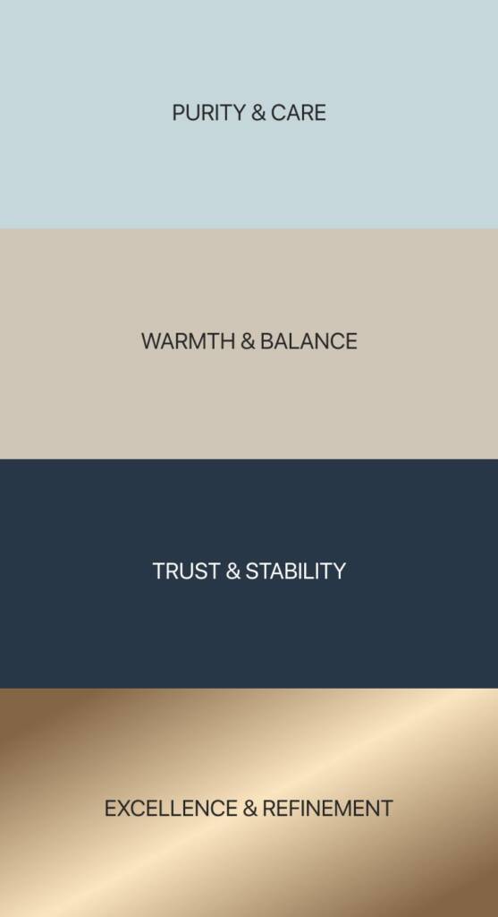
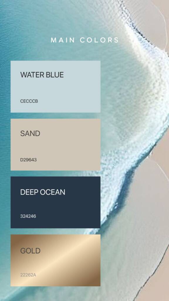
For the color palette, I suggested shades of blue to convey strength, confidence, and stability—qualities associated with stone. Sand and blue tones also reflect the balance of earth and water, creating a calm, clean, and trustworthy visual identity.
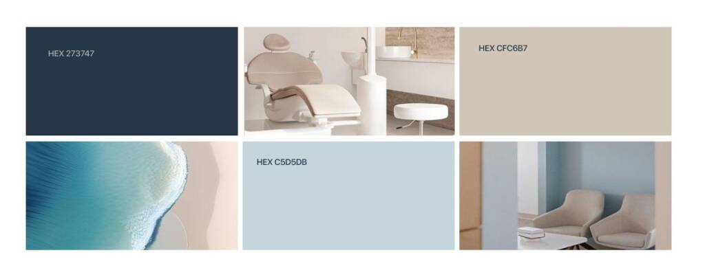
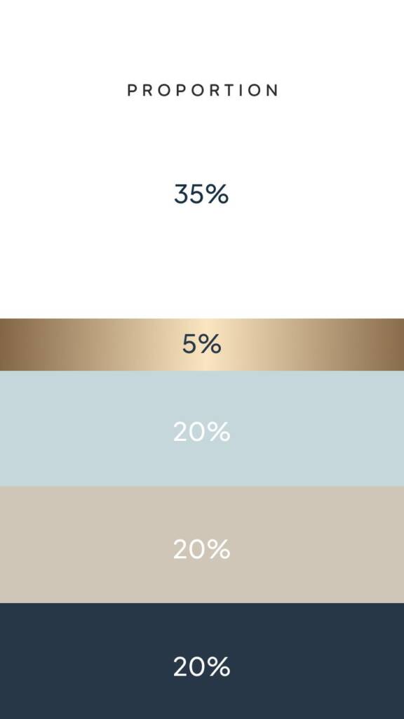
I also added a gold shade as an accent color for the brand. Additionally, I provided clear guidelines for color usage and proportions, which became the foundation of the brand identity and ensured visual consistency across all brand materials.
Check the brand I created in the similar color palette – Professional, luxury logo design and brand services for a building company
Brand visualisation for a dental clinic
After analyzing and refining the color palette, I moved on to brand visualization and defining the brand elements. First, I separated the key brand elements to identify the brand’s distinctive features and establish a clear visual foundation.
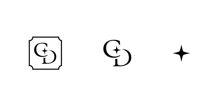
The logo symbol was designed to be flexible and can be used both with and without the frame, allowing for versatile applications across different brand touchpoints. The spark also serves as a standalone brand element and can be used independently across various brand materials to strengthen visual consistency and reinforce brand recognition.
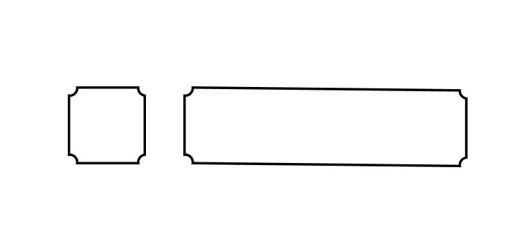
The frame also became a recognizable brand element. I suggested using it across banners, social media, and print materials to create a consistent and cohesive visual identity.
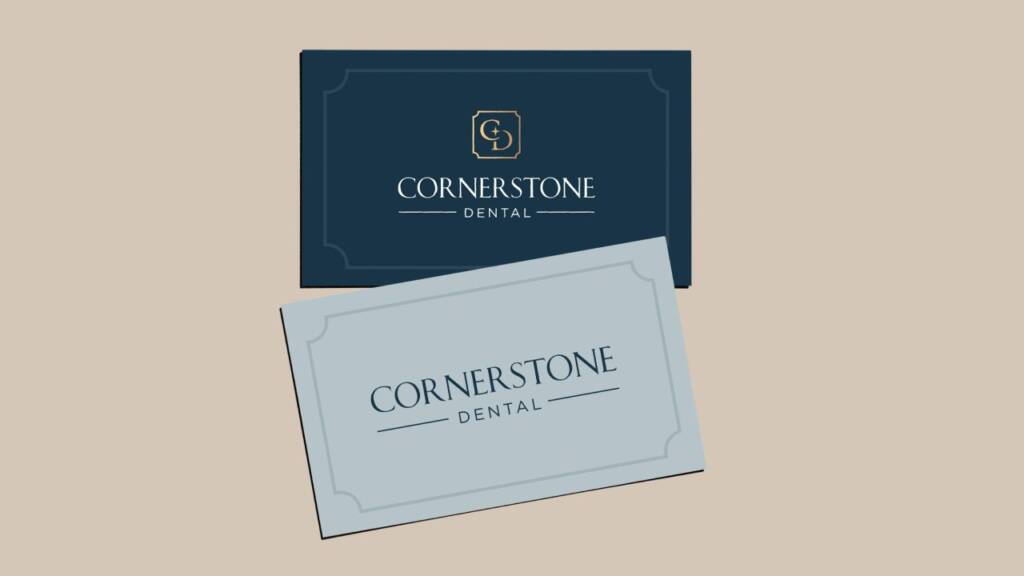
I then created a custom pattern design and established clear guidelines for color placement across various brand materials.

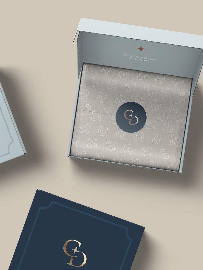
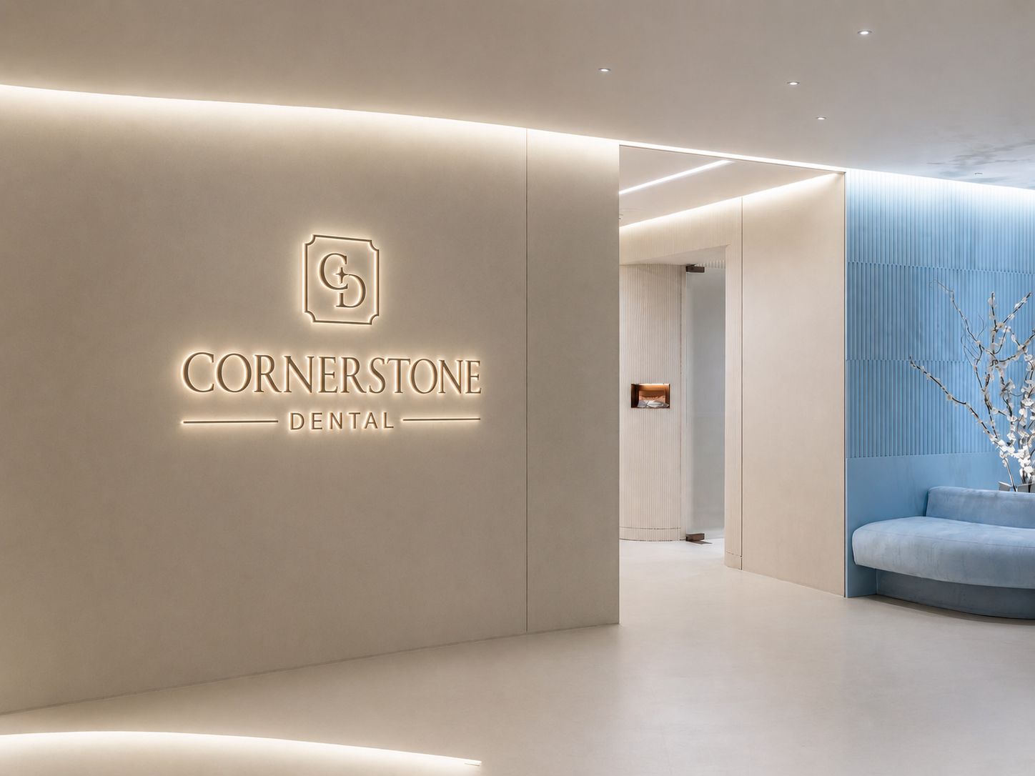
The overall brand visuals and mockup scenes provide a clearer understanding of the brand’s voice, personality, and overall feel. They help communicate the clinic’s core values – professionalism, trust, stability, and care – while creating a cohesive and recognizable brand presence across all touchpoints. These mockups also help the client visualize how their brand will appear in real-world applications and how it will communicate with their audience.
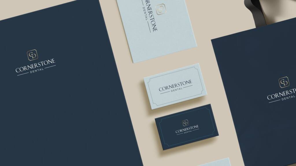
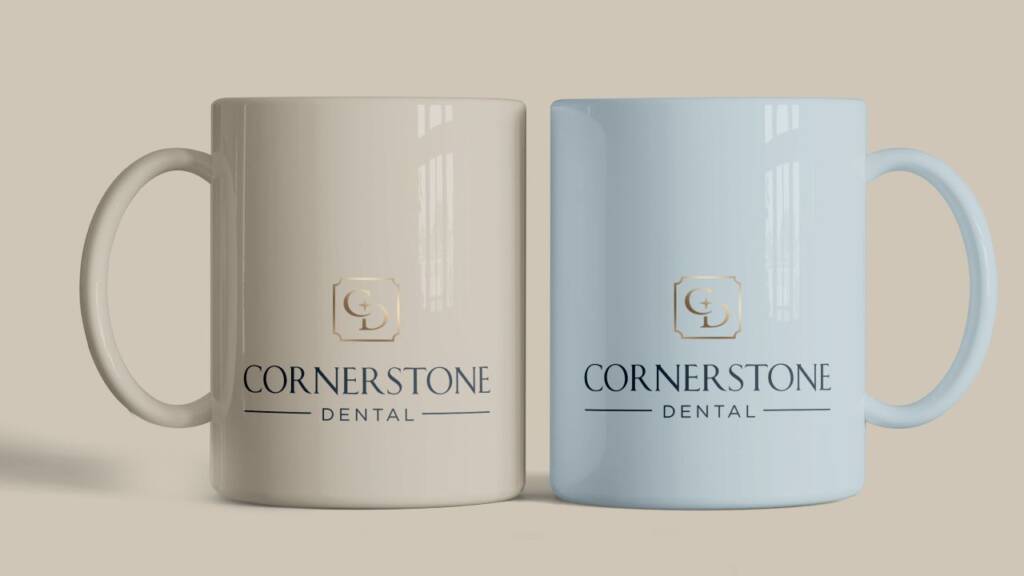
You may also like another brand I created with a similar sense of purity – Creative and clever logo design and brand identity for a hydration med spa
The client feedback
I’m still so in love with this! It has made the business start up so much easier! We have so many of our advertising products ready and waiting for the grand opening -t-shirts, water bottles, chapstick! It has made the interior design cohesive! Having done this work ahead of time has made it so much easier to communicate our social media needs to vendors and to just keep our focus on a look and feel that we love! It was a pleasure to work with you!

Cornerstone Dental
Founder