When it comes to beauty brand colors, there are virtually no limitations. What matters most is the overall aesthetic and how well the colors work together.
In this post, I’ll explore the color pink, one of the most common and visually appealing colors in the beauty industry, and explain the emotions, associations, and impressions it can evoke when used in cosmetics and beauty branding.
Pink color in beauty branding
Pink naturally evokes feelings of beauty, femininity, care, and self-confidence. It can communicate a sense of softness and elegance while remaining approachable and inviting. Lighter shades often feel delicate and nurturing, whereas deeper pinks can appear sophisticated, modern, and luxurious. This versatility allows beauty brands to appeal to different audiences while maintaining a strong connection to the concepts of self-care and personal expression.
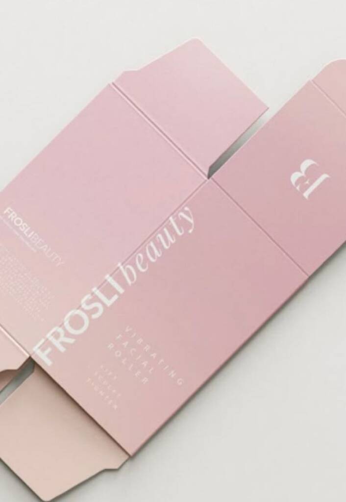
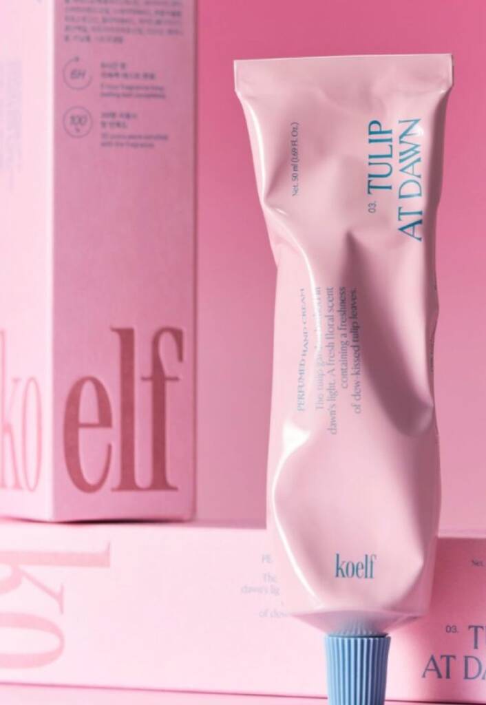
Gradient pink. Beautiful method for cosmetics branding
Pink pairs easily with a wide variety of colors, which is why it works exceptionally well with gradient effects. Blurred color transitions, radiant glows, soft gradients, and luminous overlays are commonly used in pink cosmetics branding. These effects enhance the sense of beauty, softness, and luxury while adding depth and visual interest to the overall brand identity.
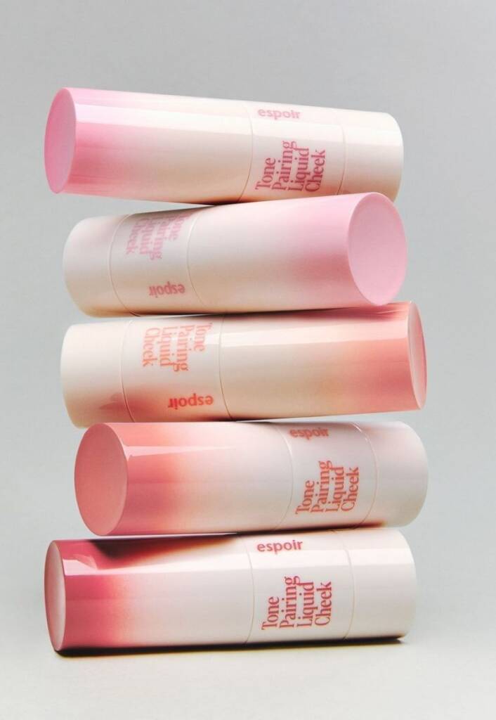
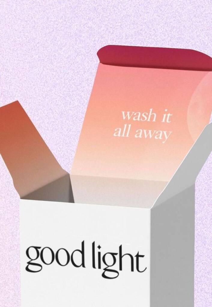
These examples showcase great pink gradient usage and were sourced from yami, weijinpackaging, thedieline
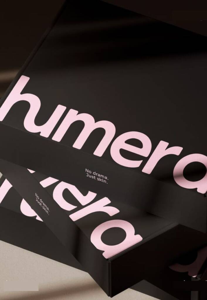
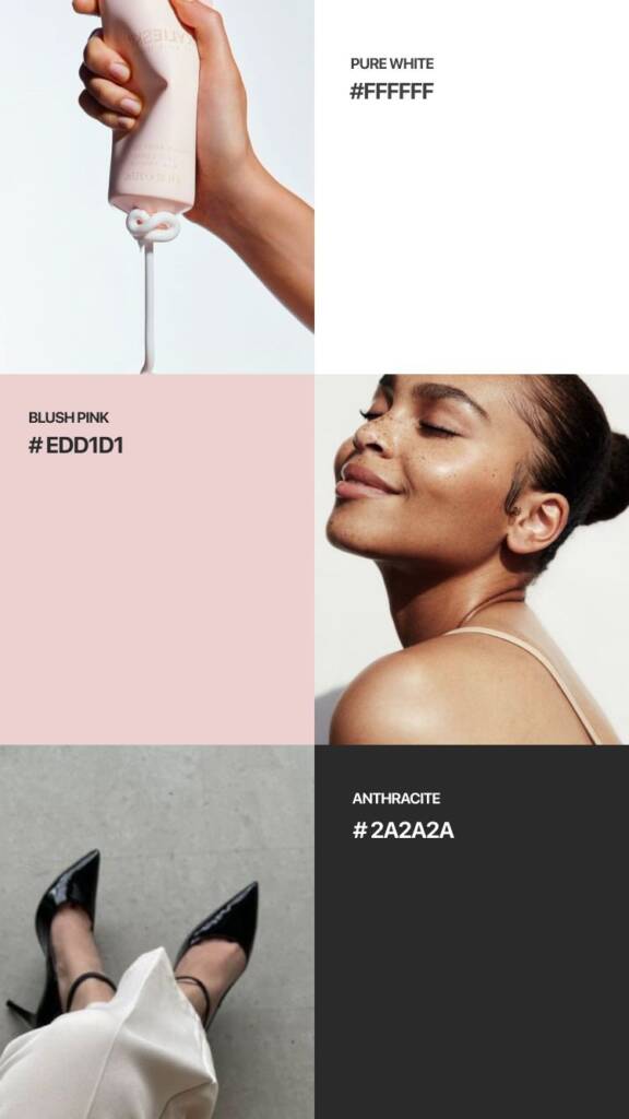
Contrast pink beauty branding
The pink shades combine beautifully with black and white, creating deep, elegant, and luxurious contrasts. While white enhances a sense of purity, softness, and sophistication, black adds depth, confidence, and a premium feel. Together, these combinations allow pink to appear both refined and visually striking, making them a popular choice for beauty and cosmetics branding.
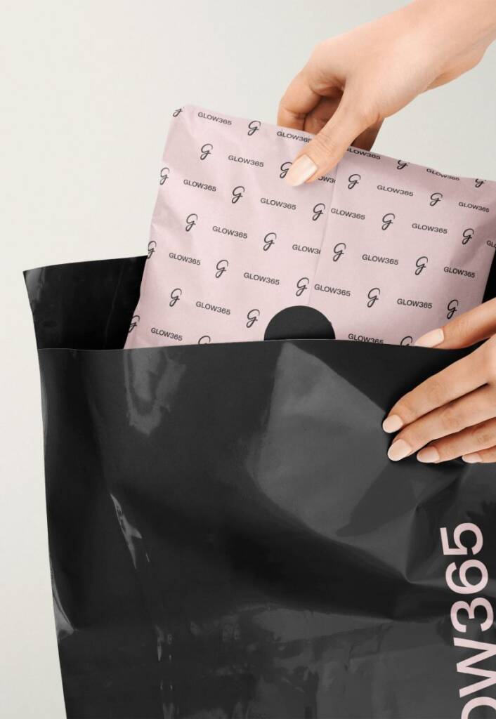
You can check out logo design and branding project created with a pink and dark gray color scheme here – Handwritten “G” letter logo design and pink branding for a cosmetics company
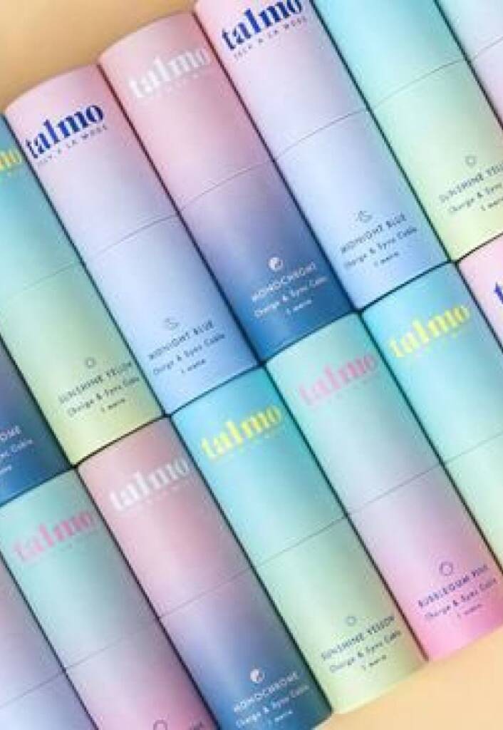
Retro, vintage pink cosmetics branding
Pink combines perfectly with bright colors, making the brand feel fun, fashionable, and eye-catching. Vibrant combinations create a sense of energy, creativity, and confidence, helping beauty brands stand out while maintaining a playful and modern appearance. This approach is often used by brands targeting younger audiences or those looking to make a bold visual statement.
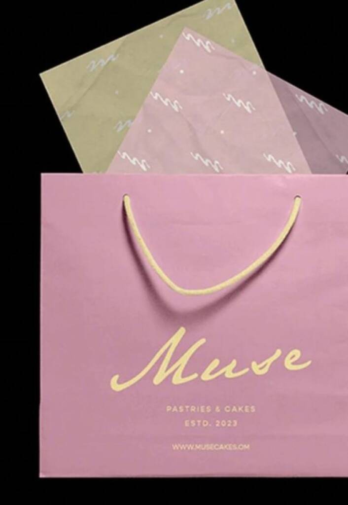
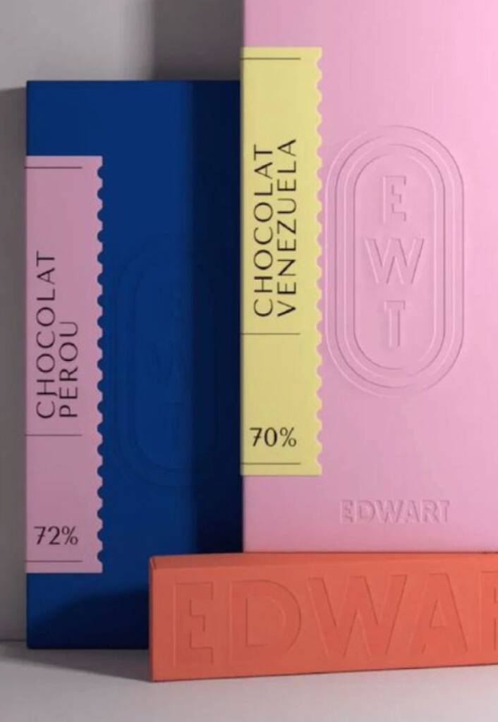
These images showcase great pink combinations to create retro/vintage feeling and were sourced from edwart, amazon and pinterest.com
Color-coding pink cosmetics branding
Color coding is a popular approach in beauty branding, especially for brands with multiple product lines or collections. Different colors help customers quickly identify product categories, ingredients, benefits, or intended use, making the shopping experience more intuitive and organized. Beyond functionality, color-coded systems create a visually cohesive and recognizable brand presence. When applied consistently across packaging, marketing materials, and digital platforms, they help brands communicate clarity, professionalism, and a well-structured product range.
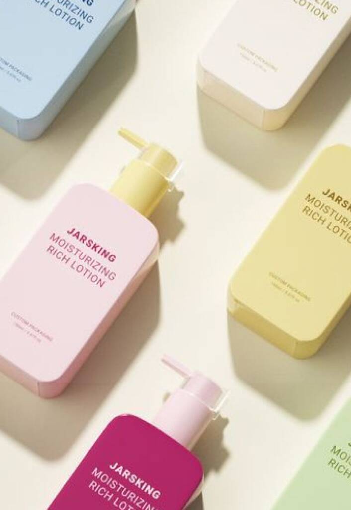
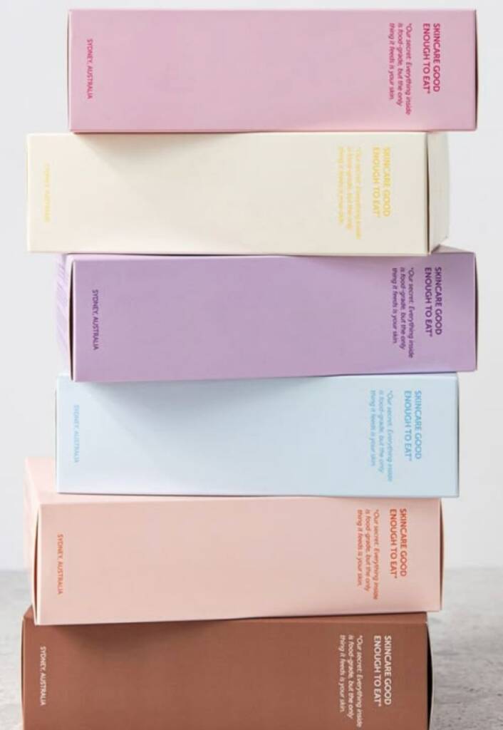
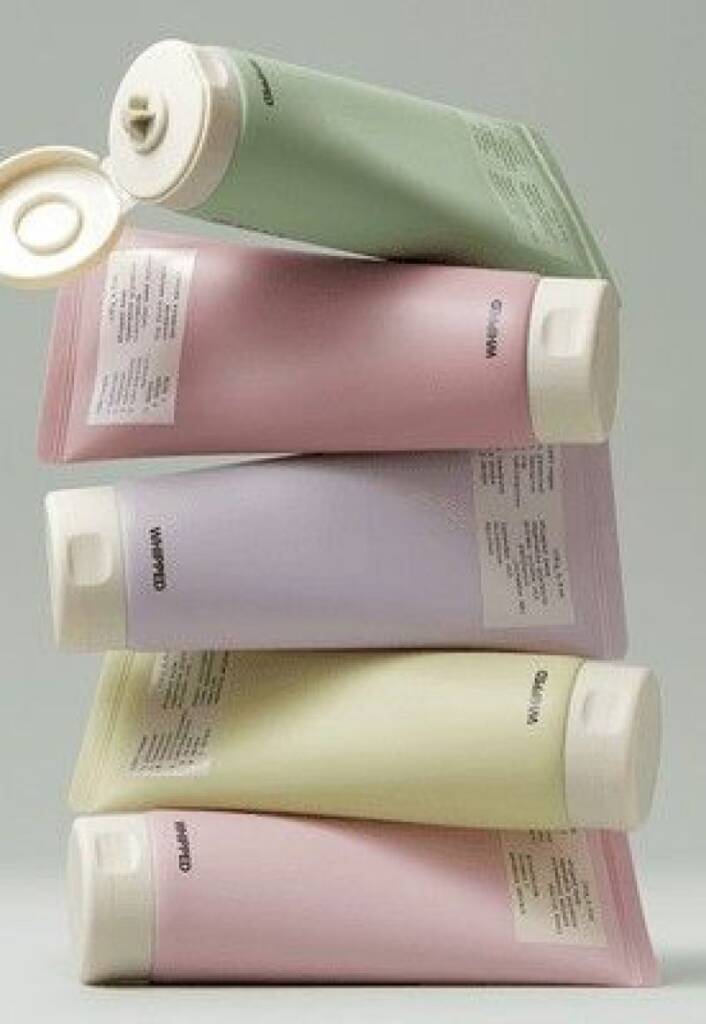
These references showcase color coding usage and sourced from jarsking, oliveyoung and pinterest.com
The beauty industry is incredibly diverse, encompassing a wide range of styles—from classic to contemporary, from soft and delicate to bold and confident. Because of this variety, there is no single “correct” color palette for a beauty brand. What matters most is the emotion you want to convey and the impression you want your audience to associate with your brand.
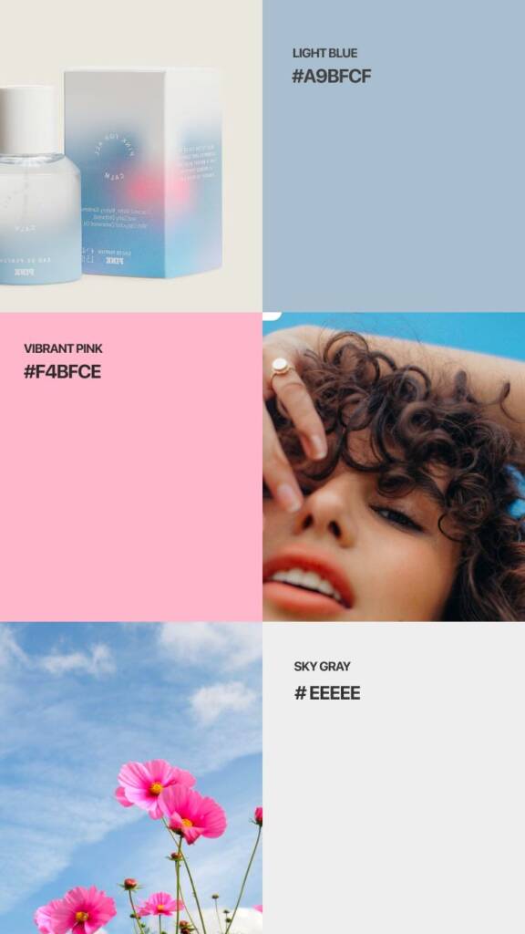
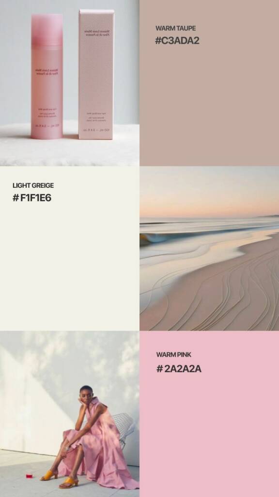
Check out a few beautiful pink palette options for cosmetic brands
Look at how beautifully pink pairs with blue and charcoal, creating two distinct styles. The first palette feels more confident and modern, while the second is softer and more playful.
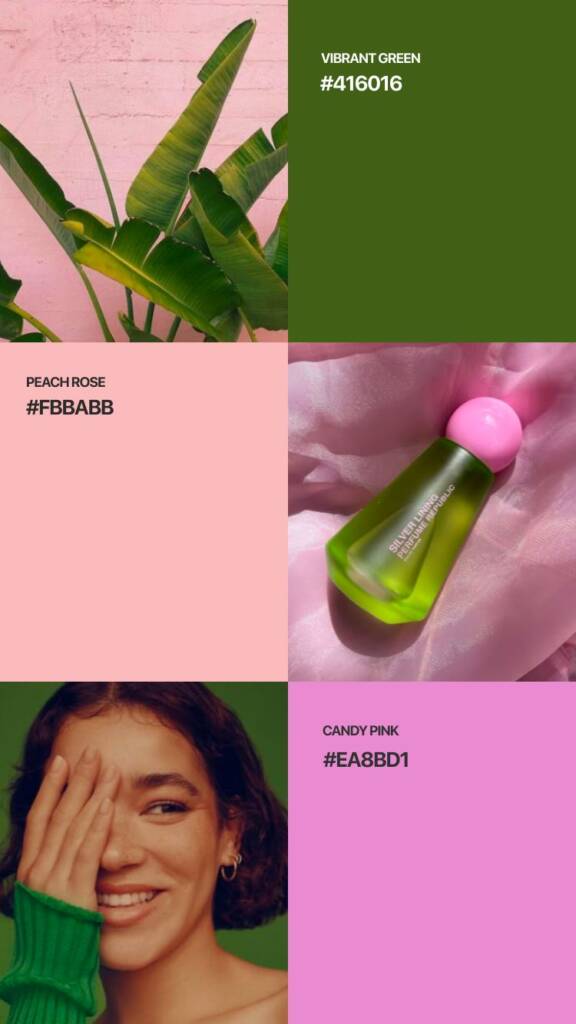
Pink color looks great with brown and soft yellow shades. It can also appear bright and bold when paired with more vibrant colors, such as green.
In my next posts I’ll explore other versatile beauty palettes