

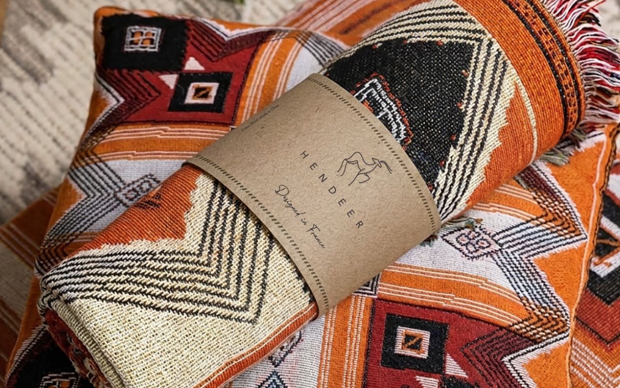

This is the second project for this brand. The first project you can see here.
The client reached me saying:
We’re very happy with the logo and the overall process. Would you be interested in designing the product packaging and labels for our throws and rugs? We look forward to hearing from you!
I was also pleased that my client came back to continue our collaboration. To me, that meant I had met their goals and exceeded their expectations. I was happy to accept, and we began this project.
Packaging Design process for an e-commerce company
I requested the packaging dieline, or at least the approximate dimensions, as they were important for creating a balanced composition. I also asked whether they had any copy, product details, or other specific information that needed to be included on the packaging.
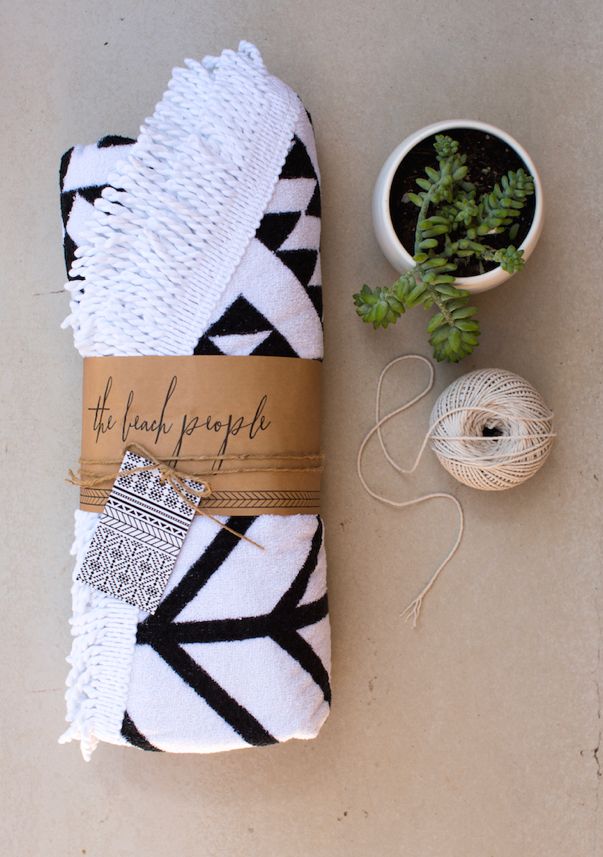
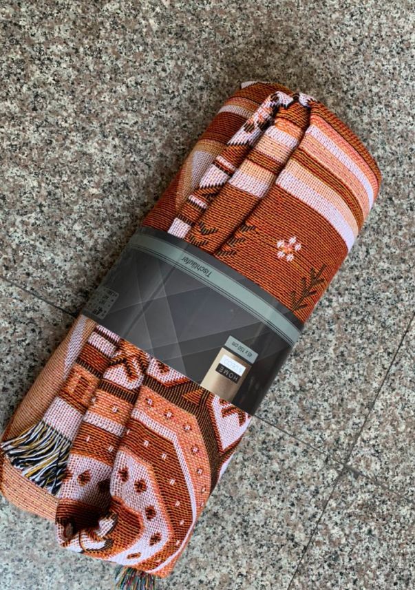
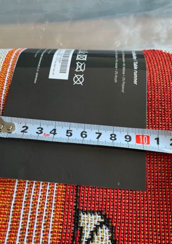
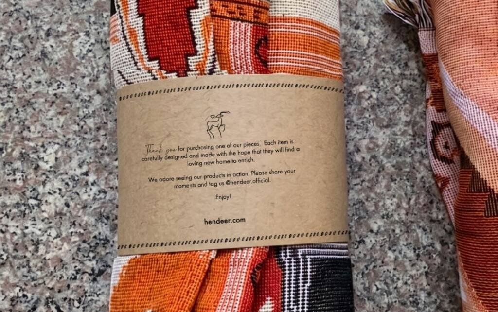
The client shared packaging references, which helped me understand the desired format—a packaging sleeve, also known as a belly band or wrap band. The client also provided the final dimensions and all the required content for the packaging.
Boho style branding elements
In one of my blog articles, I reviewed the boho style. You can check it out here – Boho branding style. Features, bohemian palettes and fonts. So I knew what elements can make the design feel branded and identified.
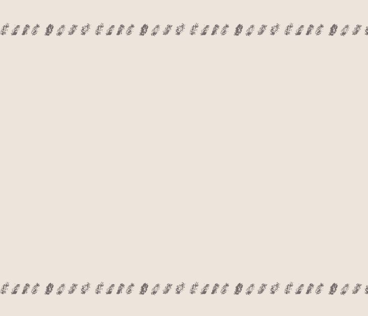
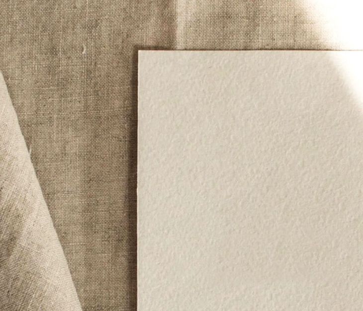
The bohemian style feels custom, free-spirited, cozy, and warm. My first idea was to use a hand-drawn decorative border. Since the boho style embraces natural materials, cardboard was the obvious choice for the packaging. As both the logo and the border were hand-drawn, I also introduced hand-lettered typography as an additional brand element.
Packaging sleeve layout
When I received the measurements, I was able to analyze the content layout. Based on the brief, I organized the information and distributed it across the sleeve.
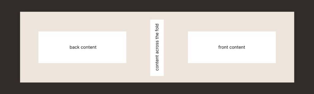
Thank-you message for packaging
Part of the content included a thank-you message. This section feels more personal and engaging, so it offered an opportunity to be creative and add a small design element that conveys warmth, humanity, and a welcoming feel.
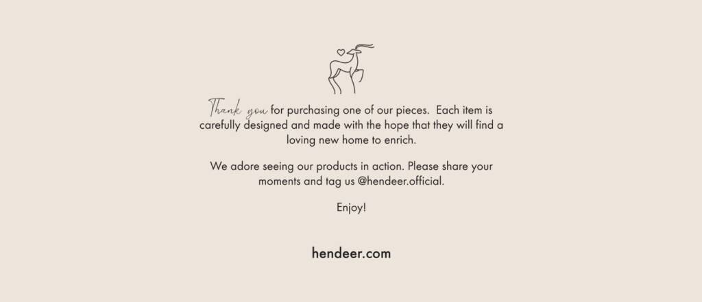
I highlighted the “Thank you” section and added a small warm accent to the deer. Even this subtle touch helps communicate a sense of warmth, care, and hospitality.
Check out another brand I created with a similar warm vibe – Logo design and branding for a decor company
Packaging sleeve design for an e-commerce company
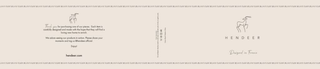
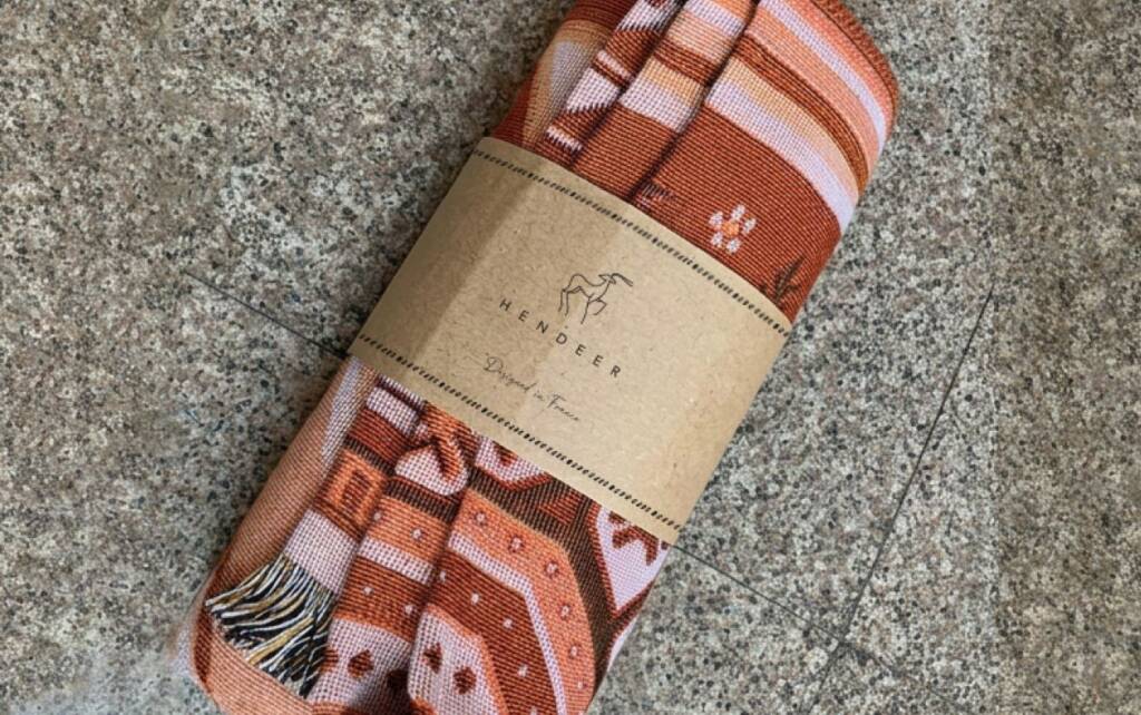
You may also like to check out another warm and friendly brand project I created – Mortar logo design and branding for a compounding pharmacy