

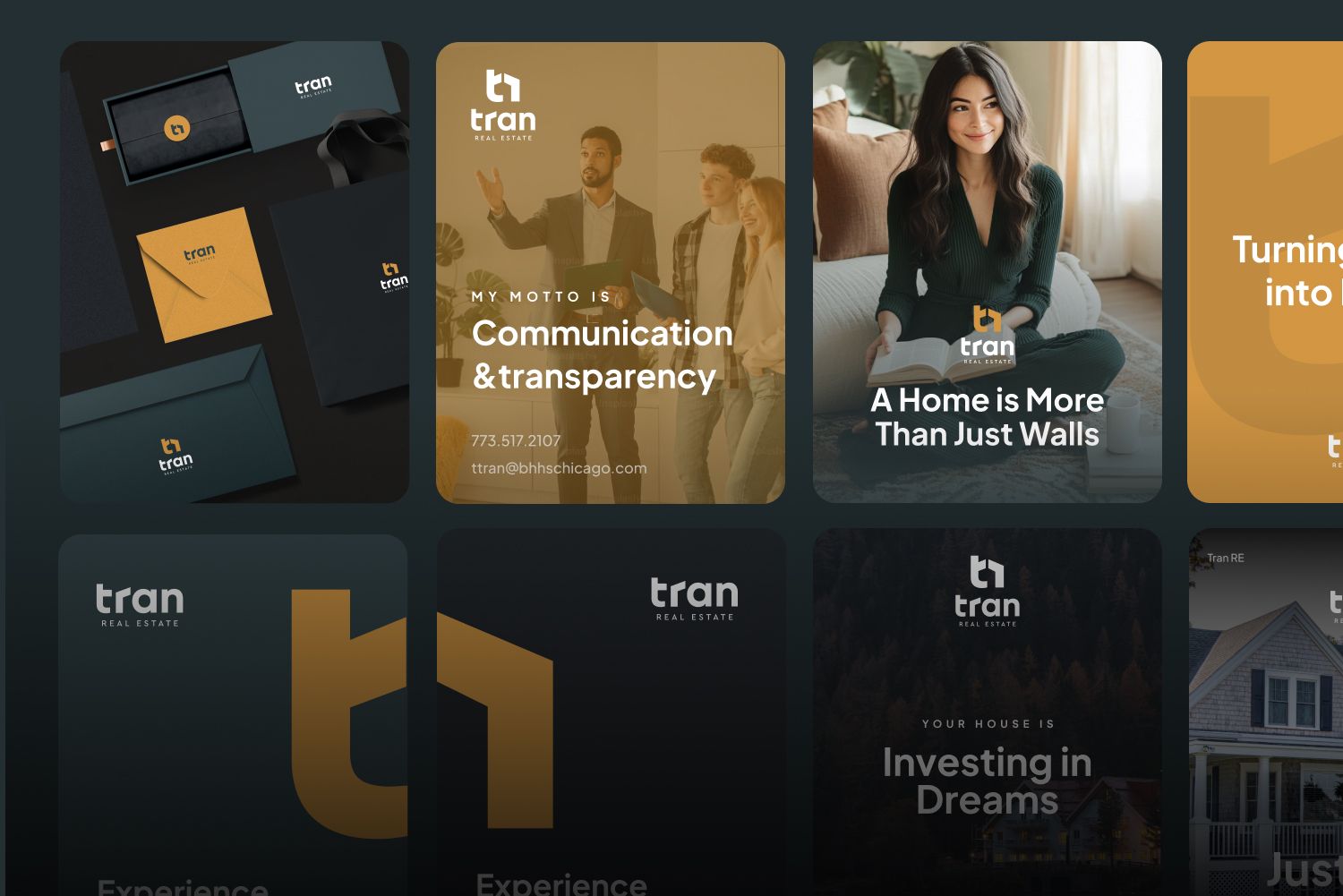
When the logo and brand guide were approved, the client decided to move forward and start building a personal brand and reputation, since he already had the essential tools — a strong logo, color palette, visual direction, graphic elements and typography.
You can read about Real estate logo design and brand identity services details here.
For a realtor, social media is a powerful channel. Many local residents spend their free time on Instagram, and a large part of them are interested in real estate. Social media is a place where people are constantly present in large numbers, and with a well-built Instagram account, it becomes possible to attract the right audience and create trust before direct communication.
Social media design process for a real estate company
Social media plan
You may already read that i start my social media development with a posting plan.
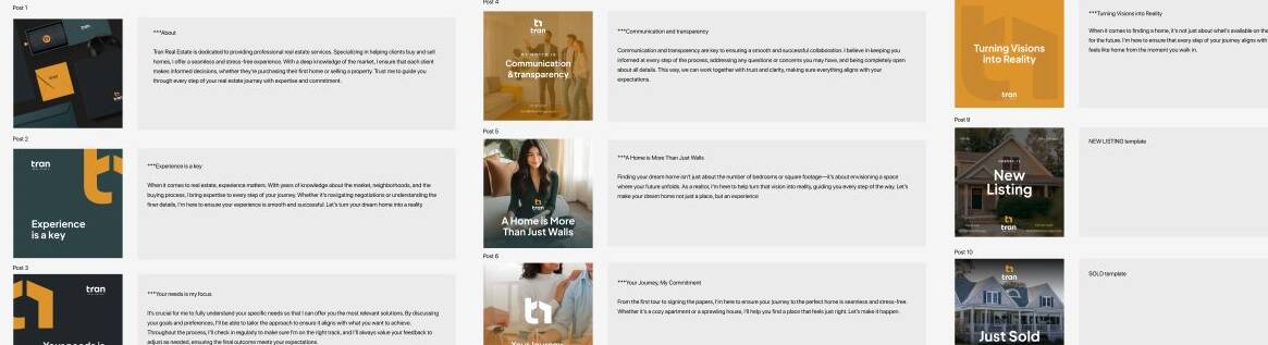
Social media for Tran Real Estate started from scratch, so the first posts were aimed at introducing the company and highlighting its main features and advantages.
I discovered what is important for real estate clients. Trust, professionalism and clarity became the foundation of the visual communication. I wanted the social media to feel approachable and human, while still maintaining a polished and confident atmosphere.
I created the content with a focus on ideas such as experience, empathy toward clients and connection with their needs. For me, it was important to convey that a realtor is not just part of a real estate service, but also a person who understands clients, their emotions and the importance of finding the right place to live.
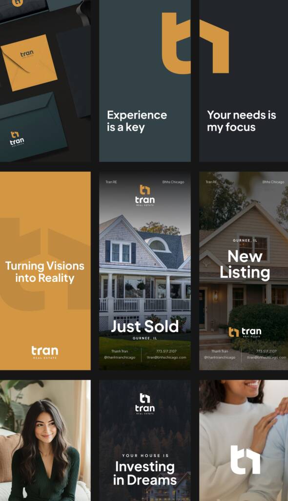
Social media design for a real estate company
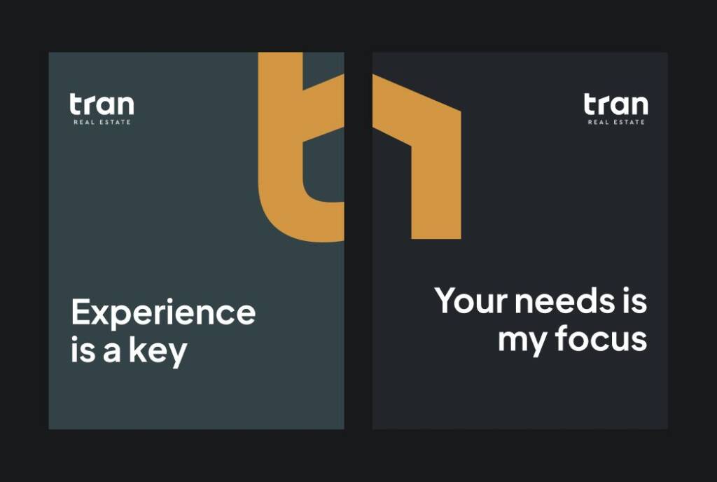
Starting the design process, I gathered elements from the brand guide. I liked how symmetrical the logo felt, and I wanted to use this trait throughout the social media design. I also remembered that the Golden Ochre color works as an accent and could become a recognizable element when used with the right visual weight among the posts.


I experimented with how the Golden Ochre color could be used — not simply as a plain background, but as a branded visual element within the overall social media grid. I chose compositions inspired by the logo placement, along with gradients and solid overlays for the photos.


Typography and imagery for social media design
When the plan is approved, I manage the content by breaking it into titles and subtitles using the correct typography sizing and layout.
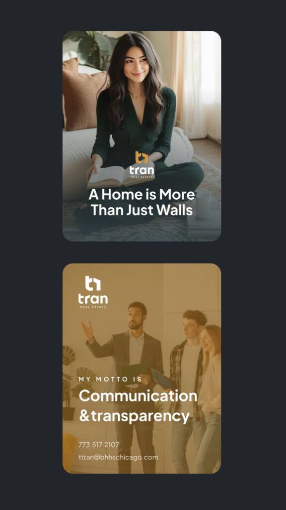
When the brand guide is ready, you can understand the mood and visual direction of the imagery. The brand feels cozy, friendly and homey — like an autumn evening with your family — which creates the right emotional atmosphere for real estate clients. Because of this, I used imagery focused on families and property.

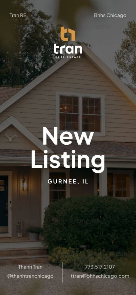
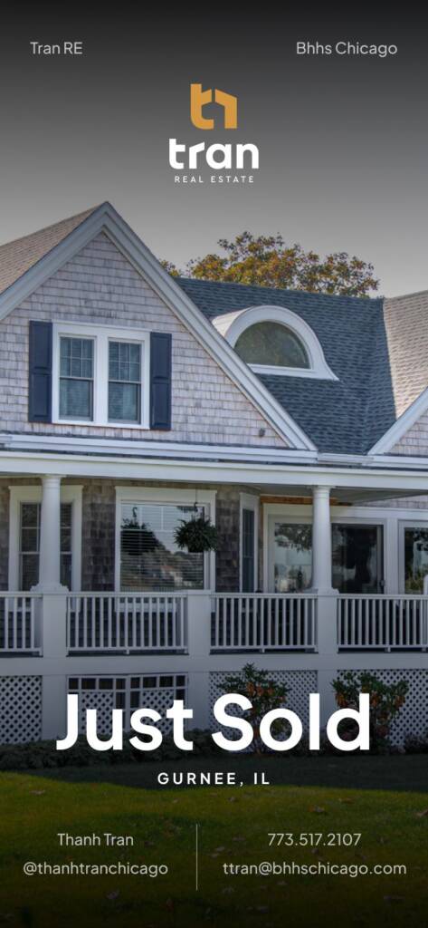
Also as a part of deliverable I made a templates for listing and sold properties.
In the end, the client received editable files for long-term use. All social media posts could be updated over time, since both the images and the text remained editable. This meant the client received not just one-time designs, but organized artboards with elements that could be moved, reused and adapted multiple times.
Read about the third project for this brand — it shows how I use branding elements in web design – Landing page design for Tran Real Estate