

Mr. Tran, a realtor, found me on Instagram, visited my website, and reached out via email. He was interested in collaborating and shared a bit about his plans for his company. I’m always happy to meet new clients, and when someone decides to make a big change and start a new journey, it’s an honor to be part of it.
Logo design process for a real estate company
I started the logo design with a quick questionnaire to understand the general direction. The questionnaire includes simple but very informative questions. Sometimes clients dive deep and write long, beautiful stories, and I really appreciate it. However, Mr. Tran was concise and answered everything clearly and to the point.
The client mentioned that he loves autumn motifs and structured logos. I also sensed his temperament — calm, consistent, and thoughtful. Since he launched a business under his own name, it was important for me to understand his personality as well.
I analyzed the word itself — how it sounds and what people feel when they say it. “Tran” is built on sharp, firm consonants, which give it a strong and confident tone. Bringing everything together — the client’s temperament, the word’s structure, and its pronunciation — I decided the direction should be bold and confident, balanced with soft, gentle outlines.
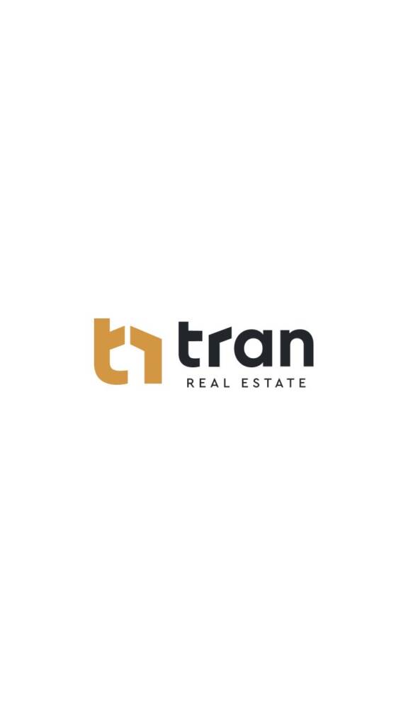
When analyzing the letterforms, I noticed that each character has a rounded shape. I saw this as an opportunity to introduce a soft touch, so I chose a bold, circular font. Then I noticed that the letter “r” could be refined with a sharper form, subtly resembling a house outline. This detail became the key idea and guided the next steps — to combine this roof-like shape with some another element.
I started exploring all possible combinations. During the exploration, I noticed that the short crossbar of the “t” could also be adjusted to resemble the second half of a house. Combining the “t” and “r” felt clever — not only because it created a thoughtful, cohesive symbol, but also because it highlights the first letters of the name, making the brand much easier to remember.
Looking for a clever typography-based logo? Check out this project – Waterline logo design and brand identity for a hydration med spa
Brand guide for a real estate company
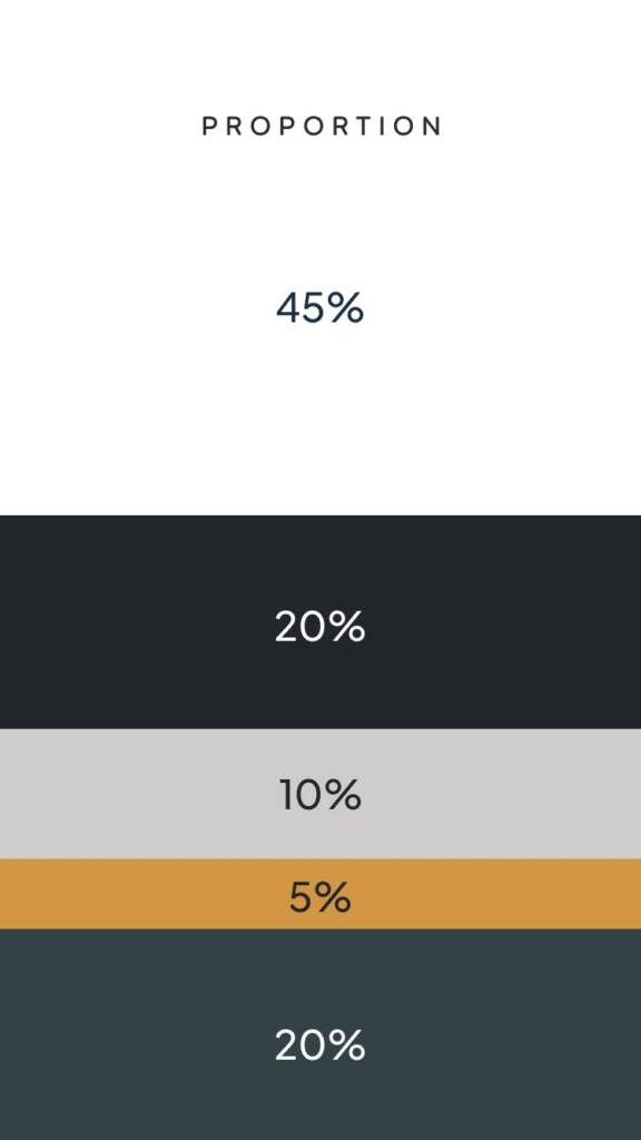
A brand guide is a document that defines how a brand looks, feels, and is used across all platforms. It includes both technical aspects — such as logo layouts, spacing rules, and typography — as well as the emotional side of the brand, like color schemes and visual direction. Mockups help visually demonstrate how to use color proportions and apply brand elements in real contexts.
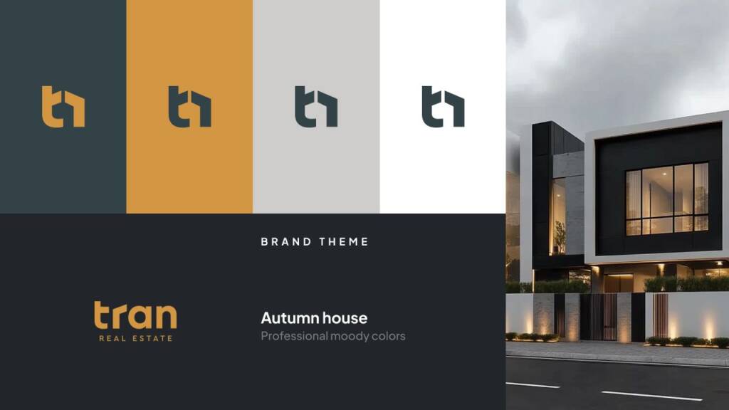
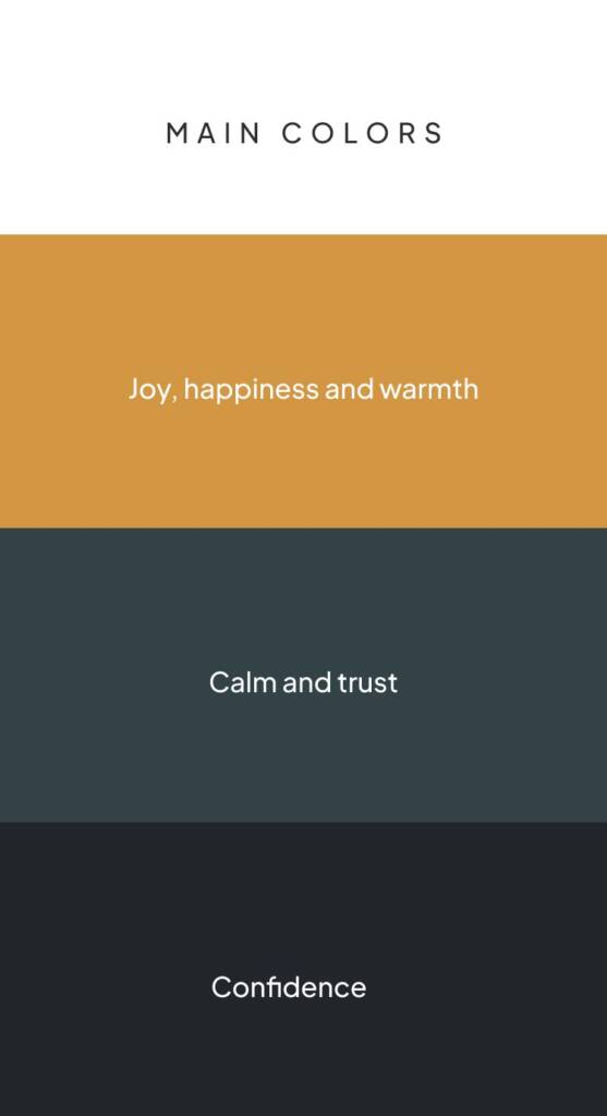
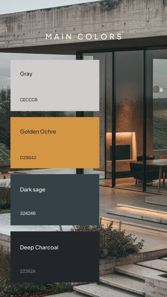
Brand color palette
After the logo was approved, I explored the color palette. Each color carries its own emotion, and together they form a distinctive emotional system for the brand. I aimed to create a confident identity with a touch of humanity — not overly corporate or rigid.
As requested, I developed an autumn-inspired direction with a golden ochre accent. Dark sage feels warm and natural, evoking calm and trust, while deep charcoal adds strength and confidence. Golden ochre brings a sense of joy and optimism — the emotions clients look for when working with a realtor.
Not sure which color palette to choose for your brand? This case will inspire you – Gift logo design and branding for a gifting company
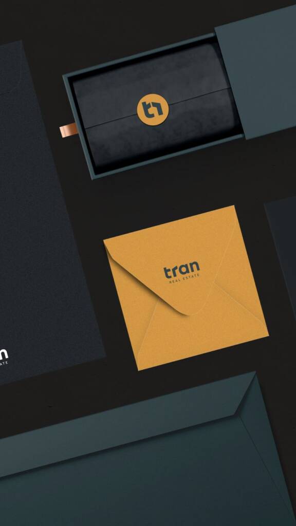
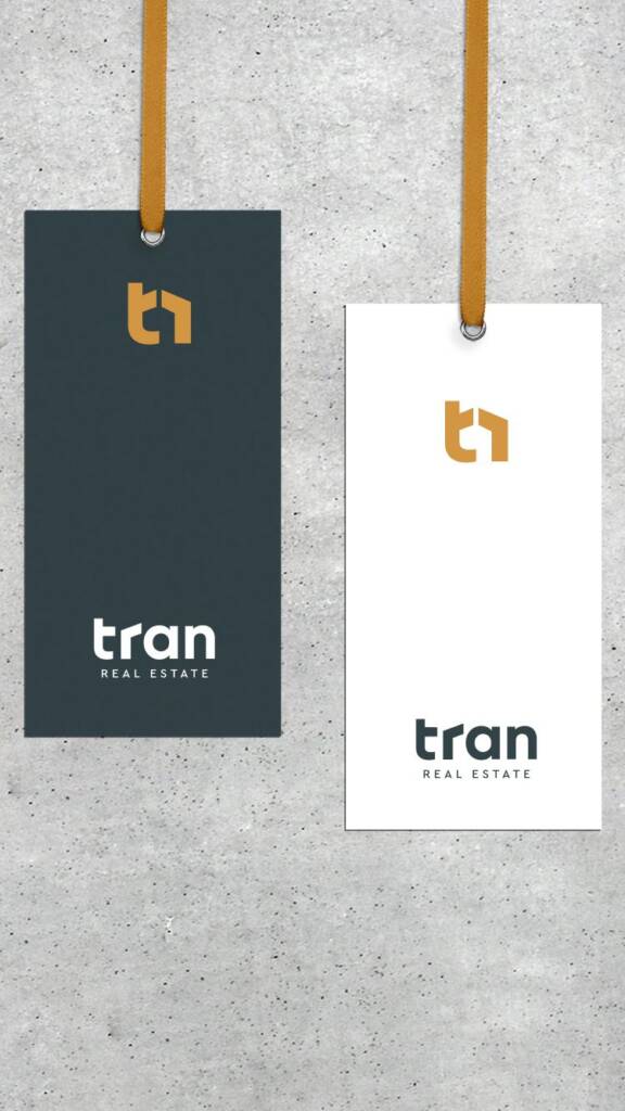
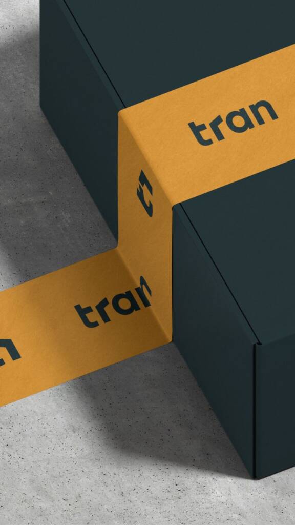
Brand layout and visualisation
When I confirmed with the client the color palette, I started to visualise the brand, following the consistence and proportion of the brand. To visualise, first I create an informatiove surrounding for the client, uning possible items that then the client will mnost likely use.
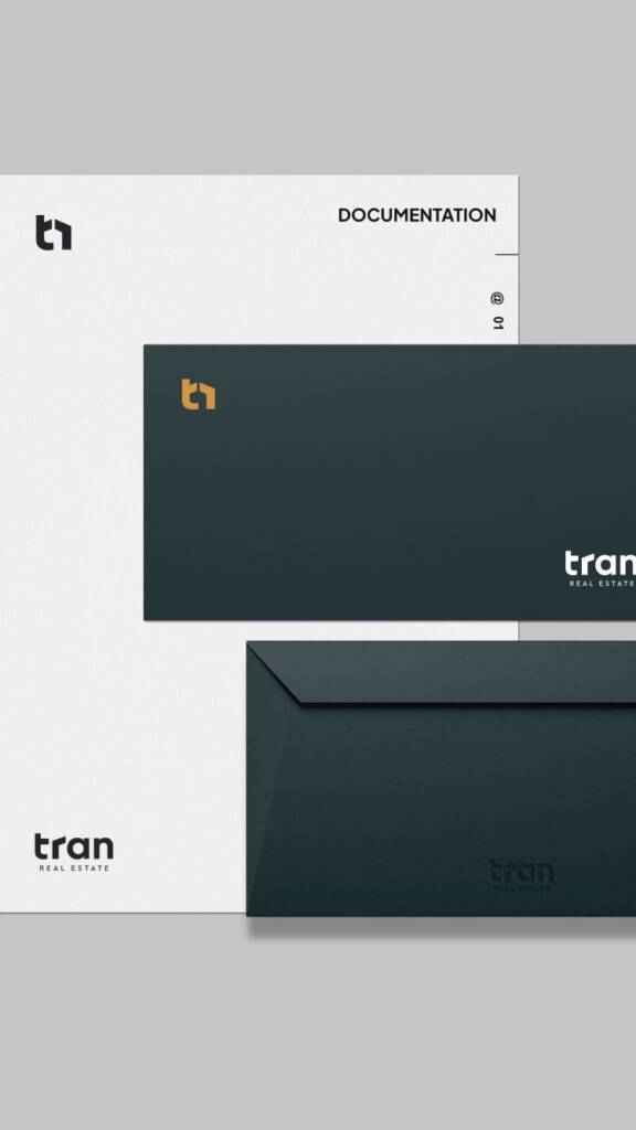
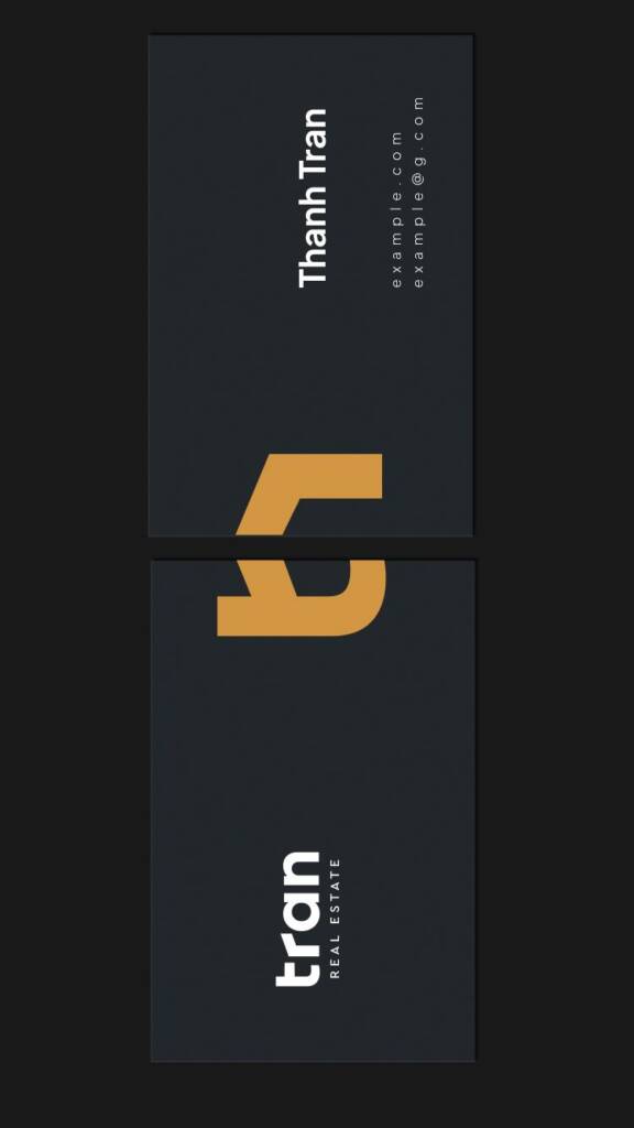
When a realtor meets clients, the first thing they need is a way to leave their contact details. These meetings often happen offline, where people interact in person, and business cards become the first point of brand communication. Then, the realtor needs to work with documentation — folders, letterheads, and envelopes — the essential items for daily use.
This selection helps me create meaningful visualizations, and it also helps the client understand what they need to establish a minimal brand presence.
Some great emotions to share:
When we completed the project, I received such kind feedback. For a designer, words like these are a reward in themselves — they motivate and reassure me that I’m on the right path.
You can review the next steps of working on this project:
– Social media project for a real estate company
– Landing page design for a real estate company