

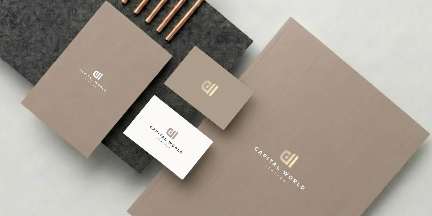

A client reached out to me via my Instagram page. They told me that they found me while scrolling through their feed. The client asked about my pricing and whether revisions were included. I kindly answered all their questions. You can check the pricing details here and learn more about revisions here. Then the client wondered how we would begin and how he could send the logo name and other details. I explained that once we start, I send a quick questionnaire with short yet important questions about his business. After that, we continued with the project.
Logo design development for a building company
When we started, the client showed me examples of the apartments and malls they develop. They also explained that the company specializes in development management and retail management, overseeing projects from early planning and concept development through execution and long-term operations. Capital World Limited focuses on creating commercially successful, well-structured spaces that align with investor goals, tenant performance, and user experience.
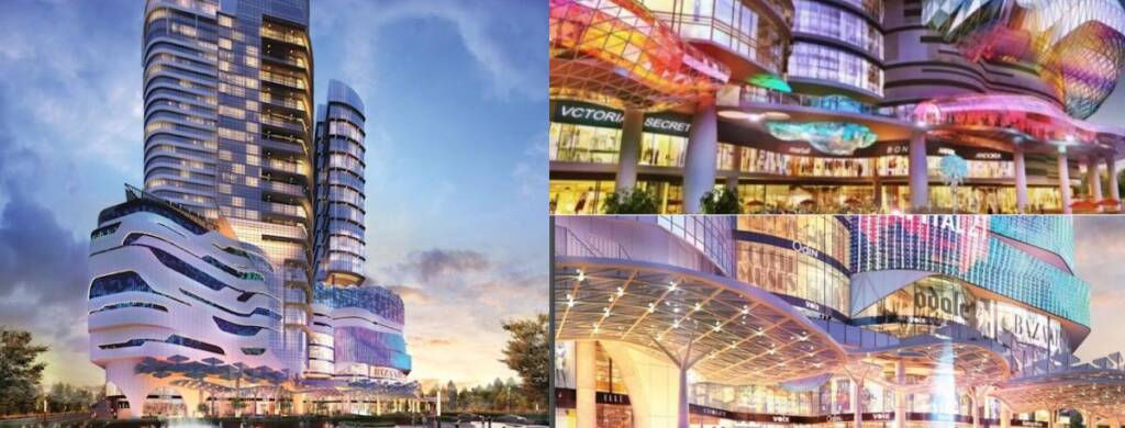
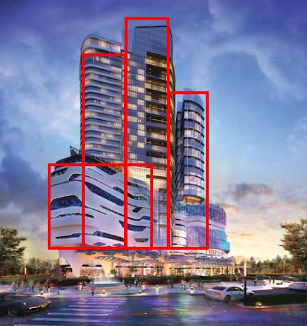
This vibe reminded me of something futuristic, large-scale, and shiny, and I had several versatile concepts in mind. Additionally, the building’s tall architecture inspired me to create something bold and geometric.
Logo options I developed for a building company
- The first option featured a circular shape associated with the word “World,” while the “W” lines conveyed growth and development. The overall look felt modern yet natural for the niche. The soft outline felt friendly and looked harmonious.
- The second option was a more business-like outline with a serious and majestic feel. The lines stood out more and resembled growing buildings.
- The third option developed the idea that the buildings had a futuristic character. The logo could be unusual for the real estate niche—more dynamic and distinctive. The symbol conveyed the letters “C” and “W,” both resembling movement and volume, much like the buildings the company developed. I also added an alternative possible style based on the appearance of the buildings—their futuristic and celebratory character. The logo resembled a rising star, symbolizing success, ambition, and growth. The three lines inside the “C” resembled buildings.
- The fourth idea featured a symbol that combined the letters “C” and “W.” The “W” lines grew upward to convey scale, growth, and development.
- The final option showed a symbol that combined the letters “C” and “W.” The “W” looked wild and dynamic, almost like a bird in motion, adding character and a sense of ambition.
The client liked option 4
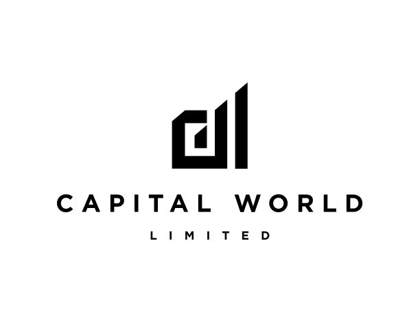
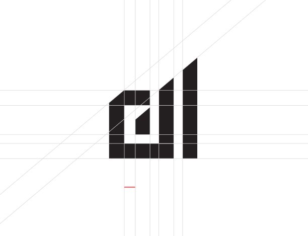
They sent some feedback and asked me to develop variations of this option.
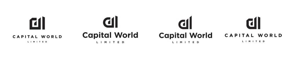
Finally, the client made their choice. He liked how the bold lines resembled buildings, creating the impression of a skyline.
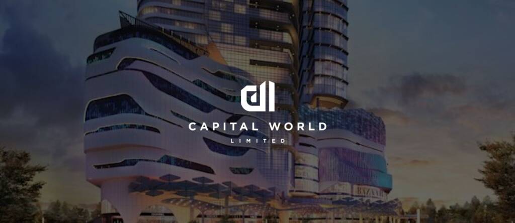
Love this style? Check the creative and bold logo I created for real estate brand – Real estate logo design and brand identity services
Color palette for a building company
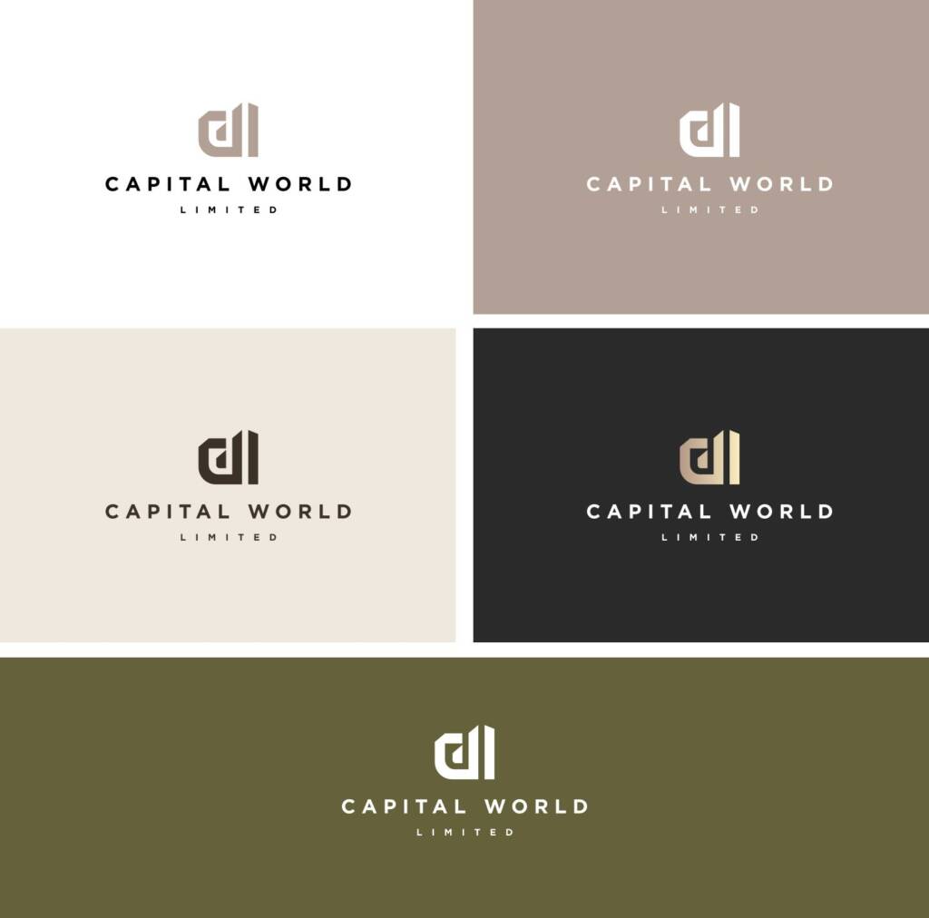
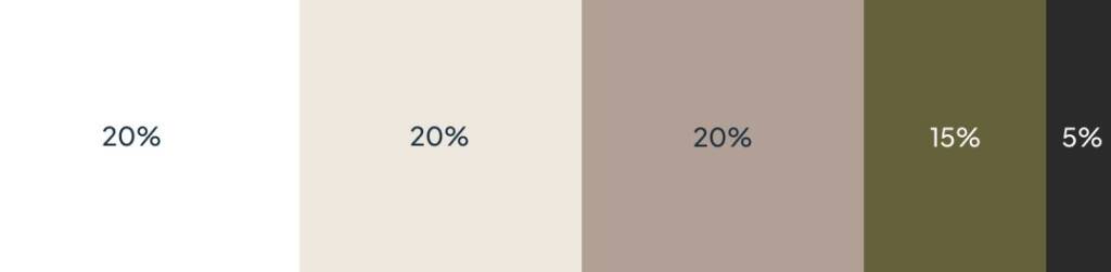
After some consideration, we arrived at the following color palette. The client liked how sophisticated and rich it felt.
Love colors? This brand I created has a similar color palette, but different personality – Logo design and branding for a decor company
Warm beige shades served as soft, muted neutrals inspired by natural stone. They brought a sense of stability, balance, and quiet elegance, creating a refined foundation for the brand without drawing attention to themselves.
Olive and dark green tones added a deep, grounded feel that conveyed confidence, maturity, and long-term value. They brought depth and character to the palette while maintaining a calm, composed presence.
Then we defined the color proportions and checked the readability of the colors.
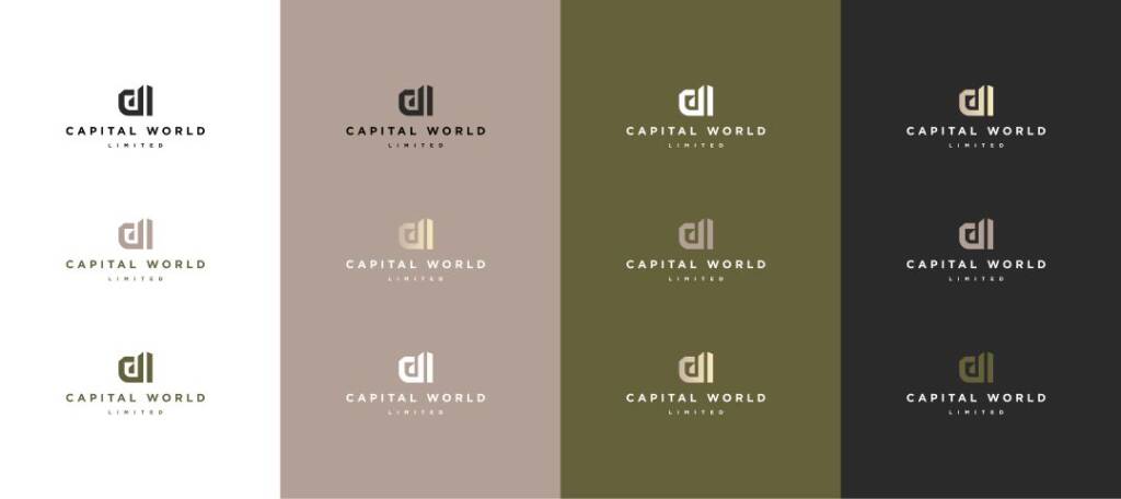
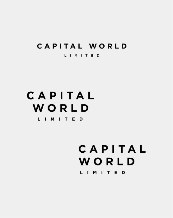
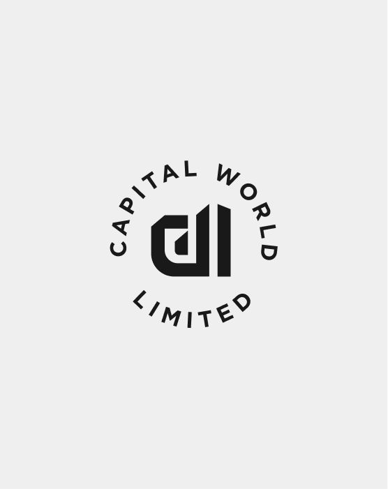
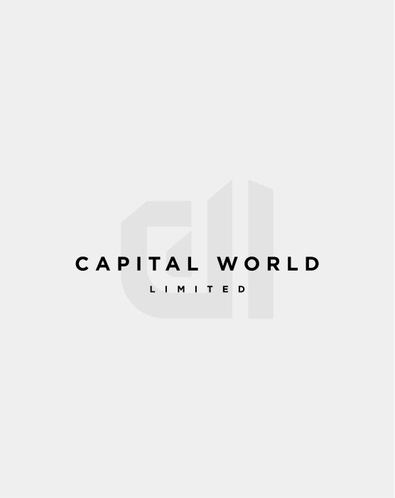
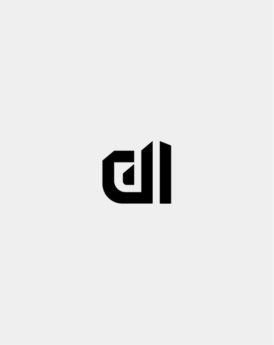
Logo layouts for the brand
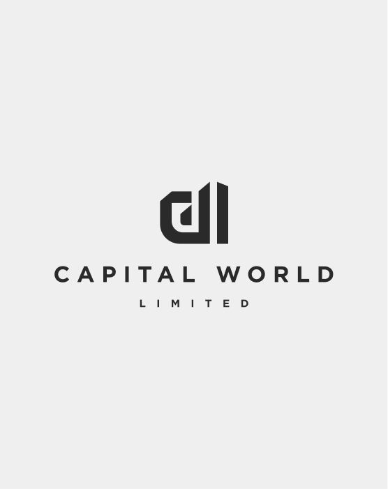
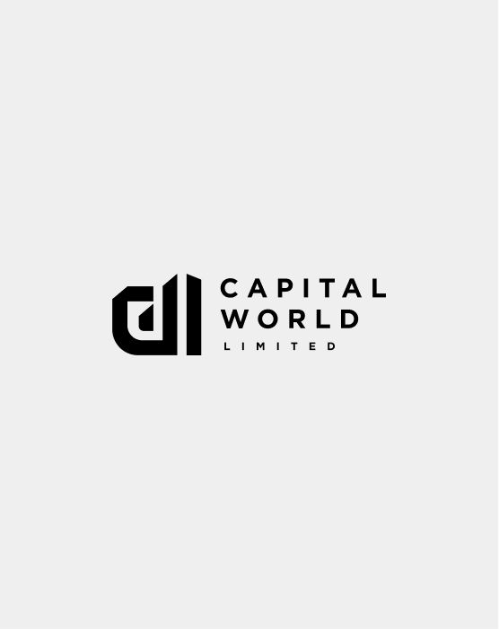
“Logo layout” means how the different elements of a logo are arranged in relation to each other. It’s needed because one logo arrangement doesn’t work equally well everywhere. A horizontal version might work well on a website header, while a stacked or symbol-only version might work better on social media, packaging, signage, or a favicon.
Brand graphic elements
To build distinctive brand elements, I analysed the logo itself, which had a bold, linear appearance. These lines were recognisable, so I used them to create a pattern that felt branded and cohesive.
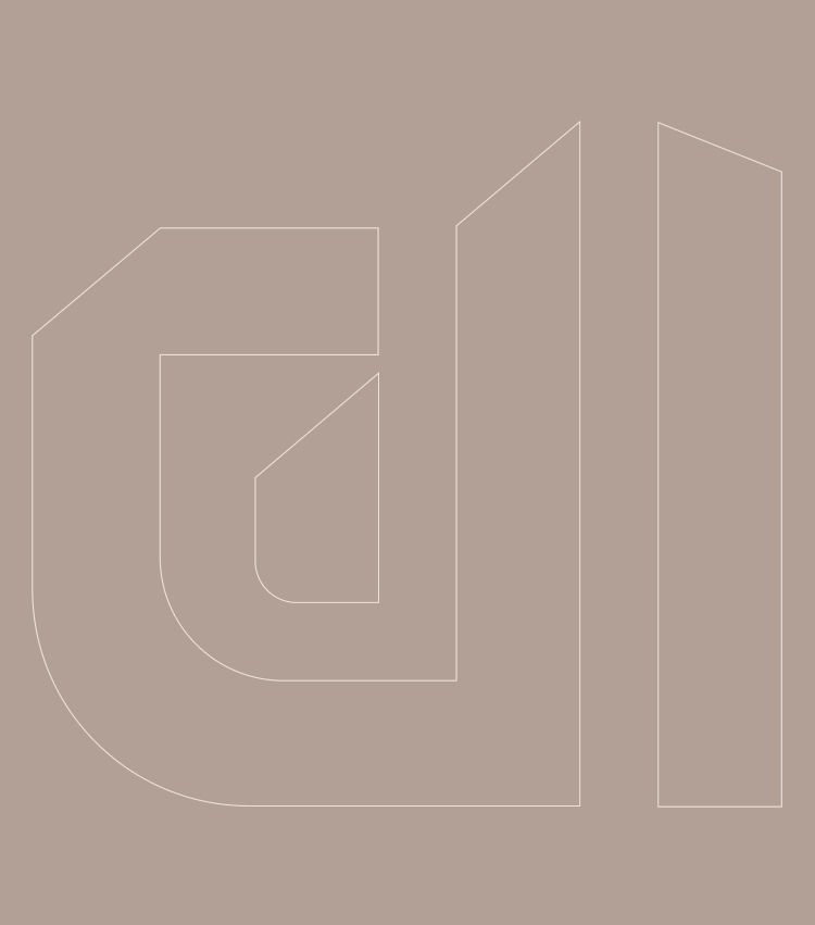
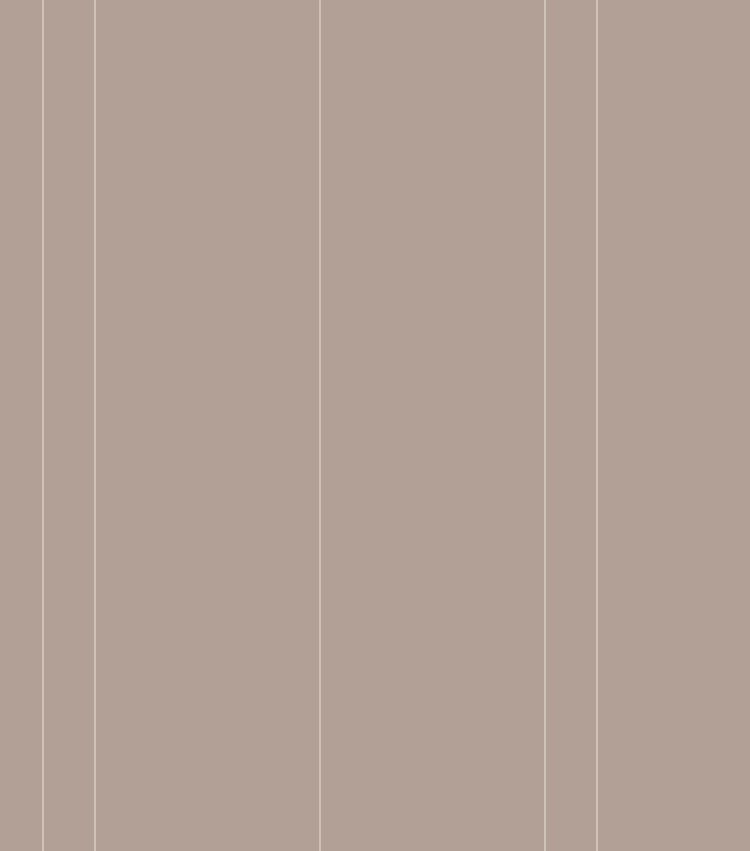
This brand I created also features distinctive brand elements – Ethnical brand guide design for a fashion brand
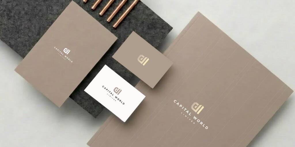
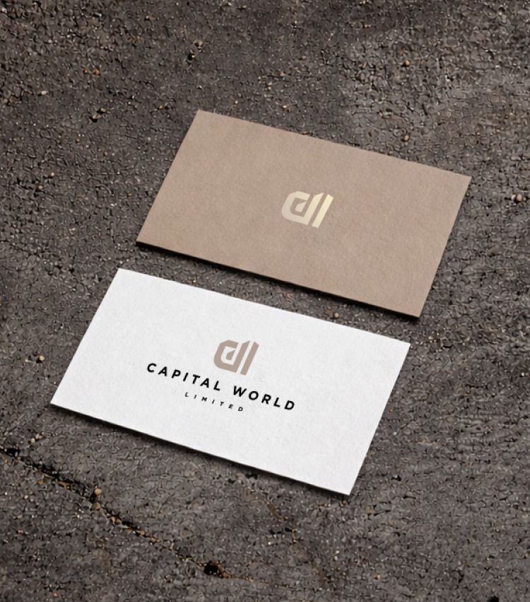
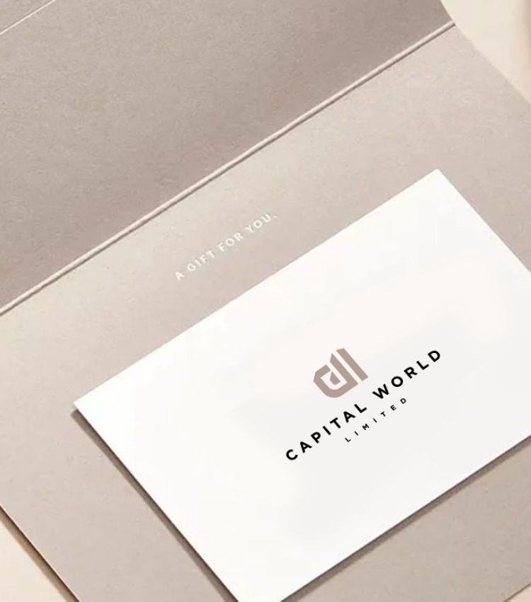
These lines worked well across branded stationery and other brand applications. They also inspired some interior design elements, such as wooden slats.
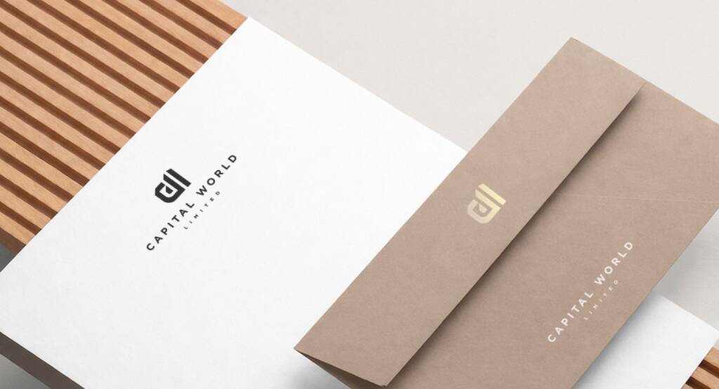
I also created other visuals to illustrate the color distribution across the brand.
Looking for real estate logo and branding? Check another brand I created – H monogram logo design for a real estate company
The client feedback
Thank you so much, Inna, for all your hard work! I really appreciate your timely responses and quick turnaround.
Capital World Limited
Owner