


I had the opportunity to work with Lifestyle Smiles, an established dental clinic looking to elevate its visual identity. The goal of this project was to create a brand identity that reflects the clinic’s values, reinforces its trusted reputation, and resonates with its patients.
The client reached out to me through a freelance platform to discuss the design process, pricing, and timeline. After our initial conversation, we scheduled a meeting where I had the pleasure of meeting the founder and the project manager, who was overseeing the branding project. It was a friendly conversation, and by the end of the meeting, we were all excited to move forward together.
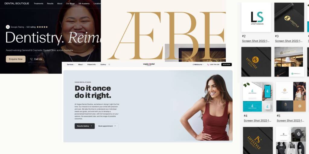
The client shared a mood board that included references to luxury brands, along with several logo concepts they had explored in the past. It was clear that they had already invested considerable time in searching for the right visual direction.
On one hand, this was encouraging because they had developed a clearer understanding of their preferences and the image they wanted to project. On the other hand, it also suggested that none of the previous concepts had truly captured the essence of their brand. That meant the responsibility was on me to discover a solution that felt authentic, distinctive, and ultimately the one.
Logo design development for a dental clinic
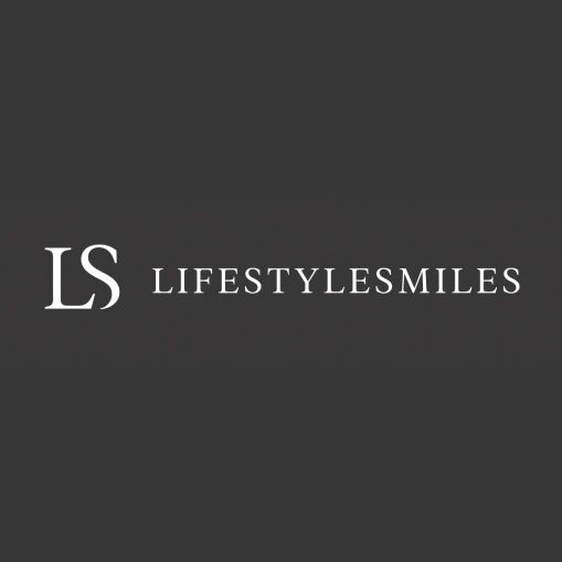
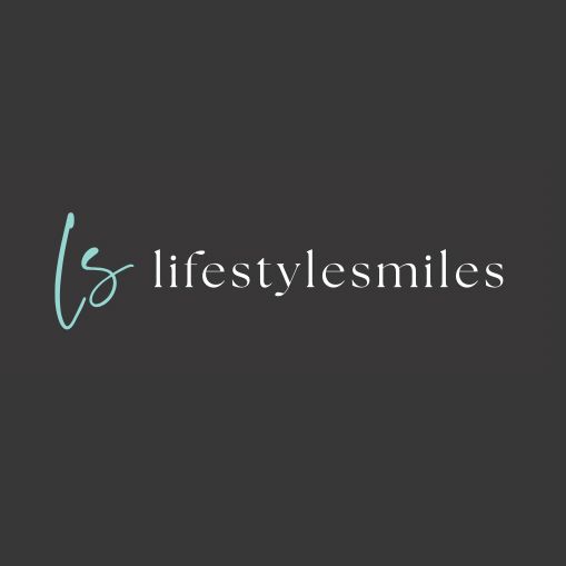
The client initially requested a logo based on the “LS“ monogram, so I began by exploring several directions for discussion. At this early stage, many aspects of the visual identity were still undefined. For example, it wasn’t yet clear whether they preferred classic or contemporary typography, condensed or extended letterforms, or serif versus sans-serif styles. To answer these questions, I intentionally created a variety of logo concepts rather than focusing on a single direction. This helped us identify their preferences and establish a solid foundation for the branding process.
Since the logo’s primary application would be on the website, we started by exploring horizontal logo layouts to ensure they would work naturally within the site’s header and provide the best user experience.
The client answered:
“
Hi Inna, hope you’re having a great weekend. I personally liked the original LS and option 1. The rest of the designs don’t look that much boutique and classy. We would appreciate to create something more classy.
Frankly speaking, feedback like this is quite broad and open to interpretation. It’s something I encounter frequently during the early stages of branding projects. On one hand, it suggested that the client hadn’t yet defined a clear visual direction. On the other hand, it gave me the creative freedom to experiment, explore different ideas, and move beyond the initial request in search of a stronger solution.
The client was also highly engaged throughout the process, regularly sharing references and examples of ideas they found interesting. This collaborative approach helped us refine the direction more efficiently and ultimately led to a more thoughtful and intentional brand identity.
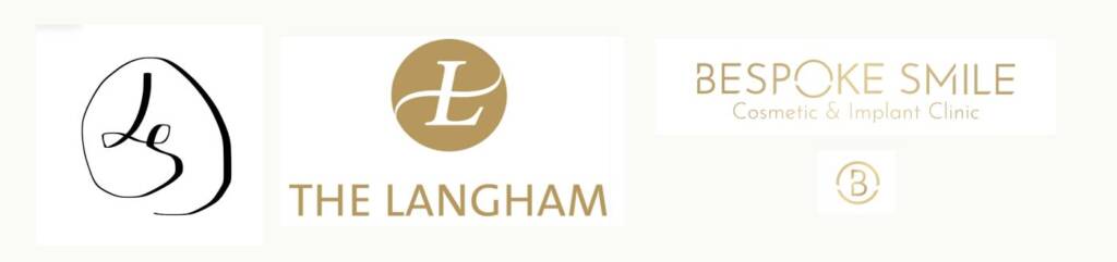
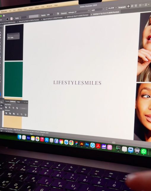
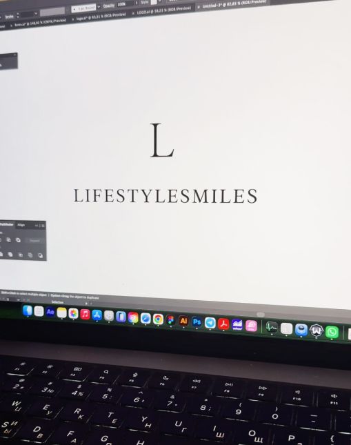
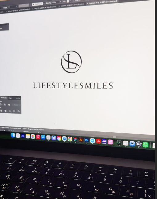
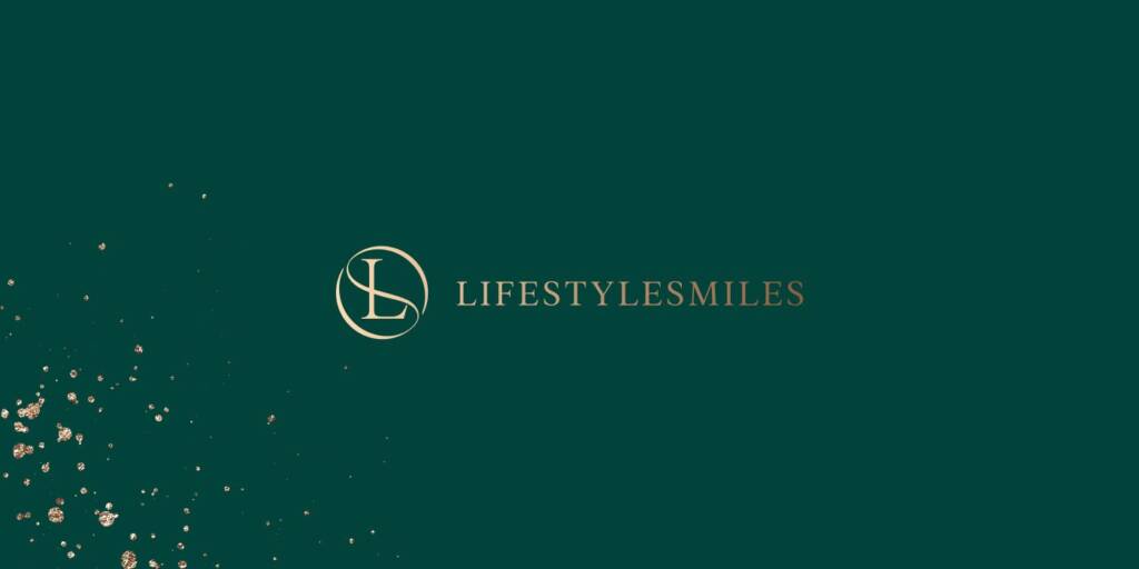
The client shared another collection of inspiration, including several logo concepts they had created themselves. From these references, it became clear that they were looking for a circular logo. With this direction in mind, I developed a new series of concepts, and one of them immediately stood out as the client’s favorite.
Looking for a dentist logo design? Check the brand I created for a dental clinic – CD logo design with a spark for Cornerstone Dental
“
Hi Inna, nice work! Out of all, we loved this option! Great job as we all liked it.
Color palette and brand elements for a dental clinic
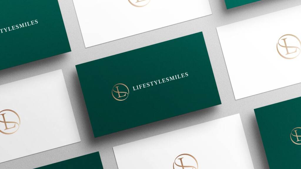
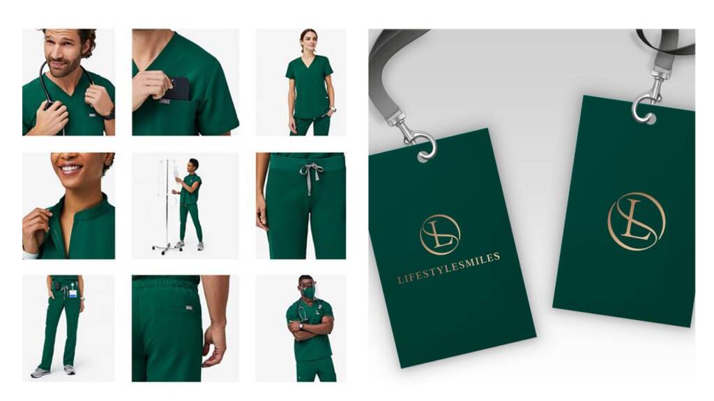
Initially, the client was drawn to a Tiffany blue color palette because it felt luxurious, sophisticated, and understated. However, after reviewing the concepts, they decided to switch to a deep green. The new color complemented the clinic’s uniforms beautifully while giving the brand a stronger and more distinctive presence. Green also has a natural association with health, care, and well-being, making it a more meaningful and appropriate choice for a dental clinic.
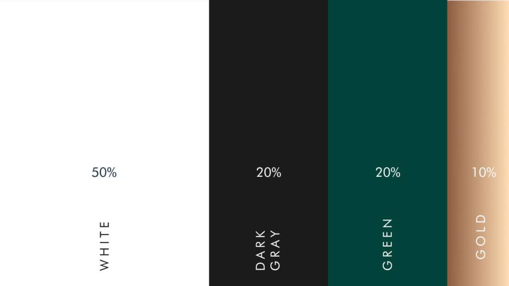
To reinforce the brand’s premium positioning, I introduced gold as an accent color. Gold conveys luxury, prestige, and exceptional quality, making it a natural complement to the identity.
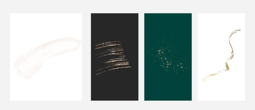
I also wanted to express the deeper meaning behind the name Lifestyle Smiles. A healthy, beautiful smile is a form of wealth – something as valuable and timeless as gold. Lifestyle is about the choices we make, the rhythm of our lives, and the way we choose to present ourselves to the world. To support this concept, I incorporated elegant gold details and subtle watercolor textures throughout the brand identity. These artistic elements symbolize the idea that life itself is a work of art, and each person is the author of their own story, choosing the very best for themselves—including their health and smile.
Appreciate golden vibe? Explore this brand I created for a pharmacy company – Mortar logo design and branding for a compounding pharmacy
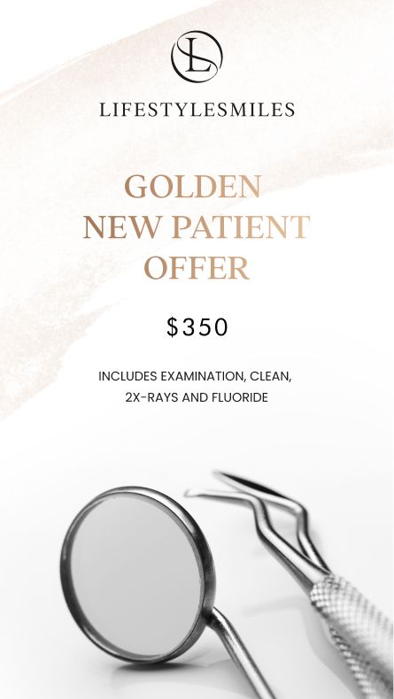
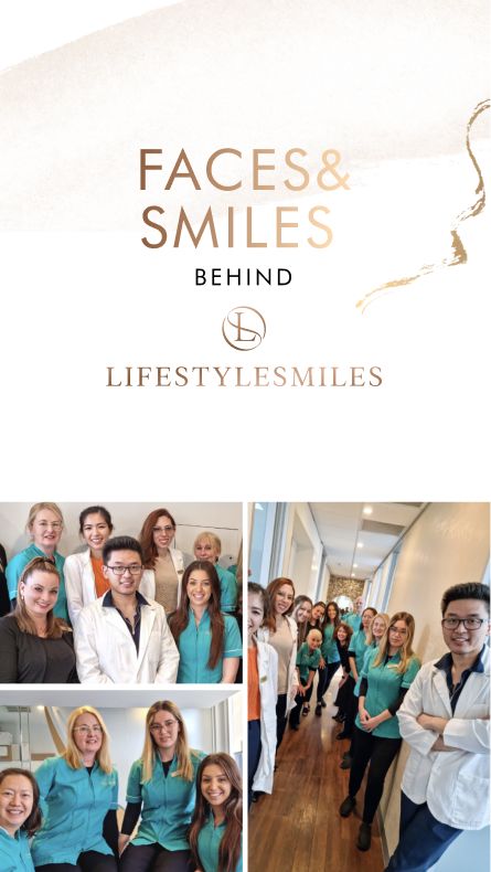
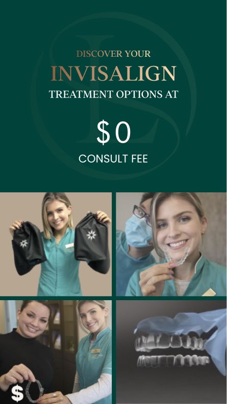
These elements work beautifully as accent graphics across the brand identity and promotional materials. Below, you can see how they come together with the color palette to create a cohesive visual system.
Love green colors? Explore this brand I created for a real estate company – Luxury and strong H monogram logo design
The client feedback
Thank you, Inna! It was a great experience. I highly recommend working with you!

Lifestylesmiles
Owner