

The client contacted me via email and shared that she was about to launch a luxury, science-backed anti-aging skincare line and needed a full brand identity — including a logo, color palette, typography, and graphic elements. She also asked whether I work on projects like this and wanted to understand how to structure the process, as several design items were involved.
After our discussion, we defined a clear plan:
Logo and brand guide — to focus on the brand’s appearance, voice, and overall communication. This stage helps define the direction and core graphic elements.
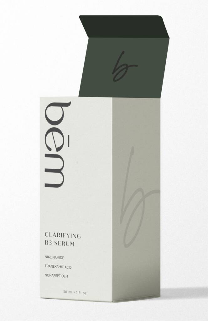
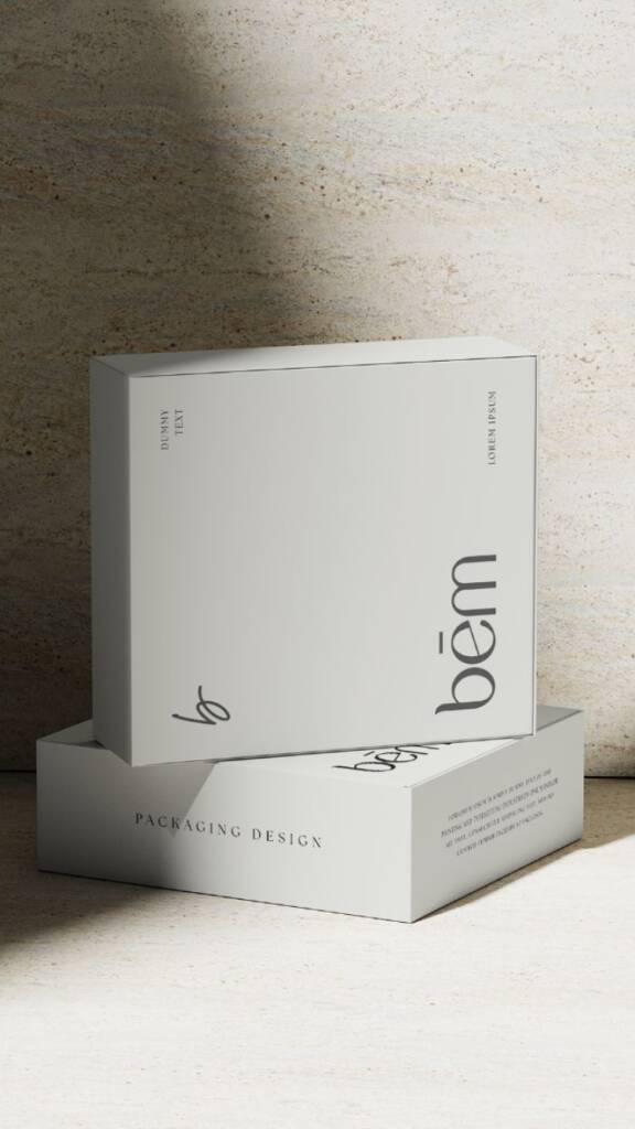
Box design — a ready-to-use application of the brand. On this stage we would concentrate on the details: content, brand layout and design structure.
Web design – to build a general web layout and imagery.
Logo design process
Letterform composition
At the start of the design process, I explored the letterforms in depth. The name had only three letters — bém — and I knew it would become a defining feature of the logo, as its pronunciation and structure already felt complete and distinctive, even without any design.
If you say the word “bém” aloud, it sounds soft and pleasant, which suggested that the direction should be smooth and calm. Also, when you look closely at each letter, they have a rounded appearance in lowercase, which further suggested focusing on a lowercase wordmark.
The examples above show different outlines I had in mind — you can see how each letter complements the others, while still expressing a distinct style: organic, bohemian, or bold. These explorations helped reveal the possible directions for the typeface.
Love lettermarks? You’ll love this project – Bold, clever logo and brand guide for a hydration med spa
Finally, the client and I refined several structures and agreed on the appearance below:
Symbol design for a cosmetics company
In parallel, I explored different symbol options. Some symbols were created from the wordmark as an alternative representation. However, the client was drawn to a subtle, sophisticated handmade mark as a supporting logo for smaller sizes.
Brand guide for a cosmetics company
Color palette definition
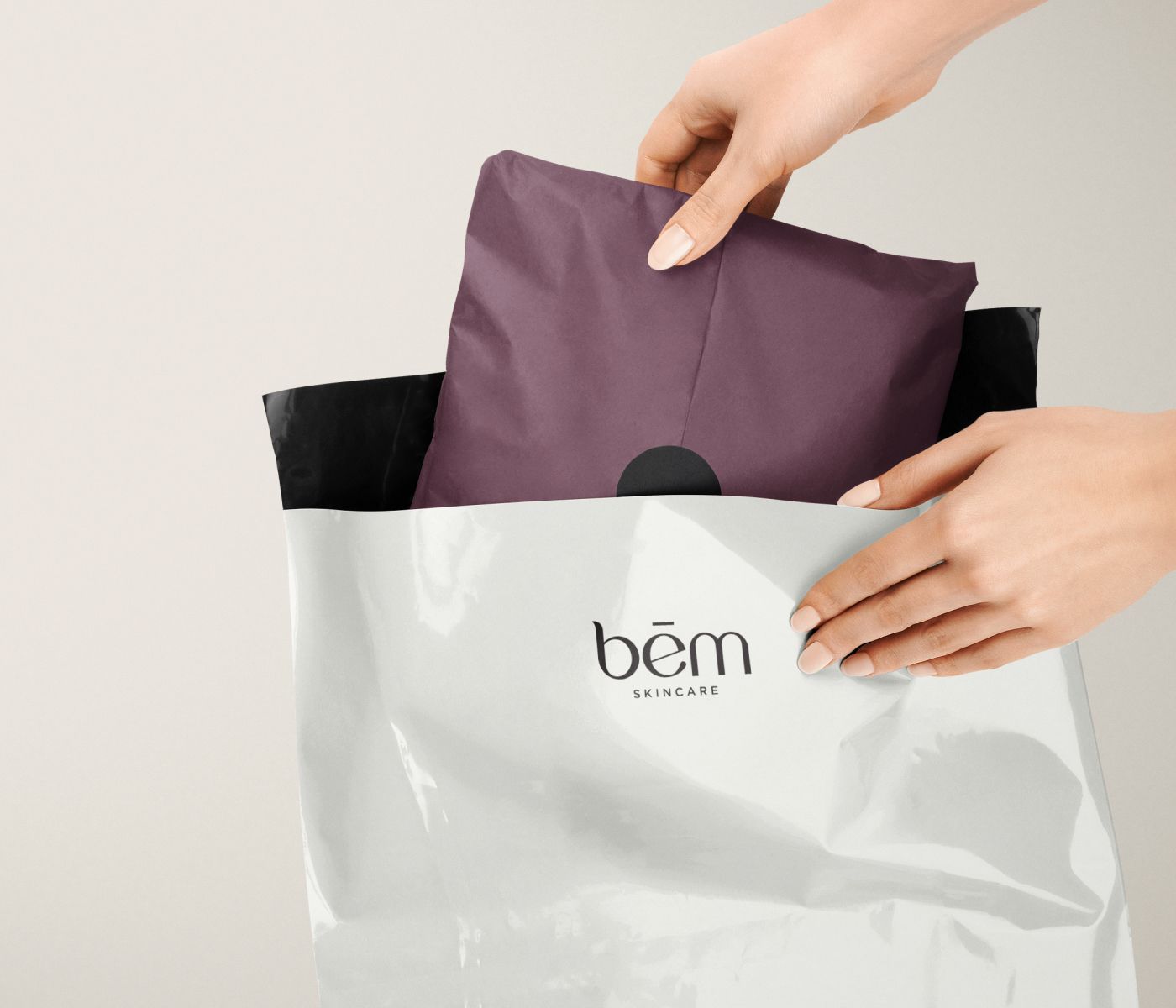
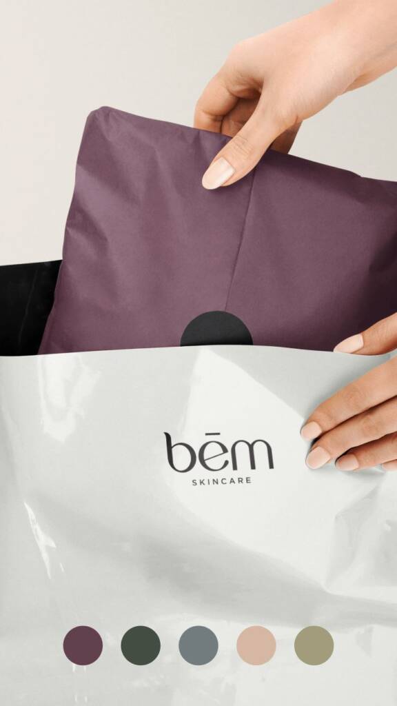
When I came to the brand guide stage, I kept in mind that the next step would be packaging creation. Packaging design has multiple directions, for example minimalism, where a brand uses small lettering and a lot of white space, or vice versa, more colorful designs. I aimed to add accents and keep the brand simple, but not sterile. Thus, in this case, the packaging design direction guided us in building the entire brand.
Do you like bold, authoritative colors? Check out this project – Logo and brand guide for a building company
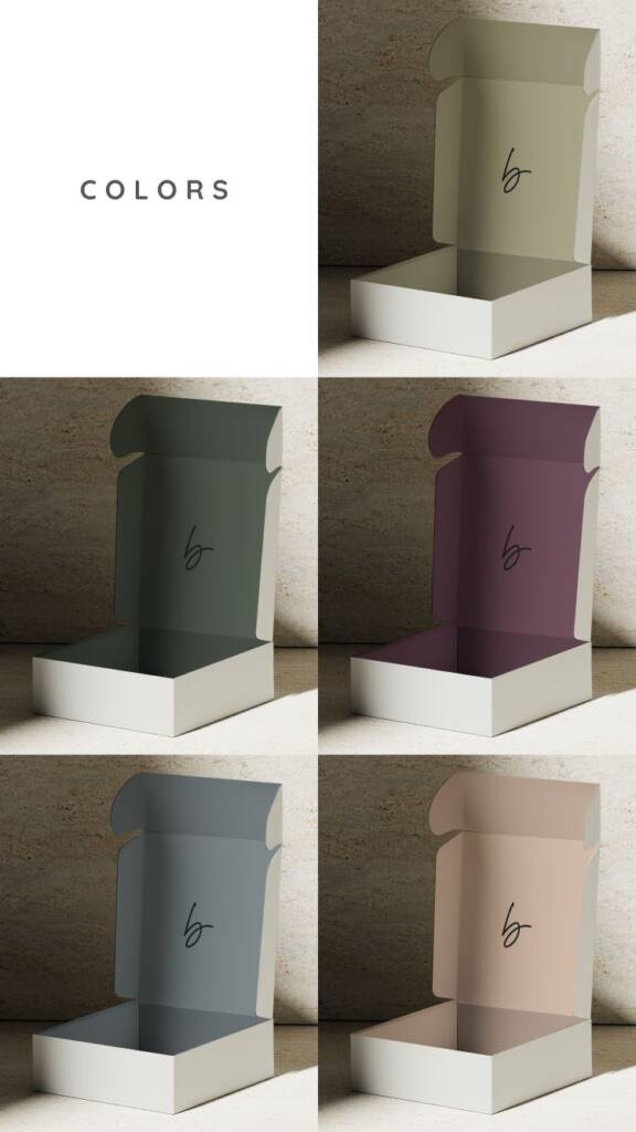
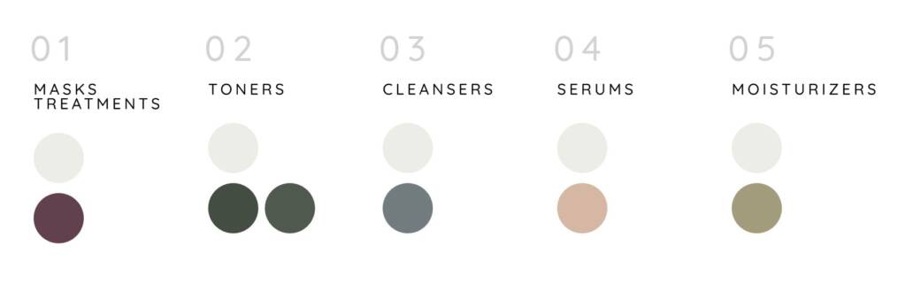
Color-coding brand method
Color coding is a method in which different product ranges are assigned their own colors to organize variations such as scents, formulas, categories, or collections in a way that is instantly recognizable. It emerged when brands expanded their product lines and needed a clear way to differentiate items while maintaining a consistent identity.
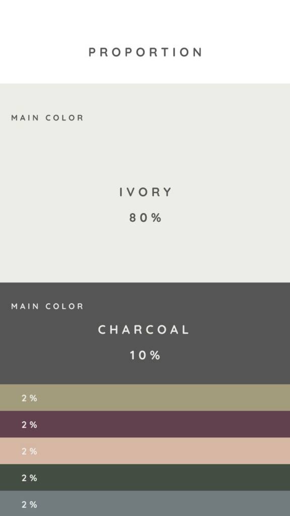
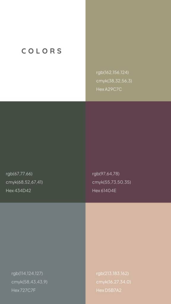
Additionally, when I prepare colors, I always specify RGB, Pantone, and CMYK formats, as they are essential for different use cases—print and web.
The product has multiply scents and we chose the colors for each
You can review the next steps of this project:
– Packaging and label designs for a cosmetics company
– Clean and refined web design for a cosmetics company