

The client started building their social media presence and later decided to move forward with a landing page design. For a kitchen design studio, a landing page can be important because the service is highly visual, expensive, and trust-based. Clients rarely make decisions based on a logo alone—they want to see expertise, style, and real results.
Check out the logo design and brand guide project of this brand – Elegant and timeless logo design and brand identity for a kitchen interior studio
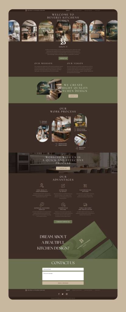
Landing page design process for a kitchen design studio
Landing page design is the creation of a single web page that presents business, service, or product in a clear and focused way. It guides the visitor toward a specific action—such as contacting you or using your service. Clients need a landing page to establish a digital presence, communicate their value clearly, and convert visitors into clients. It doesn’t cost much but can bring results, especially when shared on social media and other business platforms.
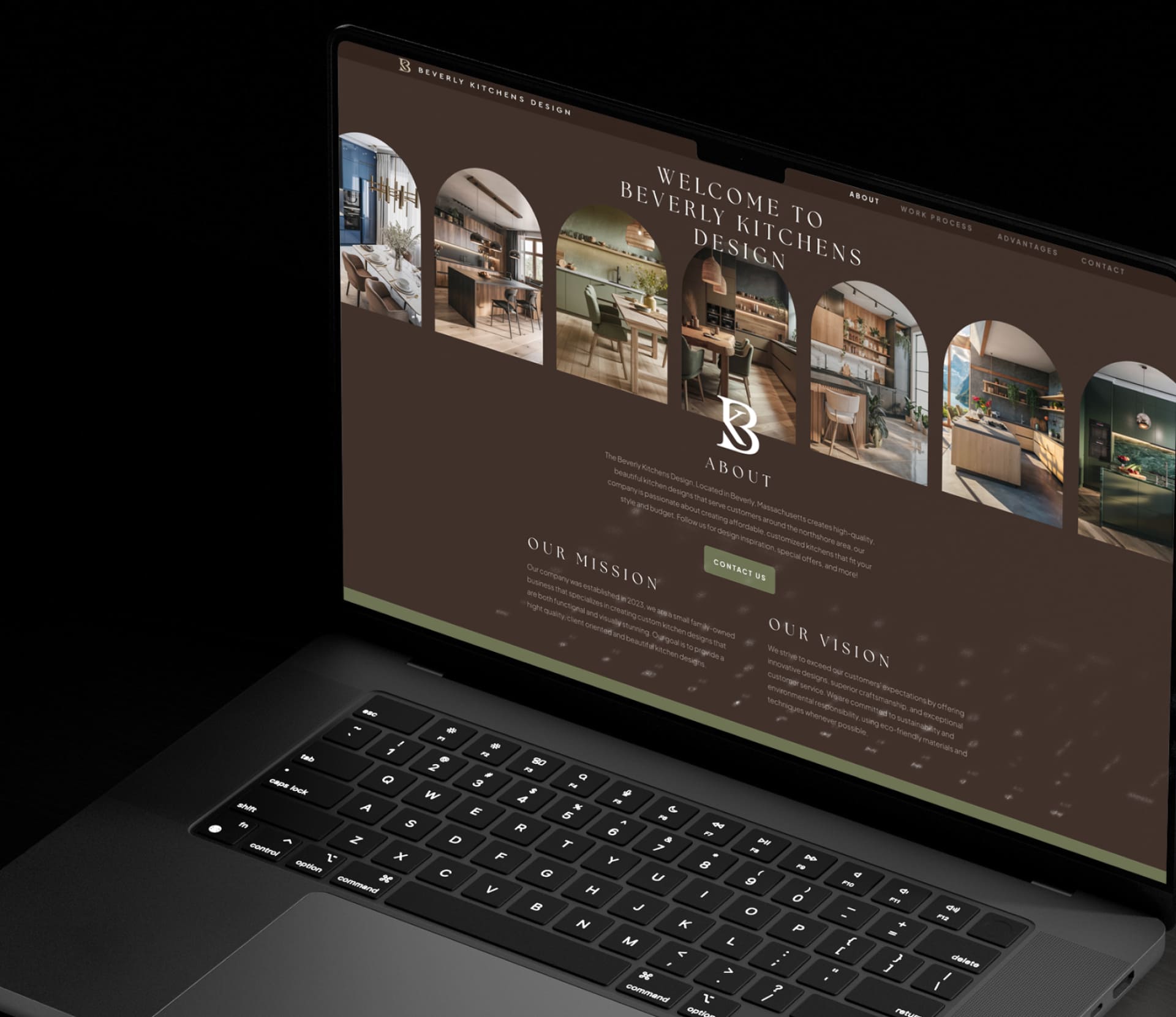
When creating web design, it’s important to understand layout and user behavior. Traditionally, I started with the header.
Web header design
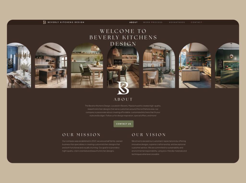
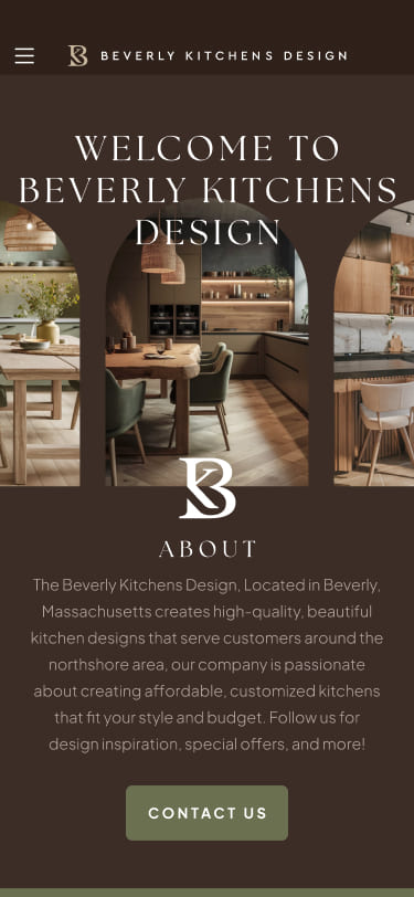
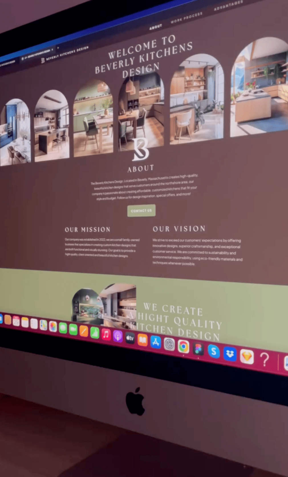
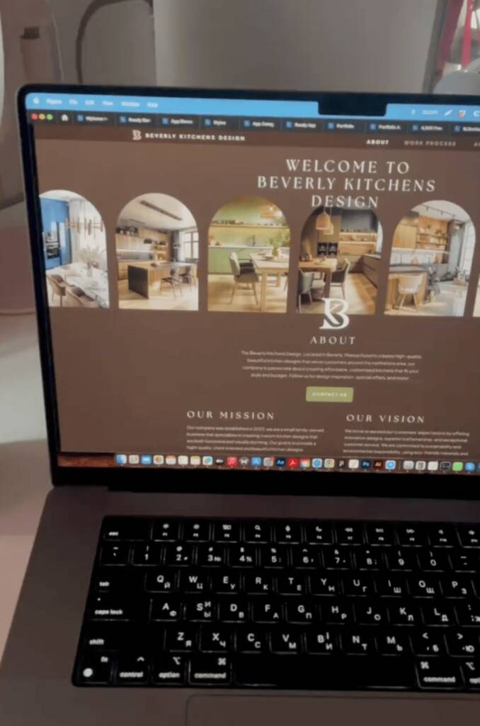
Header is the top section of a website that users see first. It usually includes the logo, navigation menu, and a call-to-action. It sets the first impression and helps users understand where they are and how to navigate. I created the header aligned with the brand guide, adding a touch of vintage and boho style.
The header of the interior design studio features a welcoming message that creates a warm and inviting first impression. It also includes a gallery showcasing kitchen designs that reflect the studio’s expertise and design direction. The gallery images are displayed within arched frames inspired by the brand style. This architectural detail subtly evokes the feeling of stepping into a thoughtfully designed interior space, creating a stronger connection between the website experience and the environments the studio creates.
Below the gallery, I placed an About section that provides an overall studio description and includes a call to action. This section gives visitors a quick introduction to the studio before they continue exploring the website.
Our vision, our mission design block
Our vision and mission are included to communicate the brand’s purpose and direction. They help build trust and show what the business stands for. It also engages emotionally.
Check out the social media design project of this brand – Solid and boho social media design for Kitchen interior studio
Our process
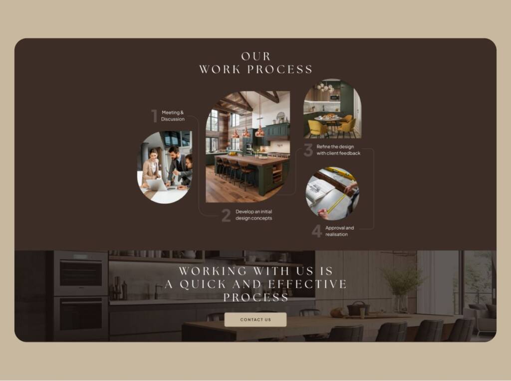
Our process section shows the steps behind working with the client. It helps reduce uncertainty and makes the business more transparent. Since there are several steps, I added subtle design variations to keep the layout engaging.
Below the “Our Process” section, I placed an insert block that includes an interior design image, a motivational message, and a call-to-action button. The purpose of this block is to maintain visual interest throughout the page and provide additional opportunities for visitors to access the order button at key points of the website.
Our advantages
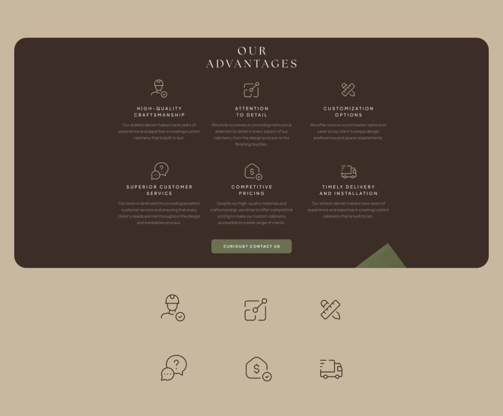
The advantages section highlights the benefits a client receives when working with the business. It provides more details and helps visitors identify key reasons to choose this service. It also shows care for clients and a commitment to meeting their needs and building loyalty.
This type of section requires branded icons. Sometimes these icons take additional time, as they may need to be customized and further elaborated to match the content and purpose of each individual block.
Footer section
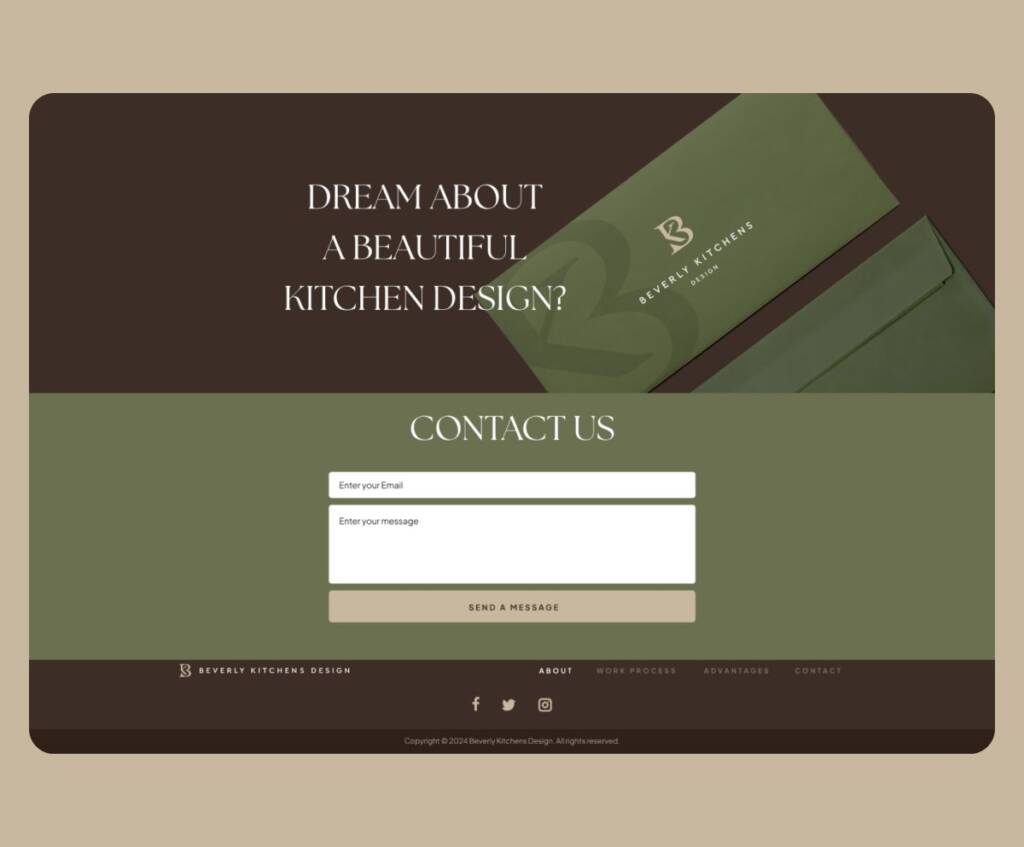
And the final, important section is the footer. It provides a contact form to connect, social media links to reinforce the brand’s presence, and some engaging text for emotional impact.
The design is responsive and adapts to mobile, tablet, and desktop layouts.
You may also like to check out the web design for the Helios interior brand – Modern home page design for an interior design studio