

The client approached me on Instagram. They launched a new interior business and looked for a strong, bold logo that evokes trust and professionalism. The client didn’t provide much information, just told that the name “Beverly Kitchen” comes from their location in Beverly, Massachusetts.
Logo design process for a kitchens design studio
Logo style
When choosing a style direction, I have three things to analyze — industry, lettering, and client suggestions. In this case, I had freedom, but I still needed a thoughtful argument for my design. The first thing that came to my eye was the long name, Beverly Kitchens. It didn’t have any objects behind it — no physical item, story, or association — so the first obvious idea was to create a combination of the “B” and “K” letters.
Logo industry
The industry is interior design, and it has a general outline. Interior designers create drawings, which means straight, solid lines, sharp edges, and a kind of mechanical aesthetic. It may also include interconnections and a grid-like structure. I began by developing general concepts. Keeping technical specifics and client information in mind, I also understood that it is a personal brand, and the owner is a woman, so she might prefer some feminine and elegant designs.
Logo ideas for a kitchens design studio to present
You can see variations of a script symbol, geometric and linear forms. They were created to explore logo ideas from different perspectives. It allows me as a designer to understand the client faster — and helps the client better understand themselves and what they want.
The client immediately liked option 2 and requested to elaborate it and show options of a single concept.
As a result, the client made her choice during the second iteration.
Like earthy tones? Check this brand – Real estate logo design and brand identity services
Brand guide design for a kitchens design studio
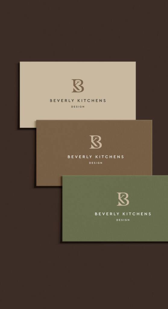
Brand color palette
During the process, I identified the color direction. It’s important as it helps to understand the voice of the brand, it’s rhythm and character. After some exploration the client liked strong shades like rich wood tones and deep natural hues. Brown shades evoke warmth, stability, and a sense of grounded, natural quality, while moss green adds freshness and a connection to nature.
Like the colors? Here’s another brand with similar colors but completely different personality – NGS lettermark and brand identity for an educational beauty company
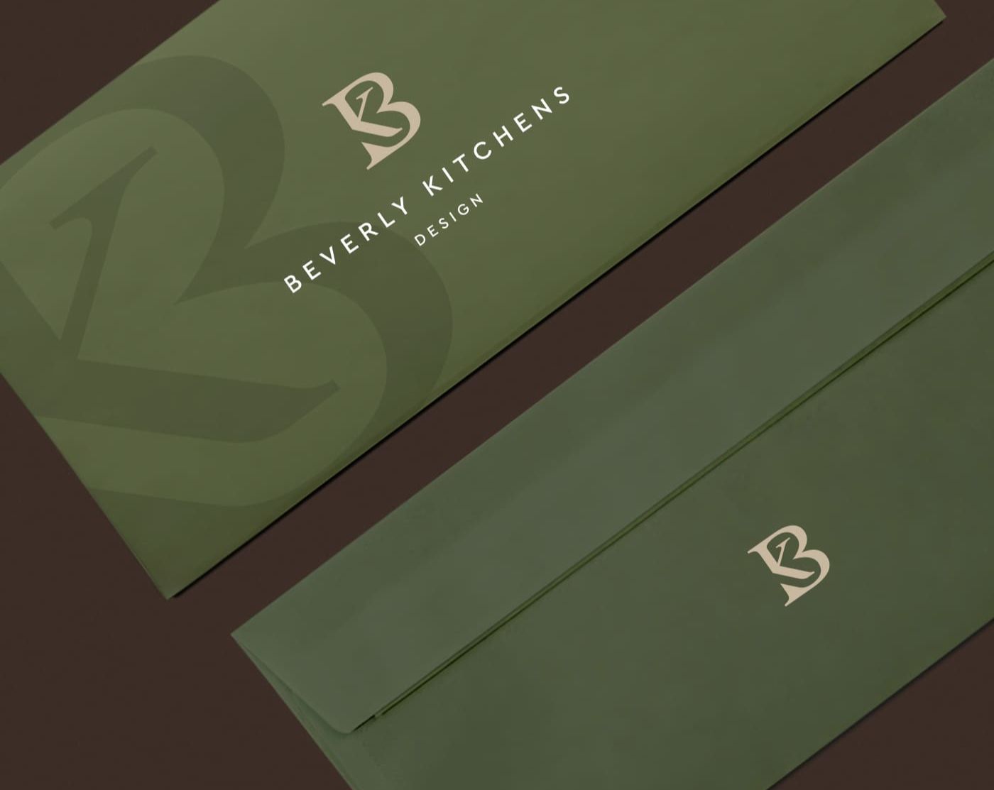
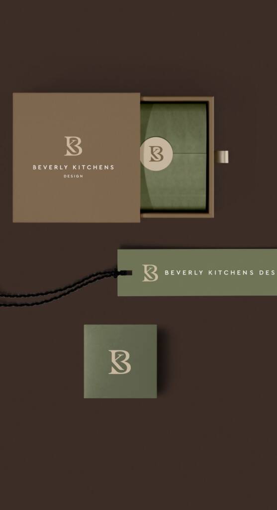
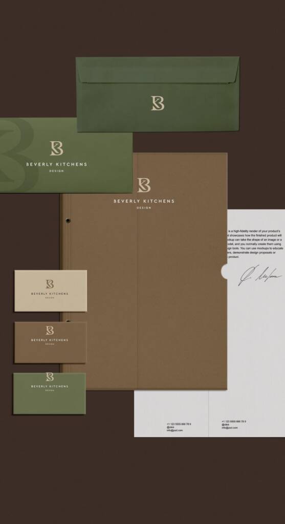
Brand mockups
When the colors were approved, I developed the visual identity by creating mockups. A mockup is a realistic visual representation of how the design appears in real-life use. It helps visualize how the brand works across different touchpoints—such as packaging, stationery, and digital platforms—and ensures consistency and clarity before final implementation.
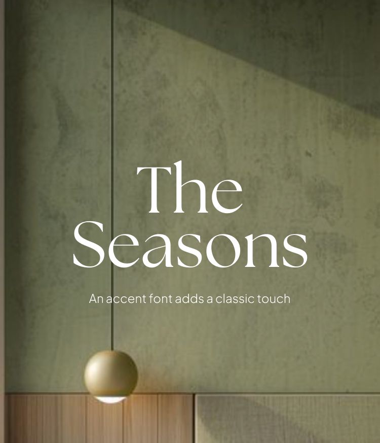
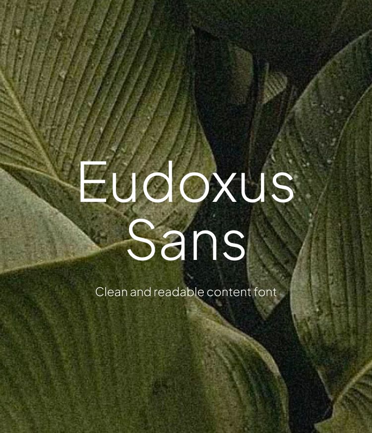
Brand Typography
Typography defines how a brand communicates. It shapes the tone, creates hierarchy, and makes content easier to read and understand. The right typography strengthens the brand identity and makes it recognizable across different platforms.
Logo layouts
Logo layout is the structured arrangement of elements—such as the symbol, typography, and spacing—that ensures clarity and balance. It is adapted for different uses, including social media, horizontal formats, and vertical layouts etc.
Check out other projects of this brand:
– Solid and boho social media design for Kitchen interior studio
– Landing page design for a kitchen design studio