

This client found me via Instagram, visited my website, and then reached out by email. She clearly explained her ideas and shared a document with references. She listed logos she liked and added comments next to each one — which created a very strong starting point.
Logo creation process for an interior designer
I explored different approaches for this logo, imagining how the brand should feel if it were connected to Greek culture. I had several ideas to start with:
– An arch approach inspired by Greek architecture
– An abstract sun concept
– Linear compositions
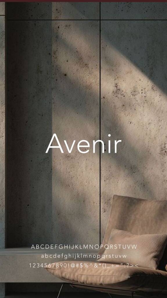
For the typeface, I wanted to convey a sense of tradition and family values, so I leaned toward serif fonts with smooth lines. The client liked the option where I represented the letter “H” using negative space. The symbol itself resembled a Greek pattern, and its circular shape symbolized the sun.
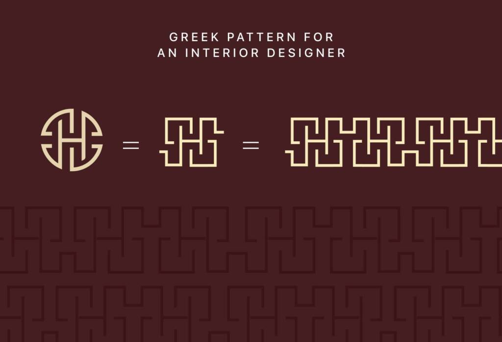
You can see below how I explored Greek patterns — I tried to mimic their line directions and overall feel. I wanted to make it angular while preserving a circular shape, to keep the logo softer, like the sun.
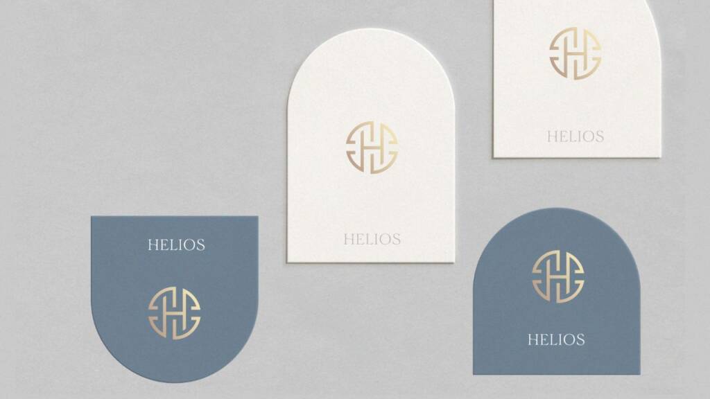
In the example below, you can see the initial logo option I presented at the beginning of the process. The client liked this approach; however, the main concern was that the “H” wasn’t clearly visible enough. She also wanted to explore other possible directions within this style.
I went through several iterations, creating about 10 variations of this symbol, and the client ultimately approved this logo.
This symbol also includes letters in a unique, clever way — check it out NGS lettermark and brand identity for an educational beauty company
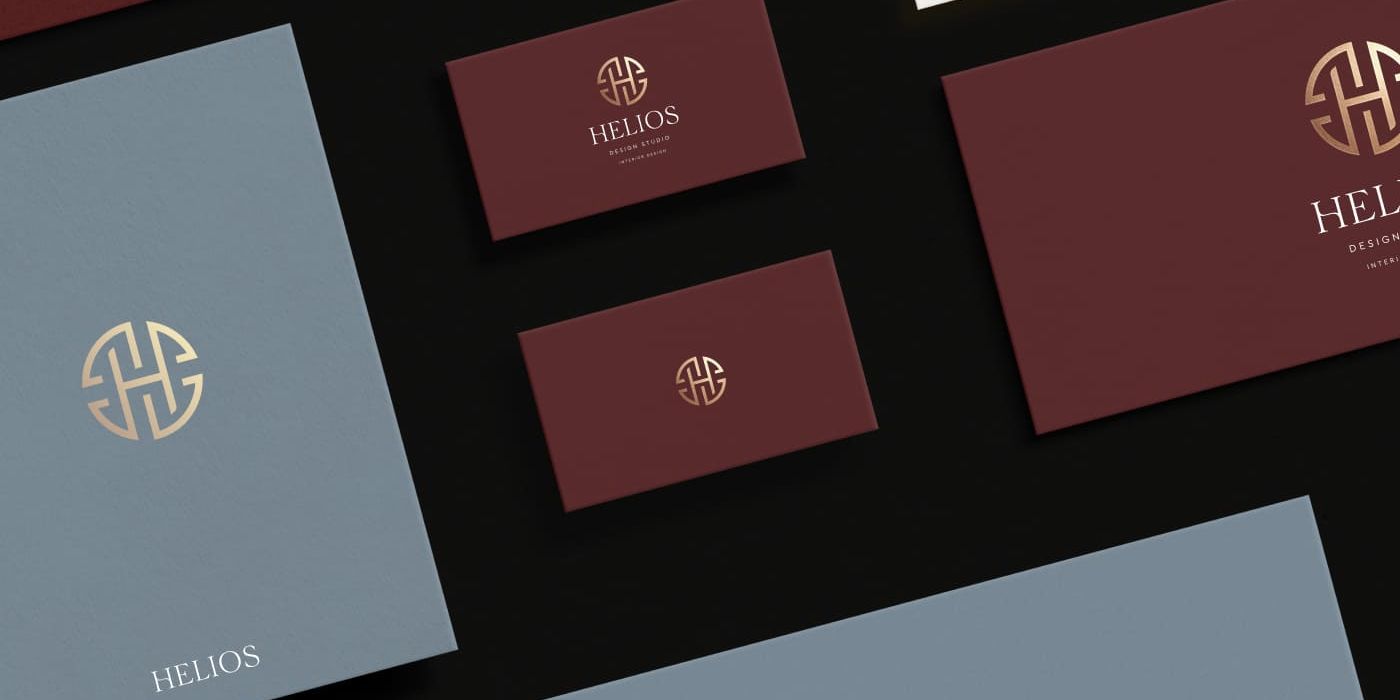
Brand guide for an interior design studio
Color exploration and palettes
This is one of the important step before creating visuals. We discussing possible palettes and arrived at the idea of a deep red (“theater, arena”), blue (“time, sky, nature”), and gold to convey power and divinity.
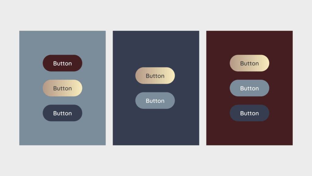
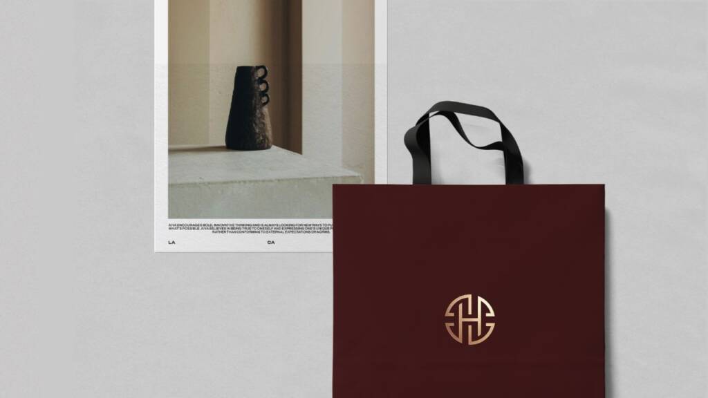
I showed possible combinations of the colors and their usage for ui, web and print. Also I explored elements like patterns and fonts
Logo pattern design and typography for an interior designer
I created a pattern based on the lines of the “H” symbol. You can see the line direction stays the same, but instead of a circular layout, I used a rectangular one.
Love patterns? Explore this brand – Gift logo design and branding for a gifting company
Visualisation and imagery for an interior designer
Using mockups, I explained color proportions and how they should be applied. I also suggested specific items to strengthen the brand—not only through color, but through form and material choices.
In the example below, I proposed using arc elements for inserts or invitations, thank you and appointment cards as they reflect Greek architecture and align naturally with the brand concept. I also suggested incorporating elements of antiquity into both the imagery and the interior to reinforce the overall aesthetic.
Check out other projects for this company:
– Classic and timeless social media design for an interior studio
– Web design for an interior design studio