

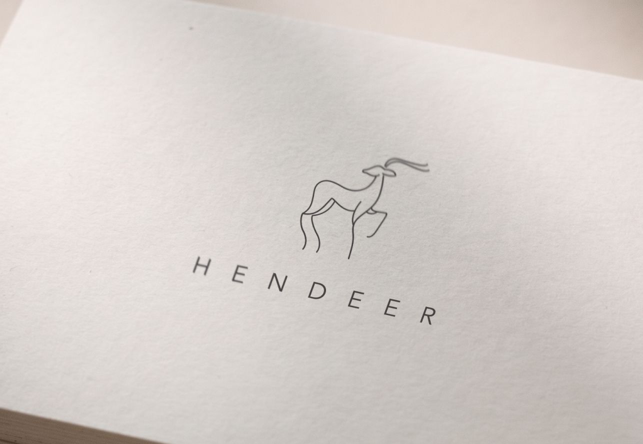

I found this client on a design platform. The idea of creating a Scandinavian-inspired logo immediately caught my attention, so I decided to take on the project. The brief was simple, the client wanted to design a stylish and minimalist logo design and for that moment they wasn’t sure if to include the deer symbol as it was a part of its name.
Logo design process for a rug shop brand
From the brief, I identified the key characteristics the logo needed to convey: a balance of Scandinavian minimalism and bohemian warmth. I began by exploring the visual language shared by these two styles to establish the right creative direction. Since the store specializes in rugs, I also researched interior spaces featuring similar products to better understand the brand’s visual environment and how the logo would be used in real-life applications.
When looking at references related to Scandinavian design, you can immediately notice a clean, minimalist aesthetic. The interiors feature very few decorative elements or strong contrasts. Instead, everything is unified through a soft, neutral color palette of light, beige, and brown tones.
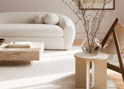
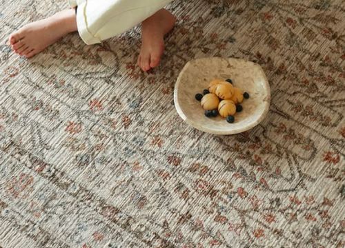
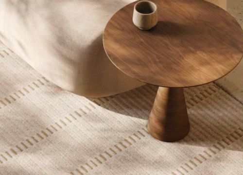
These examples showcase scandinavian aesthetic were sourced from pinterest.com
When looking at references related to boho design, you can see a more relaxed and less restrained aesthetic. It often features natural materials with a touch of vintage charm. Compared to Scandinavian interiors, boho design embraces a wider color palette, layered textures, organic patterns, and decorative details.
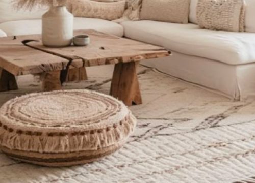
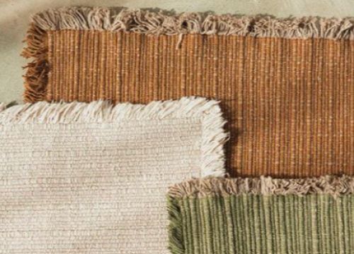
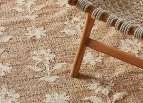
These examples showcase boho aesthetic were sourced from pinterest.com
Option1. Scandinavian wordmark logo concept
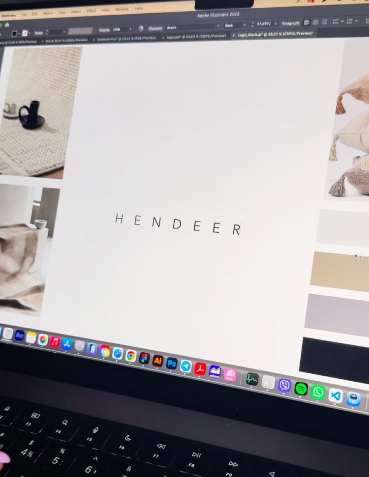
I presented two logo concepts. The first was a clean wordmark with the flexibility to develop a shorter logo variation for future use. While researching Scandinavian and boho aesthetics, I noticed recurring textures, repeating patterns, and thick woven threads commonly found in textiles and rugs. These elements inspired me to create a custom handcrafted wordmark that reflects the brand’s artisanal character while maintaining a minimalist feel.

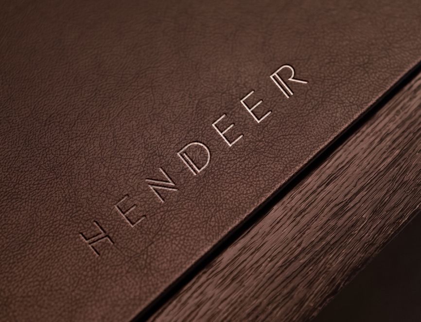
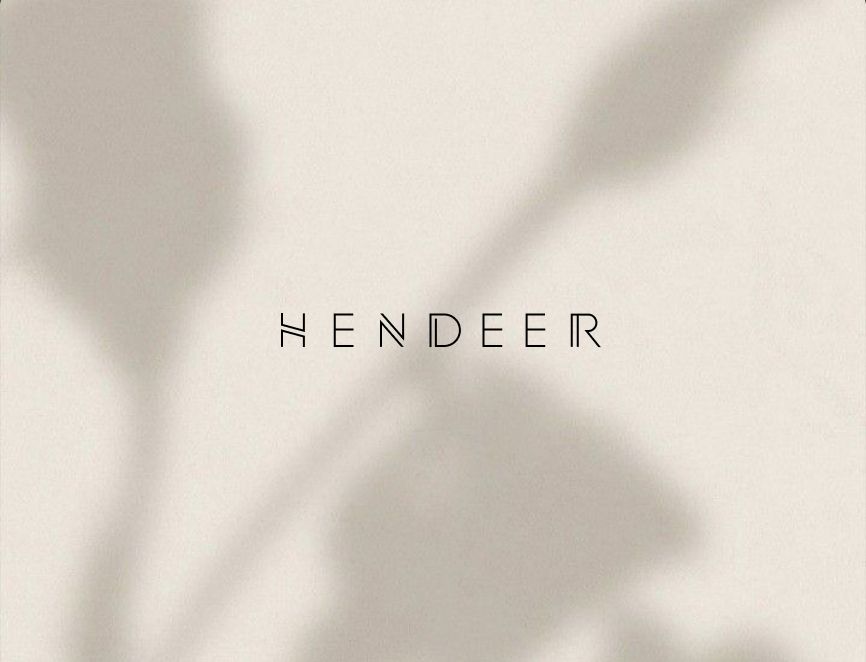
Looking for a strong wordmark symbol? Check this project – Logo design and branding for a decor company
Option2. Deer symbol logo concept
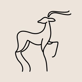
As for the second concept, I chose to incorporate a deer symbol. First of all, it reflects the brand name. Secondly, I felt it suited the brand perfectly, as deer are strongly associated with Scandinavian nature. They symbolize grace, tranquility, and a close connection to the natural world, making the mark feel both meaningful and timeless.
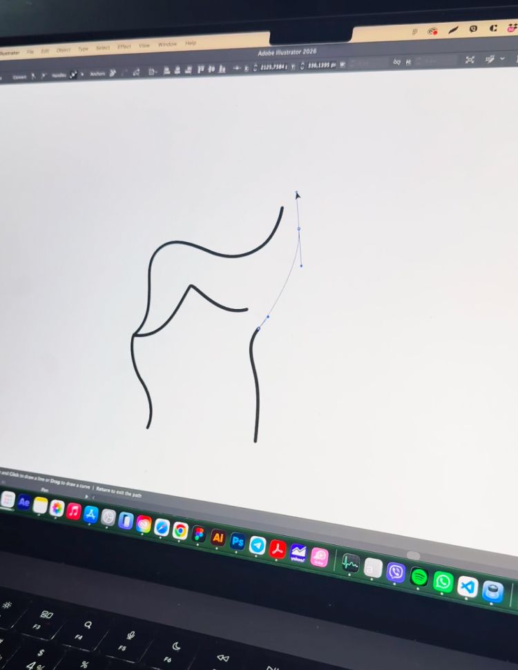
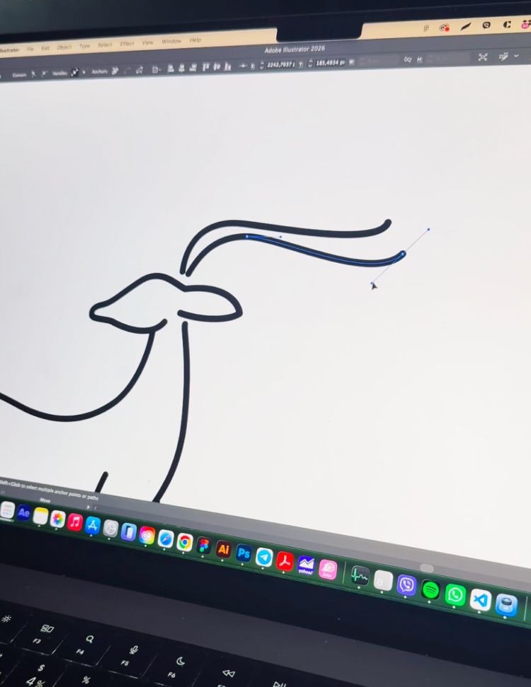
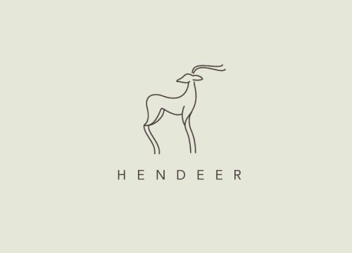
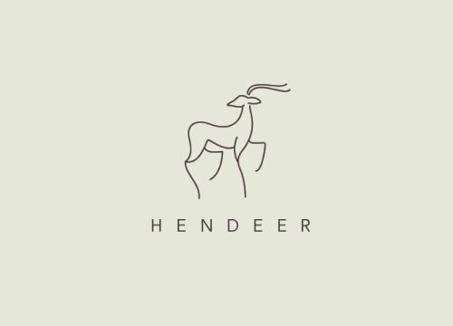
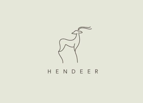
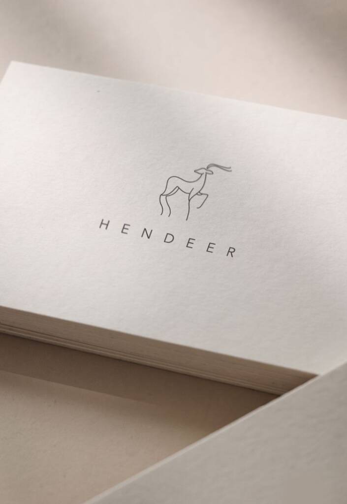
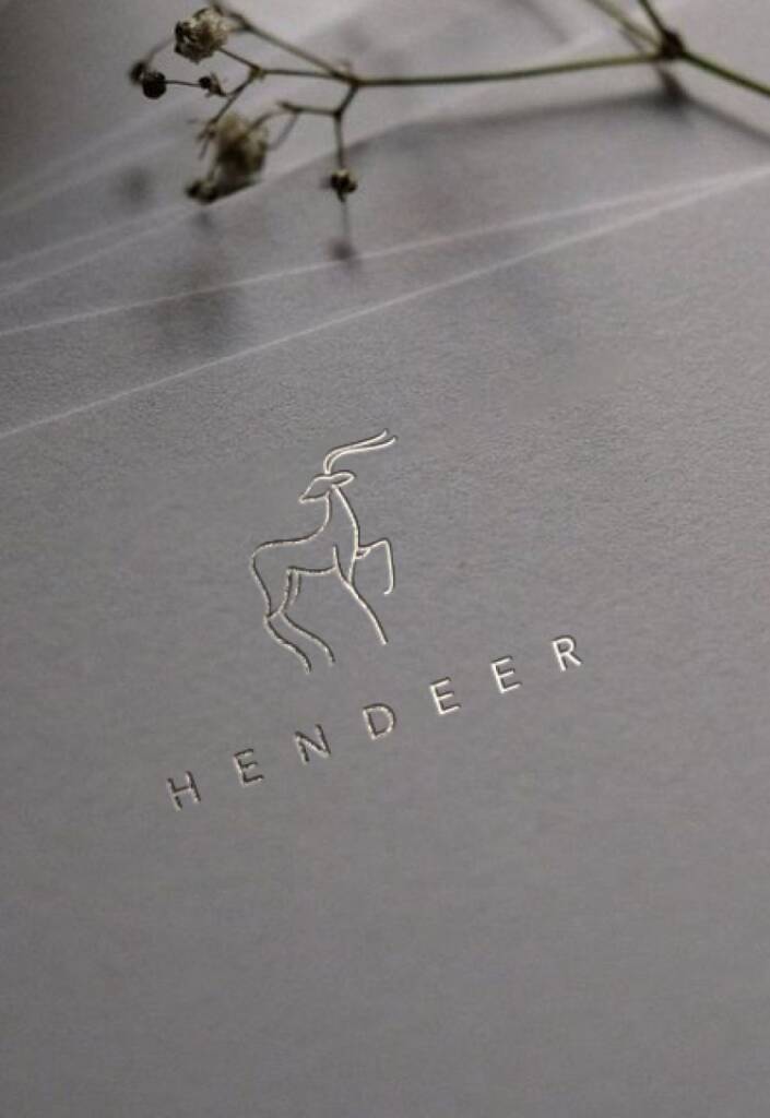
I presented three logo variations to explore which deer pose worked best. After a few iterations, we arrived at the final design, which the client loved.

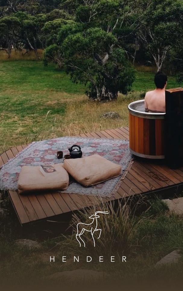
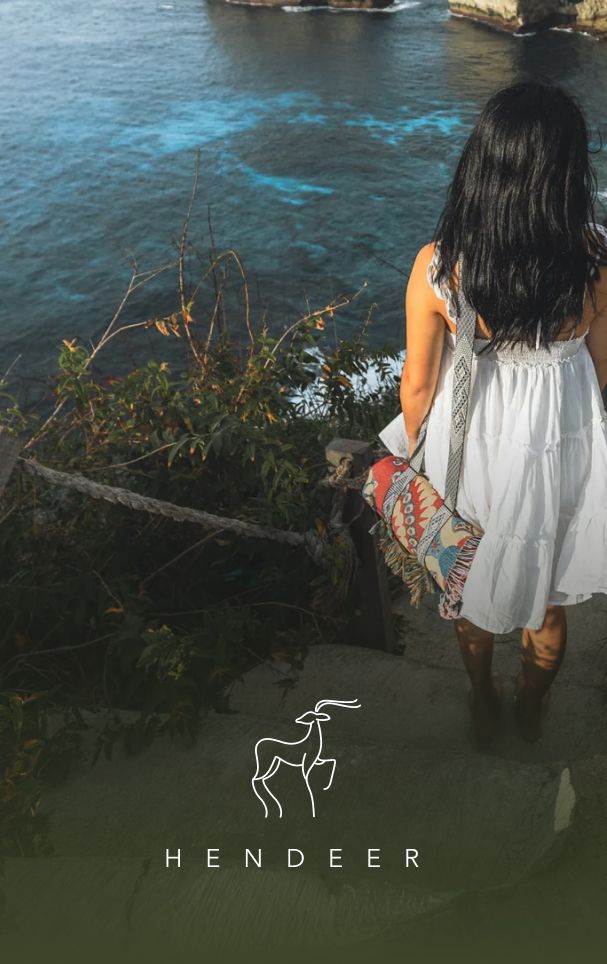
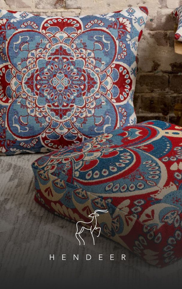
The rugs were designed not only for home interiors but also for outdoor use, whether at the beach or during a picnic. The brand also planned to offer accessories for carrying and storing them. Because of these nature-oriented use cases, the deer felt like a natural choice. Once we placed the logo within nature-inspired imagery, the client had no doubt that this was the right direction.

You may also like another bohemian logo I created – Bohemian, eye-catching, unusual logo design for for a silk bedding company
You can check how it works on the client imagery. The logo is designed to evoke the feeling of walking through a Scandinavian forest, surrounded by nature, wilderness, and fresh air.
Check the next project for this brand – Throw and rug packaging sleeve design
The client feedback
Inna was great to work with. We loved the design she came up with, it matched our brief perfectly. Highly recommend.
Hendeer
Owner