

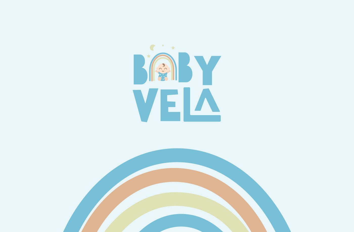

This project was developed on a freelance platform, and you can check it out here. I was excited to work with a baby brand, as this type of branding traditionally has a playful mood and feel. As a designer, working on fun projects brings more creativity and joy to the process.
The client shared their initial logo and Instagram page. It was clear that having a strong Instagram avatar was important for the brand.
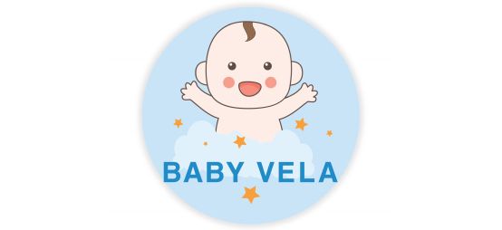
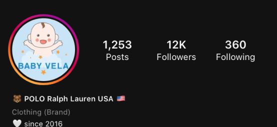
References from the client brief
The client also mentioned that they were open to experimentation and not strongly attached to their current logo.
Logo design process for a baby brand
The first thing I noticed was the balance in the wording — the “Baby” and “Vela” parts carried the same visual weight, and I felt this could become a distinctive feature of the logo. I envisioned a custom hand-drawn typeface with a playful, slightly imperfect feel, as if it had been sketched by a child.
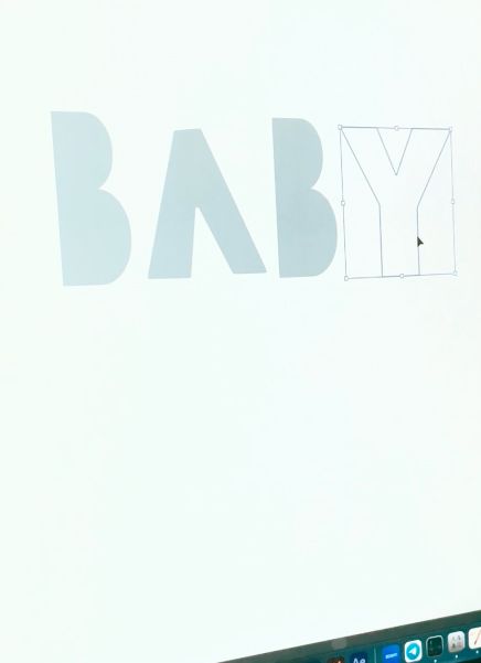
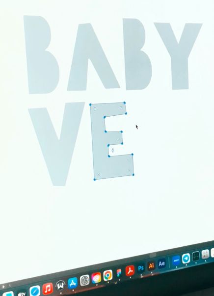
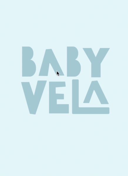
Once it was created, I saw it was not enough. The wordmark looked great, but from a business perspective, the brand needed an additional element to create a stronger visual accent and serve as a standalone brand mark.
The word “Baby” is simple, familiar, and instantly recognizable—similar to universal words like “apple.” Because of that, even if one letter is replaced or reimagined using another object, the word remains easy to read and recognize. I decided to remove the letter “A” from “Baby” and replace it with a graphic element. The first idea that came to mind was using a rainbow.
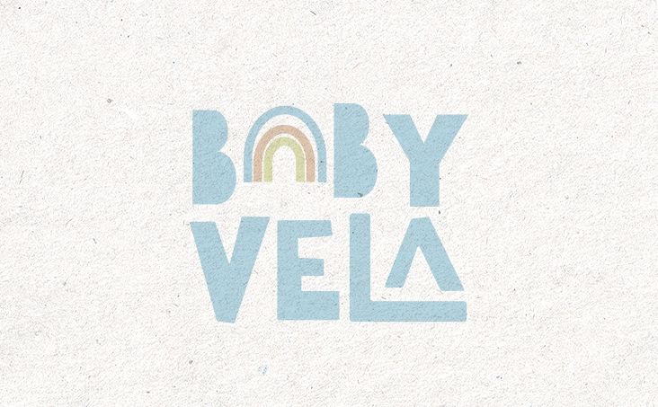
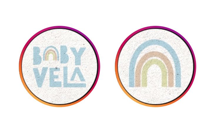
This way, the wordmark would remain recognizable and easy to read, while the symbol could also function as a standalone brand element.
The client said:
“
Great design. Can you add something baby in the rainbow. I really like the idea however, i prefer to have something like baby in the icon. Thanks for your response quickly
I understood that their old logo included a baby in the icon, and the client probably wanted to keep that element so the old and new logos would feel connected, translated through the new symbol rather than being fully redesigned. On the other hand, the rainbow was already taking the small “A” spot, and I was concerned that adding another element, like a baby, might make the design feel too busy. Keeping these aspects in mind, I suggested several options to ensure I could align with the client’s vision effectively.
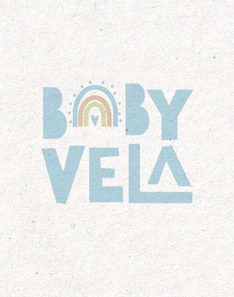
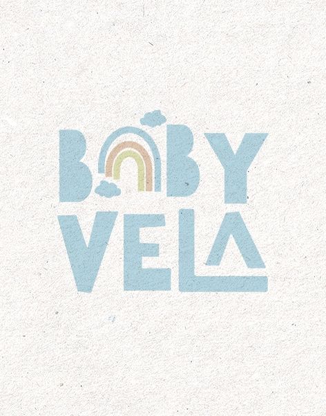
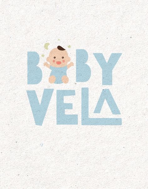
I added a baby and removed the rainbow. As an alternative, I suggested several playful modifications, explaining that combining both the baby and the rainbow might make the design look too busy.
The client answered:
“
Yeah actually i like this logo. But could you create more design on baby or baby with rainbow or baby with the sun or something with baby
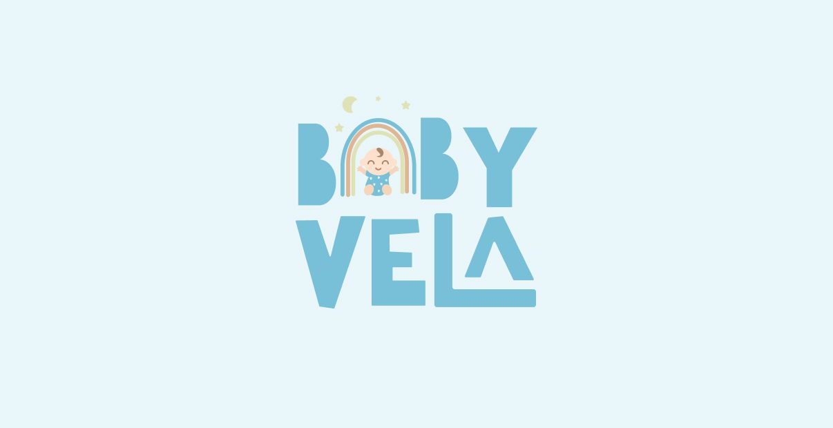
This feedback made it clear that the client wanted to combine both the baby and the rainbow, and my goal was to make this combination simple, recognizable, and readable. The baby needed to have as few details as possible, and the same applied to the rainbow — I wanted to simplify both elements as much as possible.
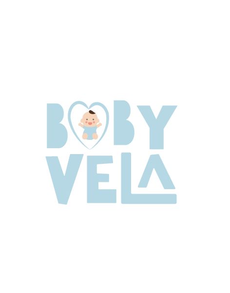
After a few iterations, the client chose the winning concept.
Love blue colors? Check the project I created for modern food brand – Fun, bright logo design and brand guide for a dessert company
Branding for a baby shop
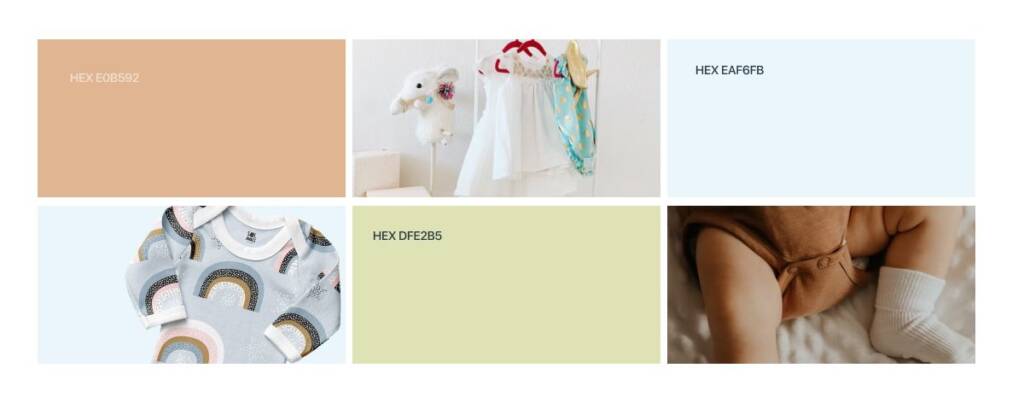
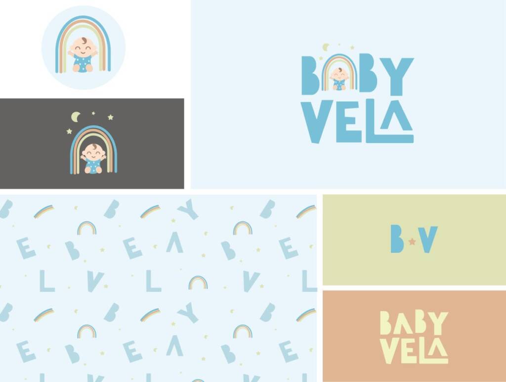
When we finalised a logo I continued with branding. First step was defining the color palette.
The logo already had a color scheme that the client liked, and I wanted to create a cohesive palette that would work well not only for the logo but across all brand touchpoints.
Blue represents purity and trust. It is strongly connected to the Earth, sky, and freedom, creating a calm and reassuring feeling.
Orange evokes happiness, warmth, and joy. It brings energy to the brand and adds a playful, cheerful character.
Green represents nature, growth, and harmony. It creates a fresh, balanced feel and strengthens the brand’s connection to natural values.
This brand has a playful vibe. You might also be interested in checking out another brand I created for a gift company – Gift logo design and branding for a gifting company
Rainbow as a brand element
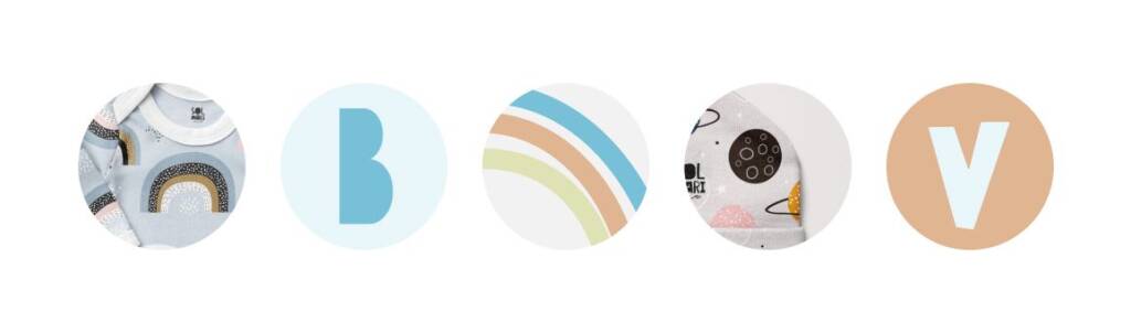
Since the logo features a rainbow, it naturally became a prominent brand element, as it is colorful, noticeable, and recognizable. Overall, each letter and logo element is unique on its own; however, the rainbow, with its long vibrant lines, is especially versatile and easy to use throughout the brand. The unique letters could be used for shop categories and for patterns.
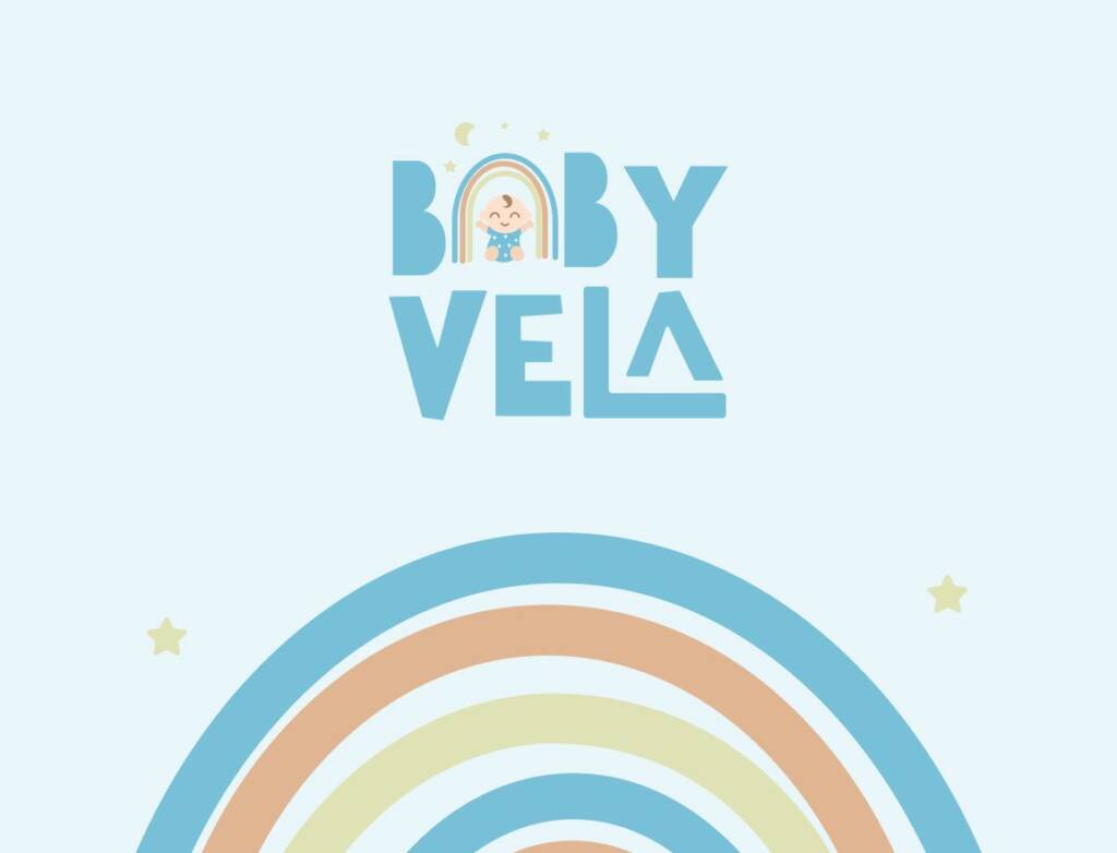

I also included social media highlights to demonstrate how the brand could be used, as I knew how important Instagram branding was for the client.
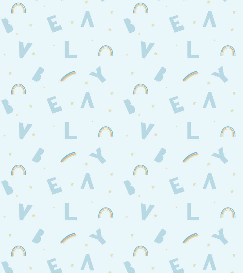
Branded pattern for a baby shop
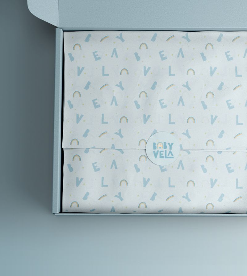
I liked that the brand had many standalone elements, so I decided to use them to create a brand pattern. The combination of Baby Vela letters and playful elements like stars and the rainbow makes the pattern feel complete and visually engaging.
When the sticker, full logo, and pattern are used together, the brand identity feels more cohesive and tells a complete visual story.
Playful typography for a baby shop
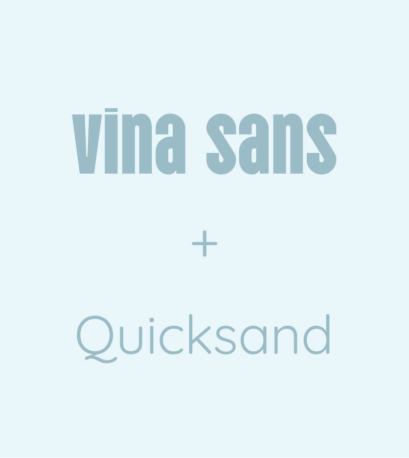
For the typography, I aimed to select fonts that complemented the logo to keep the brand visually consistent across different touchpoints. I chose a bold, playful font as an accent and selected a soft, rounded typeface for the main content.
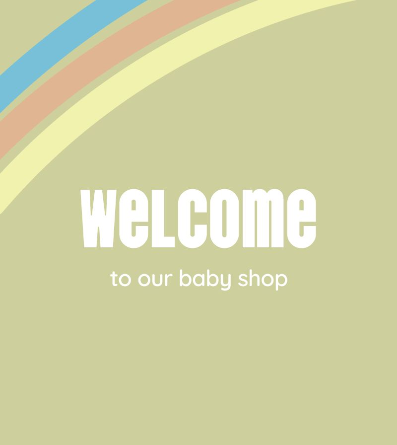
Even though it is a kids’ brand, it still needed to remain clean and professional. I also visualized how the typography would look in real-life applications, such as banners and Instagram posts.
Check out the next project for this brand – Baby rainbow instagram social media design
The client feedback
Very happy with our final design, exactly what we were looking for
Baby Vela
Owner