

The client already had a website and a developer working on it. They wanted to completely redesign the homepage, as it is the most important page of the website. The plan was then to use the established styles and web elements consistently across the inner pages.
Check out the logo and brand guide project for this brand – Interior studio logo design and branding with ornamental “H” letter
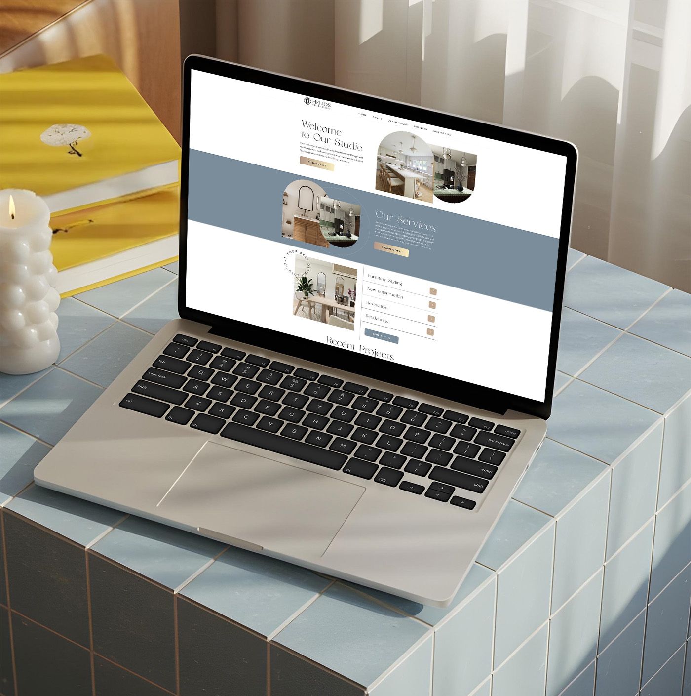
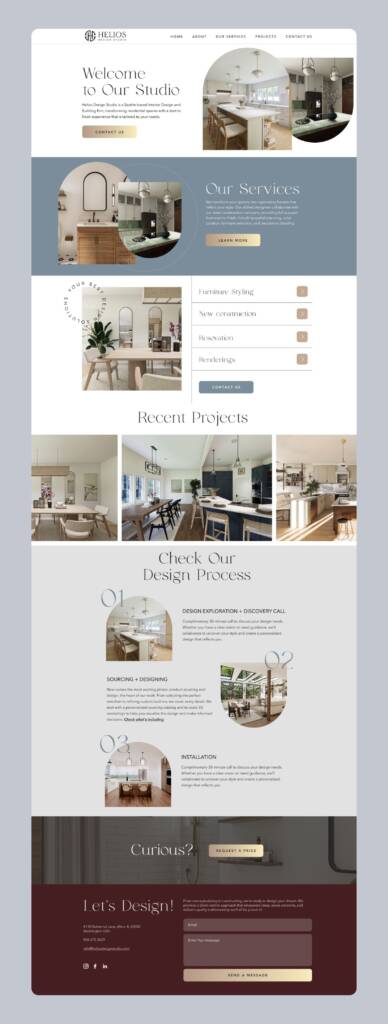
Web design process for an interior design studio
Wireframing
I started the web design with a wireframe to approve the storytelling with the client. I analyzed what would be most relevant and engaging for potential clients, helping them become interested in the service and encouraging them to continue reading.
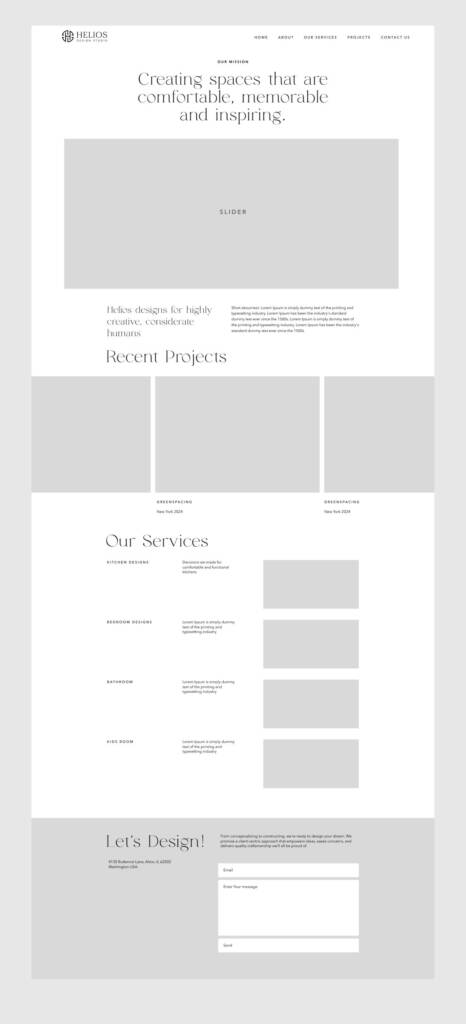
My idea was to build the following sections:
- Welcome Message – always feels inviting, warm and professional.
- Our Services – provides introductory information about the company and its offerings.
- Recent Projects – showcases the company’s latest work and demonstrates its expertise.
- Our Process – an important section that communicates transparency and helps clients understand what to expect.
- Footer – includes contact information and additional navigation links.
The client loved the content and I started a web design.
Web design for an interior design studio – Header
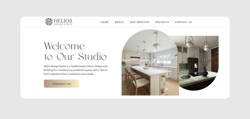
The first thing a potential client sees when opening a website is the header. That is why it’s important to keep it clean, on-brand, and supported by a clear message.
While developing the brand guide, I suggested using arch elements because they reflect Greek architecture and culture. Since the brand is called Helios, inspired by the Greek god Helios, these arches help establish the desired mood and visual identity while creating a strong connection to the brand’s origins and story.
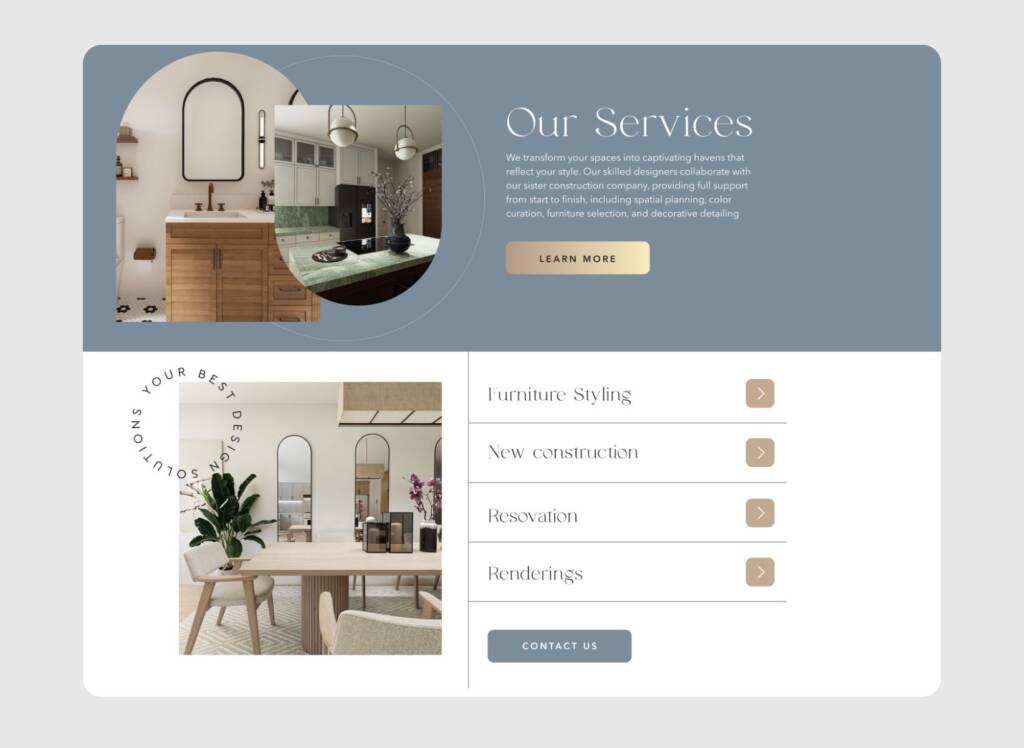
Our services web block
This section also includes arch elements combined with elegant typography. The overall aesthetic does not feel old or historical, as the focus is on interior design rather than ancient architecture. To keep the design fresh and contemporary, I introduced modern elements such as dividing strokes and stamp-inspired details.
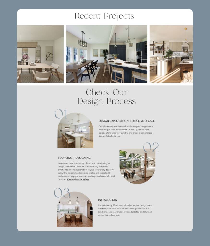
Recent projects and process
Recent Projects contained a horizontal gallery showcasing the brand’s work. Together with the overall web design, it created a cohesive visual experience. Similar colors and textures evoked a sense of unity, consistency, and attention to detail.
A process section is an important part for services like interior design — it helps clients understand the approximate timeline and makes the service feel more predictable and transparent.
Take a look at another web design project I created for an interior design studio – Landing page design for a kitchen design studio
Footer section
The footer is the final point for a visitor and serves a different purpose than the rest of the page.
It often starts with a web insert. I titled this section “Curious?” because it serves as a call-to-action block designed to capture attention and encourage users to take the next step. The warm imagery and prominent button create a natural transition from browsing to making an inquiry.
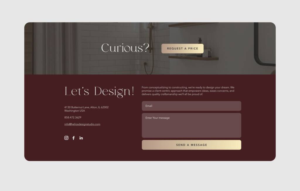
A contrasting color creates clear separation, signaling the end of the content. It helps users instantly understand they’ve reached the final section. After scrolling through the main content, the footer becomes a calm, structured block that holds essential links, contact details, or CTAs.
Check out the social media project of this brand – Classic and timeless social media design for an interior studio