

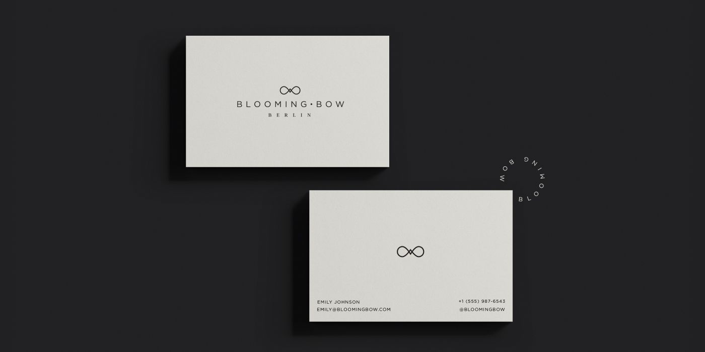

I created this logo on a freelance platform for a client launching a new fashion brand. They wanted a memorable yet simple logo that would reflect elegance, femininity, and timeless style. The client preferred a design that was minimalistic, graceful, and easy to read. Their initial vision included a black or dark gray color palette with rose gold accents on a white background, although they were open to other creative ideas. They also considered incorporating a simple peony into the logo, possibly in a subtle watercolor style, as peonies are their favorite flowers. However, this was optional, and the overall direction had to remain clean, refined, and minimal.
Logo design process for a fashion brand
From the start, I recognized some confusion. The client wanted a minimalistic brand, but at the same time they mentioned flowers and watercolor, which are not typically considered minimalist in the design world. I knew how to incorporate these elements in a simple and elegant way, but I was also concerned about potential printing issues that could arise. Since this is a fashion brand with a strong focus on printed materials, it was important to create a logo that would reproduce well across different applications.
The client emphasized that they wanted a minimalist design and asked me to use the logos of Ted Baker, Stella McCartney, Kate Spade, and Baum und Pferdgarten as references. This reinforced my concerns because all of these brands use clean, straightforward wordmarks with little or no decorative elements.
As usual, I always prepare logo options that consider the brand from different perspectives. Adding a flower gives the logo a softer, more feminine character. Since the client mentioned that their target audience is confident and independent women, I also created some options with a bolder flower outline.
Bow symbol development
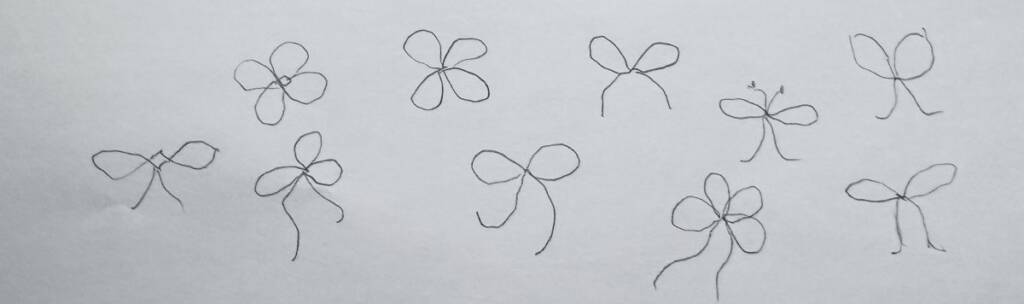
While the client was considering the idea of including a flower, I noticed the potential of the bow itself. I made some sketches to explore its outline and realized that the bow has loops that resemble flower petals. I tried to explore different ways to make the bow visually resemble a flower and evoke a sense of blooming.
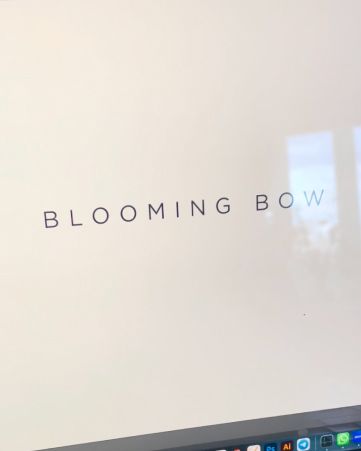
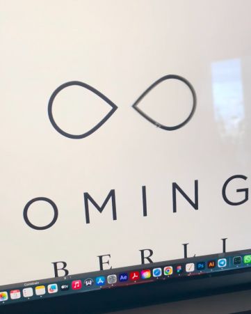
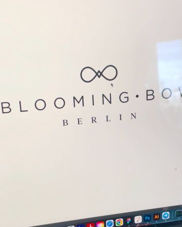
I took the two loops of the bow and gave them soft, organic curves. Then I added a small square in the center. Flowers have a central core, and this square also connects the two bow loops, creating an abstract reference to a blooming flower without making it literal.

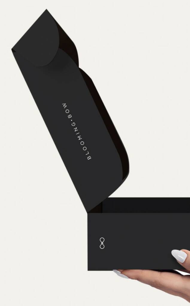
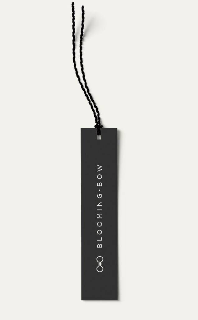
Have a fashion company and want a brand? Check this branding I created – Shoes logo design for a women online shop
The client told:
“
I really really like it! The bow looks like the symbol of blooming eternity!
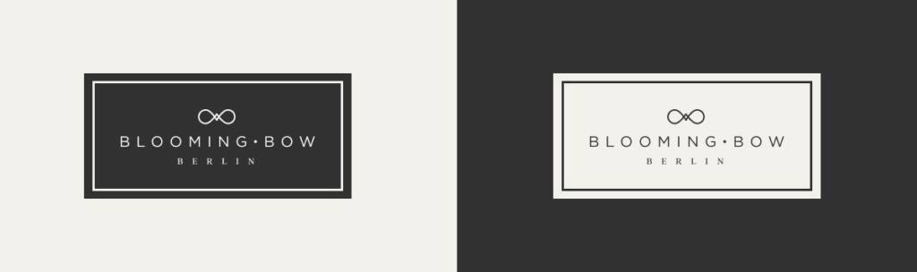
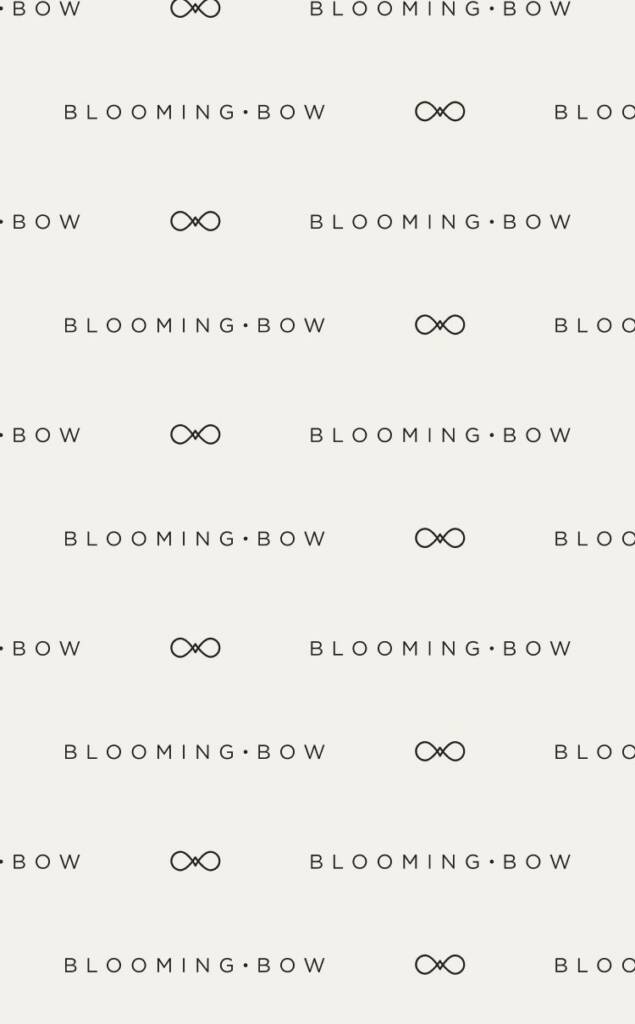
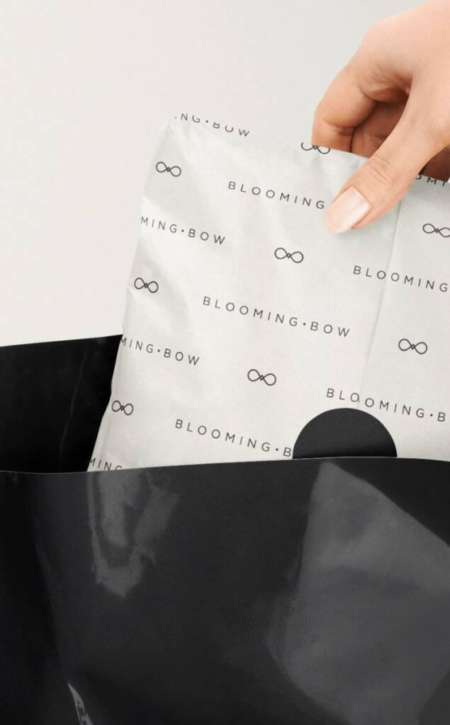
We then developed an alternative logo layout and a set of brand patterns.
Love the confident and rich vibe? Check this project – Real estate logo design and brand identity services
The client feedback
It was a pleasure working with Inna! She quickly realized what I was looking for, was attentive to the details I had provided, and combined with her knowledge, delicate taste, and quick feedback, we were able to create my perfect logo in the style of elegance.

Blooming Bow
Owner