

A client approached me by email requesting a creative logo design for their wellness studio. They explained that their mission is to help people reconnect with themselves at a higher frequency through elevated wellness events that meet people where they are. Rather than being a traditional gym or studio, they host pop-up experiences in parks, bookstores, block parties, and cafés—bringing wellness into everyday spaces.
Logo creation process
When the design process began, I first considered the name itself – how it sounds and how it feels visually. I created quick canvases and tested various fonts to find the right connection and kerning. Usually, this stage informs the next steps and often hints at the logo concept. It feels like the beginning of a meditation process.
Also, to make the direction meaningful, I referred to industry and brand keywords. The brand existed somewhere between fitness and wellness, and after reviewing the brief details, I identified the core concepts as movement, play, joy and energy, aiming to create something dynamic, expressive and eye-catching.
I started with the lowercase letters, as I realized the name letters naturally has a circular appearance, which aligns well with the idea of movement. Since the brand organizes outdoor wellness sessions, this rounded approach felt organic and appropriate. One of the concepts especially stood out to both me and the client because it subtly revealed a human figure formed through the first letters, “OC”.
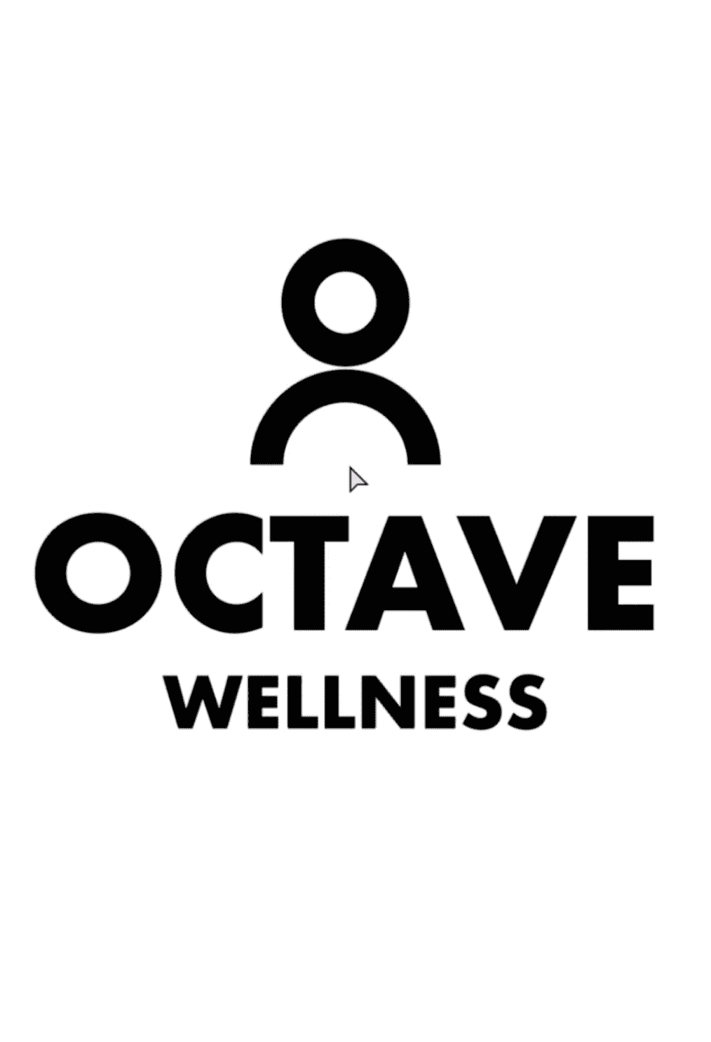
Another option the client liked was a concept inspired by a piano octave. The idea was built around the brand’s 8 pillars of wellness, 8 founding members, and the musical concept of an octave with 8 notes. At the same time, this wordmark visually resembled a staircase, naturally communicating progress, growth and movement.
As a result, we combined these two concepts. From the first direction, I took the idea of the human figure, while from the second one I incorporated the typography approach, where the lines of the letter “E” resemble a staircase.
Then we explored basic color directions and arrived at cool, bright options to make the overall experience feel lively and fun.
Love fun and bright logos? Check this brand – Fun, bright logo design and brand guide for a dessert company