Line art is a style that uses lines as its foundation. Originally, line art emerged as a graphic drawing technique, known for its beautiful and minimalist illustrations.
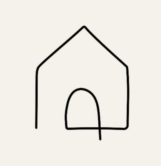
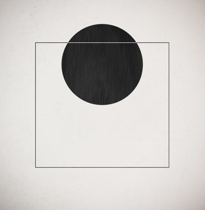
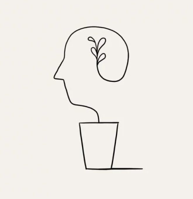
These examples showcase linear style and were sourced from pinterest.com
However, this style offers much more than just visual aesthetics. It is highly expressive and distinctive, which is why its influence has expanded beyond illustration and into branding, where it helps create strong and memorable brand identities.
In this post, I want to explore how line art style is used in branding and how modern brands strengthen their uniqueness by incorporating line art elements into their visual identity.
Line art style characteristics
Its main feature is that it is defined primarily by lines
Fist of all, this style is about using lines. It incorporates both straight and curved lines, geometric shapes, and freehand drawing. A recognizable feature is the absence of shadows or volumetric fills.
This style is quite creative and is often associated with a sense of the artist’s presence, the human hand, and talent. It’s important to understand that this style adds a human touch, helping brands feel more personal, approachable, and a bit playful.
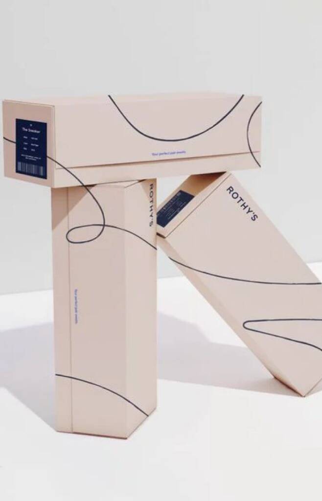
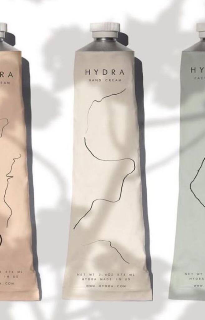
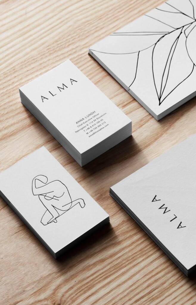
These references showcase linear style usage for different brandsand were taken from nordicdesign, maradesignco, accio
It can include sharp or curvy lines
Even though line art often feels organic and fluid, it can also appear sharp, structured, and angular, creating a completely different brand impression. Soft, flowing lines usually communicate warmth, elegance, and approachability, making a brand feel more human and inviting. In contrast, sharp and geometric lines create a sense of precision, confidence, and modernity, giving the brand a more bold and sophisticated character.
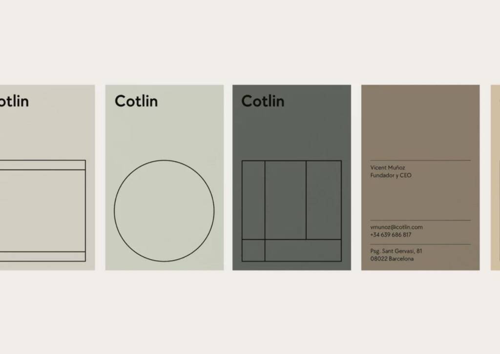
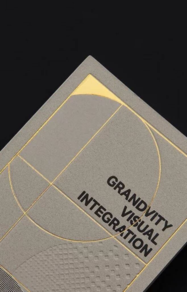
Line art style is super minimalistic
Line art style is highly minimalistic and visually simple. Since lines carry significant visual weight, every element should not conflict with the overall visual, maintaining balance through spacing, content amount, and the proportion between graphic elements and information. Together, these elements work harmoniously to create a composition that feels clean, balanced, and visually pleasing.
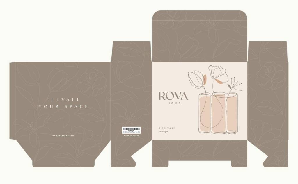
This packaging design I created for home decor brand uses line art illustrations and patterns. You can check it out here – Packaging design for home decor items
Line art avoids gradients, shadows, and textures
Minimal nature of linear art style relies on clean lines to communicate form and meaning. Adding too many extra details can create visual noise, reducing clarity and weakening the overall impact. This is why simplicity is essential in line art—every element should serve a clear purpose.
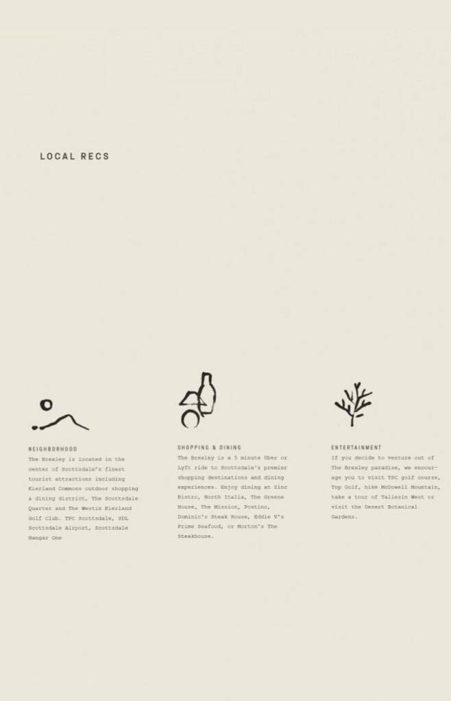
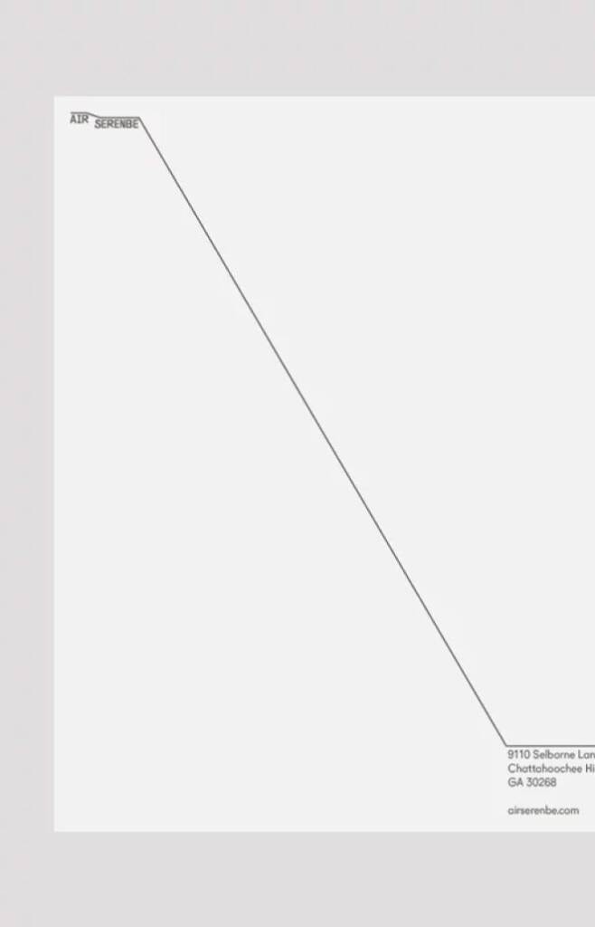
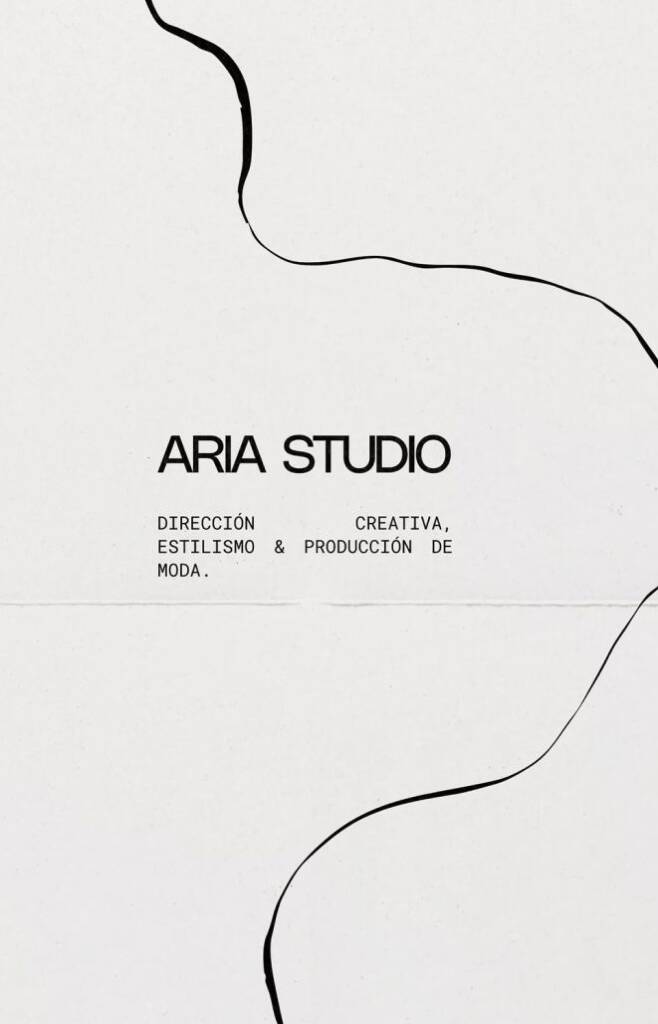
These examples showcase linear style usage for different brands and were taken from pinterest.com, fuzzco, instagram
Line art style should have an idea behind
Without a clear concept, line art can feel random or purely decorative. Strong line art is not just about aesthetics—it communicates an idea, tells a story, or reinforces the brand’s message in a simple yet memorable way.
Line art style can evoke the following meanings:
- Sense of imperfectness. Imperfect lines have a strong connection to nature, life, and living beings, all of which are inherently imperfect.
- Sense of perfection. Straight lines are often used by architects, interior designers, and builders to evoke a sense of precision, structure, and careful calculation.
- Sense of art. Especially when the lines have a brush-like form, they create a strong association with hand-drawn artwork, creativity, and artistic expression.
- Storytelling. Different brand assets, such as packaging, stationery, printed materials, or digital touchpoints, can become part of one unified visual story. Line art works especially well for creating connected illustrations that flow across multiple brand elements, helping build a cohesive and memorable brand experience.
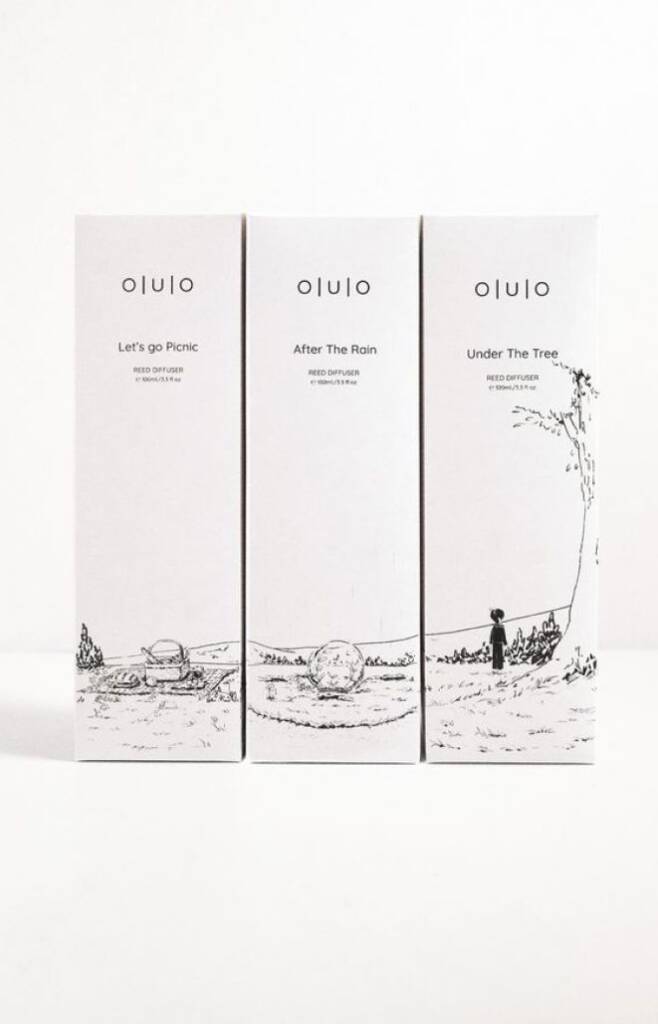
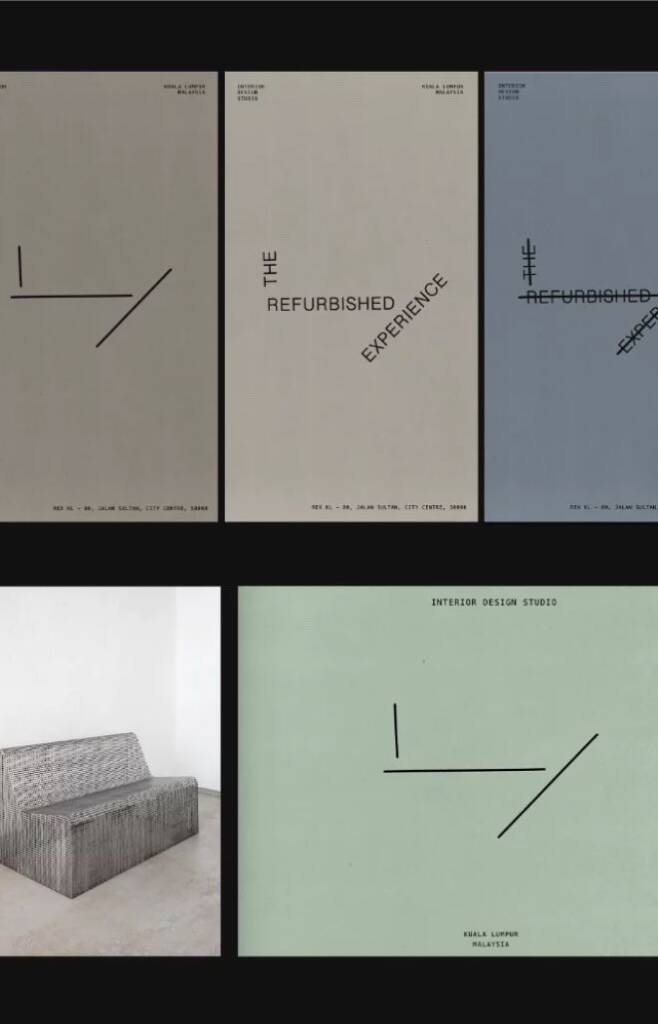
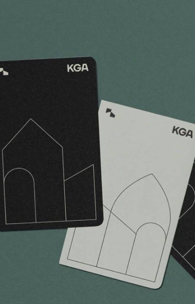
These examples show how brands communicate messages using line art style and were taken from behance, pinterest, x.com
Most commonly used in industries:
- Architecture
- Interior Design
- Fashion
- Yoga
- Jewelry
- Beauty & Skincare
- Wellness
- Travel industry
- Marketing & Advertising
- Food & Drink
- Gifting industry
- Entertainment
Theme and colors
Mostly white/muted theme. Any color can be used. However, color choice should reflect the brand voice — formal brands typically use neutral tones, while informal brands can use brighter, high-contrast colors.
Typography
Modern, straight fonts to maintain a clean look. Handwritten font accents
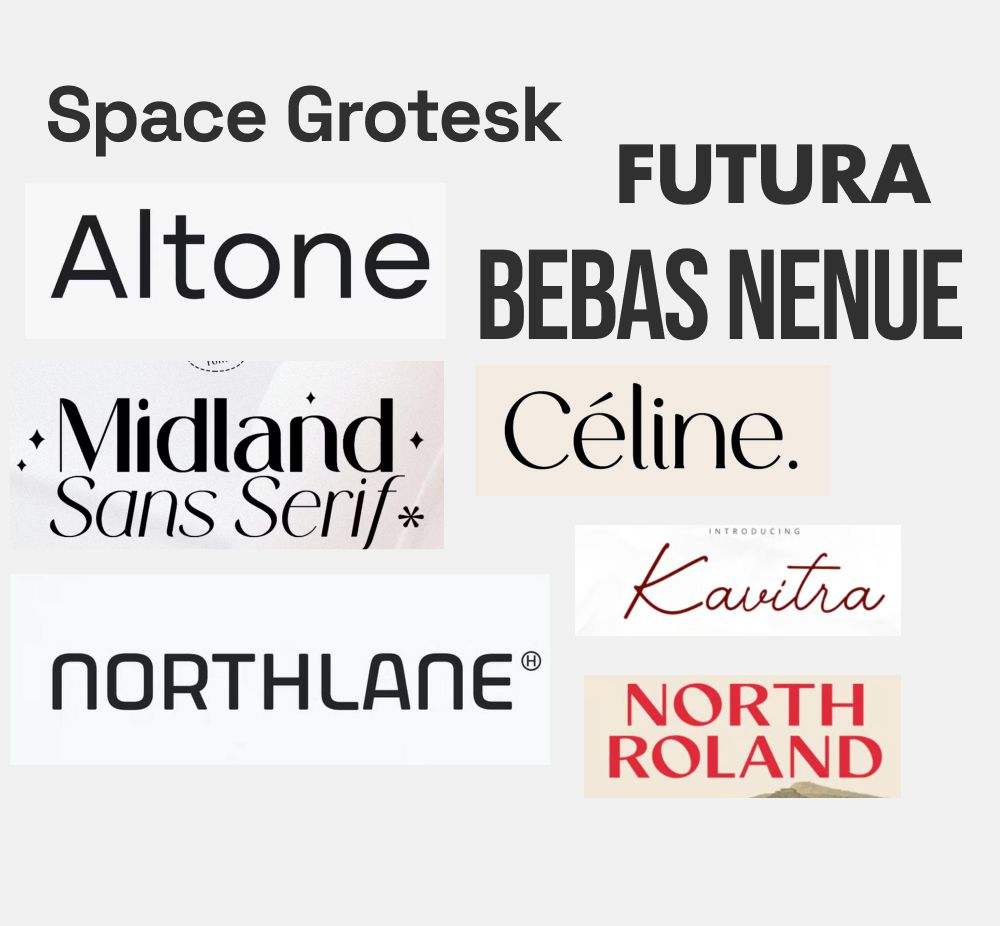
Check the brand I created using wacom tablet, this logo became a base of the linear style – Gift logo design and branding for a gifting company
More examples of linear style
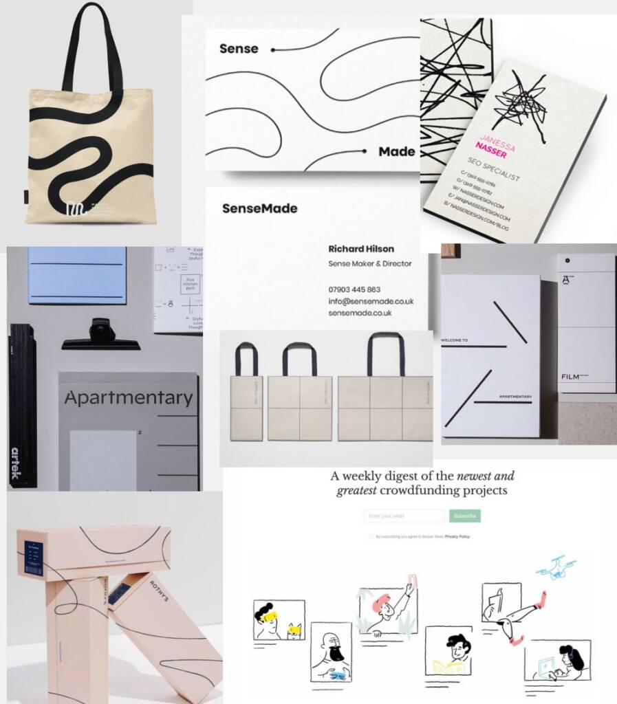
These designs are taken from third-party resources and are used solely as examples.
In the AI era, it’s especially noticeable that people are drawn to more human and tangible expressions of digital art. They want to see interfaces that feel alive, responsive, and emotionally engaging.