


A client invited me to a project through a design platform. They said: “Hi, Super excited by your portfolio of work for this exciting start-up brand project. We have a clear vision, purpose & direction for brand/logo identity but are looking for someone to bring this to life creatively in a cohesive, current, bold fashion.“
I was thrilled to work on a sports project because this field has its own dynamic and a more masculine style. I was happy to take the opportunity to challenge myself and develop my skills in this direction.
Client brief and requirements
The client provided two PDF files containing the initial brand guidelines and a Brand Assessment & Proposal. The club was envisioned as a community of like-minded people united by a particular interest or activity.
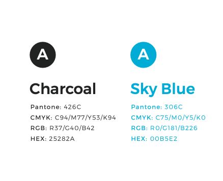
They felt that their existing logo looked too busy and didn’t align with the brand’s philosophy. As a result, they decided to change the name and rethink the color palette. The client wanted to convey a sense of connection and togetherness, bringing people together as one united community that values respect, inclusiveness, support, safety, and simplicity.
Additionally, the client emphasized the need for a simple logo, as the existing design contained too many elements. This made it difficult to read and less effective at smaller sizes, particularly on mobile devices.
Logo design development for a sport community
The word “Bunji” means “friend” or “mate” in an Indigenous Australian context. I realized that the concept was more abstract and profound, calling for a design that would convey this feeling indirectly rather than literally.
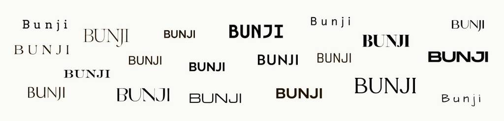
First, I started exploring fonts because the word itself is simple, which allowed me to look for a typeface that felt both familiar and slightly unconventional to serve as the foundation for the logo.
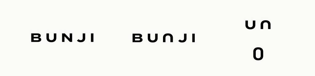
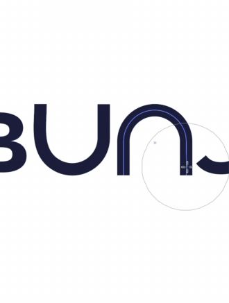
I noticed that the letters “U” and “N” could share the same outline, flipped vertically. Together, they formed a distinctive shape that could be developed into a circular symbol, reflecting the brand’s core values of community, unity, and togetherness. The circular form was also a natural fit for a cycling community.
I explored ways to make the circular form more distinctive, as a simple circle felt too generic. I researched visual concepts associated with togetherness and unity, and, given the Indigenous Australian context of the name “Bunji,” I also explored ancient symbols and traditional motifs that could inspire the design.
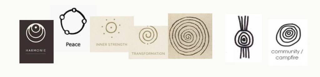
During my research, I explored symbols associated with harmony, strength, and transformation, but they felt too mystical. I wanted to find something more grounded and tangible. After some time spent researching and reflecting, I came across a symbol that felt perfectly aligned with the brand’s concept: concentric circles, which in the traditions of some Aboriginal Australian peoples represent significant places, meeting places, or campsites. The reference I found identified this motif with community and a gathering around a campfire.
The challenge was how to bring this sign to the logo
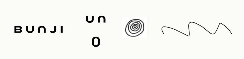
I explored how to make the circle formed by the letters “U” and “N” resemble this traditional motif. Since ancient symbols were drawn by hand, I thought about making the letters slightly imperfect rather than geometrically precise. This way, when combined, they would form an organic, irregular circle that felt as though it had been drawn by hand, adding a human touch to the symbol.



Looking for a creative wordmark? Check this project – Creative, bright and bold logo design services for a wellness company
Logo colors for for a sport community brand
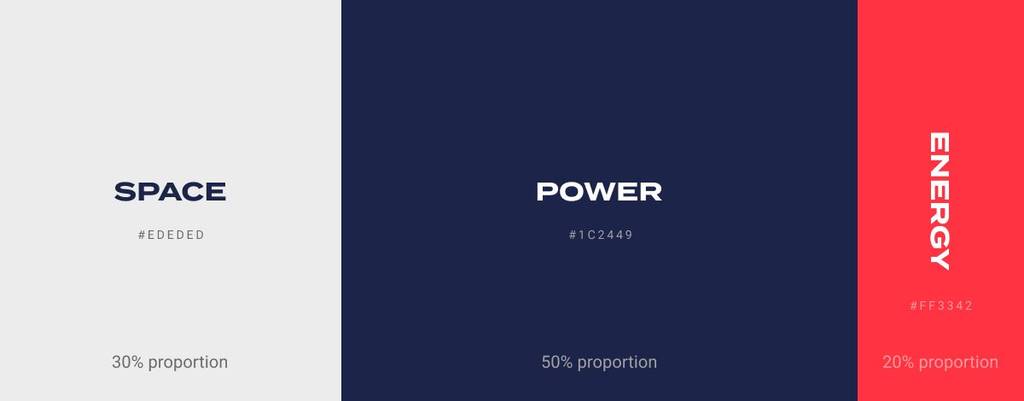
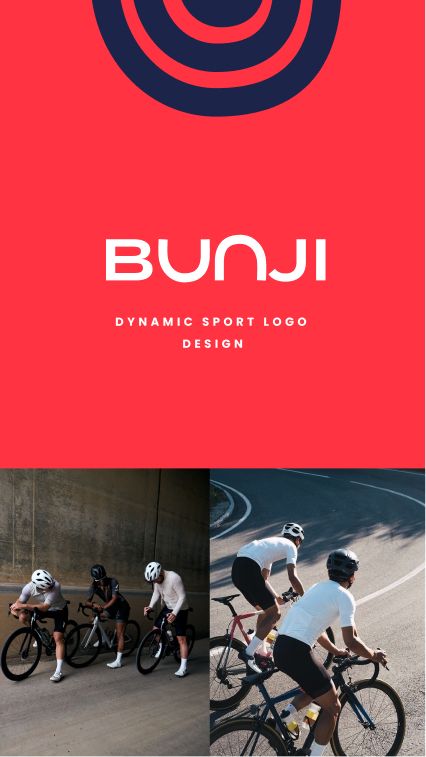
During the development process, I presented my color palette ideas to the client and explained the meaning behind each color.
- Blue represents strength, confidence, and reliability, aligning with the brand’s sports-oriented identity.
- Light gray introduces a sense of openness and space, keeping the visual identity clean and balanced.
- Vibrant red adds energy, passion, and dynamism, reflecting the active nature of the sports community and helping the brand stand out.


Love the confident and rich vibe? Check this project – Real estate logo design and brand identity services
Additionally, I presented mood boards to capture the brand’s overall feel, communicate its energy, and establish its visual direction. Together, the elements created a powerful and distinctive brand identity.
Logo layout and graphic elements
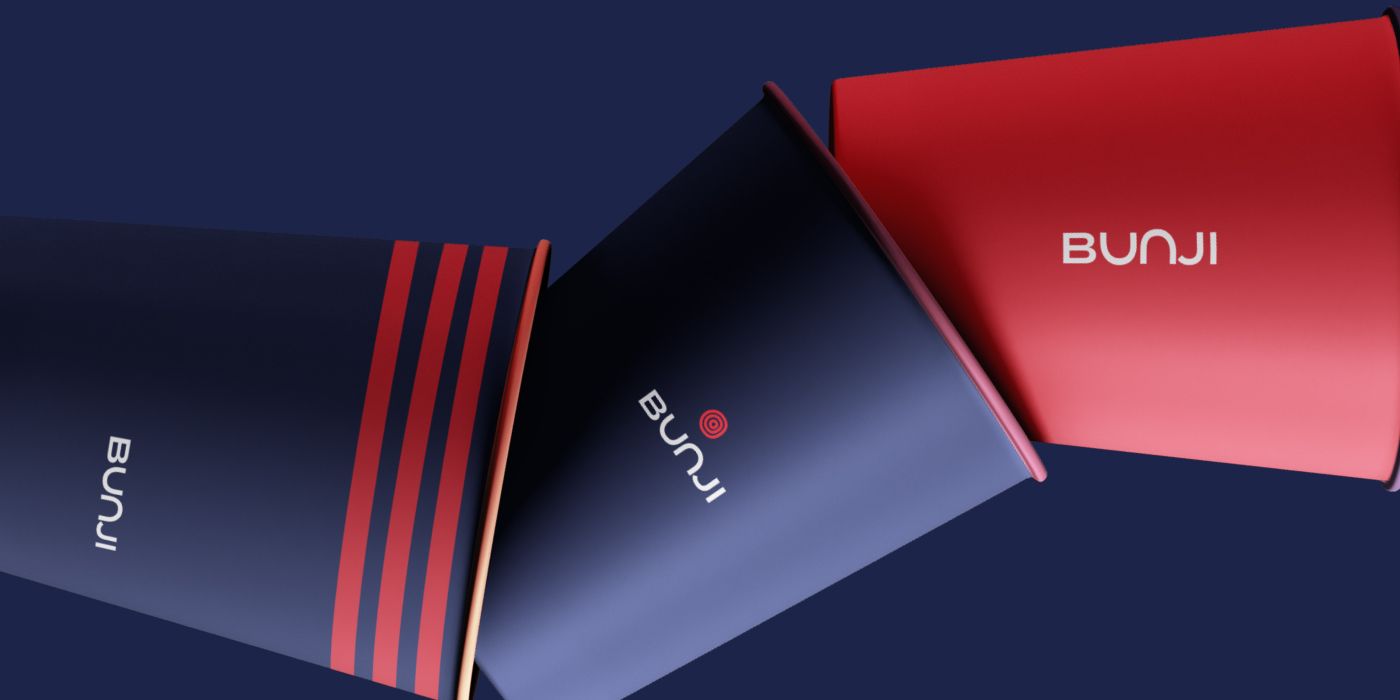
Since the logo features a circular element, I decided to extend this shape into the brand’s graphic language through circular graphics and layouts. I incorporated the circular wordmark into both the logo compositions and the pattern design. The wordmark itself could also be used as a repeating pattern, creating a cohesive and recognizable visual identity.
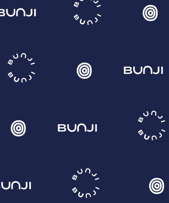
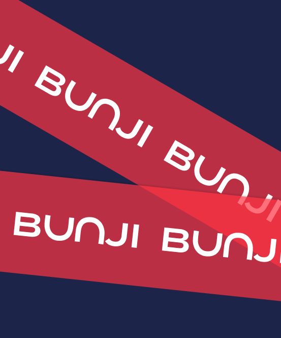
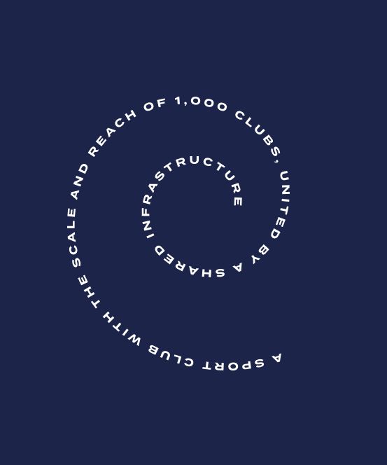
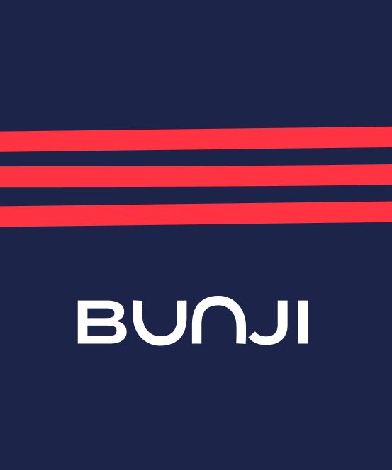
Additionally, the logo consists of three lines that can be repeated as a graphic element to create a distinctive branding pattern. This works particularly well on cylindrical surfaces, where parallel lines wrap around the object to form circular shapes that echo the logo itself.


Looking a unique and creative logo design? Check this project I created for e-commerce brand – Shoes logo design for a women online shop
Brand visualisation and mockups
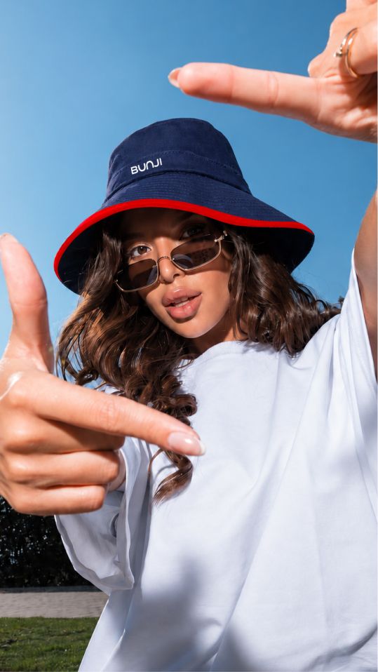
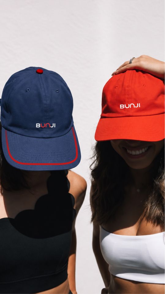
When created mockups, I wanted to help the client visualize how the logo would be applied across different printed materials, understand its placement and proportions, and see how the brand identity would work in real-world applications. The combination of typography, print details, and graphic forms creates a cohesive brand system that should be consistently applied according to the brand guidelines.
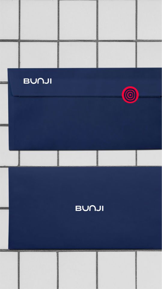
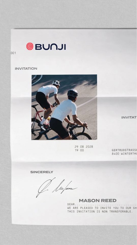
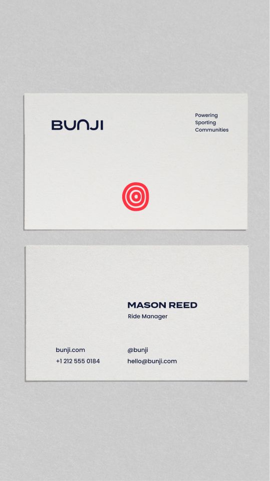
The graphic elements and color palette make the brand identity versatile, allowing it to be applied consistently across different formats, contexts, and visual compositions. In the examples below, I demonstrated how clothing and other brand touchpoints could incorporate graphic elements such as lines, as well as the brand colors. The mockups also helped visualize the color proportions and how they work together across different applications.

Love the vibrance? Explore this brand – Logo, branding and social media for a gifting company
The client feedback
We’re really happy with how the brand identity turned out. The logo feels distinctive and captures the idea of bringing people together while maintaining a strong, sporty character. We especially love how the circular symbol, typography, and graphic elements work together to create a cohesive identity that feels energetic, modern, and versatile across different applications. It’s exactly the kind of direction we wanted for Bunji!
Bunji
Sport Community