

I was contacted by a client via email. She requested a strong brand for a cosmetics company and mentioned that she already had some ideas. It was an established brand, and the client already had a basic kit and paid fonts that she had been using across the brand. She wanted to organize everything into a unified system by creating a logo and a brand guide for her company.
Logo design process
We started our collaboration with a quick questionnaire. Usually, I ask about the brand name, its meaning and the business idea behind it. The client provided short but thoughtful and well-grounded answers, even mentioning the Pantone colors they use. I noticed that the brand currently uses only pink, which already suggested a feminine direction for the identity.
For inspiration, the client mentioned Fenty Skin / Fenty Beauty and Summer Fridays — quite famous and modern brands. However, from a design perspective, these references did not communicate much direction on their own, So I understood that I had creative freedom for this brand.
Logo options for the client
I always elaborate logo options during the logo process. First ideas are usually the most obvious — they stay on the surface. I’ve noticed that real ideas come through deeper thinking. You have to arrive at them by exploring different directions, gradually going deeper into yourself. I compare it to meditation — you don’t go deep within in the first minutes, or even hours.
Based on the design brief, I identified the key brand tags: strong, modern, chic, feminine, simple, and premium. I also analyzed the consumers’ needs: they are looking for skin health and self-beauty. It is almost always about confidence, yet also vulnerability, as skin beauty is a very sensitive matter. I wanted to combine these confident and delicate aspects of the brand into a single logo.
This way I chose a wide, bold font as a base and elaborated symbol options:
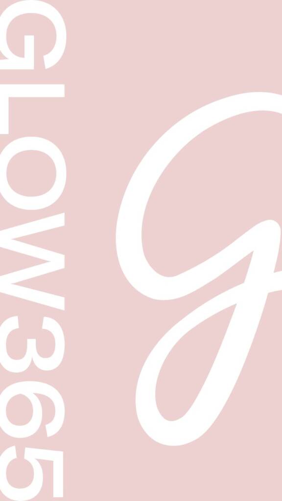
- The first option includes the ‘G’ letter designed in the form of a spark, creating a customized and unique first letter that subtly conveys the idea of ‘Glow.’
- The second option includes a ‘G’ resembling a looped arrow, which perfectly fits the idea of 365 — a continuous cycle, beautiful skin day after day.
- The third option was an experiment with a geometric, urban and bold style.
- Then I further explored the idea of using a circle as a symbol, because it naturally evokes the concept of 365 — a full year and a continuous cycle.
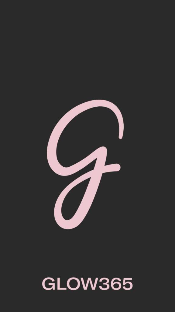
The client loved the directions and asked me to further elaborate on two of them. During the process, we arrived at a single direction — an elegant and handmade ‘G’ letter.
This option became the winner because it combined a bold font that conveyed confidence and strength with lighter, eye-catching symbolic elements that balanced the overall impression. The handmade approach also made sense, as it added a feminine touch and softened the overall design.
I created the symbol using a Wacom tablet to give it a more human, unique and original feel. After that, I refined the lines in Adobe Illustrator to make the symbol more elegant and precise.
You may also be interested in another beauty brand – Creative and clever logo design and brand identity for a hydration med spa
Brand guide design for a cosmetics company
A cosmetics brand exists in a highly visual and emotionally driven space, so it’s important to communicate the right message to its clients. If the core idea combines feminine softness and masculine confidence, it should be expressed through the brand’s colors, elements, and visual proportions.
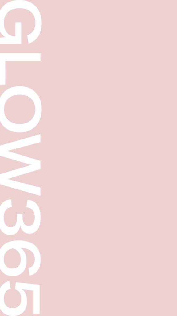
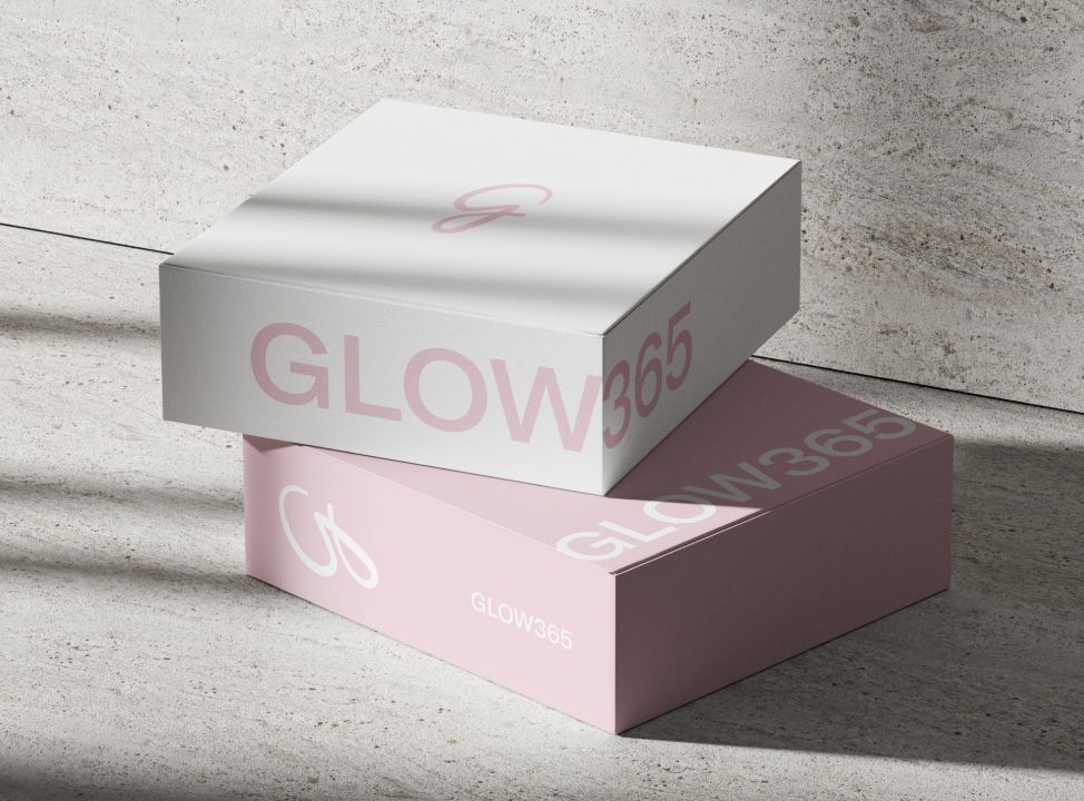
I started with the technical aspect of the logo, as it’s very important. Clients use logos in many different contexts — web design, posters, packaging and social media — so having multiple layouts is essential for flexible and consistent brand usage.
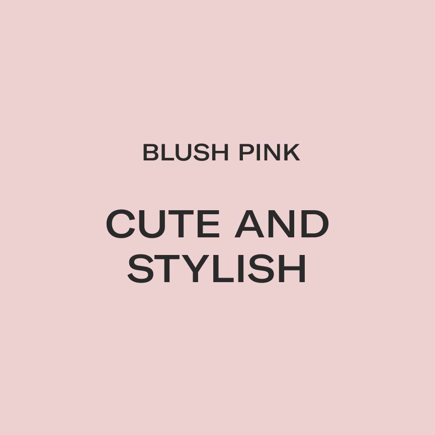
Color palette for a cosmetics company
The client already used pink color for her packaging, however the usage was not consistent. I noticed different shades of pink and decided to provide several alternatives. I chose a softer blush pink to create a more elegant and refined aesthetic. Once we selected a final option, I added the color codes to the brand guide to ensure consistency across future brand communication and packaging materials.
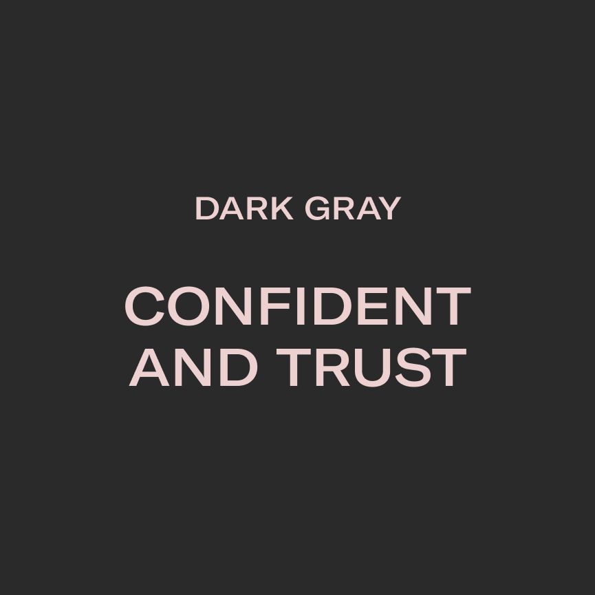
Additionally to the pink color, I suggested a dark gray shade. The symbol combines a soft, feminine “g” letter with a grounded, masculine wordmark, so adding this bold tone felt like an obvious decision. It strengthened the second side of the brand personality — confidence, stability and professionalism.
This brand uses similar colors, but in a more editorial aesthetic – NGS lettermark logo design and brand identity services
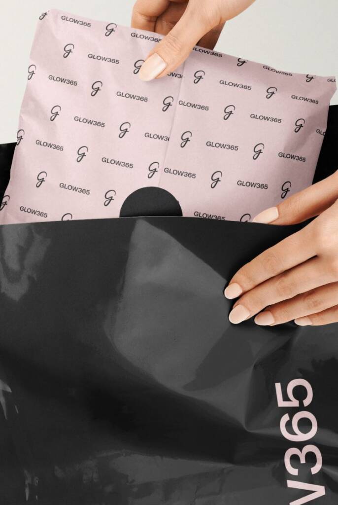
Visualisation and mockups
Once the color palette was approved, I started the visualization stage. This stage is important not only for the client, but for me as well — it allows me to see the colors in real usage scenarios. During this process, I experiment and define the most effective color distribution and balance. After that, I describe the color usage proportions in the brand guide and explain where and for what purpose each color should be used.
Using mockups, I translate the design for people who are not designers. I show the brand’s geometry and possible placements on different surfaces, so they can apply it themselves across multiple teams.
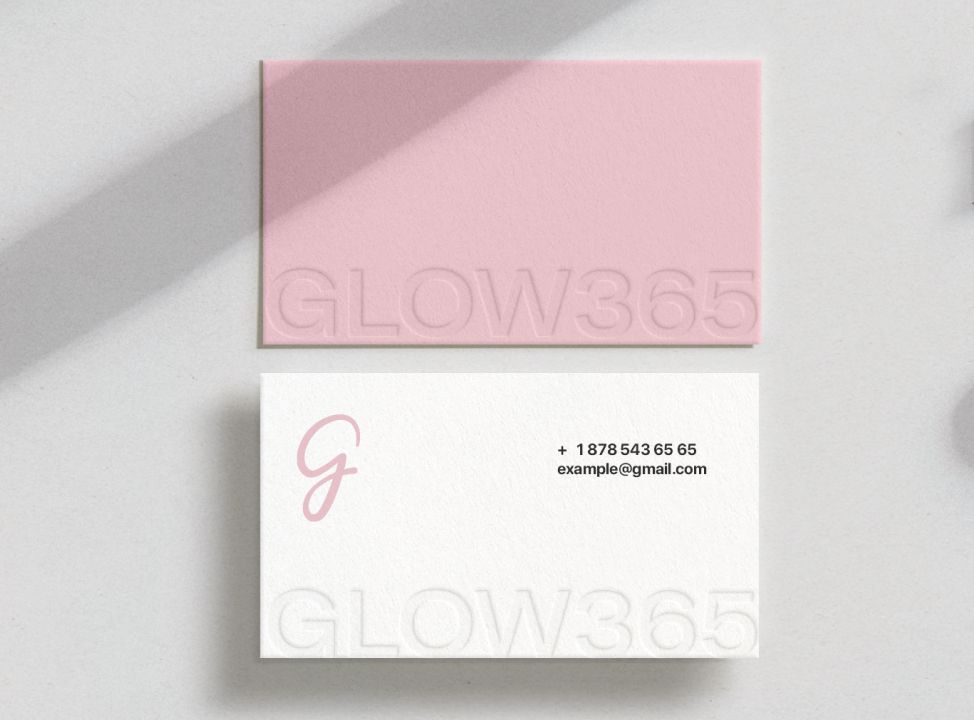
For example, the business card design below doesn’t include details like email or phone, but it clearly demonstrates element placement, layout, and the print methods to use. You can also check the business card design for another brand – KW logo and stationary design services for an interior company
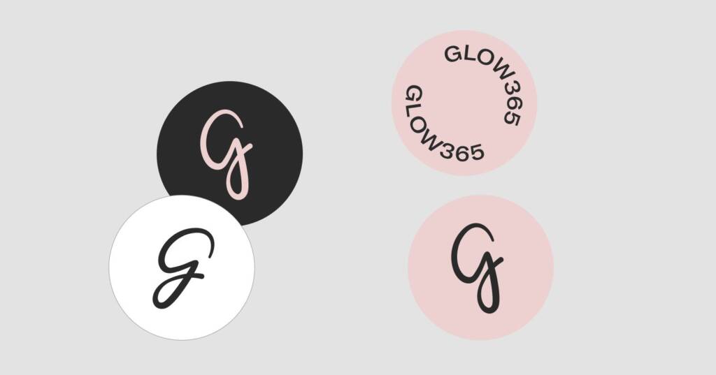
Brand elements for a cosmetics company
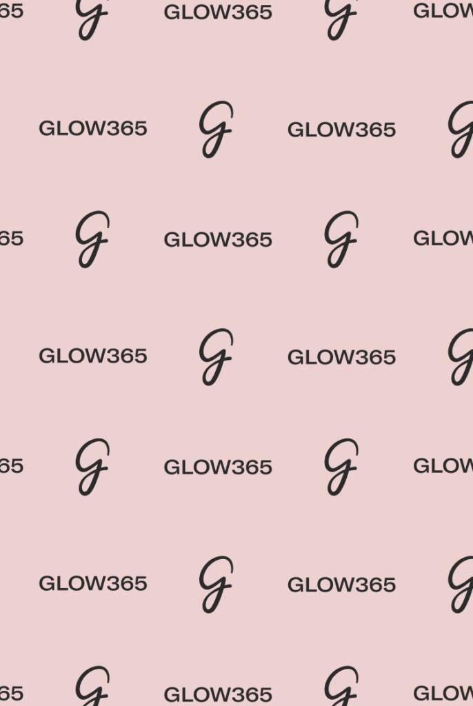
Pattern
When you launch your brand, it is important to have additional recognition elements. A pattern is always a highly functional part of branding because it can be used across both large and small surfaces, including subtle inner details and hidden areas of packaging. Over time, people begin to recognize the brand even without directly reading the logo or understanding what the pattern represents.
Typography
Typography is one of the most important brand elements, as it can have a highly recognizable appearance. In the brand guide, I mentioned the typography used for the logo design and also suggested additional supportive fonts for accents and brand communication. Also I show the possible typography layouts.
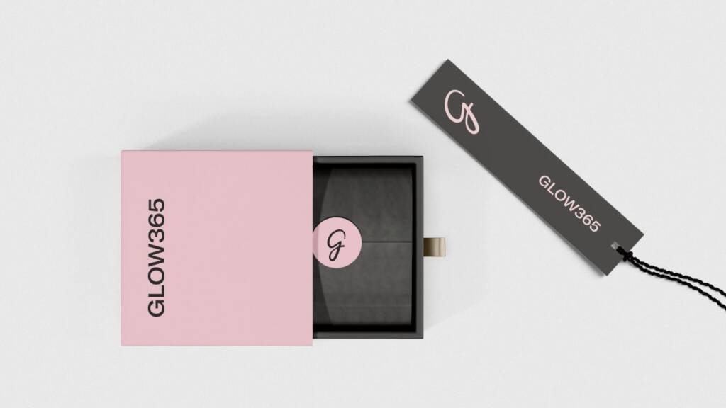
Small details
When you pay attention to small details like stickers, tape, pens or coasters, you explore your brand on a deeper level, and these details are truly noticeable for the brand’s audience. They do not require a large budget, yet they can be used across many different occasions and touchpoints, helping strengthen brand presence and create a more thoughtful and professional customer experience.
You can review a second project of this brand – Packaging design for a cosmetic mask and its applicator