

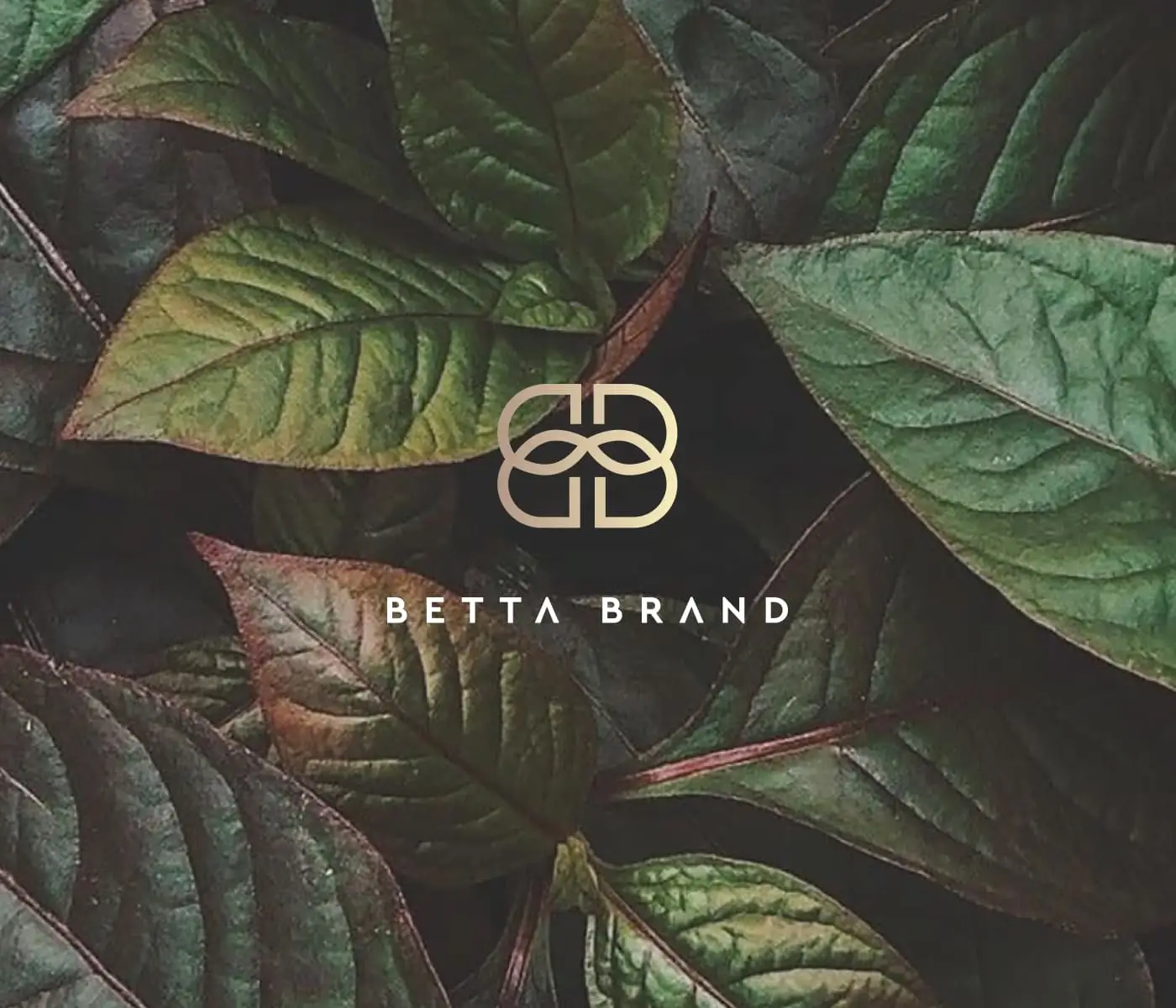
Logo design process
When I started working on this logo, I had minimal information—I only knew it was a sustainable brand, and that became the key direction. My goal was to explore how to convey the nature of the business. Organic symbols are usually built on soft lines and leaf forms.
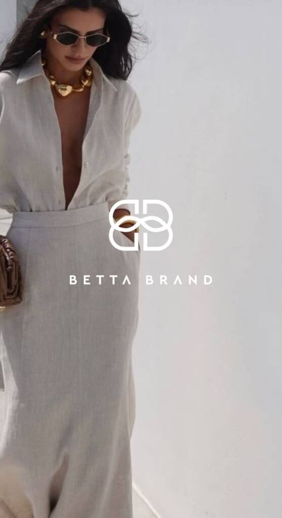
Betta Brand uses the letters ‘B’ and ‘B’, so to create a personal, brand-connected logo, I explored different layouts based on them.
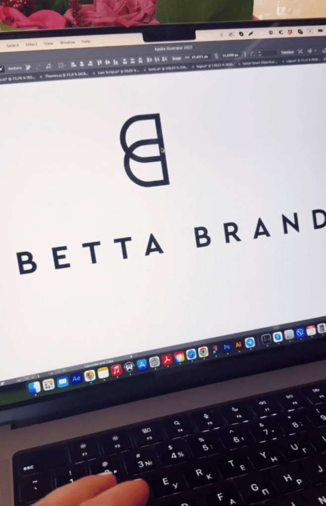
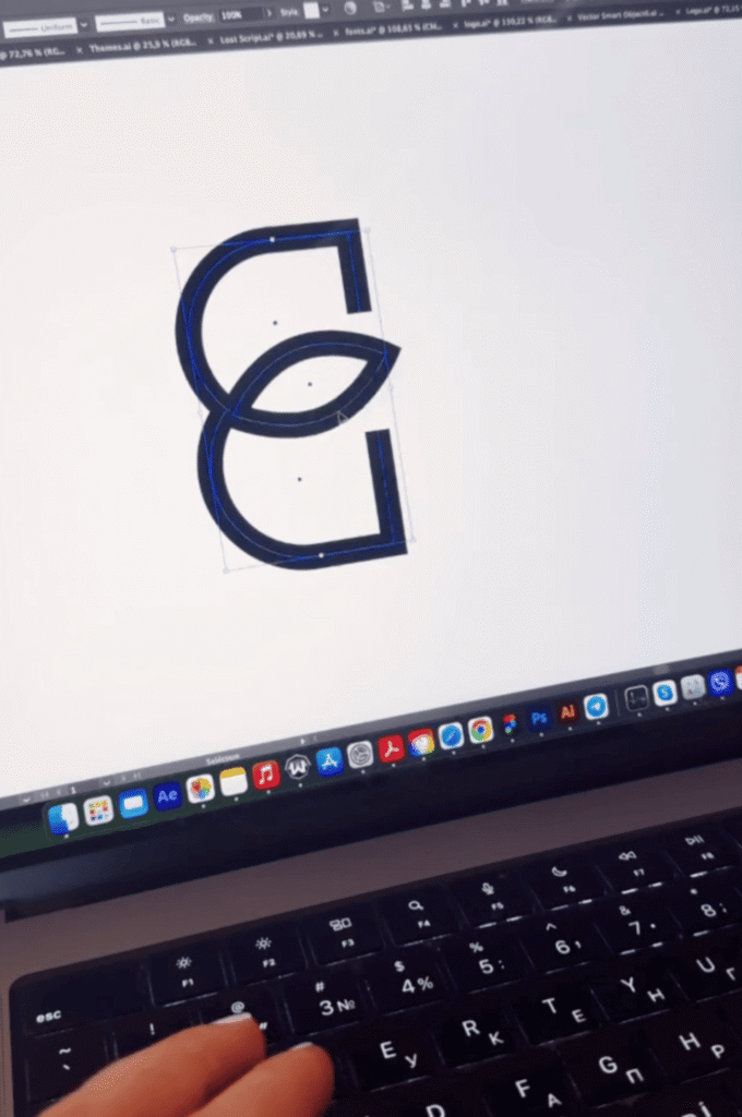
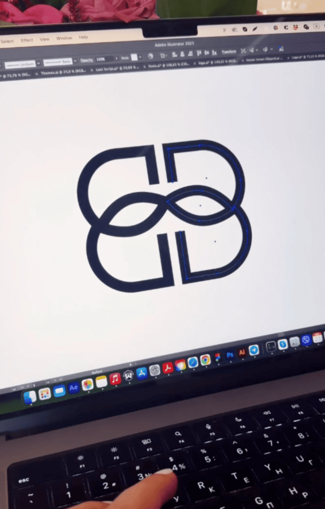
I explored different line variations and noticed that some connections could be developed further. Shaping the lines of the ‘B’ letters like leaves became a strong direction and the client accepted it.