

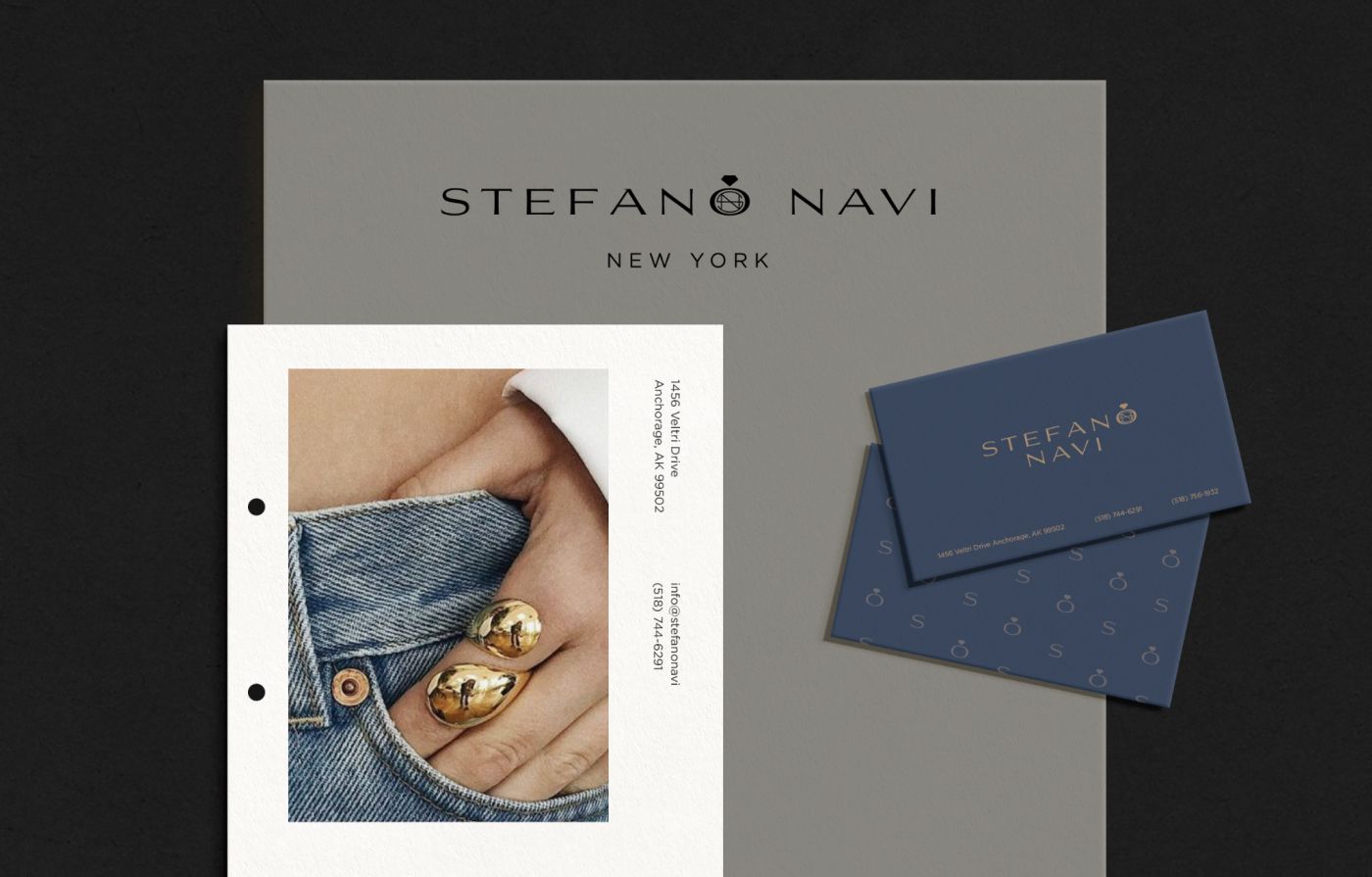

The client reached out to me through a freelance design platform. They wanted the design to communicate a sense of promise, trust, sustainability, and the exceptional value and quality of their products. Their goal was for customers to feel they could trust the brand just as they would a local jeweler around the corner.
I realized that trust was the most important emotion the brand needed to convey. From the very beginning, I felt that blue was the right choice, as it naturally evokes trust, reliability, and confidence. The logo also needed to feel grounded and bold to reinforce these qualities while reflecting the brand’s premium positioning.
Logo design process for a jewellery company
The process for this logo was a bit different from my usual approach. Instead of starting with sketches, I wanted to capture the brand’s feeling first, so I began with color exploration. As I mentioned, the client emphasized the importance of trust, and I knew the brand should be built around a shade of blue.
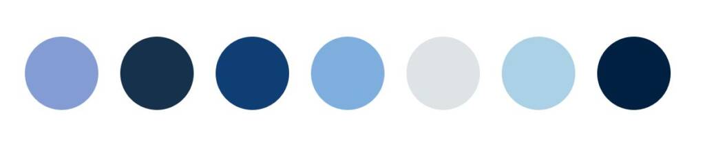
While exploring different tones, I noticed that the name contains “Navi,” which closely resembles the word “Navy.” That connection felt natural, making a navy color palette the perfect choice. It reinforced the brand name while conveying trust, confidence, sophistication, and luxury.
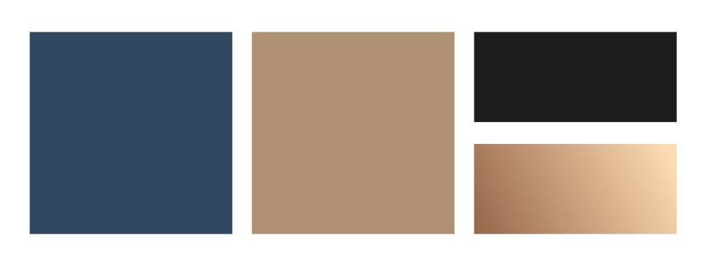
I liked the idea of using navy color combined with gold, as it feels luxury and elegant.
Typography for a jewellery brand
Once I had selected the color palette, I moved on to typography because I wanted to establish the structure and character of the letterforms. Two key factors guided my choice of typeface and overall logo direction.
First, the name “Stefano Navi” is relatively long and consists of two words, so I had to decide whether it should be displayed on a single line or split across two lines. Second, since the logo would primarily be used in the header of an e-commerce website, it needed to remain clean, minimal, and easy to read. A single-line layout was the better solution, creating a refined and elegant appearance while working well in a digital environment.
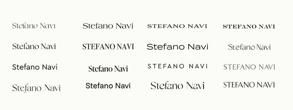
As I explored different typefaces, I was drawn to wider letterforms because they evoke a sense of stability and reliability. I also preferred a serif typeface, as it conveys timelessness, elegance, and luxury.
As a result, I decided to use a wide serif wordmark and introduce subtle custom accents to give it a distinctive character. The space between “Stefano” and “Navi” presented a great opportunity to introduce a subtle branded element. I chose a refined spark/star symbol to evoke the brilliance and glow of fine jewelry. It also allowed me to create a combination of the initials “S” and “N” alongside the symbol.
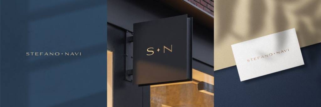
The client told:
“
I really really like the font. the color scheme is very nice as well. I love the diamond in the middle. There is something about the simplicity of this logo that i love. i want to see if you can take this design a little further with the diamond in the middle. i like your work a lot. thanks
I was happy that the client liked my direction and the ideas behind it. The overall concept was approved, so I only had to refine the symbol and continue developing the design.
Jewellery logo option 1
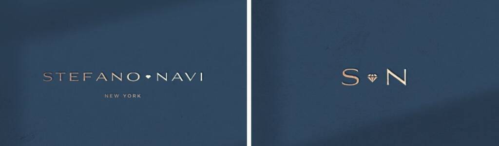
For this concept, I created two versions of the diamond symbol. The first one was designed for the wordmark, while the second one was created for the standalone logo. Since the standalone logo is usually displayed at a larger size, the diamond symbol could be more detailed.
Jewellery logo option 2
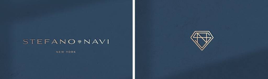
The symbol in this logo option is also a linear diamond. When used inside the wordmark at a smaller size, its details are not clearly visible. However, this gives it a more abstract appearance, making it resemble an engraving or a totem rather than a detailed diamond.
Jewellery logo option 3
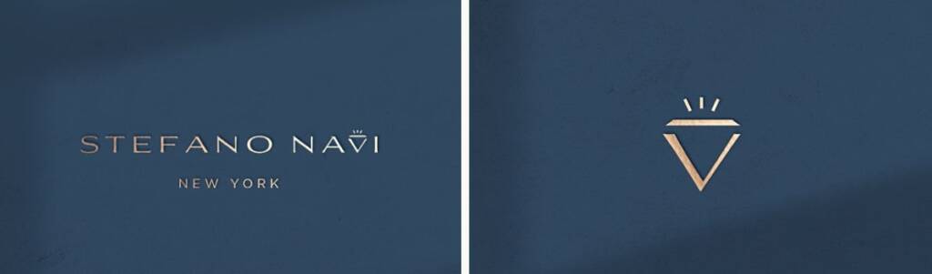
For this option, the diamond shape was incorporated into the letter “V”. This concept really caught the client’s attention and we worked on this concept a few iterations.
Jewellery logo option 4
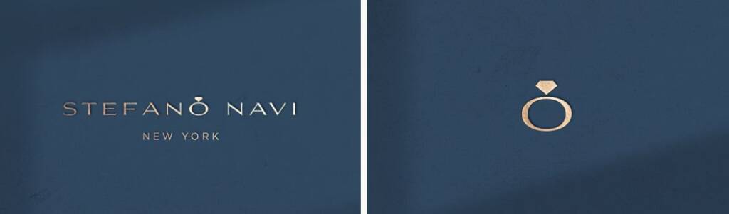
This option includes a subtle ring that combines the letter “O” with a diamond. It also helps balance the composition, as the word “Stefano” is longer than “Navi,” creating a slight visual imbalance. The ring symbol sits almost in the center, balancing the overall appearance.
After a few iteration the client told:
“
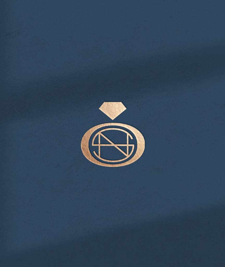
ok sorry i am asking you for so many revisions. you have been amazing and patient. is there a way to incorporate SN in this ring in a subtle way. i will need to use the ring logo by itself at times and i want it to have a little more to it
The client also mentioned that they liked the custom tweak used in Option 2.
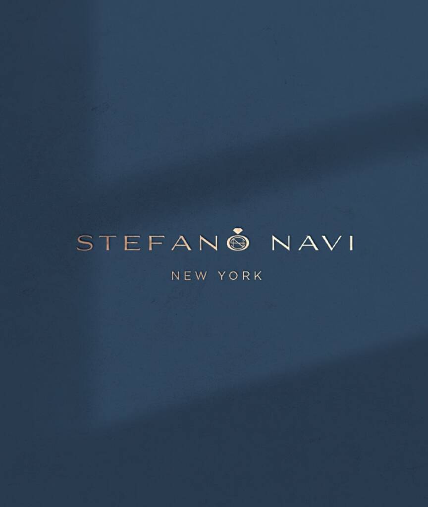
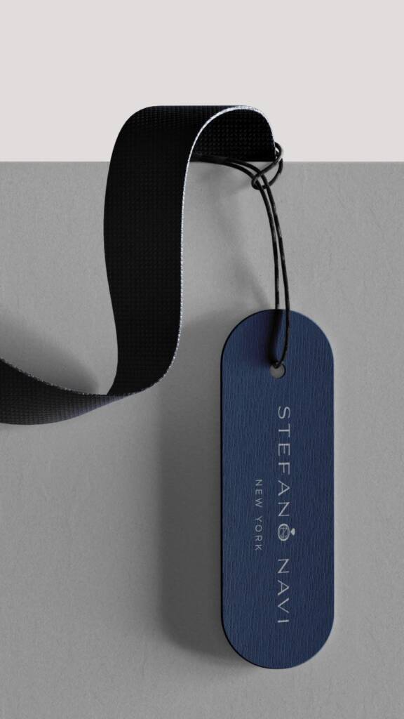
The final logo design for a jewellery company
Love the confident and rich vibe? Check this project – Real estate logo design and brand identity services
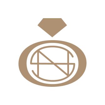
This subtle connection between the letters “S” and “N” has the appearance of an engraving when viewed from a distance. The client liked how it made the logo feel custom and personal. You can check them here https://stefanonavi.com/
Branding and brand elements a jewellery company
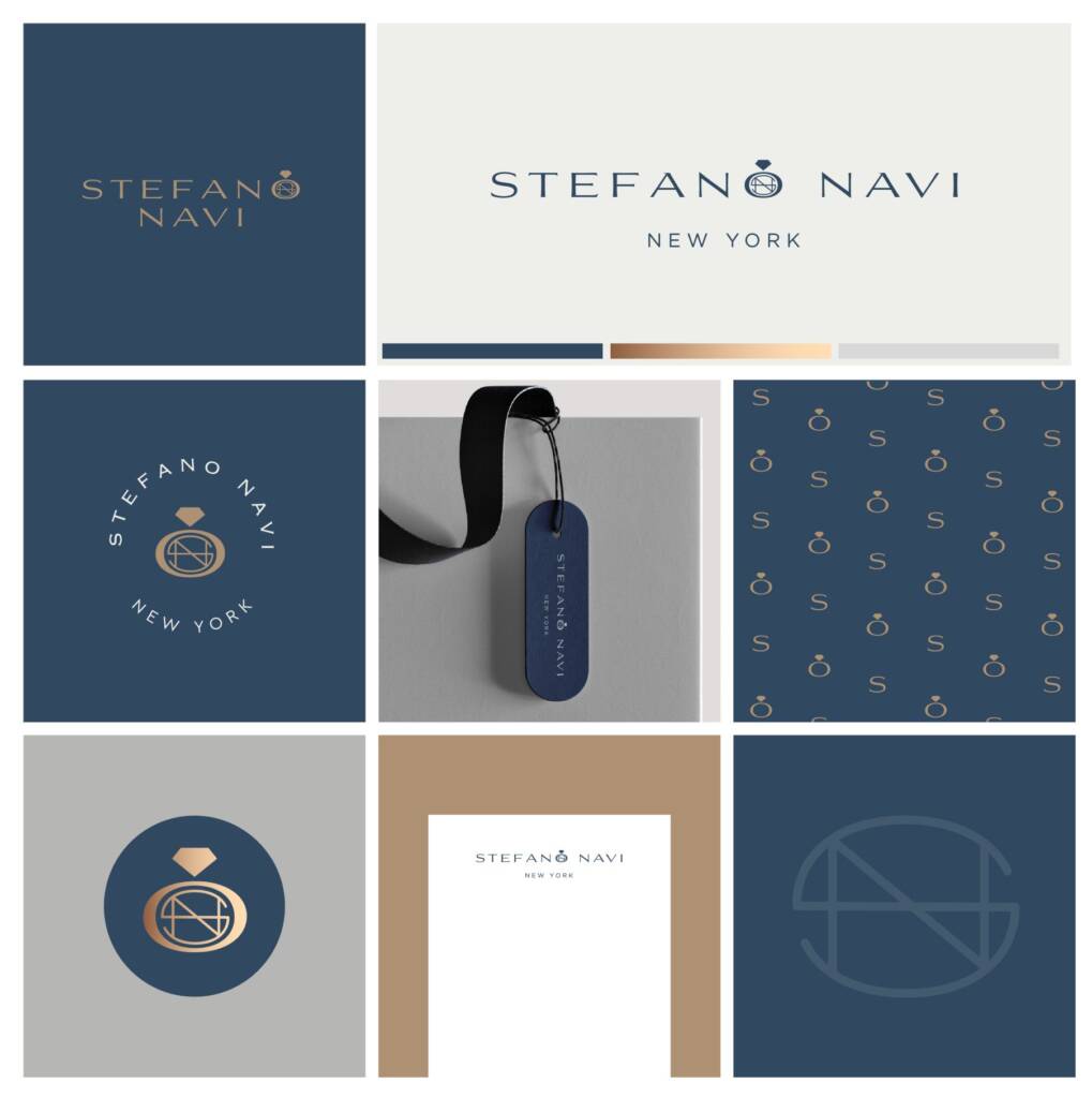
Once the logo is finalized, I always create multiple layouts and variations. This step is important because the logo will be used across many formats, including e-commerce, advertisements, avatars, business stationery, and more. The more versatile the logo is, the more professional and consistent the brand appears.
For this brand, I created a stacked logo layout for vertical applications, a circular layout for stamps and other round formats, and suggested an alternative way to use the linear “SM” element as a standalone brand asset.
Pattern design for a jewellery company
For the pattern, I suggested using a combination of the initial “S” and the ring element. This makes the pattern feel branded while remaining recognizable and readable.
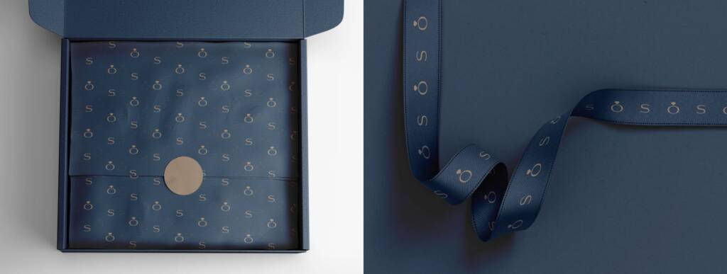
The pattern is very important for branding. It can be applied across a wide range of brand touchpoints, including jewelry boxes, shopping bags, tissue paper, gift cards, certificates of authenticity, website backgrounds, social media graphics, packaging, and printed marketing materials. Using the same branded pattern across these applications helps create a consistent visual identity throughout the customer experience.
In the examples below, you can see different pattern applications and layout variations.
This branding also uses blue as its dominant color. However, the personality feels different – Professional, luxury logo design and brand services for a building company
The client feedback
Thank you for EVRYTHING YOU HAVE DONE!!!
Stefano Navy
Jewellery Company