

The client was happy with the logo and brand guide design I created for them. They decided to continue working with me and start building their market presence, saying:
Super excited to get started. Thank you! – Alexa
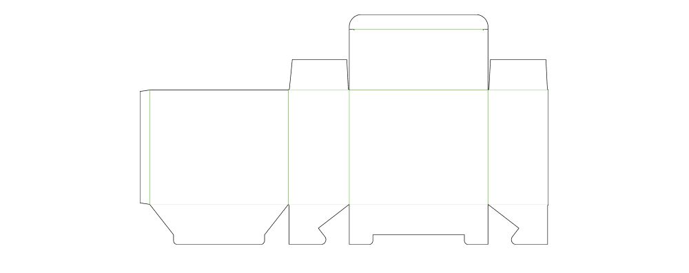
Before starting, I didn’t receive the dielines from the client. This often happens, especially when the client is still unsure about the packaging format. In this case, I usually start with a square front design, keeping in mind that the client may later choose a different format. That’s why the design needs to be flexible and adaptable.
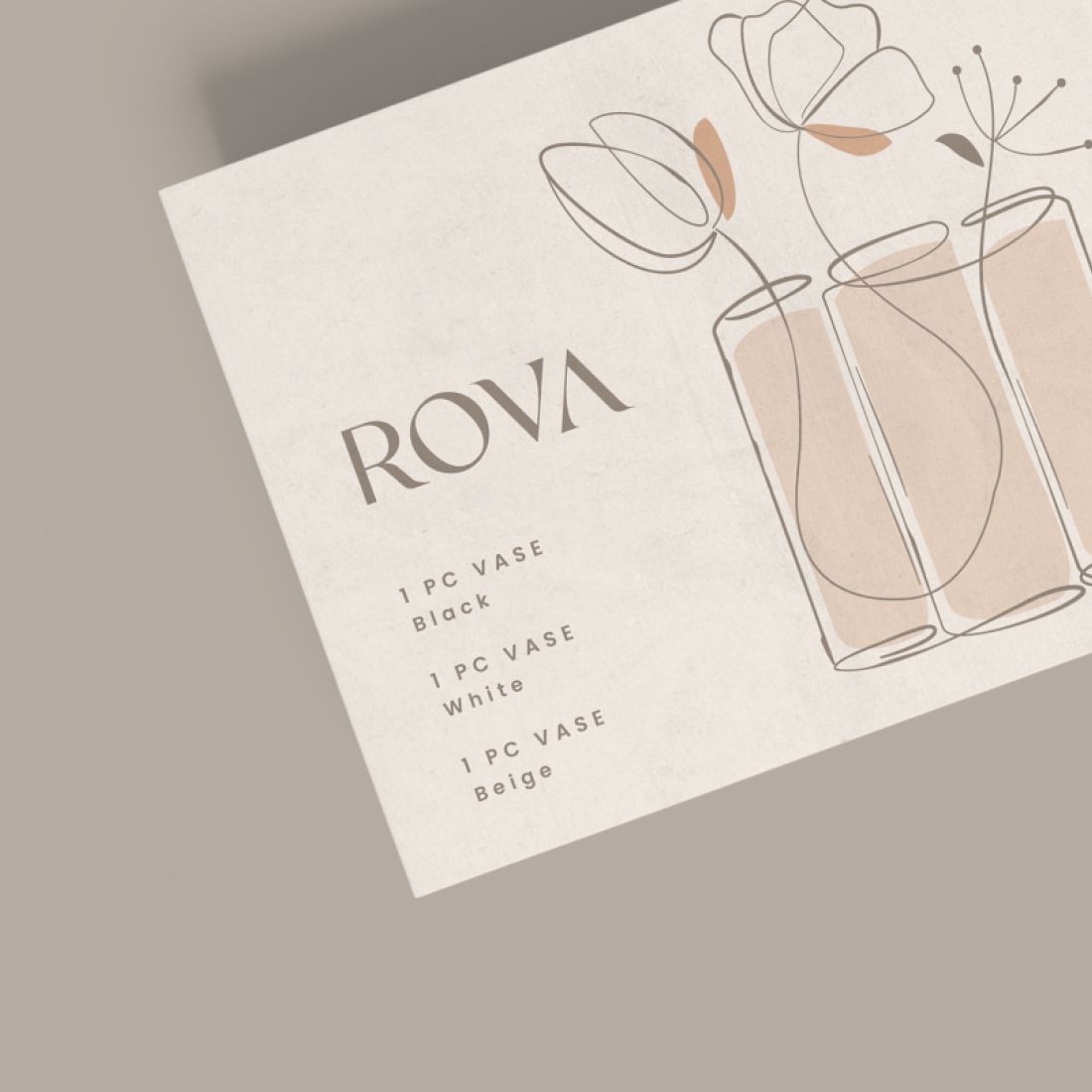
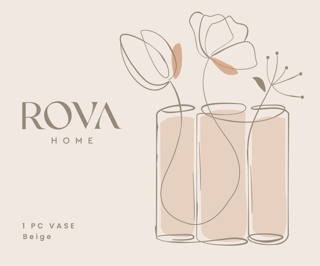
First design concepts for home décor packaging.
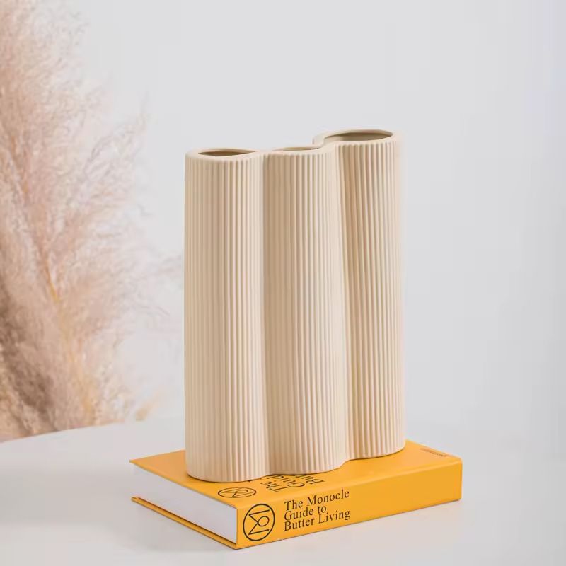
When I started working on the design, I thought about the final purpose of the product. Since it’s a vase, it would naturally hold flowers or greenery. This inspired the overall visual direction of the packaging. I wanted to create a warm, cozy feeling using floral elements and soft backgrounds that would emotionally connect with buyers and attract attention.
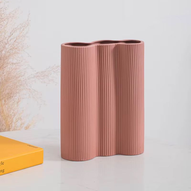
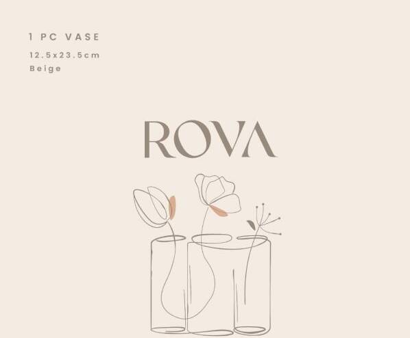
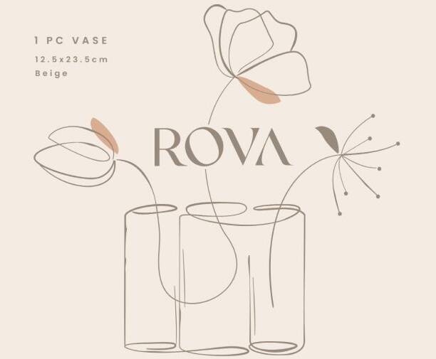
Additionally, the vase came in multiple colors, and this design approach allowed us to highlight that variety by adapting the packaging colors to match each vase.
The client said this was the right direction, shared a photo of the actual vase, and followed up with this comment:
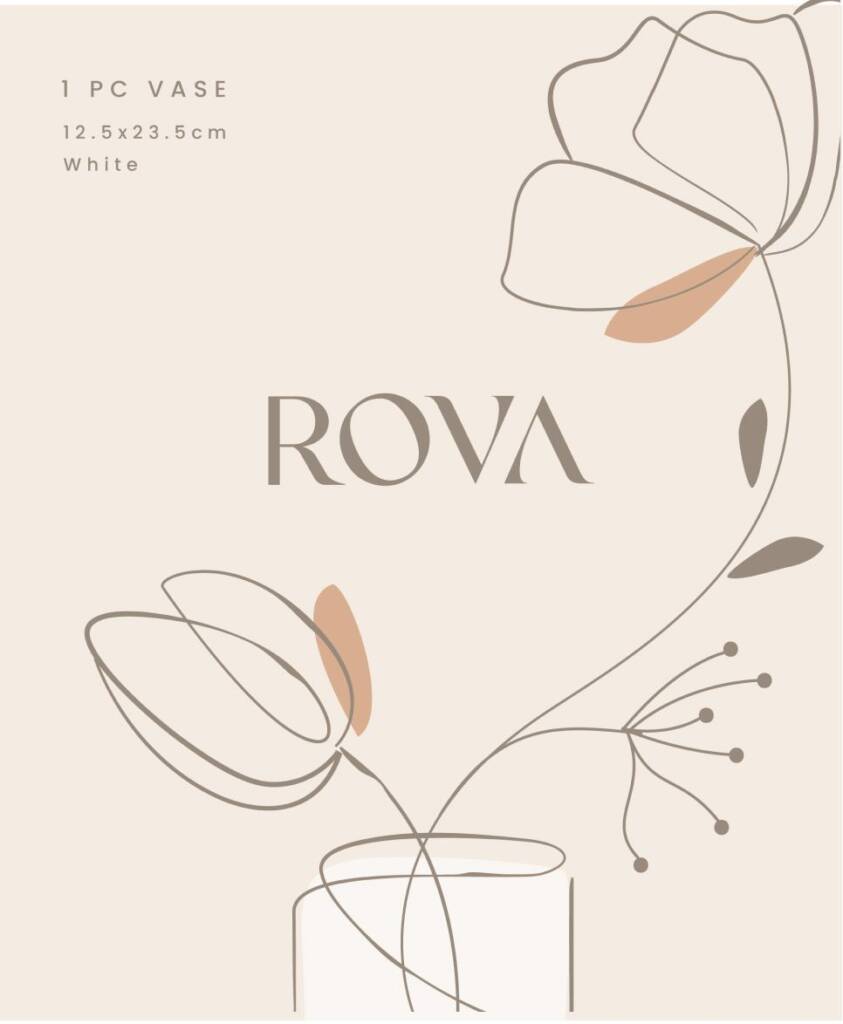
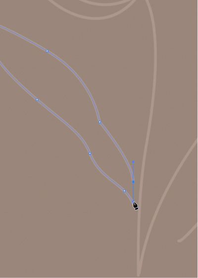
Based on the photo of the single vase, could you make the line be a complete drawing of the vase itself? We can put flowers but make it smaller as the image should be more focused on the vase. This style/look is something we’d like to replicate and be consistent with all other future products even those that are not vases.
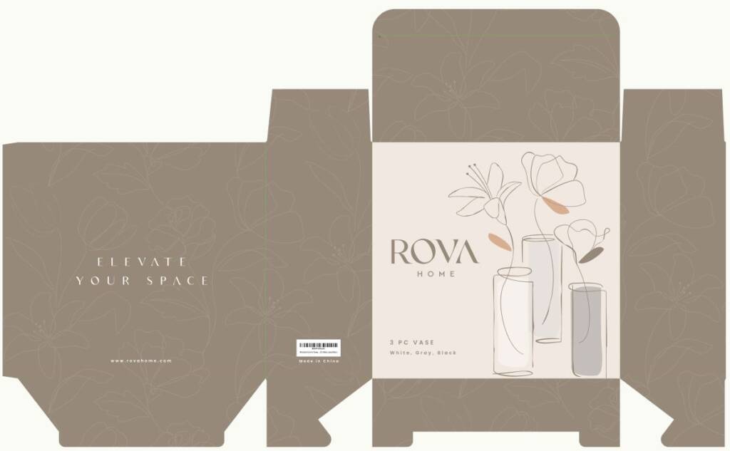
The client also sent the dieline:
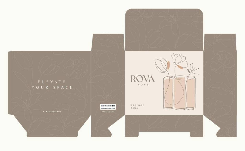
Since the client liked my concept, adapting it to the final dieline was a smooth process. I also refined the packaging design based on the vase references they provided.
Love handdrawn aesthetic? Check this project – Gift logo design and branding for a gifting company
After that, we explored different design approaches, but the client still preferred the initial concept shown above.
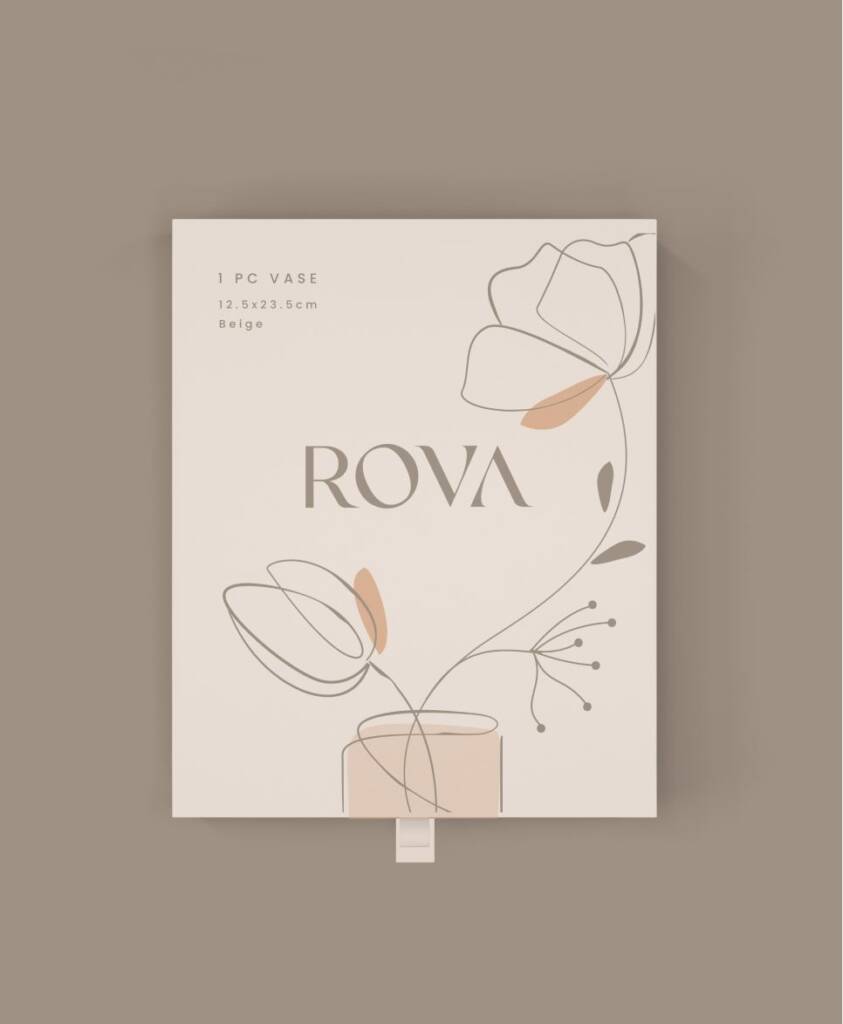
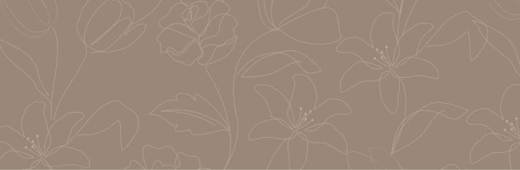
After the front design was approved, I moved on to the side panels and created a beautiful floral pattern to complement the overall packaging design.
Then I added packaging details such as a barcode and a brand tagline on the back side. Together, these elements created a custom, unique, and thoughtfully crafted packaging design.
The client feedback:
Inna, this is great! Our team loves this aesthetic and unique look. We can proceed with the 3-piece vase. So excited!
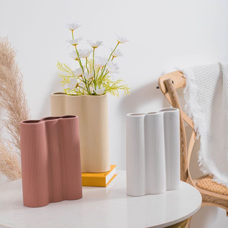
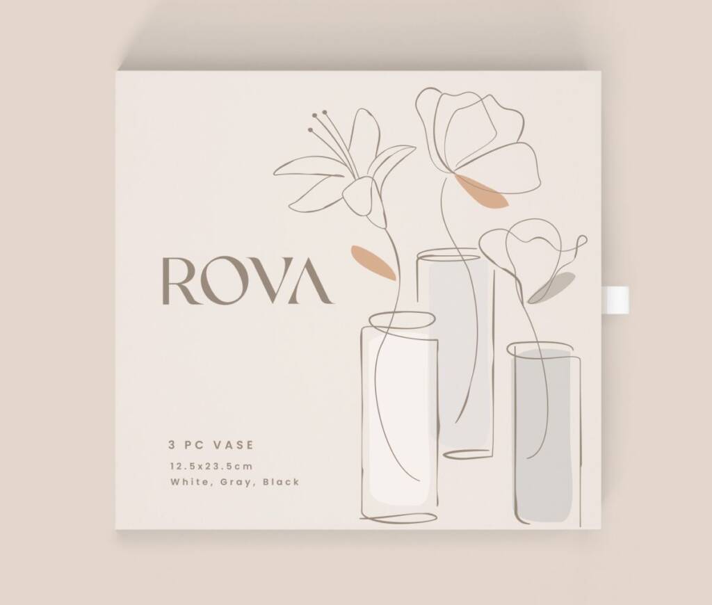
The next packaging design was created for a vase set consisting of three pieces. Since the vases came in different colors, the packaging design was made adaptable to highlight each variation.