

The client was happy working with me and asked me to redesign their packaging for a cosmetic mask and applicator.
You can check the first project here – Handwritten “G” letter logo design for a cosmetics company
Packaging design process
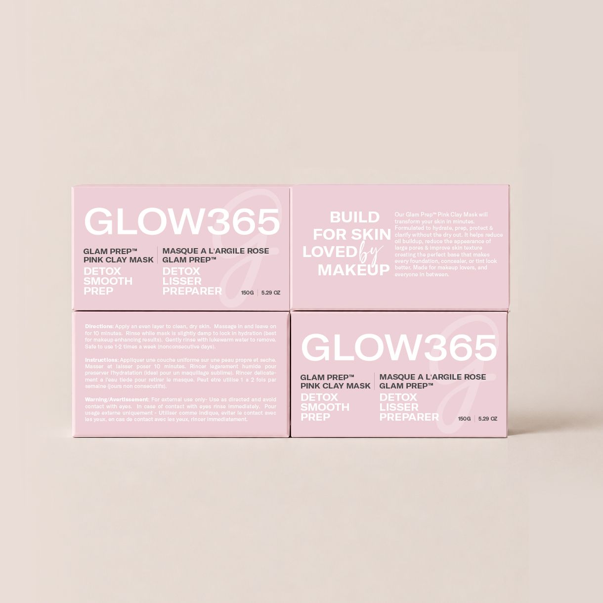
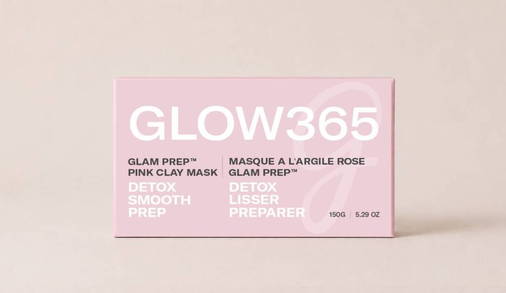
Mask packaging design
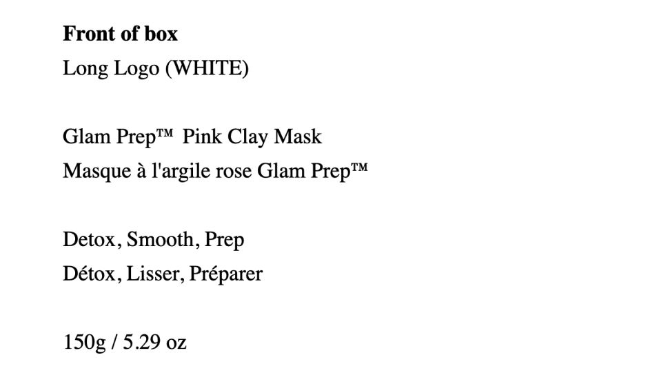
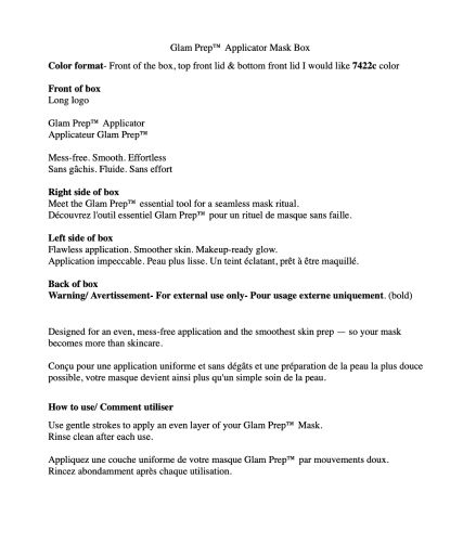
I received a brief for the mask packaging — it was a Word document containing a description of the content for each side of the boxes. The client also provided the box dieline.
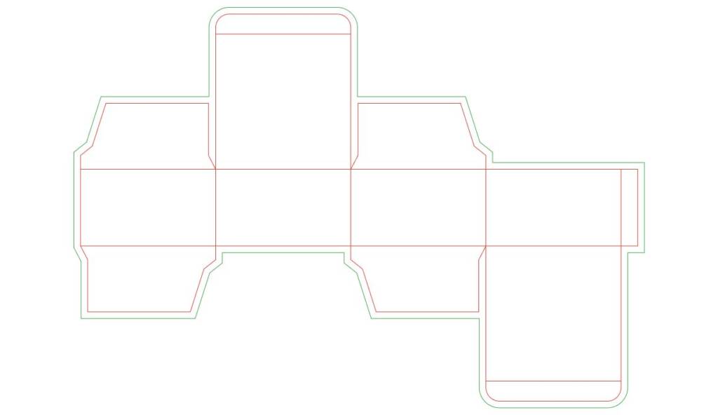
The dieline showed the exact dimensions, so I understood the content sizing and possible proportions. From the brand guide, I also knew that the design direction had to be either fully pink or a combination of pink and white. Additionally, the challenge was that the packaging content included two languages — English and French.
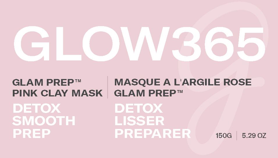
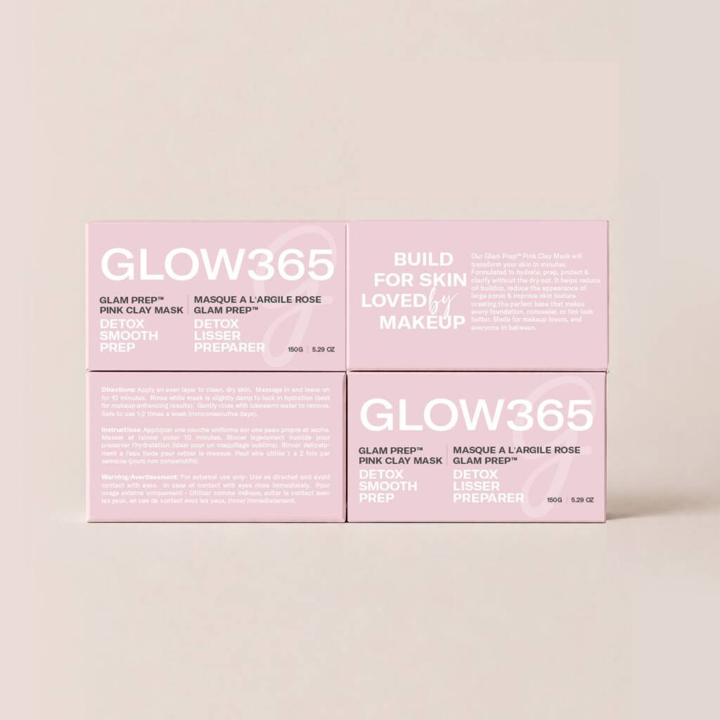
I started placing the content on the sides of the packaging. The front side included the main brand and product information.
Once I was satisfied with the front design, I continued elaborating the side panels.
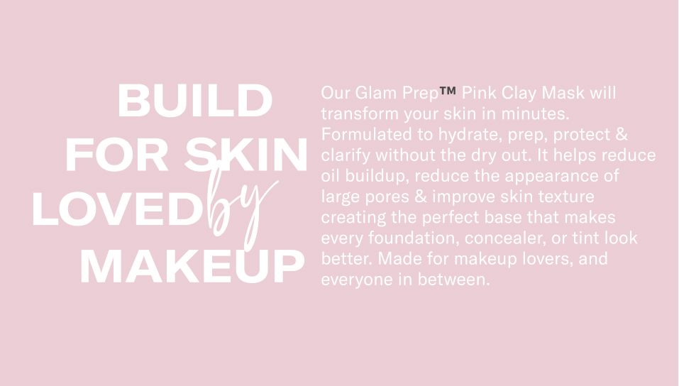
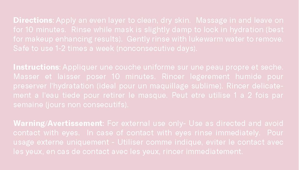
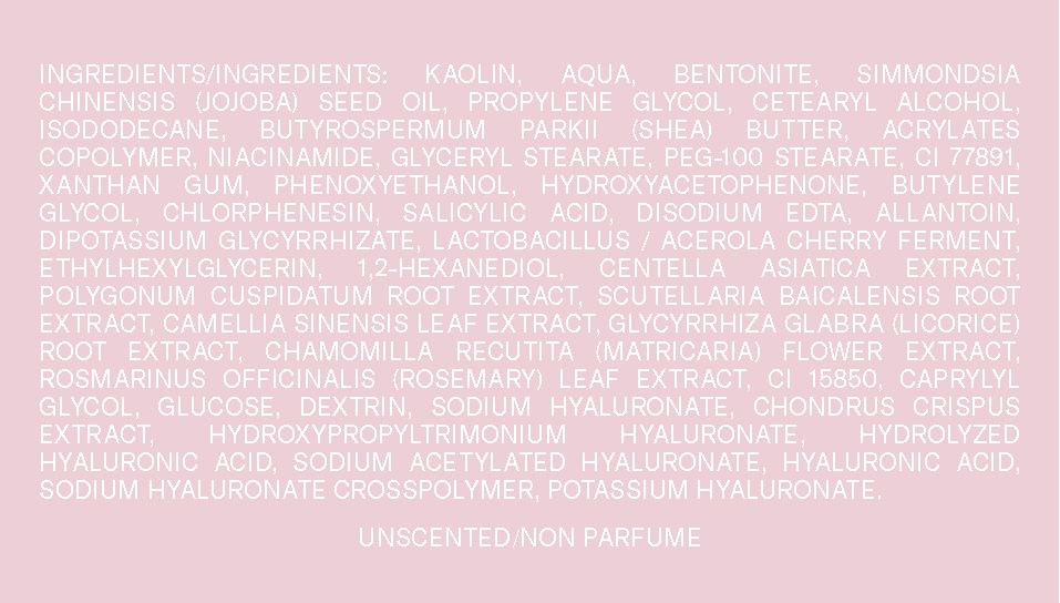
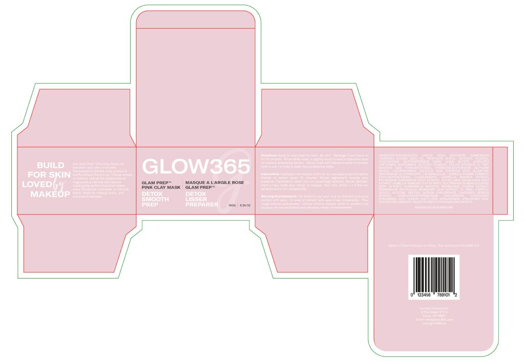
Additionally I elaborated the inner sides of the packaging
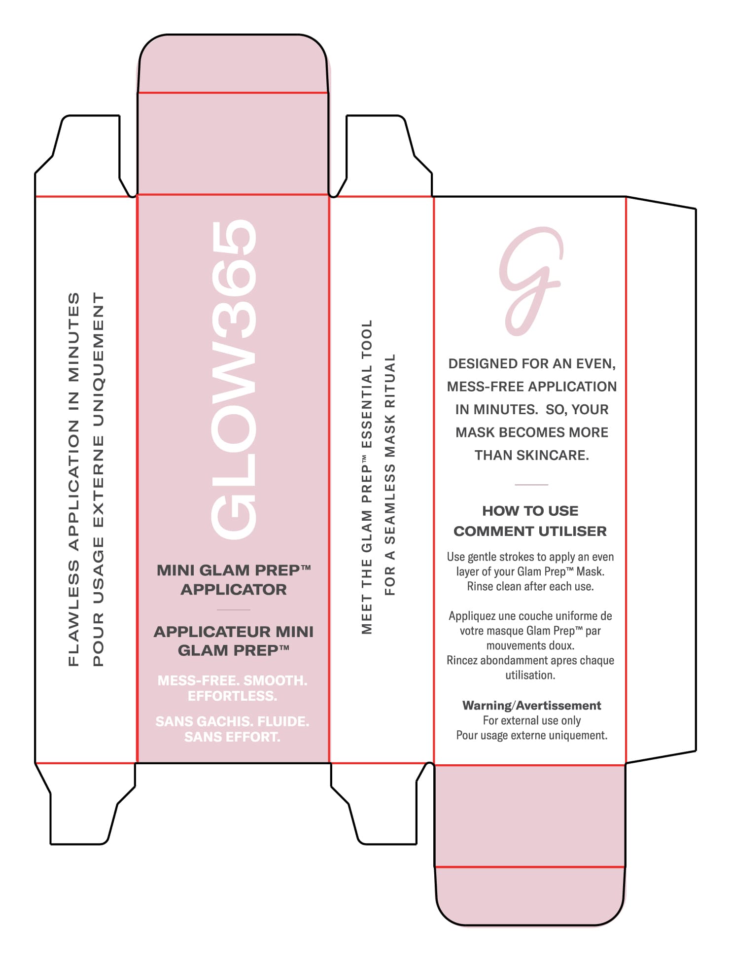
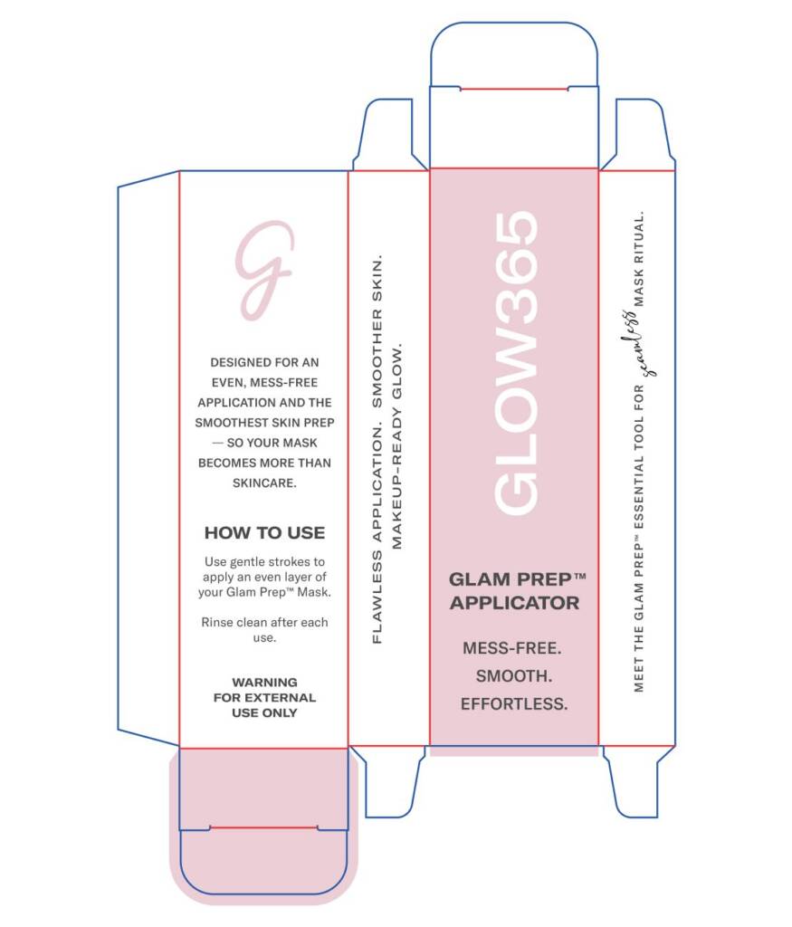
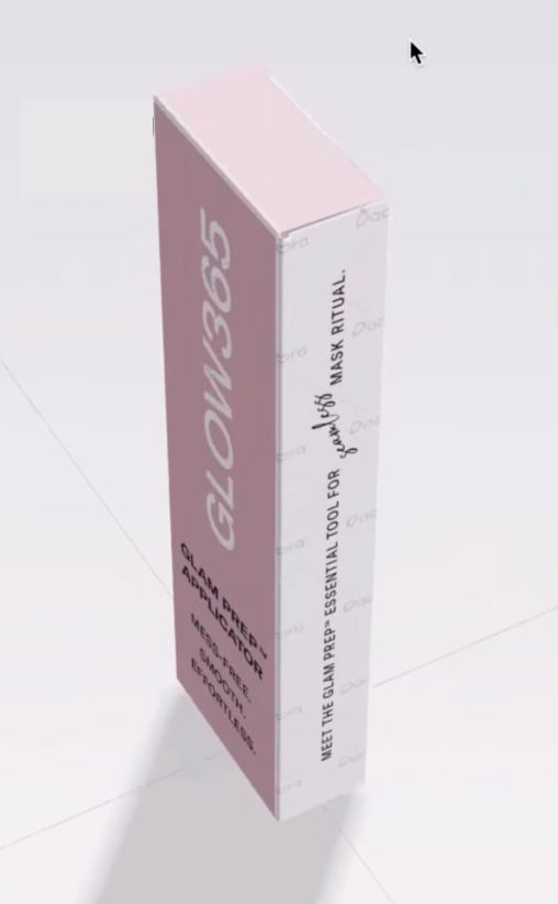
Applicators packaging design 1
Once we approved the mask packaging, we moved on to the applicator packaging design. I also received the dieline along with the content for the sides. In this case, I suggested several content improvements, and the client was happy with them.
The packaging sizes were very small—only 2.44 cm in width and 7.35 cm in height and 33mm x 114mm. Keeping this in mind, I made the text size easily readable for buyers. You can also see versatile typography—this is because the text needs to be flexible and engaging, with a clear hierarchy, sections, and titles.
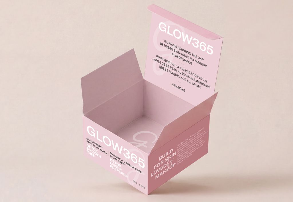
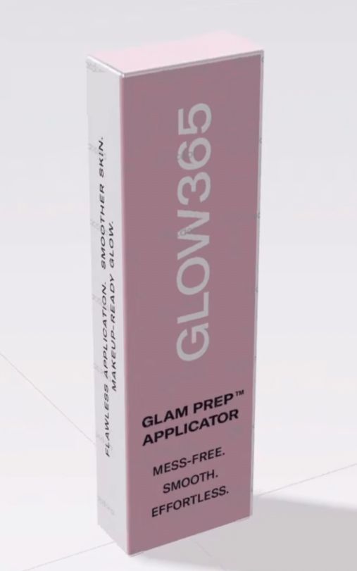
Once everything was ready, I also prepared a 3D online visualization, allowing the client to review the design in real time.