

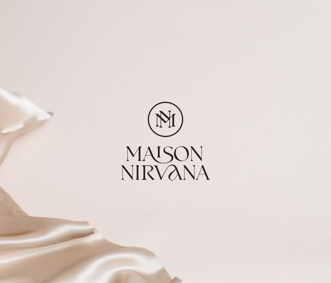
Logo creation process
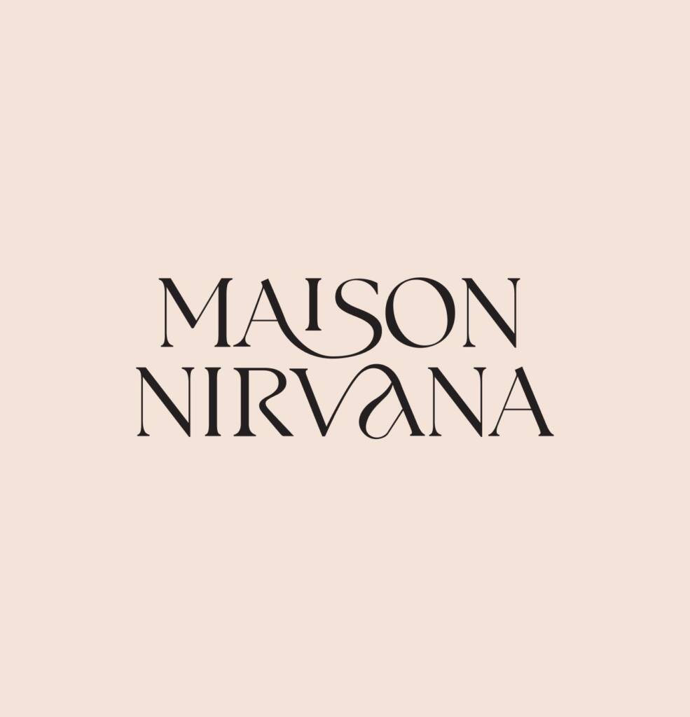
When I start developing my logos, the first thing I do is analyze the words in the name. I create five canvases for different ideas and test various fonts. This helps me understand the voice of the logo.
French style and a bohemian look almost always feature flowing lines and serif typography, so I defined an initial font that I liked and started customizing it.
The wording was long, so I decided it should be set vertically. I noticed some letter connections and refined them.
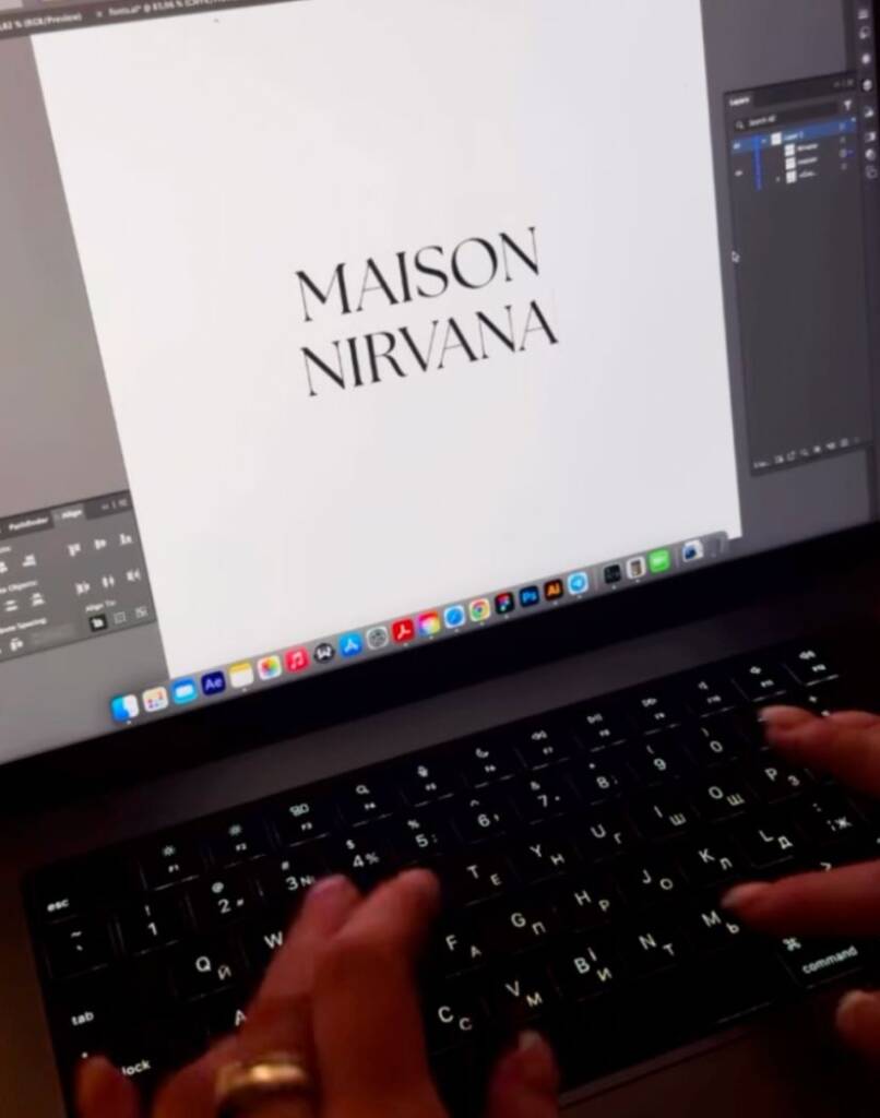
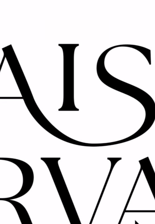
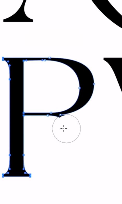
As a result, I created a very nice piece of typography.
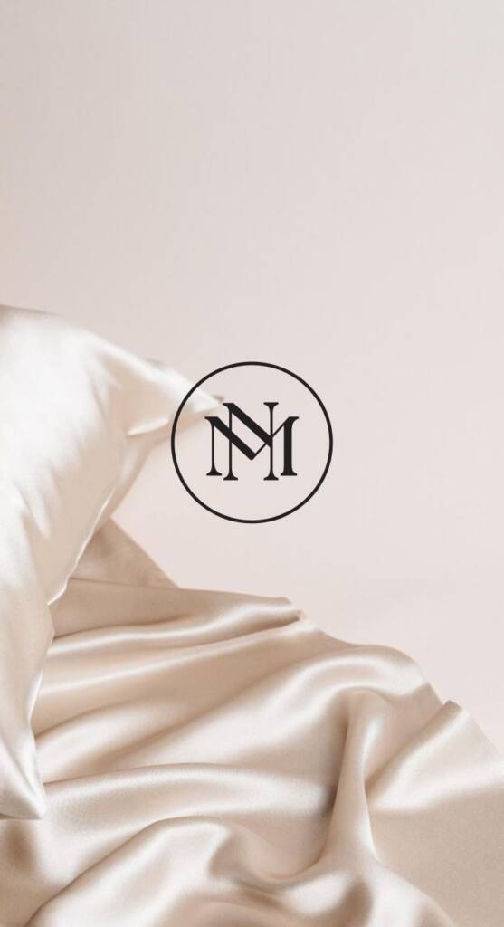
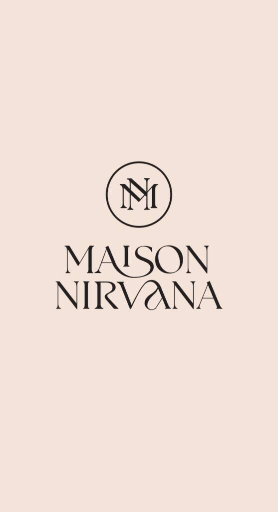
To complete the idea, I developed a symbol that would complement the wordmark nicely.
Symbol design
For the symbol, I used the first “M” and “N” letters. To make it balanced, I adjusted the letters so the lines are parallel and look smooth and professional.