

A client reached me out via email to start a collaboration. They requested a logo for their custom luxury home building business. The client asked for details – whether I provide options and what the logo and brand guide include. I clearly explained everything with pleasure. You can also review useful information about the process, terms, and deliverables. The client liked everything, and we started the project.
Logo design process
Wordmark design a building company
At the start of the project, I focused on the name. The name is “Livingstone.” It can be interpreted as “living stone,” symbolizing the balance between strength (a solid foundation, reliability) and life (a home as a space for family and inspiration).
Also, the word “Livingstone” is long and it gave me ideas of potential compositions:
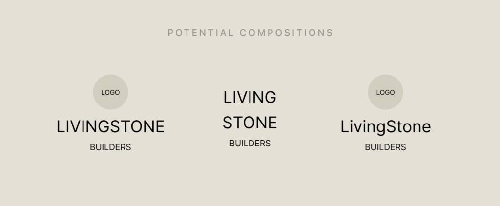
I saw the potential benefits of the longer wording — using a wide font enhances the presence of the name. The word “Livingstone” could become the stronger element of the logo (with emphasis on “Stone”), while the symbol remains more delicate and organic, evoking a sense of life (“Living”).
I explored potential fonts that later became part of the options I presented. Even though I believed my layouts and logo architecture were strong, I considered that the client might not appreciate wide, bold fonts. So my goal was to develop the strongest possible ideas using different styles and approaches.
Symbol design for a building company
I took the wordmarks as a base and developed different directions for the symbol:
- An LDB lettermark with circular and natural lines
- An organic, linear symbol that felt subtle and handmade, featuring intertwining leafs
- A signature-style option
- An ornamental logo evoking a sense of creation and building
- A flower form rooted within the letters
The client appreciated one of the options for its simplicity and eye-catching quality.
These symbols achieved a strong balance with the wordmark and were not too subtle—more defined, with a touch of handwork. The client asked for a couple of refinements and chose the option they fell in love with. It was the option that I made using a Wacom tablet. I created smooth lines of a leaf to convey a sense of nature and artistry. As a result, the logo combines soft, organic forms with sharper elements.
Love natural shapes and clever symbols? Check this project – Heart logo design with a movement for a dessert company
Brand guide for a building company
Color palettes
After the logo approval, the first thing I did was select the right colors for the brand. The client initially mentioned that she likes a strong, powerful color palette. At the same time, the wording suggested using natural, grounding tones.
Both with the client we chose these colors:
- Earth Clay evokes a sense of warmth, comfort, and stability, as well as grounded strength, reflecting natural materials and a connection to the earth.
- Blue Steel evokes a sense of trust, reliability, and quiet confidence. It reflects strength and precision while adding a refined, modern depth to the brand.
- Warm Gold evokes a sense of refined luxury, warmth, and understated elegance. It adds a rich accent to the palette, bringing light, sophistication, and a premium feel to the brand.
Color proportion
Color proportions define how each color is distributed across the brand to create balance, hierarchy, and visual consistency.
White (40%) — primary base, creating space and clarity
Blue Steel (30%) — main secondary, adding depth and structure
Earth Clay (20%) — supportive tone, bringing warmth and grounding
Warm Gold (10%) — accent, used sparingly to highlight and elevate key elements. Warm Gold, as the smallest proportion, functions as a highlight — it draws attention without overwhelming the composition.
Love bold colors? You may like this brand project – BK logo design and brand identity for a kitchens design studio
Visualisation
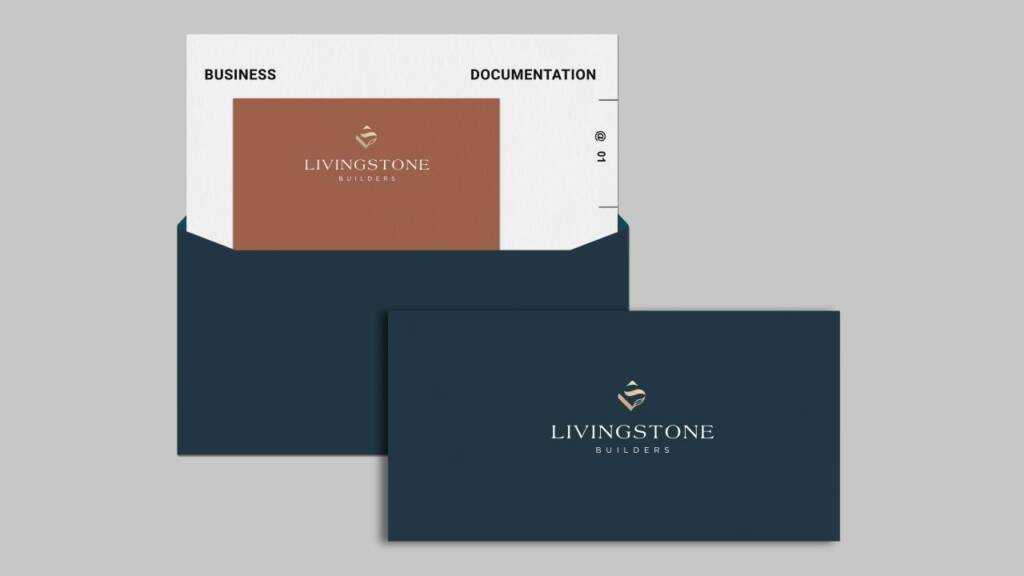
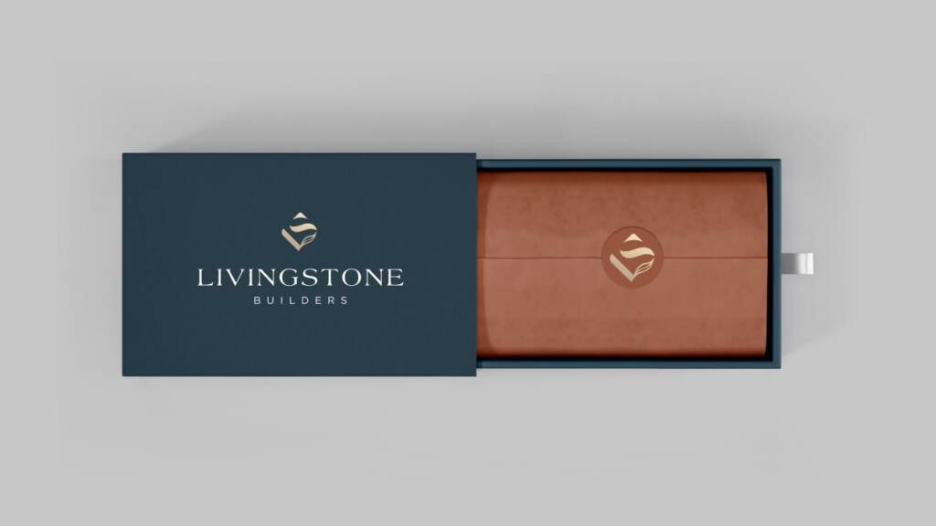
For visualization, I use mockups—they help illustrate how the brand behaves and guide teams or clients on how to use it properly. They also help define color application across elements, from larger surfaces to smaller details, as outlined in the brand guidelines.
Logo layouts
Logo layout defines how the symbol, typography, and spacing are organized to maintain clarity and visual balance. It is adjusted across formats—such as social media, horizontal, and vertical applications—to ensure consistent presentation.
It also gives an idea of logo placement on different surfaces—from web to print.
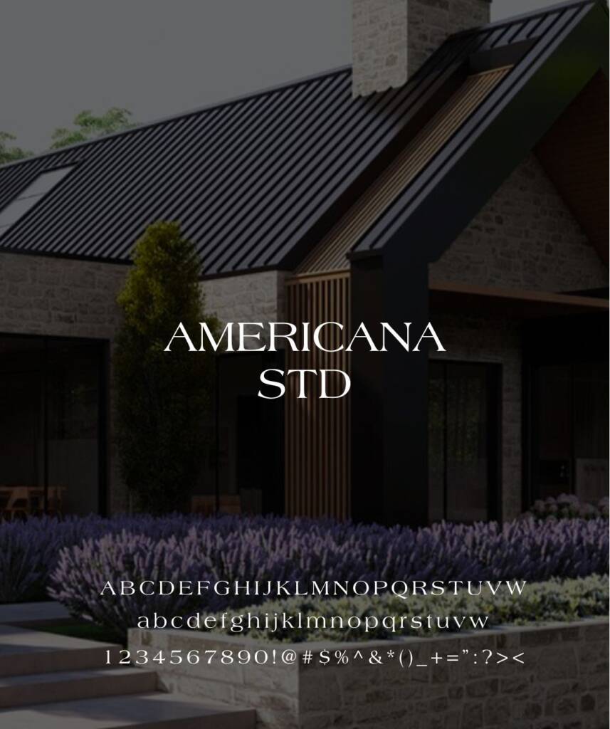
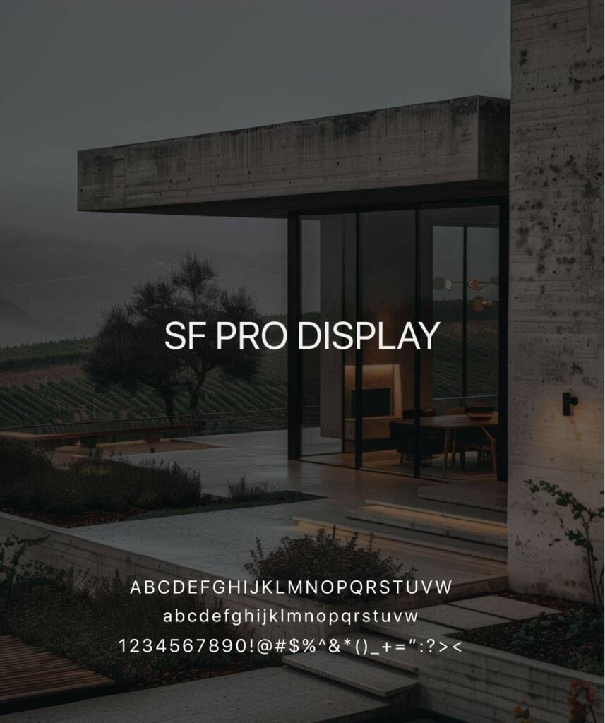
Typography
The brand guide also includes a typography section—explaining which fonts were used for the symbol and which are recommended for content and accents. For this brand, I used the logo font as an accent and paired it with another, more straightforward and highly readable typeface for content.
Looking for more inspiration? Check this project – Ornamental “H” letter logo design and branding for an Interior Studio