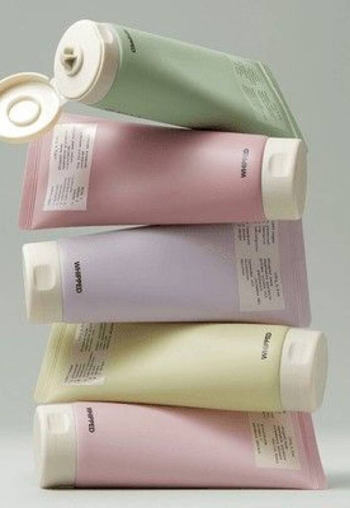
When it comes to beauty brand colors, there are virtually no limitations. What matters most is the overall aesthetic and how well the colors work together.
The beauty industry is incredibly diverse, encompassing a wide range of styles—from classic to contemporary, from soft and delicate to bold and confident. Because of this variety, there is no single “correct” color palette for a beauty brand. What matters most is the emotion you want to convey and the impression you want your audience to associate with your brand.
In this post, I’ll explore the first set of visually appealing beauty palettes and explain the emotions, associations, and impressions each color can evoke when used in cosmetics and beauty branding.
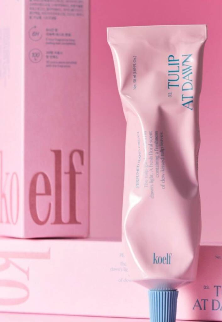
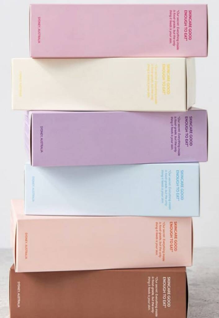
The first and one of the most popular colors in beauty and cosmetics is pink.
Pink naturally evokes feelings of beauty, femininity, care, and self-confidence. It can communicate a sense of softness and elegance while remaining approachable and inviting. Lighter shades often feel delicate and nurturing, whereas deeper pinks can appear sophisticated, modern, and luxurious. This versatility allows beauty brands to appeal to different audiences while maintaining a strong connection to the concepts of self-care and personal expression.
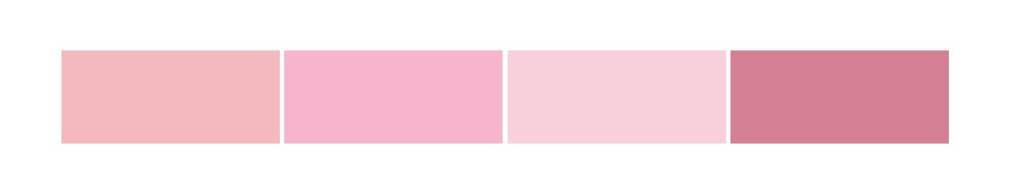
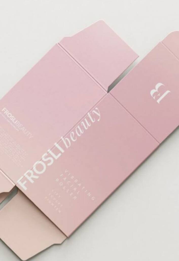
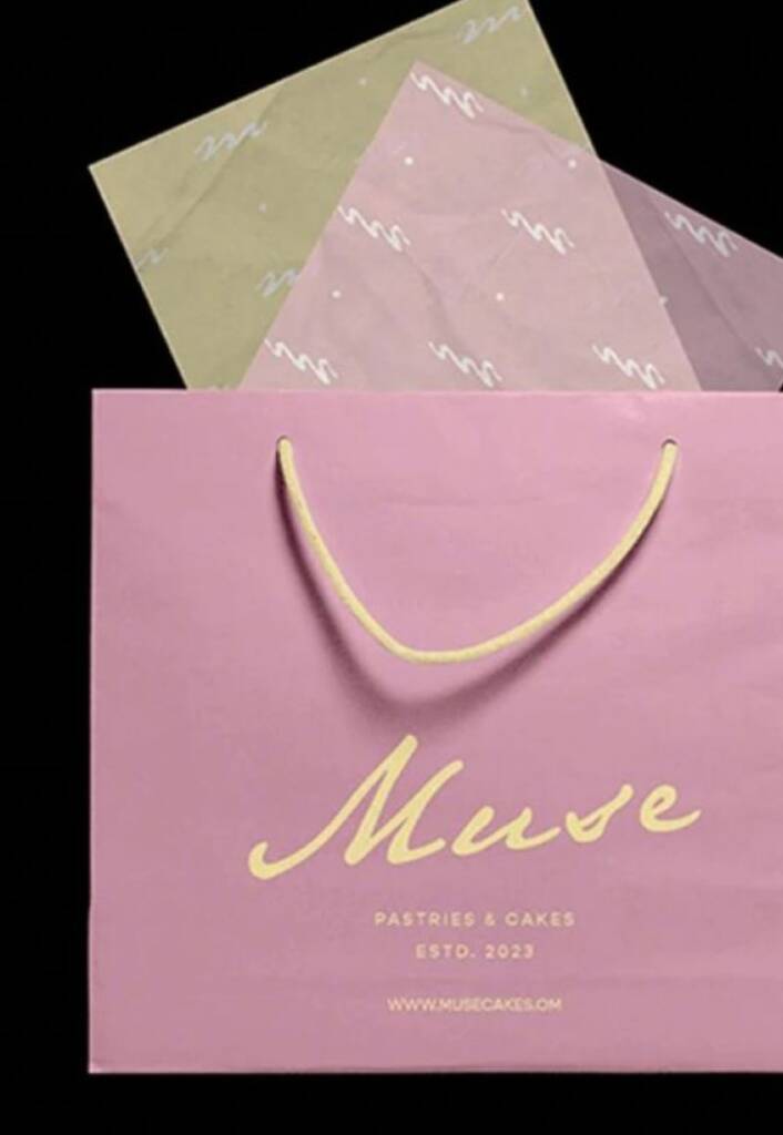
Pink gradient cosmetics branding
Pink pairs easily with a wide variety of colors, which is why it works exceptionally well with gradient effects. Blurred color transitions, radiant glows, soft gradients, and luminous overlays are commonly used in pink cosmetics branding. These effects enhance the sense of beauty, softness, and luxury while adding depth and visual interest to the overall brand identity.
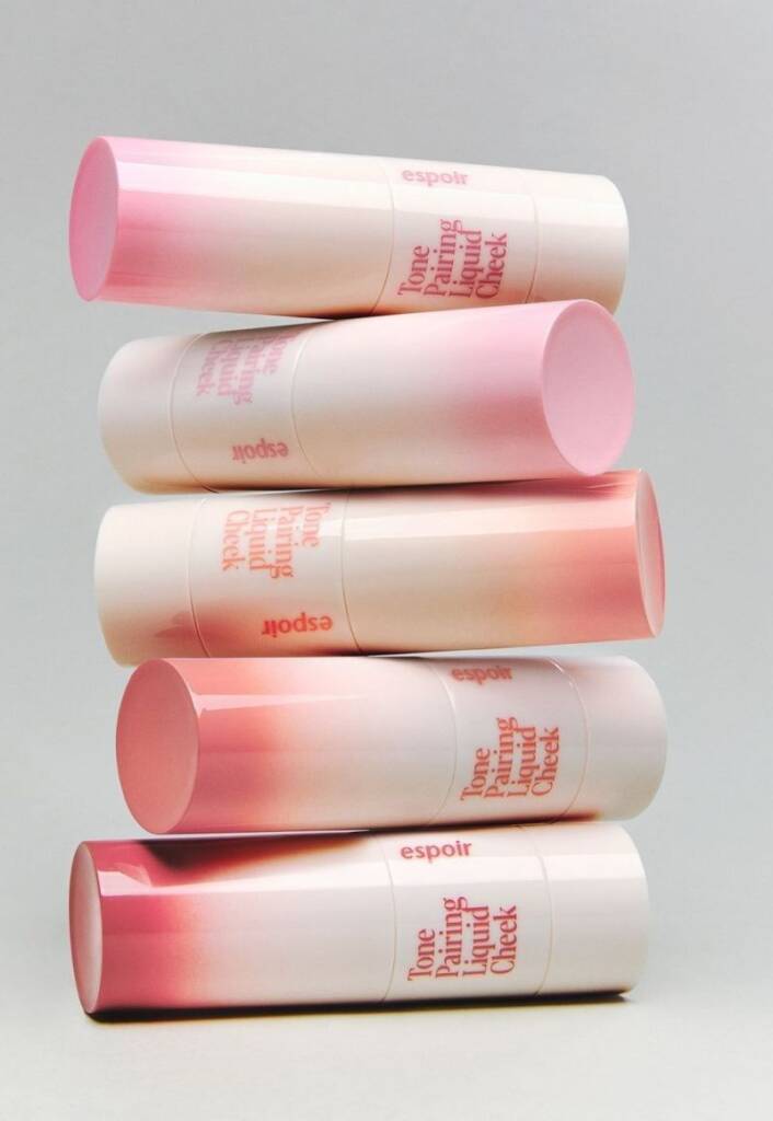
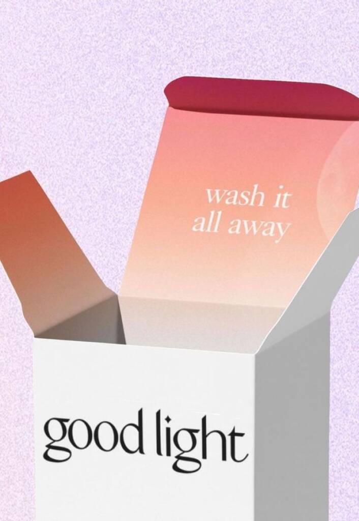
These examples showcase great pink gradient usage and were sourced from yami, weijinpackaging, thedieline
Contrast pink beauty branding
The pink shades combine beautifully with black and white, creating deep, elegant, and luxurious contrasts. While white enhances a sense of purity, softness, and sophistication, black adds depth, confidence, and a premium feel. Together, these combinations allow pink to appear both refined and visually striking, making them a popular choice for beauty and cosmetics branding.
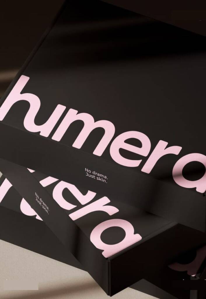
You can check out logo design and branding project created with a pink and dark gray color scheme here – Handwritten “G” letter logo design and pink branding for a cosmetics company
Retro, vintage pink cosmetics branding
Pink combines perfectly with bright colors, making the brand feel fun, fashionable, and eye-catching. Vibrant combinations create a sense of energy, creativity, and confidence, helping beauty brands stand out while maintaining a playful and modern appearance. This approach is often used by brands targeting younger audiences or those looking to make a bold visual statement.
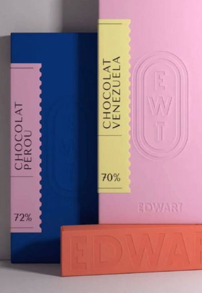
These examples showcase great pink combinations to create retro/vintage feeling and were sourced from edwart, amazon and pinterest.com
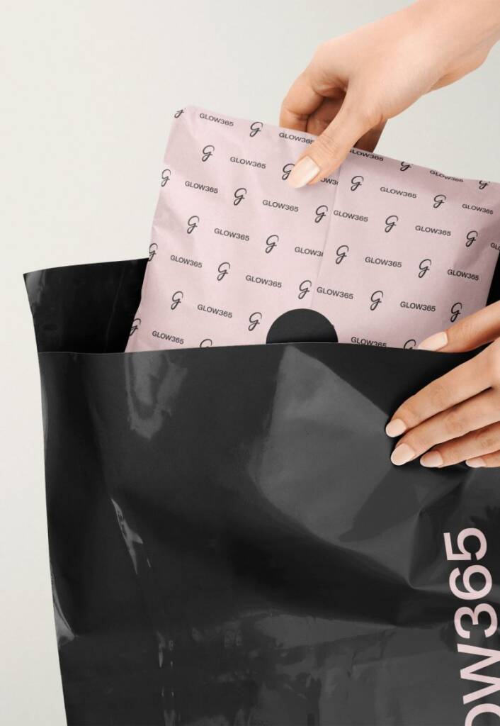
Color-coding pink cosmetics branding
Color coding is a popular approach in beauty branding, especially for brands with multiple product lines or collections. Different colors help customers quickly identify product categories, ingredients, benefits, or intended use, making the shopping experience more intuitive and organized. Beyond functionality, color-coded systems create a visually cohesive and recognizable brand presence. When applied consistently across packaging, marketing materials, and digital platforms, they help brands communicate clarity, professionalism, and a well-structured product range.
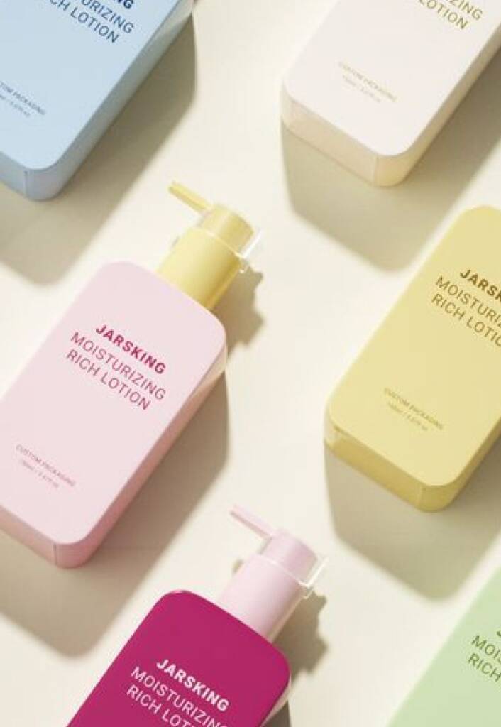
These examples showcase color coding usage and sourced from jarsking, oliveyoung and pinterest.com
The next popular color in beauty and cosmetics is blue.

Unlike pink, which is often associated with beauty and femininity, blue conveys trust, purity, professionalism, and innovation. It is widely used by skincare, wellness, and medical beauty brands because it creates a sense of reliability and effectiveness.
Lighter shades of blue feel fresh, calming, and clean, often evoking associations with water, hydration, and gentle care. Darker blues appear more sophisticated, premium, and science-driven, making them a popular choice for brands focused on advanced skincare and cosmetic treatments. Blue helps communicate confidence, quality, and a sense of well-being, making it one of the most versatile colors in the beauty industry.
Check out the brand I created using blue with accent colors – Professional, luxury logo design and brand services for a building company
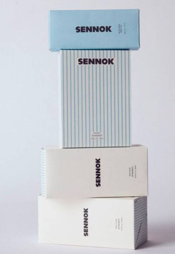
Blue and white beauty branding
Blue and white is a timeless color combination in beauty branding that conveys cleanliness, trust, and professionalism. Often associated with skincare, wellness, and clinical beauty products, this palette creates a sense of purity, effectiveness, and reliability. White enhances feelings of freshness and simplicity, while blue adds confidence, calmness, and credibility. Together, they create a balanced and sophisticated aesthetic that appeals to consumers seeking quality, transparency, and results-driven beauty solutions. This combination is especially effective for brands focused on hydration, sensitive skin, medical aesthetics, and science-backed formulations.
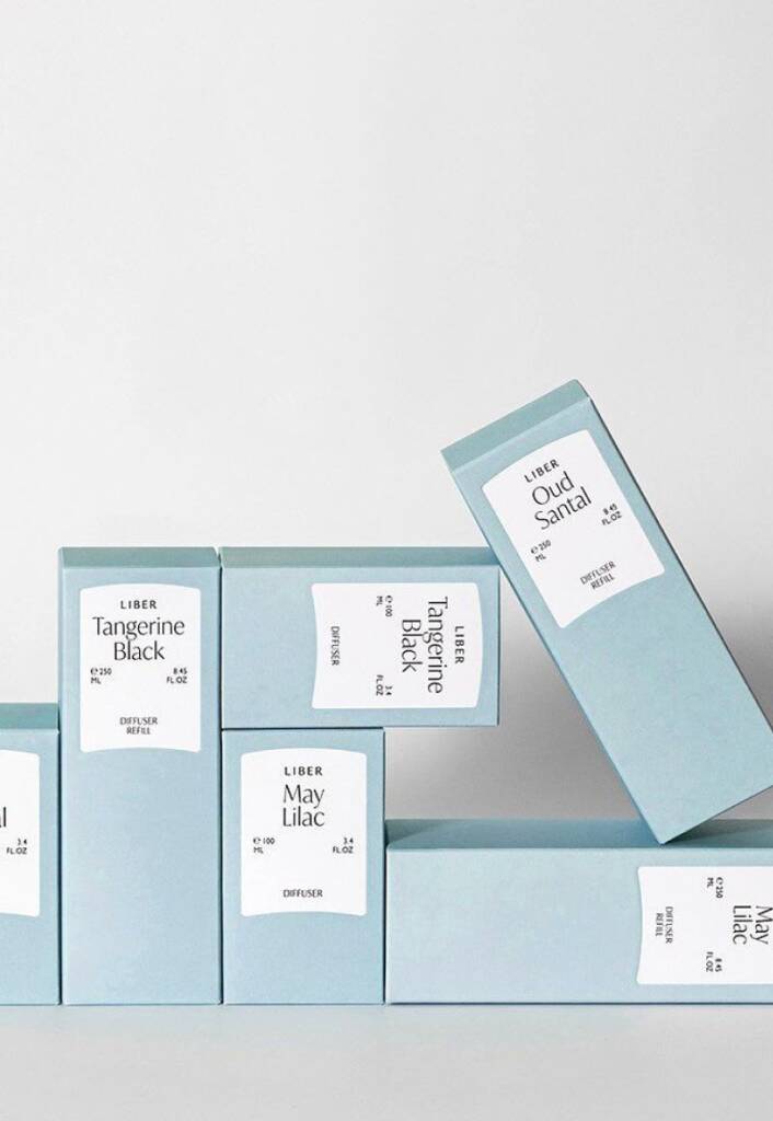
These examples demonstrates blue and white branding and found on hwahae, amazon and pinterest.com
Blue retro and pattern beauty branding
This branding method combines a sense of freshness and trust with nostalgic design elements. Vintage-inspired typography, stripes, repeating patterns, and structured layouts give the brand a distinctive personality while maintaining a clean and professional appearance. Light blue shades create a calm and approachable feel, while retro details add charm, memorability, and visual interest. This approach works particularly well for beauty brands that want to appear unique, stylish, and timeless without sacrificing a modern and premium aesthetic.
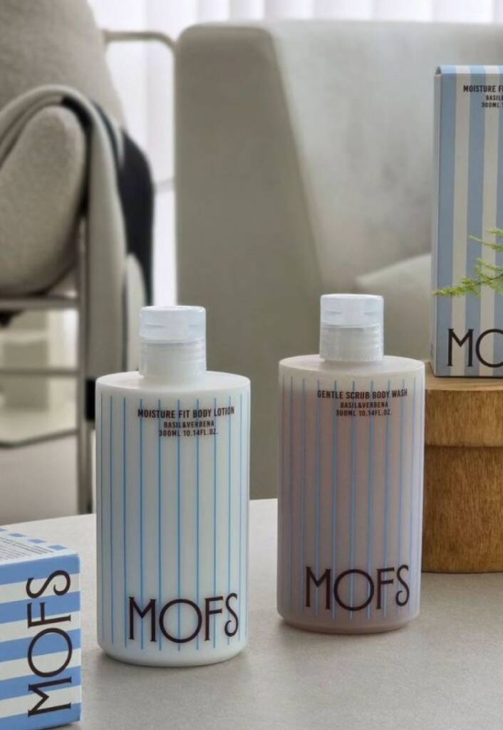
These examples illustrate blue retro branding and selected from ebay, mofs and pinterest.com
Blue color and photo insert cosmetics branding
Blue branding pairs exceptionally well with photographic inserts, creating a strong visual connection between the product and its inspiration. Images of water, sky, minerals, ice, or natural landscapes reinforce the feelings of freshness, purity, hydration, and tranquility that blue naturally conveys. Photo inserts add depth, storytelling, and visual interest to packaging while helping products stand out on the shelf. This approach is particularly effective for skincare and beauty brands looking to communicate natural ingredients, sensory experiences, or science-backed formulations through a clean and modern aesthetic.
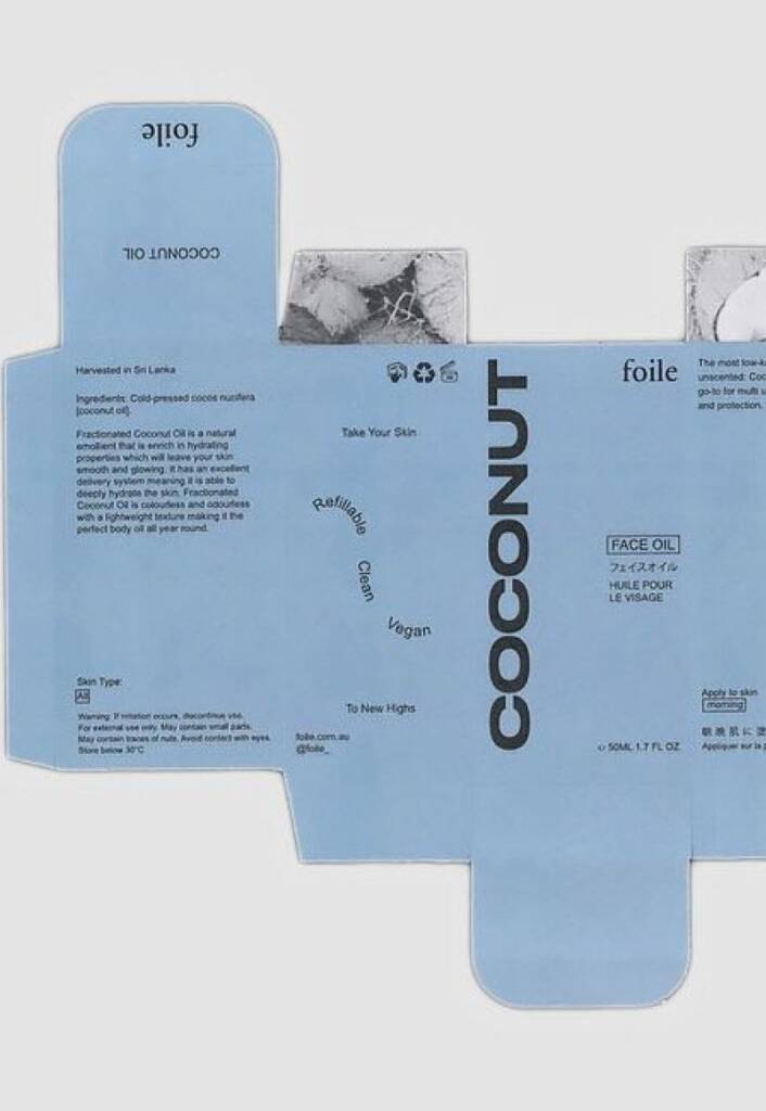
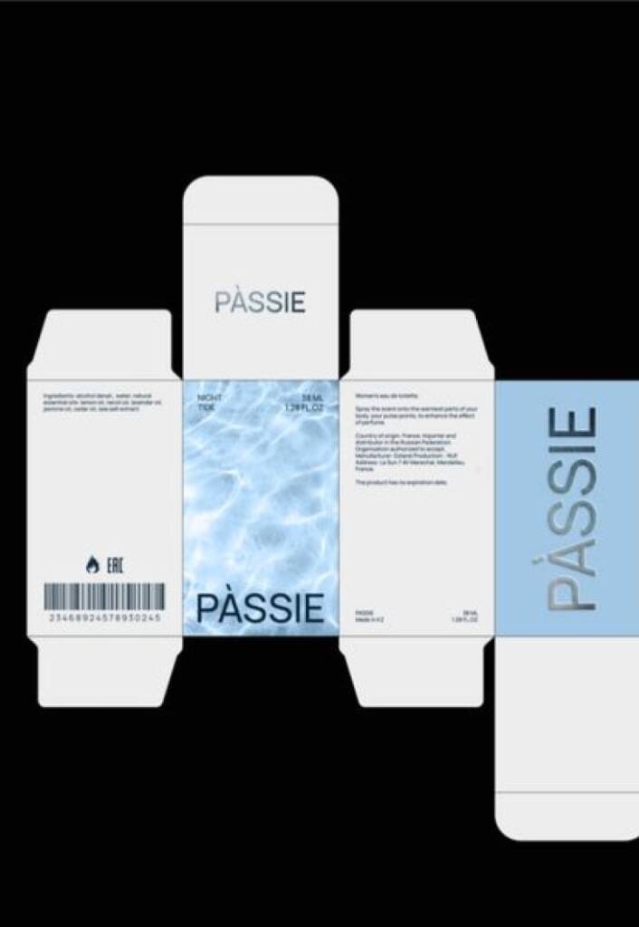
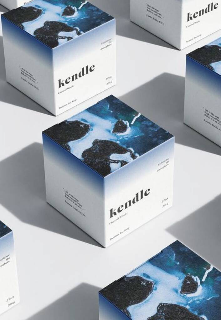
These examples feature blue branding with image insert and curated from behance and pinterest.com
Deep blue or dark blue cosmetics branding
Deep blue is often used to communicate confidence, sophistication, and premium quality. Compared to lighter blues, it feels more powerful, luxurious, and established, making it a popular choice for skincare and beauty brands that want to emphasize expertise and effectiveness.
To soften the intensity of dark blue, brands often pair it with matte finishes, clean typography, and minimal layouts. Bright accent colors can also be introduced to add energy, youthfulness, and a modern edge. This balance helps create a brand identity that feels both professional and approachable while maintaining a strong visual presence.
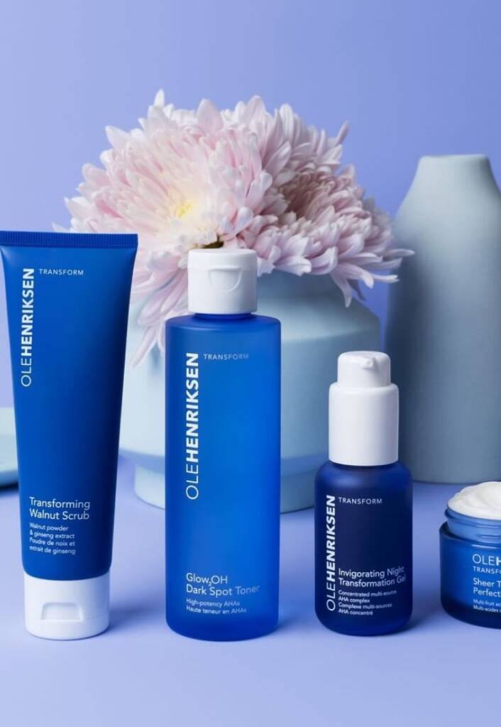
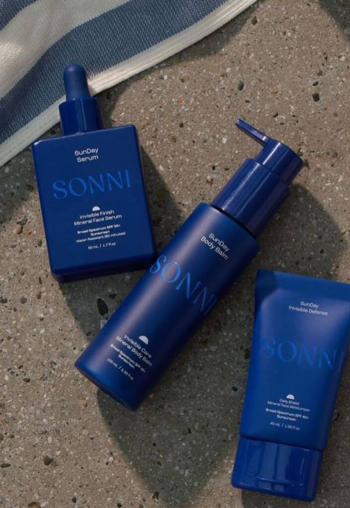
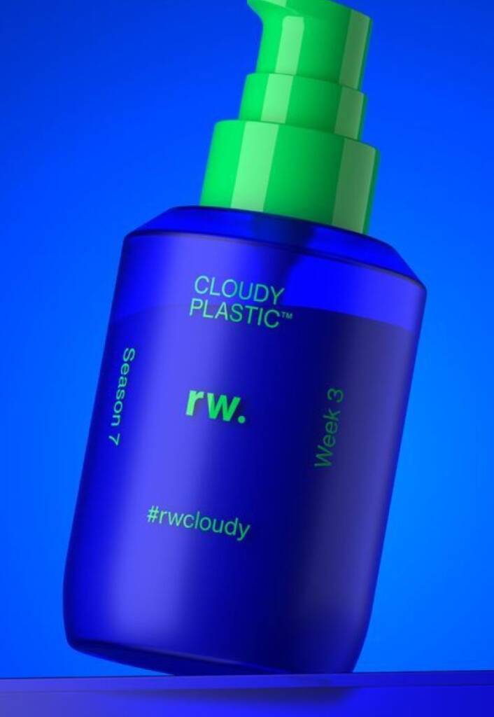
These examples highlight deep blue branding and collected from alessandroboldrin, sonniskin, sephora
The final beauty color featured in this article is brown.
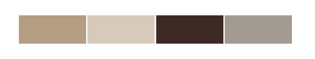
Brown conveys warmth, authenticity, stability, and natural beauty. It is widely used by skincare, organic cosmetics, wellness, and sustainable beauty brands because it creates a sense of trust, comfort, and connection to nature.
Lighter shades of brown feel soft, earthy, and approachable, often evoking associations with natural ingredients, botanical extracts, and gentle self-care. Darker browns appear more premium, sophisticated, and luxurious, making them a popular choice for high-end skincare, fragrance, and beauty brands. Brown helps communicate quality, craftsmanship, and a grounded brand personality, making it one of the most timeless and versatile colors in the beauty industry.
Amber brown matte direct print cosmetics branding
Deep brown is often introduced through the packaging material itself rather than printed graphics. Amber and tobacco-toned bottles create a natural, premium appearance while reducing the need for excessive branding elements. Combined with direct-print typography, this approach results in a clean, sophisticated aesthetic that feels authentic, sustainable, and timeless.
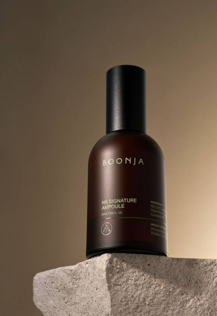
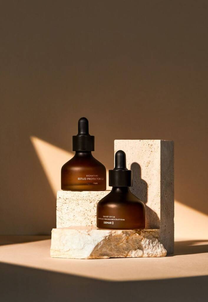
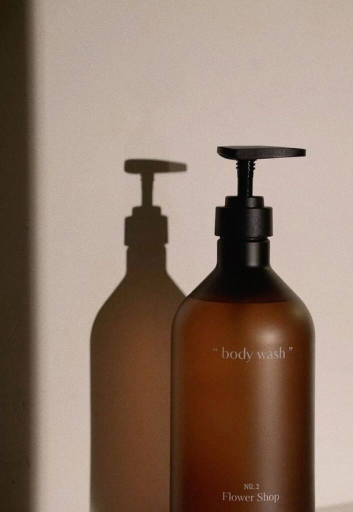
These examples feature amber brown matte cosmetics branding and taken from yami, kbeautyinsight and hwahae
Check out the cosmetics logo and branding I created for a beauty company using transparent finishes in the packaging design – Beauty packaging and label designs for a cosmetics company
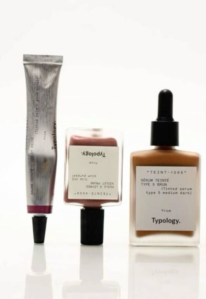
Brown and white/transparent beauty branding
Brown is commonly paired with white and transparent packaging elements to create a balanced blend of warmth and purity. The brown tones communicate natural ingredients, sustainability, and authenticity, while white accents add cleanliness, simplicity, and a sense of gentle care. This combination is widely used in skincare and wellness branding because it feels both premium and approachable, helping products appear trustworthy, effective, and naturally derived.
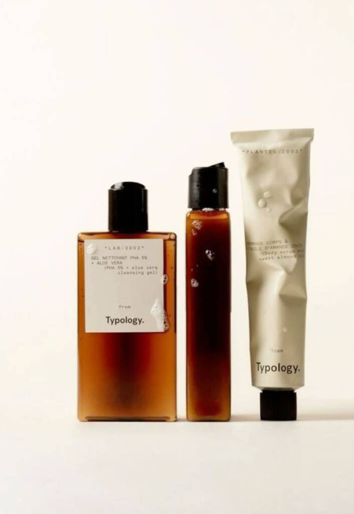
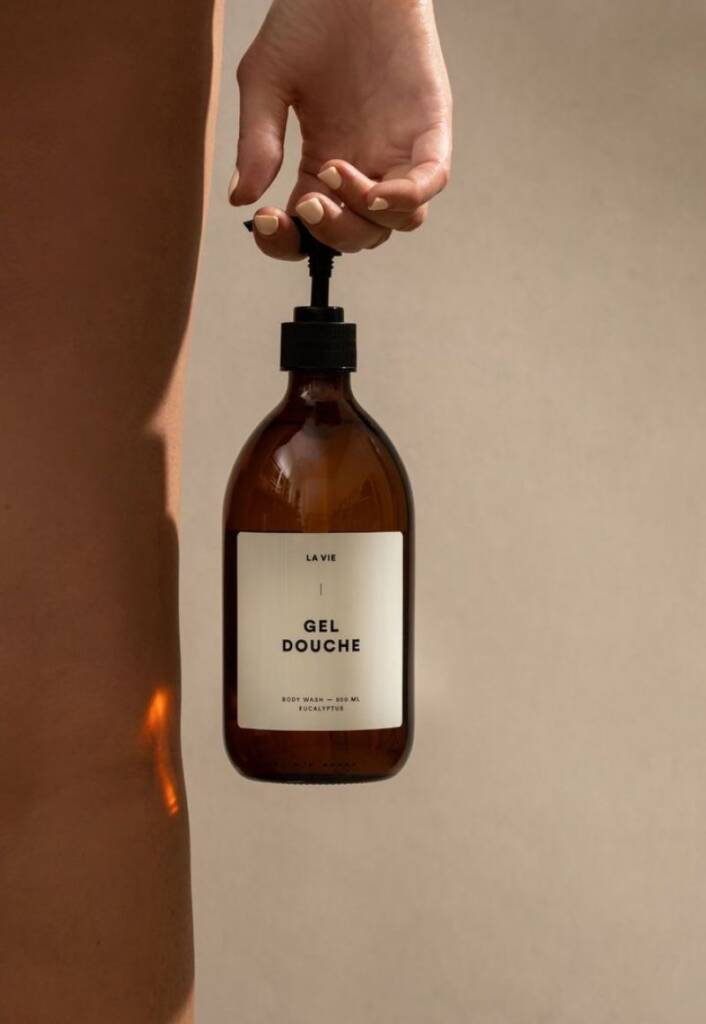
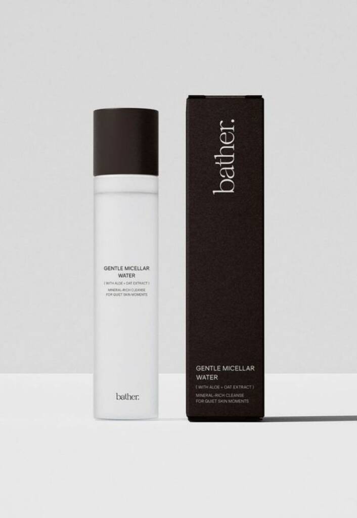
These examples showcase brown and white/transparent cosmetics branding and taken from typology, atelierlavieapothicaire and pinterest.com
Brown and metal cosmetics
Brown packaging is often paired with metallic finishes to elevate its perceived value and create a more sophisticated appearance. While brown communicates authenticity, warmth, and natural ingredients, metallic surfaces introduce a sense of innovation, luxury, and performance. This combination is particularly popular in premium skincare and cosmetic products, where it helps balance natural positioning with a high-end, science-driven aesthetic.
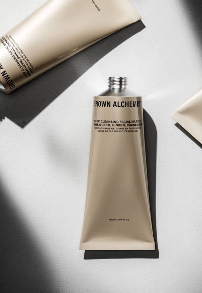
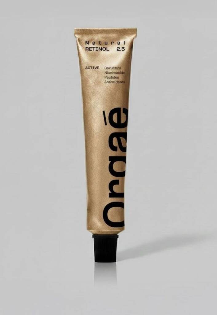
These examples illustrate brown and metal cosmetics branding and collected from typology, grownalchemist and pinterest.com