

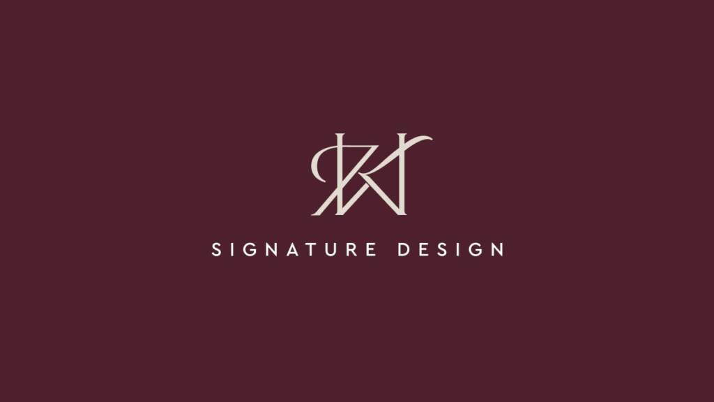
The client approached me via Instagram, looking for 1:1 work with a designer. She mentioned that they already have an established company and are seeking a redesign. She explained that the letters K and W are the initials of her and her husband, which gave me several ideas — either combining two distinct letterforms to highlight contrast, or using similar forms to convey unity. In any case, I aimed to present versatile options to the client so we could discuss and choose the direction together.
Logo design process
Frankly speaking, the letters “K” and “W” are challenging — they are sharp, with diagonal lines, and have different angles and structures. This made it initially difficult to define an approach for building them in a harmonious and balanced way.
Below is my Illustrator canvas, showing how many options I explore before presenting to a client.
The client declined the first sets of ideas, and I continued exploring how to construct the right composition.
You might ask — was I frustrated? Frankly, yes. Even after many years as a designer, you still face challenges. What matters most is how you approach them. I saw this process as a level-up — and I was right. It became a huge experience.
Working closely with the client and testing various positions, I realized that the “K” could be integrated with the “W” if the latter took on a more rectangular shape — and we decided to explore this direction.
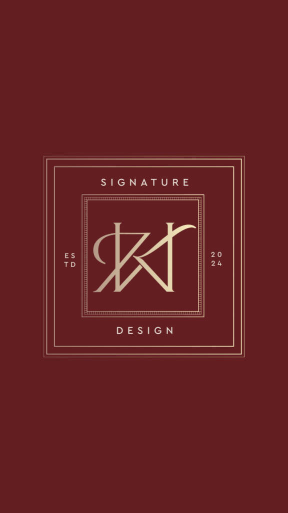
After considering colors and layouts, we arrived at additional options.
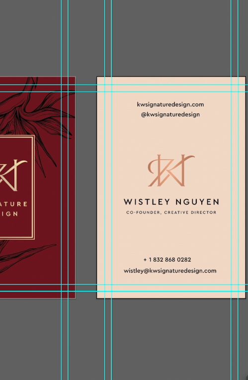
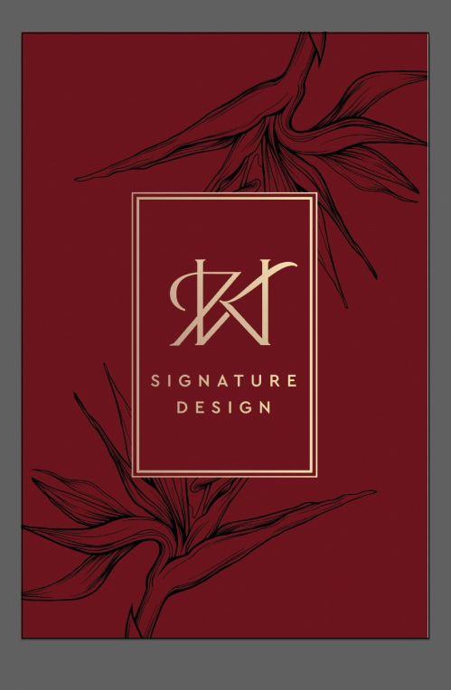
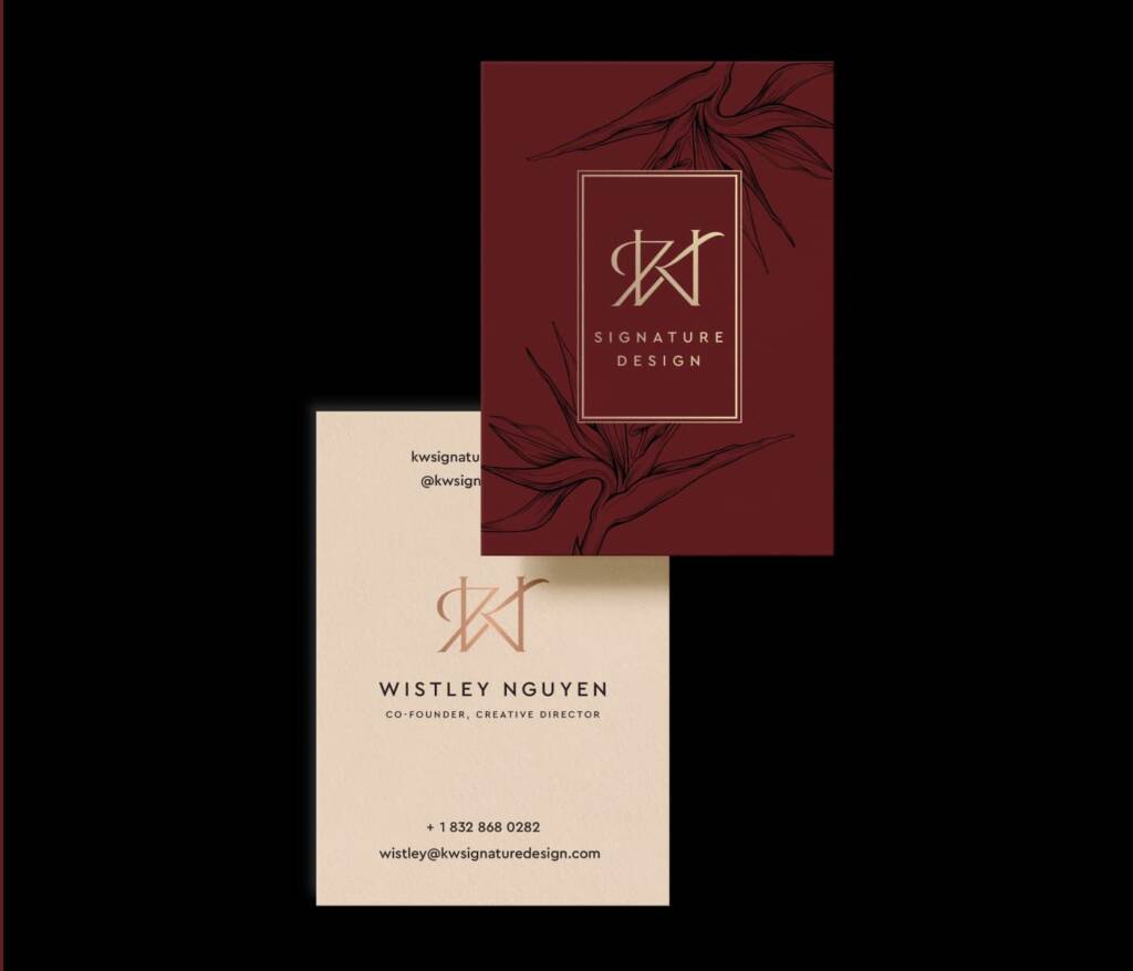
Business cards design for an interior company
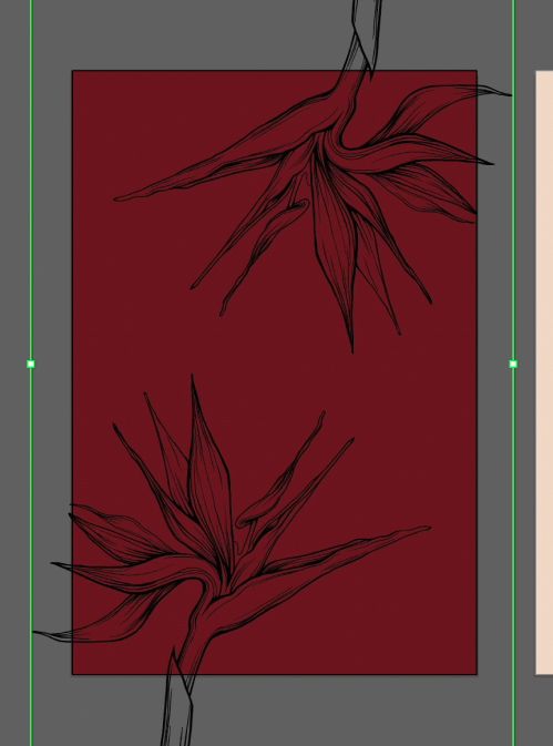
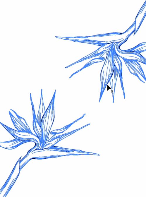
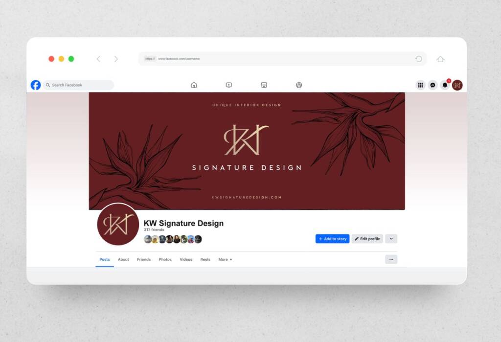
The client wanted to represent their family union through two Bird of Paradise flowers. The way the logo is designed, it appears sharp and noticeable, reflecting the same qualities as these flowers.
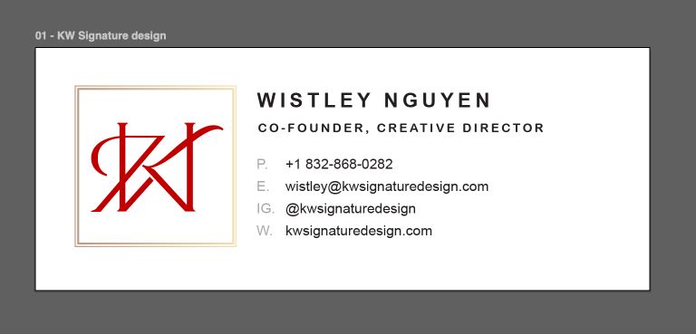
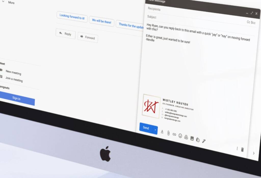
Email Signature design for an interior company
Email signature design is the visual and structured way your contact details appear at the end of your emails. It’s not just text — it’s a small branded block that represents you or your business in every message.
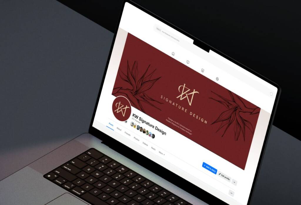
Facebook cover for an interior company
When most of the materials were completed, it became easy to create options for the Facebook cover. I used the same Bird of Paradise flowers and arranged the text so it remains clearly visible and well-balanced within the layout.